BuzzFeed is a favorite of the young set. I remember two semesters ago when every time I asked my Columbia University students to take an existing digital product as the basis for class assignments, it was Buzz Feed that would be used by a large number of students.
However, Buzz Feed apparently wants to display a showcase for its “newsy” side, beyond celebrity and lifestyle news. The new website and url have launched as you can read here. Specifically, BuzzFeed is now providing a BuzzFeed News app, a section on the main BuzzFeed site and a “BuzzFeed News” label on every story.
Now the audience will have a choice to read the “classic” Buzz Feed or a new BuzzFeed News website.
We take a look
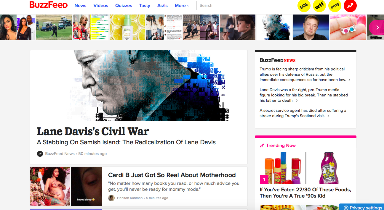
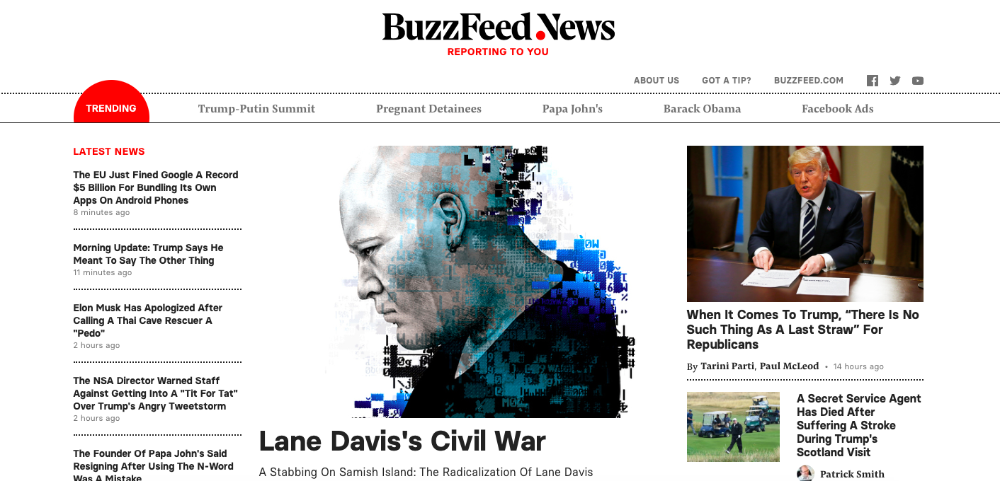
Here we see the basic design differences between the two sites:
-The classic Buzz Feed site here.
The Buzz Feed News site:
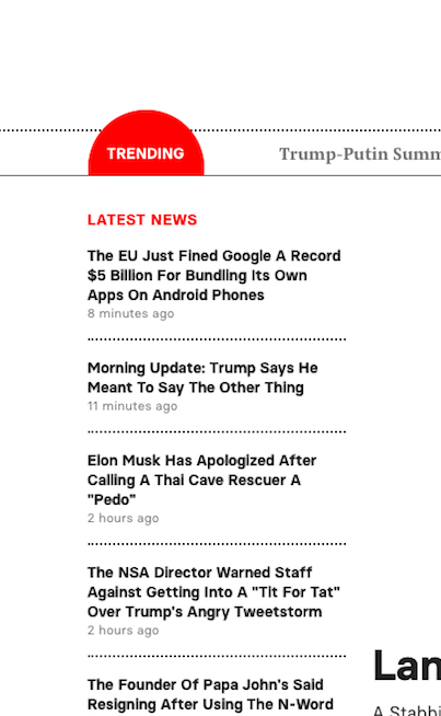
The latest news navigator bar
The newsy site includes a prominent Latest News column on the left of the screen:
Creating hierarchy and layers
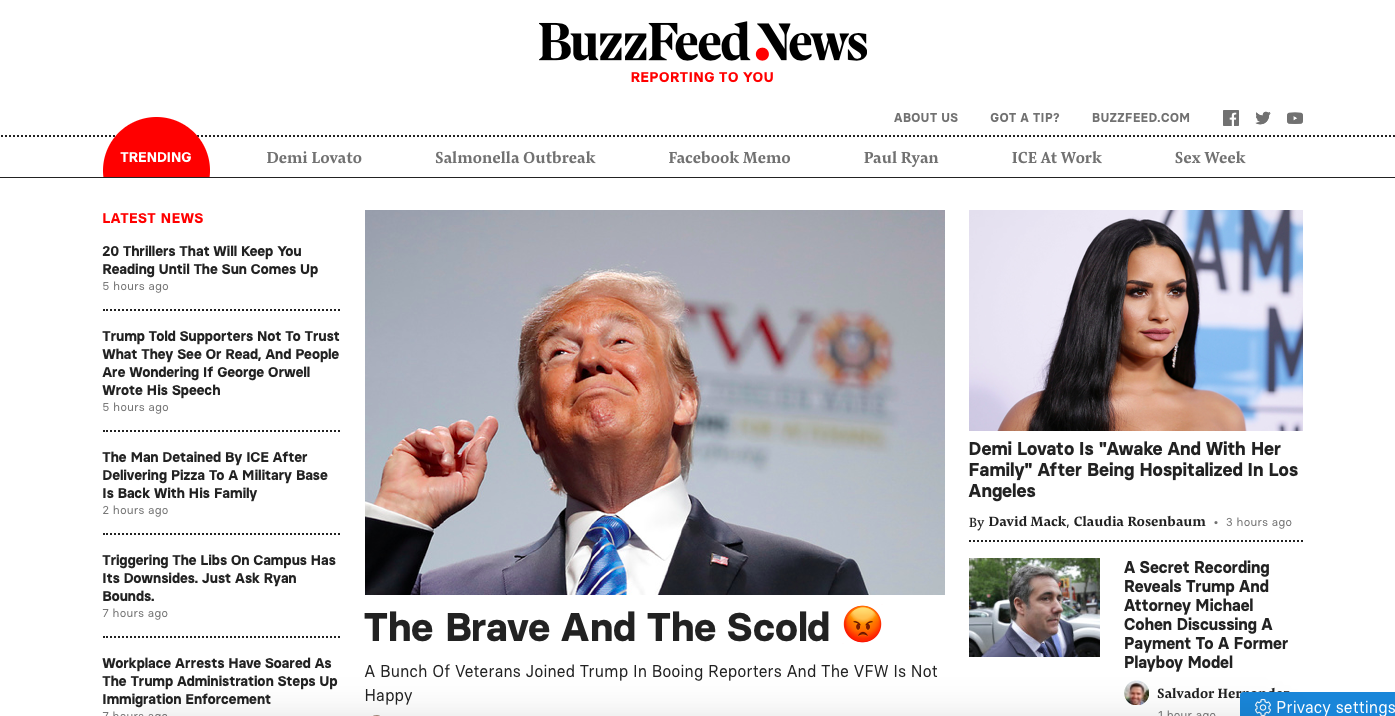
I like that the site allows for layers which help us get a sense of hierarchy for the content.
We go from the home page to this style for secondary stories of consequence:
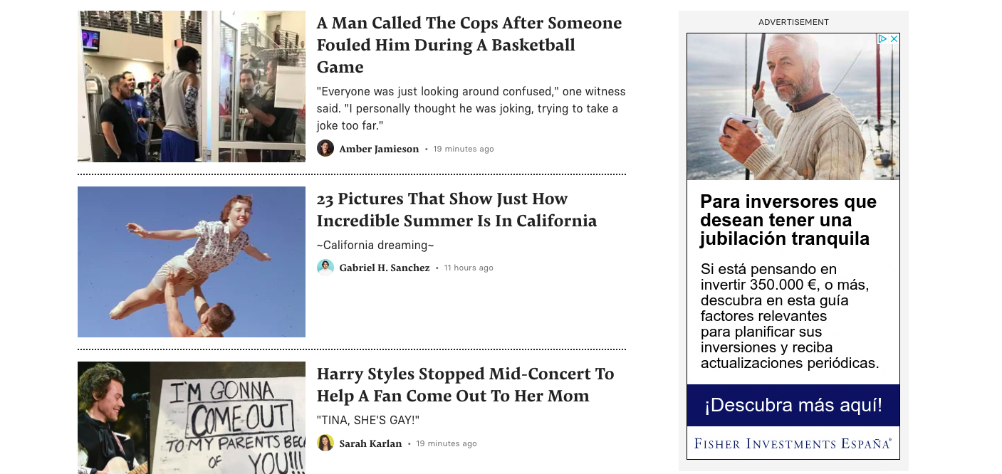
Then we see some panels with a background color for what appears to be “special” news and/or reportages:
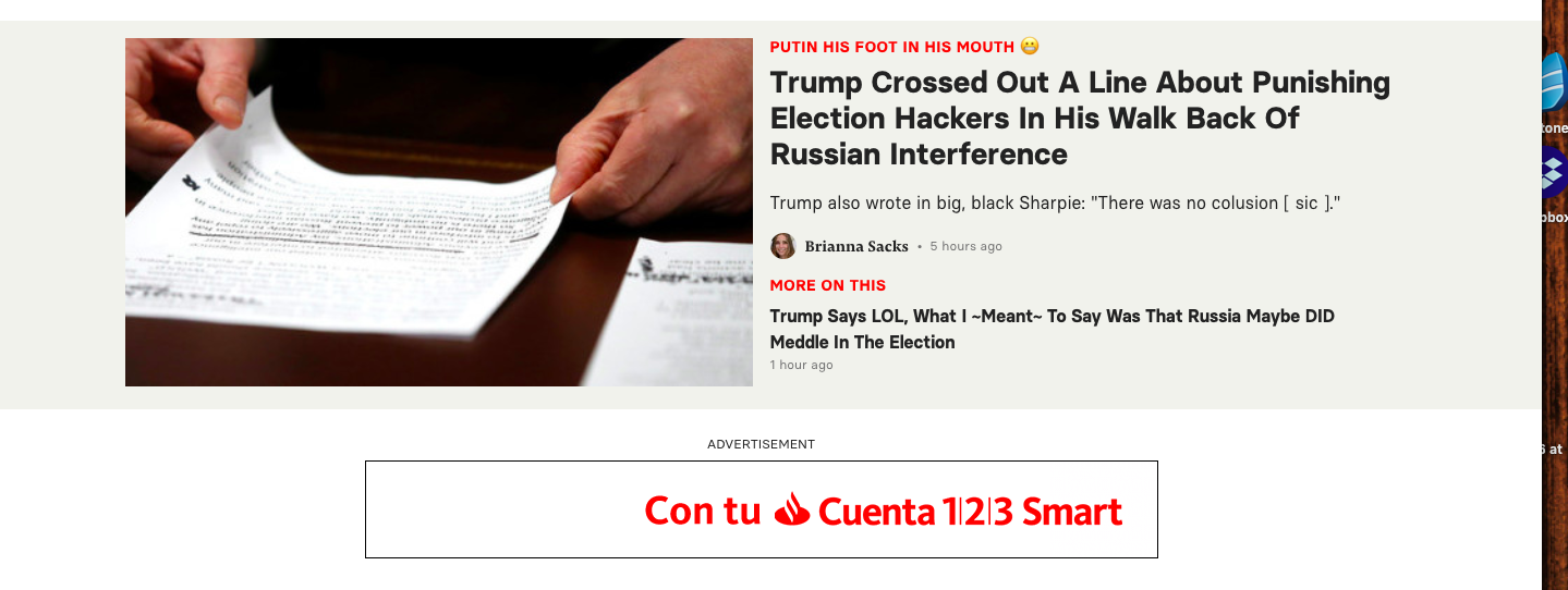

The mobile view
Here we see the Buzz Feed and Buzz Feed News content for mobile.
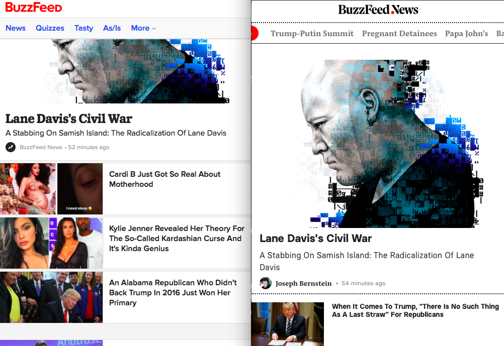
Mario’s Speaking Engagements
August 2, Digital House (Facebook workshop), Buenos Aires

October 6, 20, 27–King’s College, New York City
The Basics of Visual Journalism seminars

October 25, Eidos Media Keynote, New York City

Garcia Media: Over 25 years at your service
