Updated Monday, Nov. 23, 08:56 Frankfurt (Germany) time
TAKEAWAY: We often like to stop and to observe ideas and styles that seem to catch up. A review of Sunday front pages from the United States shows an interesting trend: the logo intertwined with photos and headlines. ALSO: My fascination with the crazy “design” style of Germany’s Bild.
Wearing your Sunday’s best?
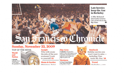
San Francisco Chronicle

Fort Lauderdale Sun-Sentinel
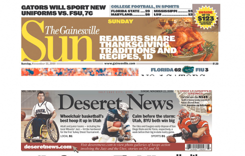
Gainesville Sun (Gainesville, Florida) , Deseret News (Salt Lake City, Utah)
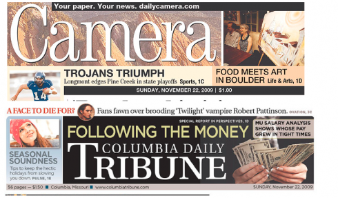
Daily Camera (Boulder, Colorado), Columbia Daily Tribune (Columbia, Missouri)

The Kansas City Star, The State (Columbia, South Carolina)

The Sunday Tribune (San Luis Obispo, California)
Here I am, taking a look at front pages of US newspapers yesterday, and I could not help to notice that logos are getting out from their isolation all of a sudden. Take a look at these front pages from a variety of dailies across the nation.
The logo seems to be part of a large square on which headlines, photos, silhouettes and other elements find their way. Many of these newspapers don’t carry out the technique to their daily editions. It is a sort of wearing your Sunday’s best.
Some, like the San Francisco Chronicle, pull it off quite well. Others manage to make the logo get lost in the midst of too many elements (Deseret News and Columbia Daily Tribune).
If the idea is to create a different look and feel for a Sunday product, I think this is a good idea, but it must be art directed carefully, giving the name of the newspaper its proper hierarchy——should be number one most visible, in my view——and not junking up the area with too many elements, which is why I think that the Chronicle, and the
Sun Sentinel (Fort Lauderdale) handled it best.
As with almost everything else in design: less is best.
Meanwhile, in Austria…..
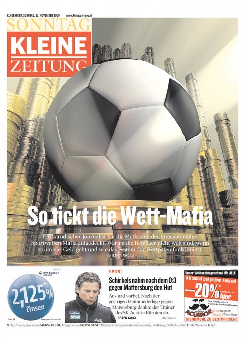
A perennial favorite of mine, Austria’s Kleine Zeitung, published in Graz, and a project I have enjoyed working with over the years, surprises us with a Sunday front page of notice yesterday. The talk in the German speaking world is all about the so called football Mafia. Here the KZ devotes its front page to an exclusive, in-depth report on the subject.
Oh, waking up with Bild Zeitung!
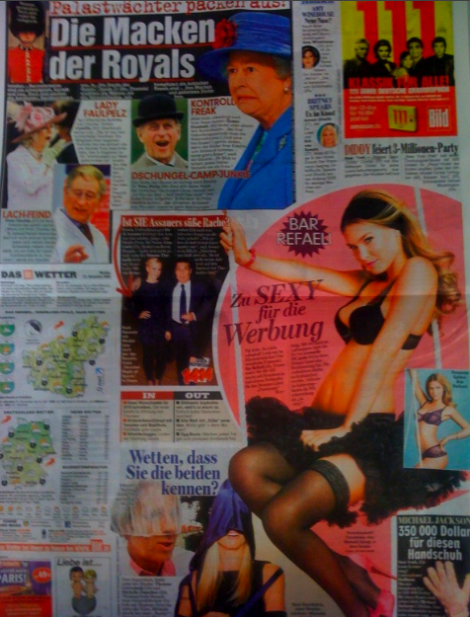
It takes a special kind of page designer to come up with Bild’s signature pages where chaos meets serendipity
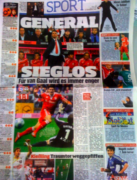
Today’s Bild Zeitung’s sports page: a Carmen Miranda hat, plus more—-see how photos and content are packed to the limit
My fascination with the craziness of the German popular daily Bild Zeitung never leaves me. What a better way to wake up on a typical German November cloudy morning than with this colorful array of squares and circles seen on this page?
Perhaps it is the fact that I cannot imagine myself ever sketching a page like this, or maybe it is the total abandonment of rules one witnesses here, but the fact remains that Bild has its own style. Surprisingly, although this newspaper is definitely aimed at the down market public, I see the colorful Bild in the hands of the well dressed execs who populate the Lufthansa First Class lounge. Yes, next to Bild will be a copy of Frankfurter Allegemeine, Handelsblatt or Financial Times, but Bild is part of the ritual.
Something to be said about that. In the midst of so much serious (and often bad) news, here comes Bild, a giant tutti frutti gelato cake of titillating stories and photos.
As for why I like it: perhaps it is a bit of envy of those page designers who have no rules to follow, no rectangles to adhere to, total freedom to let the imagination go, the silhouettes cross into the territory of stories not related to them, and headlines that start at 95 points on any inside page.
I think I know what I want for Christmas this year: to sit down with the Bild team and design a page like this.
It will take practice, but I am ready, Santa.
TheMarioBlog post #425