TAKEAWAY: Joachim Berner and I worked together at the Goteborgs Posten, Dagens Nyheter and Expressen. He is away from the media right now, but very much intrinsically involved with what is happening in the media landscape. Lunch with Joachim Berner in Stockholm. Remembering the Super Mario project!
1994: planting the seeds of the Goteborgs Posten of today
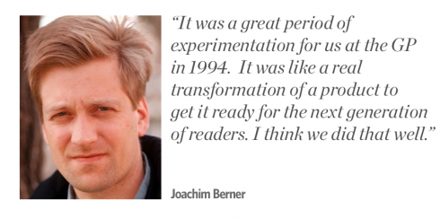
A highlight of my weekend in Sweden was a delightful encounter with Joachim Berner, former editor of the Stockholm dailies,Dagens Nyheter and Expressen, and who many describe as the boy wonder of the media in Sweden in the 1990s.
Joachim is no longer involved with the media and, instead, is at the top of his late father’s company, Christian Berner AB, which provides technical and building equipments. This is a radical departure in activities for Joachim, whose run with the media started at the Goteborgs Posten (Goteburg), where we met.
It was 1994 and he and publisher Peter Hjorne, who are also good friends, were in the process of transforming the GP and making it a modern, vibrant and more colorfully designed publication. I was happy to be part of what came to be known as the Super Mario project. Yes, nice name, too.
Joachim and I reminisced about this period while enjoying a meal at Atrium, the restaurant inside Stockholm’s National Museum—-a place I recommend. The meal was good, but, even better, our conversation.
“It was a great time for innovation and change,” Joachim told me. “We were seeking new ways and nothing was off the table.”
I told Joachim that I still remember the GP Super Mario project as one of the highlights of my career. We were like kids playing in the sandbox. As a result, we threw the entire contents of the GP up in the air, and put it together again, but differently.
Highlights of the GP Super Mario project:
1. It was the first time that a “design” project in the newspaper turned its attention to the product in other ways beyond the look.
2. We were one of the first to abandon the old sectioning of the newspaper and concentrate content in fewer “books”.
3. It was one of the first Swedish dailies to introduce secondary readings, shorter items, “whispers” around stories, to facilitate understanding of major stories.
4. In terms of design, more white space was introduced, new fonts, more color.
To this day (and I still continue to do consulting with the GP, a job I like very much), it was the 1994 Super Mario project that ignited the fire, that became the foundation for change that is still there today.
Not to mention that, as far as I am concerned, we also pioneered in the “workshop concept” as the basis for change and innovation.
At GP, workshops are still the order of the day when contemplating change. Two who were in the original 1994 project are still there today: Per Andersson-Ek and Mats Widebrant. Hjorne is still the publisher. Andersson still credits the Super Mario project with the fact that today GP is still the most succesful of the major morning papers in Stockholm, Goteborg and Malmo – at least when it comes to readership and household reach.
I told Joachim that he would still be much needed in the media today, and that I, for one, think he will appear as an editor somewhere sometime.
Joachim simply smiled and told me that he is not totally out of the media, as he participates on the board of a Norwegian newspaper group.
The industry can benefit from the insights of a smart, thoughtful and young media man like Joachim.
Thinking back, many publications today need the playful mode that accompanied the Goteborgs Posten’s 1994 Super Mario project. Today the need is greater and the possibilities for experimentation even more varied.
Dali/Vezzoli exhibit at Stockholm’s Moderna Museet: the media as art
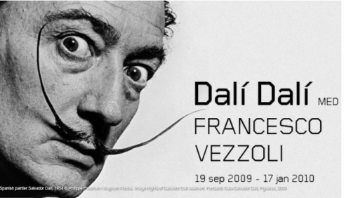
The Dali/Vezzoli exhibit at Moderna Museet is a must see for media people
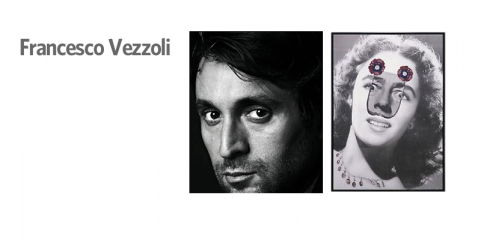
Francesco Vezzoli: contemporary media-based art. Shock a la Dali in most pieces, including this one.
Another highlight of my weekend in Sweden was to see the Salvador Dali/Francesco Vezzoli exhibit at Stockholm’s Museum of Modern Art. The exhibit, which runs through January 17, 2010, is experimental in itself, combining Dali, perhaps one of the most popular artists of the 20th century, with the younger Vezzoli (1971). What brings them together here is the fact that both artists use their art to embrace the media of their times.
Dali’s art is there to provoke and often shock; Vezzoli’s images do the same, using contemporary figures from Nancy Reagan to Elizabeth Taylor., among many.
This exhibition toys with the idea of putting Dalí‘s oeuvre in a contemporary context and looking at Vezzoli from a historical perspective. The exhibition highlights the artist role that Salvador Dalí assumed. It also experiments with the exhibition phenomenon itself, by juxtaposing a historical artist with a contemporary artist, Francesco Vezzoli.
I liked the set up of the exhibition itself. You first walk into the Dali part of the exhibit. Double doors open to a back room where one faces a huge theater curtain on which hang Vezzoli’s works. The doors to the back are closed, as a metaphor for the unattainable. In the first room, works by Dalí from the 1930s are shown in a traditional museum setting. This period has long been considered to be the best in Dalí‘s oeuvre. The second room presents Salvador Dalí the Universal Artist, who experimented in a wide range of genres, including fashion (two evening gowns are displayed), one of them white silk, with a huge red lobster covering most of the back of the dress. Wonder if Dali’s wife and muse, Gala, ever wore it.
The rear wall presents Francesco Vezzoli’s work, which focuses on the celebrity cult. Using famous people in the way a painter would use colours on a palette, he parodies a social climate in which the announcement of an event has become more essential than the event itself.
How true.
A surprise: One of the Dali exhibit’s walls is devoted to a newspaper appropiately called the Dali News, mostly text, with huge 500-point headlines.
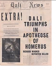
Front page of the Dali News—-several pages of which are shown in the Dali exhibit in Stockholm.
Belgian newspaper circulation: follow up
Last week we discussed
our meeting with Christian Van Thillo, of the DePersgroep Publishing in Belgium. We related the success story of the group’s dailies, De Morgen and Het Laatste Nieuws, which we attribute to Van Thillo’s focus on keeping his brands loyal to their core readerships.
Today we show you here the actual circulation figures.
DeMorgen (upper market): In 1998—-44,364; in 2008—54754
Het Laatste Nieuws (mid to down market): In 1998, 254,241; in 2008—283,040
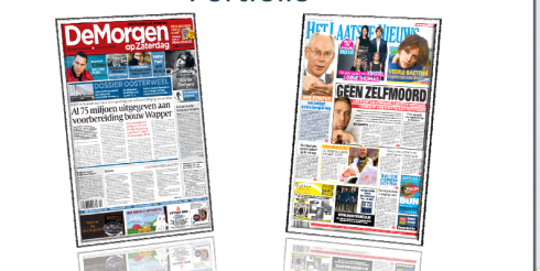
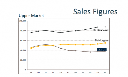
Both DeMorgen and Het Laatste Nieuws continue to increase circulation even in the midst of a global economic crisis

Who is Jacky?
Jacky belongs to Frank Deville. The Luxembourg-based pooch is an “avid reader” of the German newspaper, Bild Am Sonntag. Every Sunday Jacky picks stories and interesting graphics in Bild Am Sonntag , the German newspaper.

Follow me at www.twitter.com/tweetsbydesign
Follow the Marios

Two Marios. Two Views.
Follow Mario Jr. and his blog about media analysis, web design and assorted topics related to the current state of our industry.
http://garciainteractive.com/
Visit Mario Sr. daily here, or through TweetsByDesign (www.twitter.com/tweetsbydesign)
In Spanish daily: The Rodrigo Fino blog
:
To read TheRodrigoFino blog, in Spanish, go:
https://garciamedia.com/latinamerica/blog/
TheMarioBlog post #405