TAKEAWAY: From time to time, we use this space to showcase the work of art directors from around the world who have undertaken redesigns of their publications in house. Today: Kerala Kaumudi , of Kerala, India.
New look launches Nov. 1
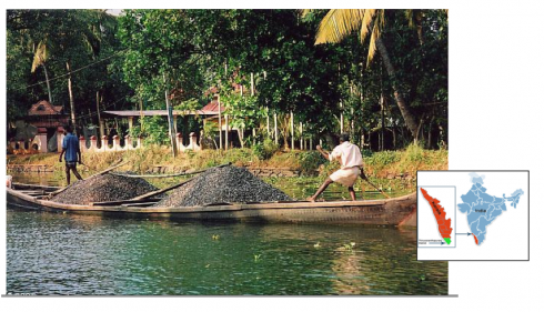
Kerala’s peacefully scenic backwaters: truly one of India’s most beautiful regions
Occasionally, art directors who have completed a redesign in house send pdfs to me, and tell me all about their experience.
I always appreciate these entries into the blog, and they are usually preceded by something like: “Dear Sir, I hope you will find my work of interest. We could not afford an internationally renowned consultant, so we tried it on our own.”
There is something to be said for these efforts, as we know that the art director who is doing the redesign is also taking care of the daily publication. It makes for long hours, intense days and weeks.
Today, I have received a note and pdfs from Sajeev Kumar T.K , visual editor of the Kerala Kaumudi, circulation, 150,000. It circulates in one of my favorite spots in India, scenic Kerala, in the south, with backwaters that inspire artists, and muilticolored birds who fly overhead as if the humans down below were not there at all. Quite a spectacle. Years ago, when my team and I travelled to Kerala to redesign Malaya Manorama, also in the Malayalam language, a highlight for me was to run in the midst of the rice patties and the beautiful nature that surrounds the area.
Sajeev reports that the new look of his paper premieres in early November, and that he mans a department of four staffers—-two illustrators and two designers.
Talk about intense days and weeks to accomplish a redesign!
Here are some pages, in the before and after versions (the new version always on the right). Many of you will find the Malayalan alphabet of great interest.

The new front page of Kerala Kaumudi
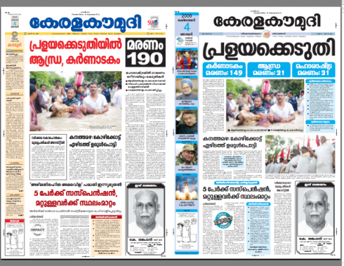
The front pages before and after
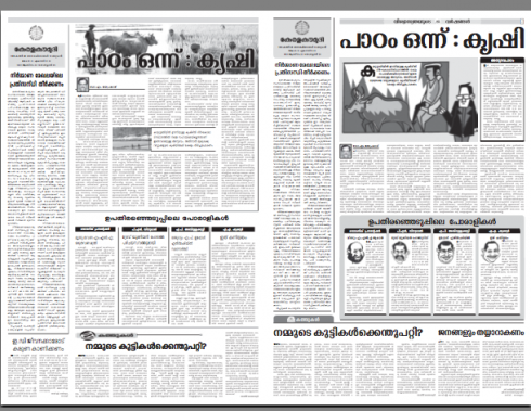
Opinion pages before and after
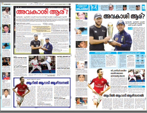
Sports pages before and after
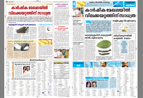
Inside pages before and after
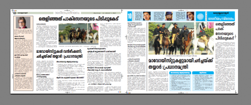
Navigational detail
My comments to Sajeev: Some texts are too long (especially opinion page), and perhaps there is too much of the light blue on page one. Otherwise, the pages of the redesign are more attractive and advance the look, perhaps inviting more readers to come. But with so many faithful readers, the question is: will they like it enough to continue reading their favorite newspaper?
I am sure Sajeev will let us know what reader reaction is. In my experience with various Indian projects I find that readers are very appreciative of positive changes, and they see any advancement in their newspapers as a plus, something to be proud of. Some even write letters to let the editors know that. Nice.
Thanks for sharing your work.
The Washington Post’s new look: Take 2
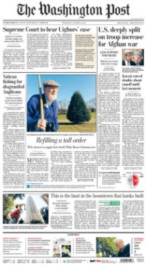
Recent front page of the newly redesigned The Washington Post
Earlier this week we discussed the Post’s new look (via Roger Black and his team). Here is a follow up item that may be of interest. It is more about editor Marcus Brauchli and his participation in the process.
Headline: Say Hello to the … Washington Street Journal?
http://dcist.com/2009/10/goodbye_washington_post_hello_washi.php
TheMarioBlog post #403