TAKEAWAY: So your new rethinking of that newspaper has launched, and some early reactions are rather negative. What to do? This installment of Pure Design, and its update, guide you. ALSO: Typography and its applications around the house
What the readers said…..
I stand by what I wrote for Pure Design in this installment in 2002: don’t let that first reaction from readers/users about a new rethinking of your product turn you back to the drawing board for immediate changes.
Today, this is even more important than ten years ago. In this age of immediate interaction between audience and news sources, the reactions come fast and furious when a publication makes a dramatic (or sometimes not so drastic) change. It is part of the human condition that negative responses come as an avalanche first, while the users who liked the new product simply have another cup of coffee, smile and go on with their day.
When those first BAD reactions arrive, many editors immediately wish to make changes. Not so fast. In my experience, one needs to let a design take hold. It is the same as when new furniture arrives in the house, or when you move the baby grand piano from one room to another. At first, it is all so unfamiliar. In three weeks, that piano looks like it always belonged there.
FROM THE MEMORY ARCHIVES: Of course, there are exceptions, and each team must use common sense and evaluate the situation as per the specifics involved. Sometimes, it is necessary to make immediate changes when one realizes that the reaction is overwhelmingly negative and the calls keep coming in. Case in point: The Philadelphia Inquirer, which launched its redesign in 1986. I remember we had reduced the size of photo captions to 8 points, to save us a little space. Bad, bad move. The readers complained loudly that they could not read those photo captions as well, so within 24 hours, we changed them back to 9 points, and never heard a complaint again.
AN UPDATE FOR THE TIMES: Many publishing houses today live to PRESERVE that constituent of readership which is the traditional readers—-usually older than 55. Well, they are not likely to enjoy any dramatic changes in their newspaper, so DON”T create your product for this group, or, better yet, don’t react too strongly to their first outbursts of negativity. In my experience, the traditional readers first kick, scream and threaten you with cancellations of their subscription, but, eventually, they come back. Two months later, they have no clue how the old product they loved so much even looked.
Don’t let a core of your readership keep you from advancing your publication to the next level. Sometimes this is a decision that will guarantee that your publication, indeed, has a next level to advance to.
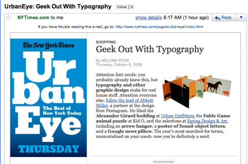
Geek Out with Typography: NYT Style

With this provocative headline, The New York Times makes a call out to anyone interested in typography, but this is not about reviewing the latest font created by some type genius. Instead, this piece is about typography and other graphic design which make for cool house stuff. Go read it, some real cool stuff here, taking typography out of its usual territory and into everything from pillows and sheets (Alexander Girard collection, Urban Outfitters) to Spring, Design & Art.
Go here:
http://www.nytimes.com/indexes/2009/10/08/urbaneye/index.html?8ur&emc=ur

Who is Jacky?
Jacky belongs to Frank Deville. The Luxembourg-based pooch is an “avid reader” of the German newspaper, Bild Am Sonntag. Every Sunday Jacky picks stories and interesting graphics in Bild Am Sonntag , the German newspaper.

Follow me at www.twitter.com/tweetsbydesign
Follow the Marios

Two Marios. Two Views.
Follow Mario Jr. and his blog about media analysis, web design and assorted topics related to the current state of our industry.
http://garciainteractive.com/
Visit Mario Sr. daily here, or through TweetsByDesign (www.twitter.com/tweetsbydesign)
In Spanish daily: The Rodrigo Fino blog
:
To read TheRodrigoFino blog, in Spanish, go:
https://garciamedia.com/latinamerica/blog/
TheMarioBlog post #390