Editor’s note: This post was published over the weekend and stays through today. There will be a new blog post Tuesday, May 12.
While the changes Folha de S. Paulo has introduced April 20 are significant, and the note from the editor (in Portuguese) details the depth of the change in terms of content and placement, the overall design does not appear to be a very dramatic change from the newspaper’s previous design change, which we at Garcia Media were honored to be involved with in 2006. The design of Folha has evolved.
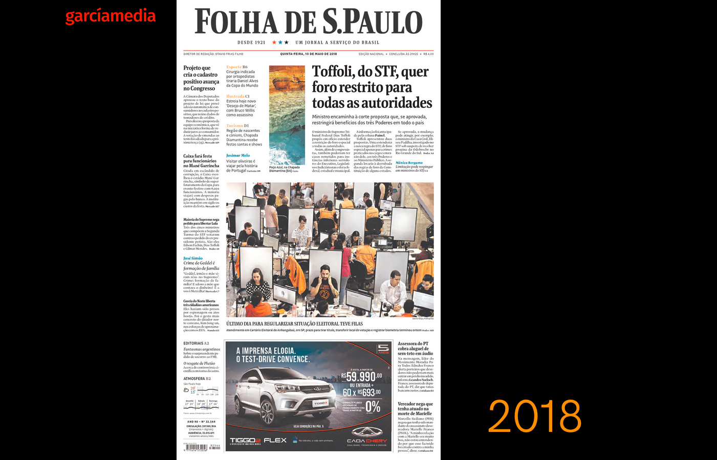
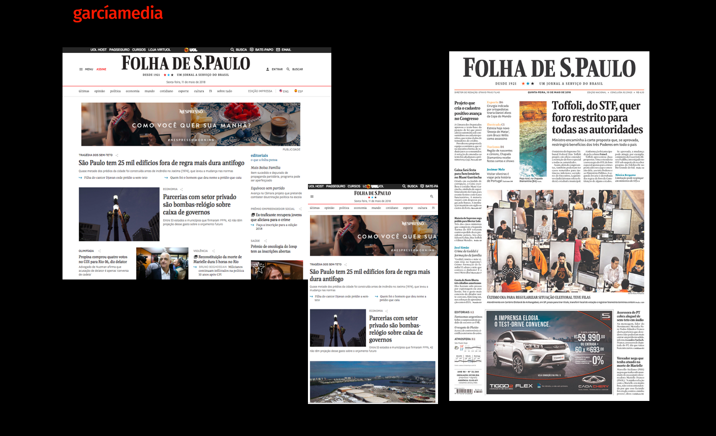
Here is the front page of with the new look, which is elegant and more of a digitally-inspired printed front page, with lots of “promos” to stories on the inside. I find it effective, but perhaps less pictorial than what the editors were looking for when we redesigned the newspaper in 2006.
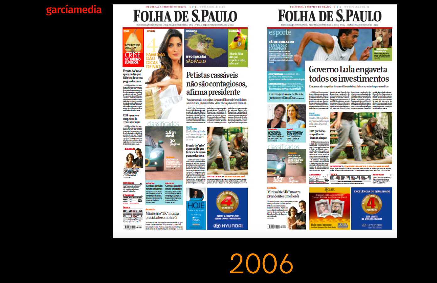
Here are front pages from our 2006 redesign, working with the late Massimo Gentile, the talented art director or Folha at the time. Art directors for Garcia Media on this project were Rodrigo Fino and Paula Ripoll, of our Garcia Media Latinamerica office.
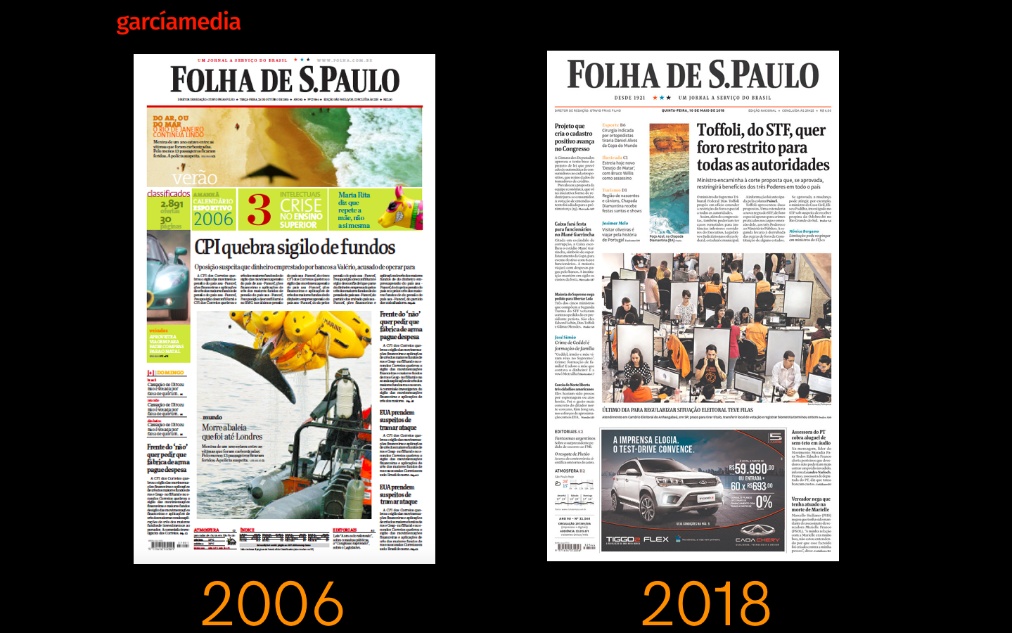
As you can see here, the overall look of the newspaper has not changed very dramatically between 1996 and this new design of 2018. Both present an elegant, contemporary and easy to navigate front page.
What are the big changes for Folha today?
The following video explains in detail the changes that have taken place with the April 20 introduction of a new look for Folha:
Overall, the editors summarize the changes as follows–
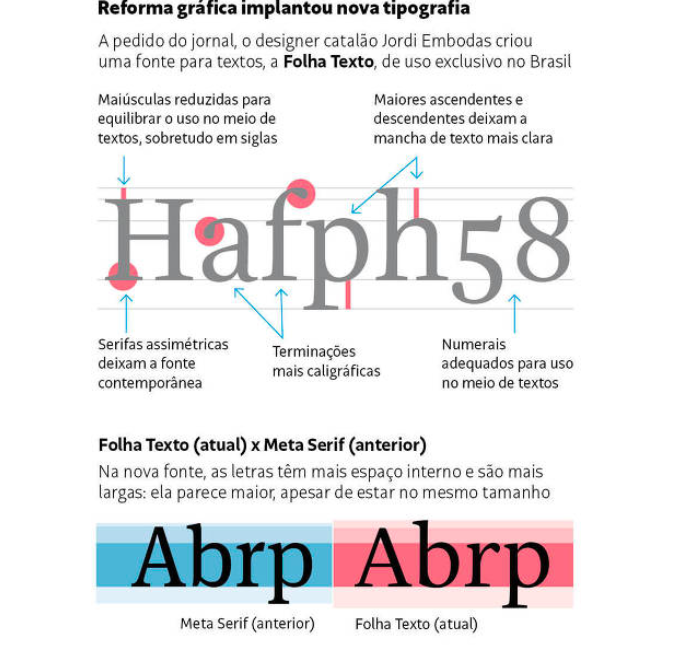
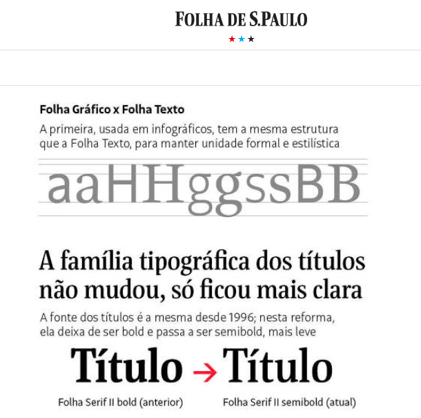
The new typography
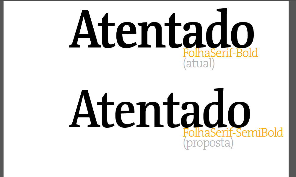
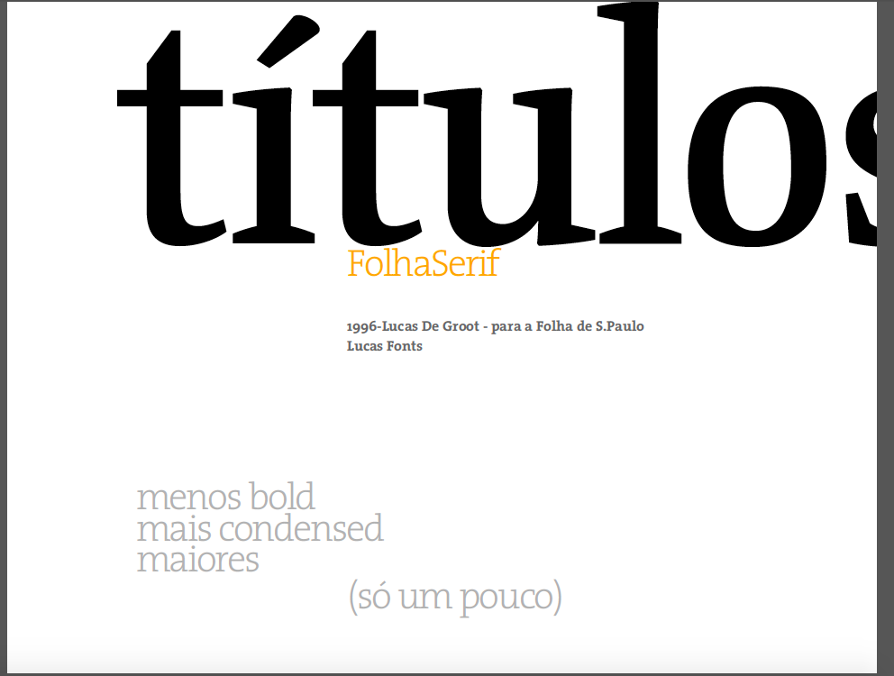
The new look preserves what is referred to as Folha’s “institutional” font: Folha Serif, which was reated for Folha by German designer Erik Spiekermann and the Dutch Lucas de Groot.
However, for this design, new fonts were commissioned to the Spanish typographer, Jordi Embodas: Folha Texto and Folha Grafico.
Images of type palette from our 2006 Folha Graphic Style Guide, compiled by Massimo Gentile:
Pleasure of reading
The many changes here make reading the printed version more pleasurable.
Logos and labels
Changed to allow for ease of finding content.
Reinstating content that had been retired, returning to print.
The so called historic sections of Folha, some of which had disappeared, are back.
Folha Corrida
More “survival” information, the guide to the city, essential information, blogs.
Supplements
New look for supplements.
Color palette
New color palette honoring the traditional colors of Folha, with emphasis blue. red and black
Relating the look of digital to print
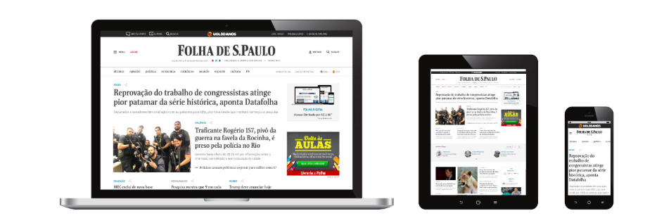
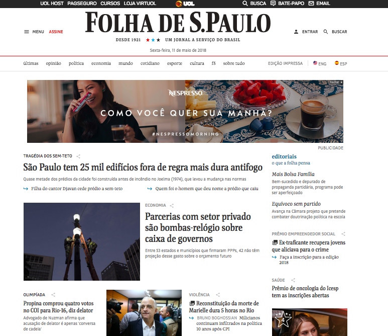
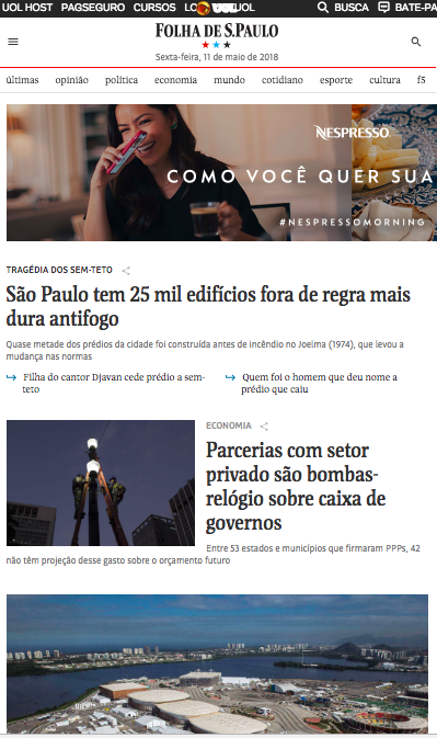
An effort was made by the Folha team to make sure that the overall design look introduced for digital platforms last February, now merged into the printed edition redesign.
We are happy to see that Folha continues to evolve visually. For design consultants, it is always an interesting experience to see how a publication which we have helped with its design in the past evolves into a new look. We would like to think that, in the case of Folha, the visual foundations we created have been fortified and expanded.
We like what we see in this evolution and I am sure that the talented art director and wonderful colleague, Massimo Gentile, smiles somewhere in heaven.
Folha mentions this blog:
In its Sunday, May 13 edition, Folha reported that the majority of readers contacted approve of the new design of Folha. In that same article, we are honored that quotes from the blog above were used.
A real evolution for Folha’s design, indeed.
Of related interest
Our tribute to Massimo Gentile, former Folha art director, who died in 2015
http://www.garciamedia.com/blog/massimo_gentile_our_craft_loses_a_giant/
All the final Columbia student projects here:
Columbia final projects, Spring 2018
https://www.garciamedia.com/blog/my-columbia-stud…rojects-part-one/
https://www.garciamedia.com/blog/my-columbia-students-final-projects-part-2/
https://www.garciamedia.com/blog/my-columbia-students-final-projects-part-three/
https://www.garciamedia.com/blog/my-columbia-students-final-projects-part-four/
Mario’s Speaking Engagements

June 7-8—WAN-IFRA World Congress, Lisbon, Portugal
For more: http://events.wan-ifra.org/events/70th-world-news-media-congress-25th-world-editors-forum
June 12-14, CUE Days , Aarhus, Denmark
http://www.ccieurope.com/news/6738/Video_What_is_CUE_Days_2018
August 2, Digital House (Facebook workshop), Buenos Aires

October 6, 20, 27–King’s College, New York City
The Basics of Visual Journalism seminars
Garcia Media: Over 25 years at your service
TheMarioBlog post #2837
