TAKEAWAY: How much experimentation can we carried out using text type to form shapes? Mint sample says it can be done, with care PLUS: The newspaper as camouflage? AND: Pure Design download: Color in Headlines
Taking text type out of the column
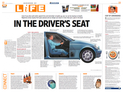
In this example, the designer has crafted part of an automobile from text type: here it works, but handle with care.
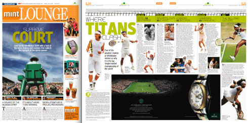
Cover page of Mint’s weekend edition, Lounge, and double page inside treatment. Notice presence of large rising ad at bottom of the page, which did not keep the designer from presenting information in an appealing manner.
It’s a little over two years since India’s newest financial daily, MINT, made a grand entrance into the crowded newspaper market there. Since then, the newspaper has continued to gain circulation, expanded distribution beyond Delhi—-to Mumbai and Calcutta—-and continues to be a favorite for its comfortable Berliner format (a first for India), and for the color that can be found on almost every page.
From time to time, the designers there send me pages for me to monitor progress. Today, some interesting pages from designer Manoj Madhavan, who is in charge of the design of feature pages.
I have found these pages of interest and wanted to share them with you.
Type in odd shapes
One of the most often asked questions I get at workshops is whether one can use text type to create shapes.
My standard answer is: use with care. Each situation is different, and, of course, most readers prefer to read texts in column formats——not in circles, triangles, or the shape of a slice of pizza! (I have seen examples of all of the above).
So, when Manoj sent me this page about automobiles, and I saw that a half of the car illustration is, indeed, the text for the story, I did a double take. However, I was able to follow the text (no broken hyphenation) and the area used for this technique was small enough, and surrounded with white space, so that it is was not painful to get through the narrative. It looks good too.
My advice stays the same: treat each case of using text as anything but in column format with care. Think twice before embarking into such strategies. Count to 50 real fast, and if you still wish to do it when you get to 51, then chances are it could be done.
Apparently, Manoj did his counting and it paid off.
For previous blog post about Mint:
And now the “newspaper pouch” to carry your laptop and fool those computer thieves out there. Is the name of La Vanguardia misspelled here, or was this on purpose?
Being creative with a newspaper may go beyond the boundaries of the newsrooms these days.
A Spanish firm has devised a computer-carrying bag that is meant to deter thieves from taking your laptop computer when you least expect it.
When the laptop is wrapped in the pouch, the computer resembles the front page of the newspaper—-a real cover up using the front page of a well known European newspaper. Chosen for the honor are Spain’s El Pais and La Vanguardia, of course; also, Germany’s Frankfurter Allegemeine Zeitung, or Italy’s La Gazzetta dello Sport, for example. Designed for Apple’s Mac-Book Pro, the pouches cost $85, and are made of a plastic fabric.
The creators, at a company called the Mitemite Unnecessary Objects Lab in Barcelona, call their bags “urban camouflage.” They say that the company “specializes in creating products which will spread a few more chuckles in a somewhat mundane reality.”
To think that they used to refer to newspapers as fish wrappers at one point in their history. Times have, indeed, changed.
Pure Design: Color in Headlines
What I would add to this “fable” from Pure Design: We now use more color in headlines. Perhaps it is an influence from the Internet, where so much type gets colorized. We tend to cllick more readily on type that has color, it seems. We can also print much better than ten years ago, so color and type get along better. Overall, we do see more colorized headlines. Use with caution. In my book, nothing beats the power of a nice black and bold headline when the right font has been selected. But I am in favor of colorizing type. Just today, I produced two prototypes with identical typography, but “painted” the navigational headlines of one version in a nice watermelon color. Adds impact. Why not?
The Impact of the Compact
Pure Design: Download entire section: Type
Download entire first section of Pure Design: Words
Now that I have fully presented the first of six sections of Pure Design on TheMarioBlog, I am offering the entire initial section, “Words,” available for download—all 33 pages of it. This may be useful for those of you saving or printing out Pure Design and will be done following each of the remaining sections. At the end of our journey through words, type, layout, color, pictures, and process, I will publish the entirety of Pure Design in one file.
![]()
Who is Jacky?
Jacky belongs to Frank Deville. The Luxembourg-based pooch is an “avid reader” of the German newspaper, Bild Am Sonntag. Every Sunday Jacky picks stories and interesting graphics in Bild Am Sonntag , the German newspaper.
WAN’s World Trends 2009 Report

The 2009 edition of World Press Trends from WAN/IFRA is now available. I always like to review this report for its complete information on global circulation, advertising and online trends in our industry. All countries in the world where daily newspapers are published are covered in the publication.
This year the WAN/IFRA folks have decided to publish a print version but only make the book available on pdf.
Those interested go:
http://www.wan-press.org/forms/wpt2009.html
Follow me at www.twitter.com/tweetsbydesign
Follow the Marios

Two Marios. Two Views.
Follow Mario Jr. and his blog about media analysis, web design and assorted topics related to the current state of our industry.
http://garciainteractive.com/
Visit Mario Sr. daily here, or through TweetsByDesign (www.twitter.com/tweetsbydesign)
In Spanish daily: The Rodrigo Fino blog
:
To read TheRodrigoFino blog, in Spanish, go:
https://garciamedia.com/latinamerica/blog/
TheMarioBlog posting #362