TAKEAWAY: Various products include the image of a newspaper in their advertising. Nothing new, really; however, in 2009, for those of us who love printed newspapers, a sign that at some levels, newspapers still sell PLUS: Whispers from Mario in Monocle magazine AND: Opinion pages don’t have to look textually boring
Sometimes newspapers go Hollywood

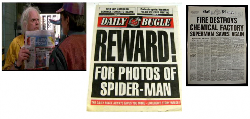
From the real USA Today, to the not so real Daily Bugle and Daily Planet: newspapers make a big screen splash
It’s no secret that newspapers have appeared as “props” in films and television shows for as long as the media has been around.
Those of us in the newspaper business are always intrigued by what newspaper an actor is holding in his hand as he chats up his lover while enjoying a coffee in an outdoor’s French cafe.
And for fans of the popular television show, Everybody Loves Raymond, it was a real feast on the eyes: Raymond was a sports writer for a Long Island daily that always looked to me pretty much like Newsday. Sometimes even the plots centered around the escapades of the sports columnist.
So, to see four different advertisements using newspapers in 2009 is not only refreshing, but, more so, reassuring. I offer them to you here after seeing them on Rodrigo Fino’s blog. Fino writes that, in the case of Apple and Citroen,both companies use newspapers to enhance the ad and offer a little “prestige”. Not a bad idea.
You will see two videos where newspapers, L’Equipe and El Pais, advertise their products; the other two are a more indirect use of the newspaper within the context of advertising for other products: computers (Apple) and automobiles (Citroen)
L’equipe, France
====
El País, Spain
===
Apple, The Wall Street Journal
===
Citroen, Various newspapers
Whispers and Monocle

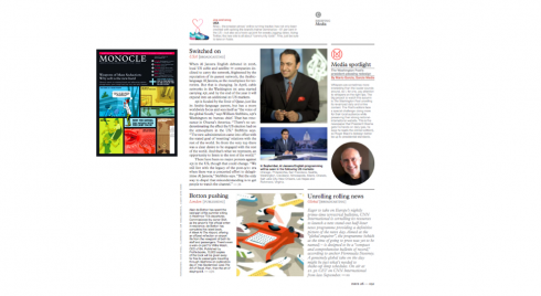
Tyler Brulé has invited me to write a short media column for his magazine, Monocle. The first such sample is now available on the September issue of the magazine, and I am now working on the one for next month.
I call my short quips about media “whispers”, and that is what these comments are. The items will always have some type of insider’s view of some aspect of our industry, the craft and noteworthy items of consideration from around the world. Hint: next month, Africa, a continent where newspapers thrive.
Going home!!
Those of you who honor me with your visits to this blog each day probably wonder if I ever go home. Sometimes I do. Today is one of those days. After five weeks on the road: four continents, 9 cities, more takeoffs and landings on Lufthansa than I wish to recall, I now head home to Florida, where I stay put a few days, playing my favorite role of dad and grandfather. The blog will continue daily, since this is part of my routine, as is running. However, now I shift my attention to domestic topics, and plan to engage more fully in the health care reform debate , the topic fervently keeping my fellow Americans busy and anything but “lazy” during the dog days of August Stay tuned.
Elegance meets commentary

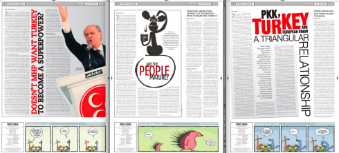
These opinion pages from ZAMAN, the Turkish daily, were contributed by Miguel Gomez of Gulf News (Dubai). He is right: they show that one can use typography and illustration to make these text-heavy pages attractive.
One of the most joyous tasks in the midst of a redesign of a newspaper is always the design of those of the opinion pages.
Usually, there are no advertisements to block the way, or to keep us from creating the type of page architecture we want.
White space, which may be impossible or banned in other areas of the newspaper, is usually allowed here.
Opinion pages offer an opportunity to let the type dance on the page—-make that a waltz!
Because they are mostly text driven—-as they should be—opinion pages offer a great opportunity to incorporate strategies which prove that one can design almost exclusively with type, and still create a thing of beauty.
Workshops in Berlin, Toronto, London
Robb Montgomery reminds us that it is, indeed, back to school season. In that spirit, his non-profit organization, Visual Editors Foundation, announces three fall seminars coming up in Berlin, Toronto and London.
The workshops deal with everything from video editing to new media.
The scheduled seminars are:
September 7-11
KircherBurkhardt is sponsoring a series of video editing, social media and multimedia seminars in Berlin.
October 5-7
The Toronto Star is sponsoring a series of one-day new media seminars.
October 26-29
Beamups is sponsoring a Camp Video Journalism workshop week in Central London.

Who is Jacky?
Jacky belongs to Frank Deville. The Luxembourg-based pooch is an “avid reader” of the German newspaper, Bild Am Sonntag. Every Sunday Jacky picks stories and interesting graphics in Bild Am Sonntag , the German newspaper.
Pure Design: Download entire section: Type
Download entire first section of Pure Design: Words
Now that I have fully presented the first of six sections of Pure Design on TheMarioBlog, I am offering the entire initial section, “Words,” available for download—all 33 pages of it. This may be useful for those of you saving or printing out Pure Design and will be done following each of the remaining sections. At the end of our journey through words, type, layout, color, pictures, and process, I will publish the entirety of Pure Design in one file.
WAN’s World Trends 2009 Report

The 2009 edition of World Press Trends from WAN/IFRA is now available. I always like to review this report for its complete information on global circulation, advertising and online trends in our industry. All countries in the world where daily newspapers are published are covered in the publication.
This year the WAN/IFRA folks have decided to publish a print version but only make the book available on pdf.
Those interested go:
http://www.wan-press.org/forms/wpt2009.html

Follow me at www.twitter.com/tweetsbydesign
Follow the Marios

Two Marios. Two Views.
Follow Mario Jr. and his blog about media analysis, web design and assorted topics related to the current state of our industry.
http://garciainteractive.com/
Visit Mario Sr. daily here, or through TweetsByDesign (www.twitter.com/tweetsbydesign)
In Spanish daily: The Rodrigo Fino blog
:
To read TheRodrigoFino blog, in Spanish, go:
https://garciamedia.com/latinamerica/blog/
TheMarioBlog posting #336
TheMarioBlog posting #338