In Italy, La Repubblica has introduced major changes that involve its design, a new typeface (Eugenio), and a philosophical overhaul, that in the words of Editor in Chief Mario Calabresi, reflect the listening and reflecting he and his team have done about the future of newspapers:
“For years we have been discussing how the newspapers should evolve, on the relationship between paper and digital, on the need and on the meaning of a newspaper today. For years I have written down everything that changes and I reflect on the answers. For 18 months, here in Repubblica we have opened a listening and reflection site, with discussion groups, internal investigations and interviews with readers. We wanted to go to the root, understand what to transform and focus on the objectives. Go back to being competitive in the match for the time and attention, knowing that today our main competitors are not so much the other newspapers but those thousand stimuli that fill every free minute of people, from the thematic television to social networks, from courses yoga to those of cooking, from festivals to documentaries to the object that has kidnapped our lives: the smartphone.”
So, what are La Repubblica’s big changes?
- Philosophical transformation: According to Calabresi, “the phone won the battle of attention and it instantly conveys large amounts of information.”
- Differentiation between digital and print: Calabresi writes that readers have every right to ask the question why they should pay for content in print that they have already seen thru digital devices, or information they can find everywhere? “This question could not be answered by impoverishing Repubblica.it, by far the first Italian information site and an unprecedented success story. We have decided to radically differentiate the two products. The Net bombards us with news but does not have the time and resources to respond in depth to why things happen.
- More of a lean back experience in print: The editors have doubled the space for in depth and interviews in the printed newspaper.
“A newspaper today makes sense to exist if it explains the contexts, if it goes to the root of the problems, if it indicates the consequences of the facts and the possible solutions. A newspaper makes sense if it can offer readers materials for reflection, analysis and points of view. If it can play a fundamental function for democracy: criticism.
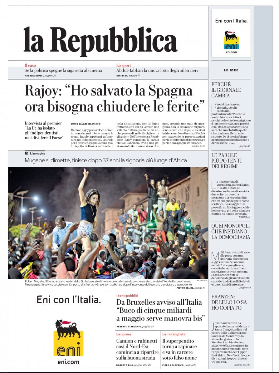
4. Hierarchy: Only two themes of the day up front, the two fundamental facts that deserve to be deepened and understood, and a page – the “Fourth Page” – for the journalistic campaigns that must define the Republic.
The new typography: Eugenio
This new font replaces the long standing Bodoni, although I find it quite similar to Bodoni. Eugenio Serif Poster is elegant and classic, but somehow it may lack enough personality for a newspaper such as La Repubblica. But, I admit I have not seen enough pages or editions of the new design to make an intelligent assertion.
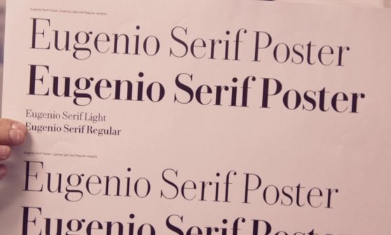
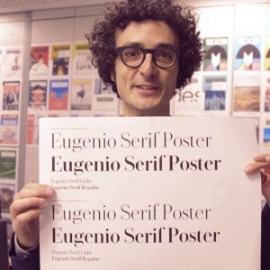
Here Francesco Franchi, one of the creative directors involved in this project, displays the new Eugenio Serif Poster font.
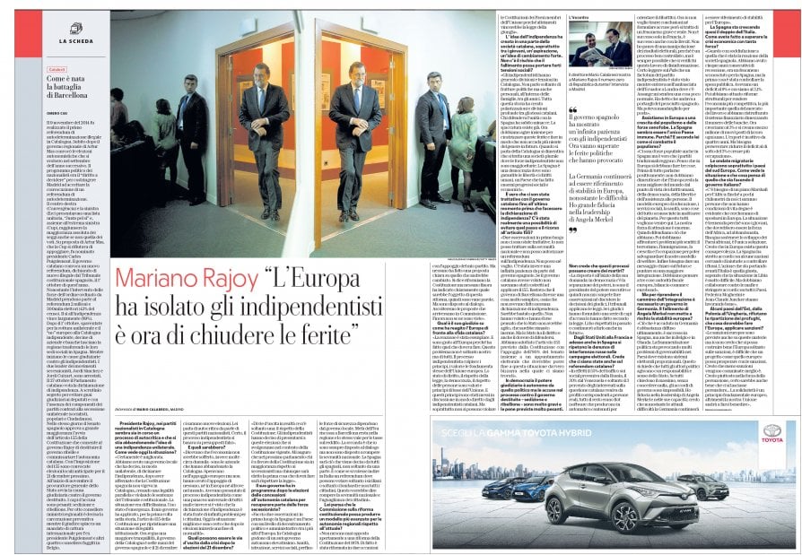
Take a look at pages of the new La Repubblica.
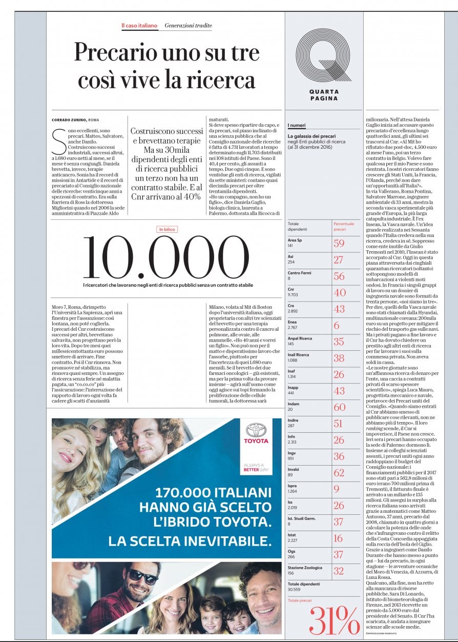
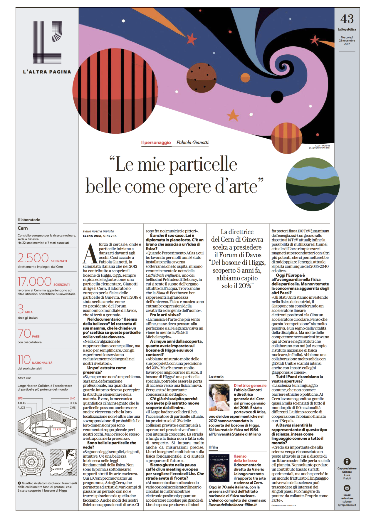
The team
Two names are mentioned as the visual team that created the new look of La Repubblica: art director Angelo Rinaldi and Francesco Franchi. “For months they worked in silence and with artisanal knowledge to create something that would make Repubblica more immediate, usable and direct,” wrote Calabresi.
In the end, Calabresi and his team at La Repubblica face the same challenges as publishers of newspapers everywhere:
“We have redesigned the newspaper and distinguish it clearly from the site, which will focus increasingly on the flow of news, video and live, but the problem remains of the smartphone and those who have lost the habit of going to newsstands. We must be in the phones, we must also talk to those readers and we have the duty to say clearly that quality journalism cannot be free.”
Ben detto, Signore Calabresi.
For the complete story (in Italian):
LA REPUBBLICA CHANGES
Society of News Design New York: Celebrating 40 years

Mario’s Speaking Engagements
April 18-19, 2018-–Newscamp ,Augsburg, Germany.

June 3-6, 2018—The Seminar, San Antonio, Texas.

June 7-8—WAN-IFRA World Congress, Lisbon, Portugal
June 12-14, CUE Days , Aarhus, Denmark
http://www.ccieurope.com/news/6738/Video_What_is_CUE_Days_2018
December 6, El Pais Conference, Montevideo, Uruguay
A series of conferences and seminars for El Pais journalists, invited professionals and communications students: The future of journalism.

Garcia Media: Over 25 years at your service
TheMarioBlog post #2801