
One of the most interesting mails received this week is from Tom S. in Canada, who writes:
This week you have profiled your launch of a newspaper, The Oklahoman, and a magazine, Paris Match. Can you tell us what you think are the major differences between designing a newspaper and a magazine?
I’d like to think that the similarities are greater than the differences, but, of course, different designers could tell you various stories, and I encourage them to send their comments here.
Format: Obviously, the most major difference is the format, as one is designing on a smaller canvas. In addition, there is more work with double pages that have to be treated as one unit.
Scope and rhythm: Here is the major difference. A magazine often has hundreds of pages, with a variety of sections and topics that may or not be related. Assuming that someone reads the magazine in one seating, the designer and the editor must provide the right rhythm, with sections where the main element may be text, while in other areas th eemphasis may be on photos, and, then short items versus longer items. I always use the analogy of the symphony: one must have adagios and staccatos, violins and trombones. Newspapers have fewer pages, with usually more homogenous topics, and the scope, rhythm and sequence tend to matter less than in a magazine.
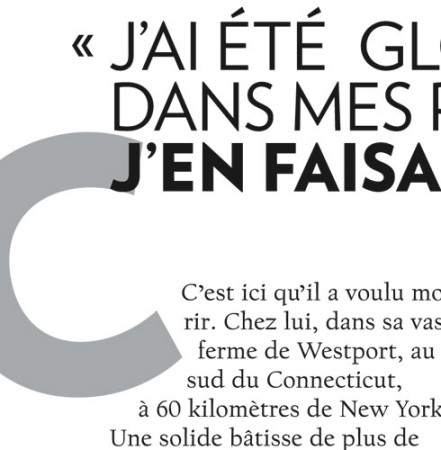
If you look at the pages of Paris Match, below, you will see that there is room for the long narrative, the photo page, and the multi-story page.
Art direction: Although art directors are now a major presence in many dailies worldwide, they were always an essential part of the magazine. I find that when one designs a magazine, the concentration is heavier on art directing—-more pages offer visual surprises, as opposed to being part of a template, as is the case in newspapers, which must be produced daily, and for which a great dependence on art direction would not be practical.
Tips: Magazine editors and art directors can learn from the newspaper about navigation (most table of contents in magazines are not practical), the use of brief items, and the more direct style of headline writing.
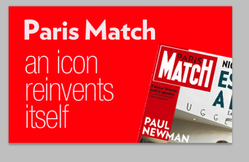
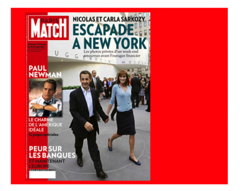
Cover: An intelligent navigator that does not promote dozens of stories, but just the three to five that are MUST reading in this issue.
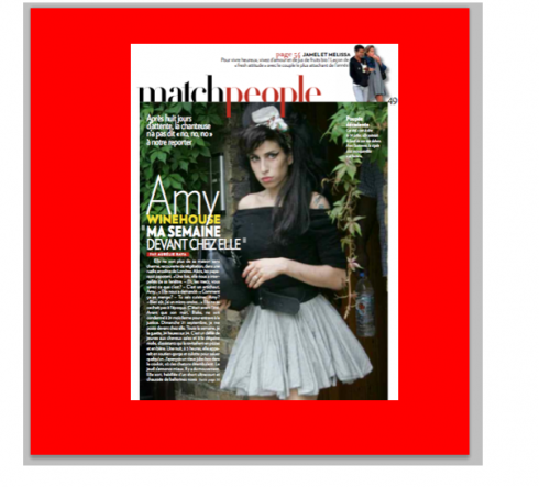
Sections: the concept utilized is that of the mini magazine inside the magazine, and so a section like Match People offers its own small cover with navigator to the best story on the inside at rop right.
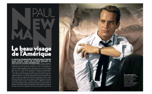
The double page: one of Paris Match’s trademarks, those double page packages.
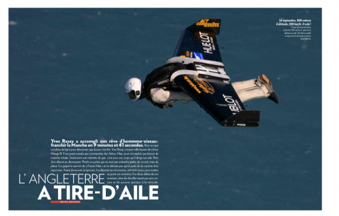
The double page photo: notice that here, beyond the caption is also a mini story that tells you more about the action on the photo.
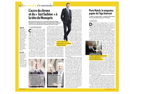
The news: Match de la Semaine is the mini newspaper inside the magazine; all about politics, economics, and the news of the week that readers should be aware of. We created it as a friendly newspaper of the future, and all of la Semaine has a distinct yellow border around the pages, to make it easy to identify.
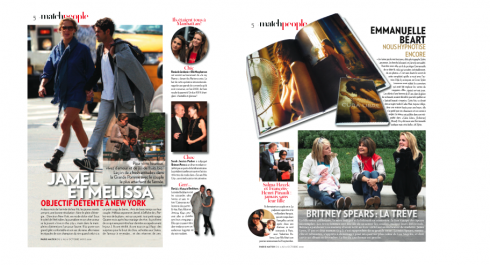
The multi-story page: single pages with more than one story, for the reader who likes the short of it all.
A legendary magazine enters a new era
Today all over the press kiosks of France, in the cafes, and in the living rooms of homes across the country, more than four million readers will be looking at edition #3098 of their favorite magazine, Paris Match.
For me and my team, this has been the project of projects: working with a magnificent, creative, forward thinking editor, Olivier Royant, who in spite of his youth, reminds me of what editors used to be like in another time: those with a nose for that one transcendental story involving the life of an ordinary or extraordinary person, that he can translate to a mini moment of great interest for the legion of readers who flock to his magazine each week.
In addition, creative art director Michel Maiquez, offered us his talent, knowledge of the magazine, and a great desire to innovate, and became a true collaborator. Together with Olivier and Michel, plus an enormously enthusiastic team of reporters, photographers and editors, the new Paris Match was born. Our Garcia Media art director, Christian Fortanet ,and I worked together over a year, conducting workshops, redefining sections, discussing content flow, rhythm and, of course, look and feel.
For me, personally, the most challenging task was to maintain all that makes Paris Match so special: those double page photo spreads, the people oriented coverage, the spirit of featury sections like Vivre Match and the newsy tone of Match de la Semaine, which we designed as a contemporary newspaper.
Navigation played a key role, and each section—-what I call the magazine inside the magazine—has its own navigation. If a reader were to start in the People section, or the Vivre section, for example, they would be able to navigate to articles in that segment, as if it was a contents page.
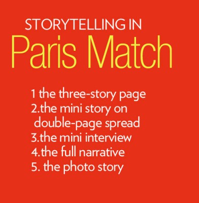
Storytelling enhanced
Storytelling—-both in narrative format as well as pictorial—-is what Paris Match is all about. After all, the magazine’s slogan is “La vie est un histoire vrait” (Life is a true story).
It was important to develop a repertoire of storytelling techniques. A visit to the rich archives of Paris Match took me to the early 1980s, when the magazine used to include a “mini story” with each of its double page photo spreads.
How Interesting, I thought.. Not only did they have a regular photo caption to describe contents of the photo, but they also had a mini story, about 15 lines to tell a story “around” the photo. Readers of today would love that, so I started sketching that as part of the new look. It tested well with focus groups of readers from the start.
Mini stories on a page
And while Paris Match included many single story pages, it did not do much with multi-story packages on a single page. Part of our work was to create single pages with three or four topics, and, indeed, small photos accompanying those stories.
These pages break the monotony, create a different tempo, and allow for scanners to get tons of information on a single page.
Typography: Verlag is the dominant font used throughout Paris Match.
Following is the piece I wrote to appear in the first edition of Paris Match
There are times in the life of a media designer when one knows that he is in the presence of a landmark project.
It happened to me when I redesigned the German newspaper Die Zeit, and, again, during the total rethinking of The Wall Street Journal Europe and Asia, converting them from broadsheets to compact formats. Not to mention adding color to the traditional pages of The Wall Street Journal in the United States.
And now, more than 550 projects later, comes Paris Match.
The moment I entered the building I knew that the rethinking of such a legendary magazine as Paris Match would be a challenge. For nine months, I have had the honor of working with the magazine’s talented and enthusiastic team. Editor Olivier Royant and art director Michel Maiquez, among others, knew what they wanted from day one: how can we make a fantastic magazine even better?
That was the task that our Garcia Media art director, Christian Fortanet, and I, had to think about. We studied the Paris Match history in the library, we stopped often to read those fantastic interviews and reportages in those bound volumes that capture 60 years of rich French history. More importantly, Paris Match has specialized in covering people in such a special way that I tried to take X-rays of how they did it, and have learned much in the process. It is that learning that has helped me and our team to create the Paris Match of the future: preserving the rich past, but catering to a new audience.
*what I have learned from how Paris Match does things:
1. Photos have been, and continue to be, protagonists, telling stories that sometimes words cannot tell so effectively, or so fast.
2. Paris Match’s editors since the 1970s have written summaries that are self sufficient—-we now do this in almost every publication, and online, for what we call scanners (those readers who are always in a hurry, but also hungry for information).
3. Paris Match stories always have had an “edge”—-that certain something that gives the impression that YOU, the reader, were right there when the event happened, with a front seat to watch it all unfold: a night at the Oscars, an explosion in Thailand, the arrival of a princess in Paris. No matter what the event, Paris Match invited you, and gave you the best seat in the house. I had to make sure that we continue to issue those invitations to you in the new Paris Match.
4. Paris Match is one of the few magazines in the world that can be many things at the same time, and in the same issue: it is part serious book, part fun book, part entertainment television show, and, with Match de la Semaine, it is the ultimate newspaper. Ironically, many claim that the newspaper of the future will not be daily, but weekly. Voila, Paris Match is so avant garde that it had this idea years ago, and we have worked hard to make this section of the magazine very special. And, may we add, the new Paris Match also borrows from that new medium, online, in the way it will navigate readers from one page to the next.
*what is new?
An overall philosophy prevails here of how to create a printed magazine in the age of the Internet. Soon, in the year 2012, there will be a new generation of adults in the world who will not remember life with the Internet. Remember that the world wide web was born in 1991. What will these adults be like as consumers of the media? Nobody knows for sure, but we have a few guesses: impatient, very technologically minded, and will do a lot of reading online, coming to books, magazines and perhaps newspapers, to get more depth, and, as research tells us, to relax, since many of them consider reading online to be “work”, while reading printed matter is more like “a leisure activity”.
This has been our prevailing thinking while rethinking Paris Match. I don’t call it a redesign, or the creation of a new maquette, because that implies a purely cosmetic exercise. It is better to say that the Paris Match you have in your hands today is the product of a rethinking——a new way of taking the absolutely wonderful content that you are used to, and present it in a way that is more apt to satisfy the readers of the “always on” generation—-always connected, always hungry for more information, but forever in a hurry.
It is issue number 3098 of Paris Match this week; for editor Olivier Royant, it is his 1000th issue working with the magazine. It is project number 556 for me personally.
A new era opens with this edition of Paris Match , and it has been a tour de force for me to study this legendary media product and to present it for a new generation of readers. It takes a little time to get used to something new, just like when you redecorate a room in your house. Give it time, let the design embrace you. The Paris Match you have come to love and to admire is still here, but, we think it is easier to read.
![]()
In Miami, Florida, visiting with my mother, before starting the next trip to Europe/Afria/Asia.
ATTENTION: Because this is an extensive case study of a weekly magazine, we will keep this posting thru Monday of next week, adding other items as they become available as part of the daily posting, but Paris Match will remain the lead item on TheMarioBlog.
TheMarioBlog posting #110