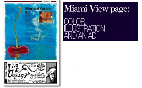
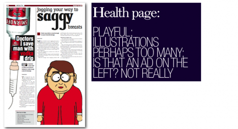
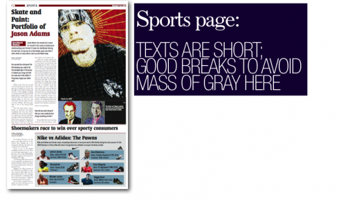
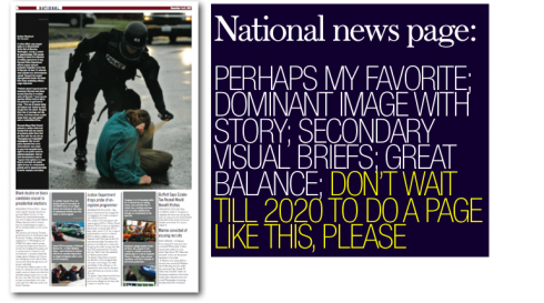
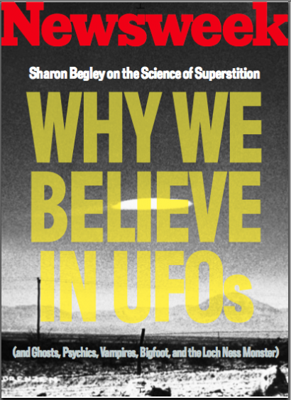
I find it difficult to create a concept for the “anything” of the future, although I am often invited to participate in such endeavors. I remember creating a 2020 newspaper when the American Press Institute conducted a seminar on the subject in 1999.
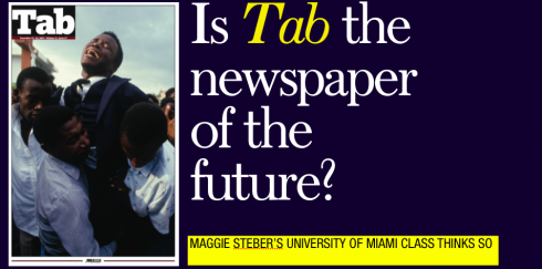
However, I find it refreshing that a group of university students, given the task to create the newspaper of the future, still worked on a printed daily. Yes, ink on paper; photos; illustrations, and, voila, text—-although not too long.
Missing from the sample pages that Maggie Steber shared with us are the in-depth story, the headline on page one, as well as the comics, horoscope and classified pages. But that’s all right, we assume that either these would not have a place on the newspaper of the future, or the semester ended too soon for the creators of Tab.
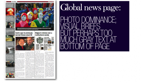
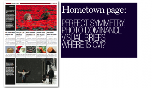
Tab is,indeed, interesting in the areas where it is not surprising: photos are king here. Of course, Professor Steber is, as we know, the matter of the photographic craft. What lucky group of students to have Maggie for a semester, teaching them and offering her vast experience, talent and gift for presentation. Just to sample her work, and to hear her explanations of it should be a class I would love to sign up for!
Perhaps students thought of the “electronic tablet” as well, but will save its creation for later. Or how about the mobile telephone as dispenser of news?
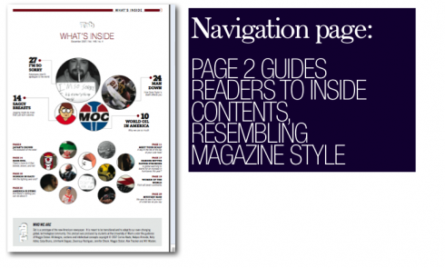
I present a variety of pages here, with my comments side by side. We welcome yours, of course. And Maggie Steber is always ready to give you more details of her project with the University of Miami students.
MAGGIE STEBER DISCUSSES THE PROJECT
At the University of Miami Knight Center for International Media, I had nine students, hand-picked, including photo majors, designers and writers/editors. We spent 3/4 of the semester researching, designing, discussing, debating, analyzing, looking at a myriad of newspapers and magazines from around the globe. I started out thinking we were going to design MY newspaper, spawn from the Tabula Rasa idea I had formulated about a new kind of newspaper. But no! It ended up being a fusion of ideas from all quarters. They didn’t read papers yet they had very strong opinions about them. They also were not satisfied with internet websites but had a hard time coming up with something new. I told them it was because they only looked at the internet. And it was true. Very little
print of any kind in these young lives.
I was surprised at how conservative the students sometimes were. I had to push them to be original. They didn’t know what they didn’t know. I brought in articles that had nothing to do with newspapers and we discussed them. We spent one day looking at 100
photographic books of all natures, and not as powerpoint, a different experience
realized by the students by end of class.
In the end, considering the paper was put together at the 11th hour (students, ya know),
I think there are some exciting and successful ideas that could grow. It really is a compilation of ideas but we see the paper as fitting an image the reader has of himself. And it can be published anywhere, as a franchise. The students, extremely talented
and completely engaged, really clarified and taught me many things, and as a result,
we have the first of what one hopes will be many offspring of Tabula Rasa.

WHAT THEY SAID ABOUT NEWSPAPERS
Here is my favorite collection of assorted references to newspapers by a variety of distinguished characters:
“Newspapers cannot be defined by the second word—paper. They’ve got to be defined by the first word—news.” ?New York Times publisher Arthur Sulzberg, Jr.
“People don’t actually read newspapers. They step into them every morning like a hot bath.” ?Communications theorist Marhsall McLuhan
“I often wonder what future historians will say about us. One sentence will suffice to describe modern man: he fornicated and he read newspapers.” ?Albert Camus, French novelist, dramatist, philosopher, 1956
“Here is the living disproof of the old adage that nothing is as dead as yesterday’s newspaper…This is what really happened, reported by a free press to a free people. It is the raw material of history; it is the story of our own times.” ?Henry Steel Commager, historian, 1951
Bartlett, John. Familiar Quotations, 10th ed., Enlarged and edited by Nathan Haskell Doyle, Bartleby.com, New York, 2000.
<![]()
Following are some resources related to the topic of newspapers and their future
Newspaper Next: The Transformation Project
From the American Press Institute
10 Reasons There’s a Bright Future for Journalism
How the Local Newsroom of the Future Might Operate
Serious Journalism Won’t Die as Newspapers Fade
By Mark Glaser, MediaShift
Newspapers in 2020——-advertising networks, good, check NYTIMES, USAToday, TRIB consortium
By Jeff Jarvis, BuzzMachine
Speech to American Association of Independent Newspaper Distributors
By Tim McGuire, McGuire on Media
The Newspaper of the Future
By Jack Shafer, Slate
A Model for the 21st Century Newsroom: The News Diamond
By Paul Bradshaw, Online Journalism Blog
Chasing the Chasm
By Mark Potts, Recovering Journalist
Other useful resources are available under the Strategy section of the NAA Web site.

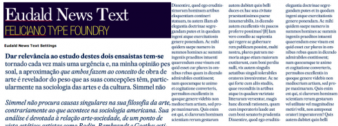
THREE OTHER INTERESTING TEXT TYPE FONTS: THE REED REIBSTEIN CHOICES
Our Yale University intern, Reed Reibstein, whose interest in typography has inspired my colleague Pegie Stark Adam and me as we work on a rethinking of the Yale Daily News this summer, had these contributions to make concerning choices for text type—-the subject of previous postings of TheMarioBlog.
After reading your recent post on the five text types that always work for you,
I thought I would send you three of my favorites:
1) Globe and Mail Text: http://www.shinntype.com/globetext.html
The text member of Nick Shinn’s typographic suite for the new Globe and Mail
looks like it was plucked from a beautifully set novel, not made for the
harshness of newsprint. It has the short descenders and high x-height useful
for newspaper columns, but its slight calligraphic flair makes the experience
of reading it quite unusual for the setting.
2) Eudald News: http://www.felicianotypefoundry.com/main/?page_id=88
An indirect member of the wave of Fleischmann revivals for publications (Hoefler
& Frere-Jones’ Mercury and Christian Schwartz’s Farnham among them), it is the
most rococo, with odd but not offputting “zigzag” terminals evident in the “E”
and long tails in the italic. Mario Feliciano has imparted a powerful fullness
to its letters that makes them burst confidently from the page, giving it a
style largely unfettered by the traditions of newspaper type.
3) Greta Text: http://www.typotheque.com/fonts/greta_text/
Peter Bil’ak might have created Greta to work especially well for setting
languages with lots of diacritics, but it functions beautifully no matter the
tongue. It looks wider than many newspaper types, yet was made with economy in
mind; overall, it is a gorgeous, entirely modern typeface that livens any page
it graces.

PRECIOUS FIND: WHEN MAGGIE STEBER POSED FOR MARIO
Picture the scene: the lobby of one of Dubai’s grand hotels (aren’t they all?), a night of celebration as we had completed a successful redesign of the Gulf News, and Maggie had gingerly put the icing on the cake, completing a workshop for photo editors and photographers. Then I saw just the perfect chaise lounge, with a luminous and theatrical curtain behind it, shining as much as Maggie did as she moved through the room. It was a mini moment, so I grabbed the camera and asked Maggie if she would strike her best Rosalind Russell pose for me. Maggie jumped on the couch, smiled, put a hand up in the air, in her best Auntie Mame rendition, and I captured it. Here it is.

A THREE-MINUTE INTERVIEW WITH JONATHAN HOEFLER
Jonathan Hoefler, president of Hoefler & Frere-Jones, Inc., discusses the customization of type fonts as well as new type designs he and his team are currently creating.