IN CASE YOU MISSED THE ORIGINAL ENTRY: https://garciamedia.com/blog/articles/the_new_ugly_the_plain_ugly_the_not_so_ugly_how_do_we_define_beauty_in_our/
Here is what Andrew has to say about what constitutes “beauty” in terms of design and the choices we make daily for everything ranging from typography to illustration/photography and, of course, page architecture. He discusses the design of 032c magazine, by Meiré, with its bare bones design, ample use of white space, and what some critics have referred to as “the new ugly.”
“Mario, your posting contains an interesting set of reflections.
“Personally, 032c’s treatment of type reminds me of 80s fanzines and early copies of The Face, where Brody used a Xerox machine to distress, stretch and scale type, before gluing the words into place at various angles. In other words, it’s a computer approximation of a physical playfulness – the kind of thing that slick DTP programs such as InDesign are designed to stamp out. Reed describing it as a “Microsoft Word” design reinforces the point – it looks like it’s been created using software not built for purpose, which makes it surprising and slightly jarring. But Meiré‘s careful respect of space, width, readability keep the whole thing reigned in.
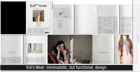
“I find Meiré is one of the most adventurous, interesting designers around, with magazines including Brand Eins and Kids’ wear showing his breadth and adventure. Though 032C’s current design isn’t my idea of beauty, it is perfect for its subject matter – creativity, youth, arts, and fashion. It’s these kinds of magazines that help remind me that imagination in print isn’t dead, it’s only much of the mainstream that’s killing itself.
“Also an aside: you mention that our ideas of beauty come in a great part from the Greeks. Yet our stereotypical image of classical beauty – pure white marble statues – is a fallacy. The statues were painted all over, usually in garish colors. It’s only time and weather that’s turned them white. Perhaps the new ugly is the old ugly after all?”
Thanks for sharing these provoking thoughts, Andrew. I find your use of terms like “surprising and adventurous” to describe Meiré’s design as key words that every designer should remember often. And, indeed, I agree with you that imagination is not dead in print, even though it is not always encouraged, especially at a time when panic and fear of what may be are on the menu of almost every print project.
Meiré’s minimalist design concepts are appropriate for the projects in which he has developed them. In that sense, the design is functional. We leave the aesthetic evaluation to the readers. Perhaps instead of “new ugly” we must describe Meire’s work as “new functional”—-but that is another discussion.

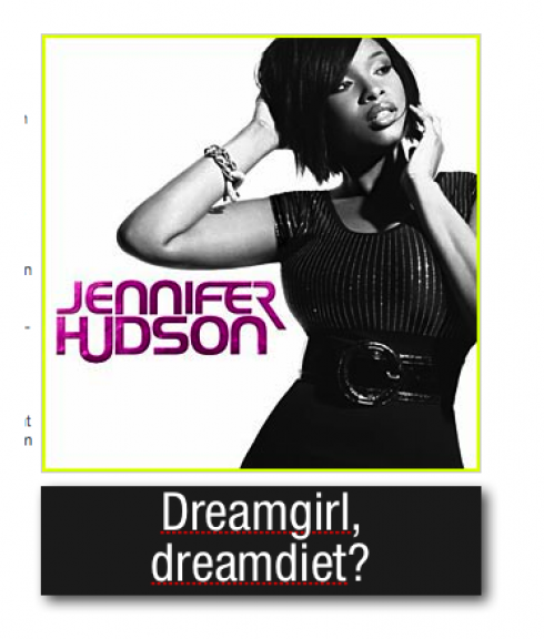
THE MINIMALIST JENNIFER: The new Jennifer Hudson CD is out, but before the first song even gets reviewed, it is the photo of the Oscar-winning actress/singer who rose to fame with her show stopping performance in Dreamgirls, that is getting all the attention. Yes, it is a marvelously svelte Jennifer striking a pose: did her Sex in the City movie costars inspire la Jennifer ? Did she hire her own personal trainer and follow the pineapple and water diet? Or was a Photoshop-obsessed art director behind her amazing weight loss? Another example of the quick and easy digital diet? Regardless, the diva’s music is what counts, and that is likely to be as potent as what her many fans are used to.
WHERE IS MARIO? Flying Frankfurt to Miami today.