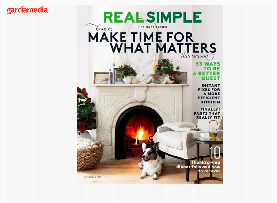
If there is one word to attach to our refrigerator door, it is simplicity. Years ago, the magazine Real Simple became quite popular, with features that inspired us to simplify our lives: clearing clutter from our closets, or cooking nutritious meals without a lot of fuss.

Perhaps Real Simple should start publishing tips for editors and designers, since it is that which audiences want in the era of the journalism of interruptions.
This takes us back to the two tempos that I often discuss here: lean forward and lean back. I believe that even when we are leaning back, we want to indulge in simplicity.
Why is it, for example, that The New York Times will sometimes use a story structure template about an important issue and remind us “why this is important”? As a veteran reader of the Times, I can’t imagine that the Times would have used such headers to help us understand the Vietnam War, for example. Readers would have considered an insult to their intelligence.
Few, if any, members of the Times audience probably resent it today, and, in fact, many will probably applaud it. We all need to understand the complex world around it, and it is up to storytellers to simplify things.
Simplicity applies to the reporter, the editor and the designer.
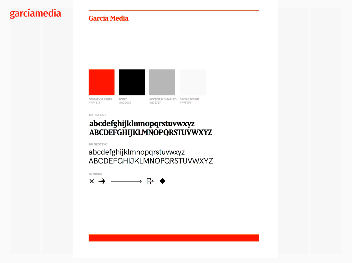
I was thrilled when our own stylesheet for the newly revamped Garcia Media website fit into one screen with only the essentials: typography, color and symbols. We could have added the story structure used for the blog. Period. If it is easy to record on a style sheet, then it is easy for the audience to consume.

Real simple does it. What took us so long to understand that basic premise?