When the CEO of the National Catholic Reporter, Bill Mitchell, my former Poynter Institute colleague called, he was a man on a mission.
Mario, we have a vibrant publication here, packed with news and features, but we would like to make all that good content easier to access and to read. We want to rethink our visual presentation across platforms.
And so began our one-year engagement with Bill and his talented team. There was a pandemic going on, so meeting in person for the various stages of the project was out of the question. Thanks to Zoom calls, we were able to assemble the troops and go through the four stages of a redesign process with the team: briefing, sketching, prototyping and launching.
The briefing
Bill Mitchell expressed the feeling of his team from the start:
“We are seeking a clean, edgy, professional look that conveys NCR’s standing as the leading independent source of news about the Catholic Church. And: A design that prioritizes news but also facilitates good experiences for members and donors.”
- In addition, the briefing called for a bigger differentiation between news and opinion features.
- “..more attractive pages overall for both news and features.”
- Clear indication where readers can subscribe and donate.”
In terms of the design;
- An attractive design that is modern and newsy.
- A home page that is attractive and newsy but not too busy.
- A page footer that is cleaner and more uncontested.
- A more prominent navigation bar.
- A clear visual distinction for special topics and features that now get lost in existing design.
Goals of the project
With those ideas in mind, the Garcia Media team, headed by senior art directors Rodrigo Fino and Paula Ripoll, went to work. I acted as chief architect of the design, consulting often with NCR’s top editorial team:
Managing Editor Stephanie Yeagle , project lead, working with Executive Editor Heidi Schlumpf, Art Director Toni-Ann Ortiz, General Manager and Audience Engagement Director Tony Hernandez, EarthBeat Editor Stephanie Clary, Global Sisters Report Editor Gail DeGeorge and Publisher Bill Mitchell.
Take a look at the new design here
Here is how CR Executive Editor and VP Heidi Schlumpf introduced the redesigned site to readers with an online column Oct. 18 :
“We are excited to introduce our updated and redesigned websites for NCR, EarthBeat and Global Sisters Report, which feature fresher, more organized and more functional designs. The overall look is cleaner, fresher and uses more graphics and photos, while making it easier for readers to find stories and discover other content on the website through easily navigable sections such as ‘The Latest,’ ‘Editors’ Choice,’ ‘Most Read Stories’ and ‘In Focus.'”
The home page
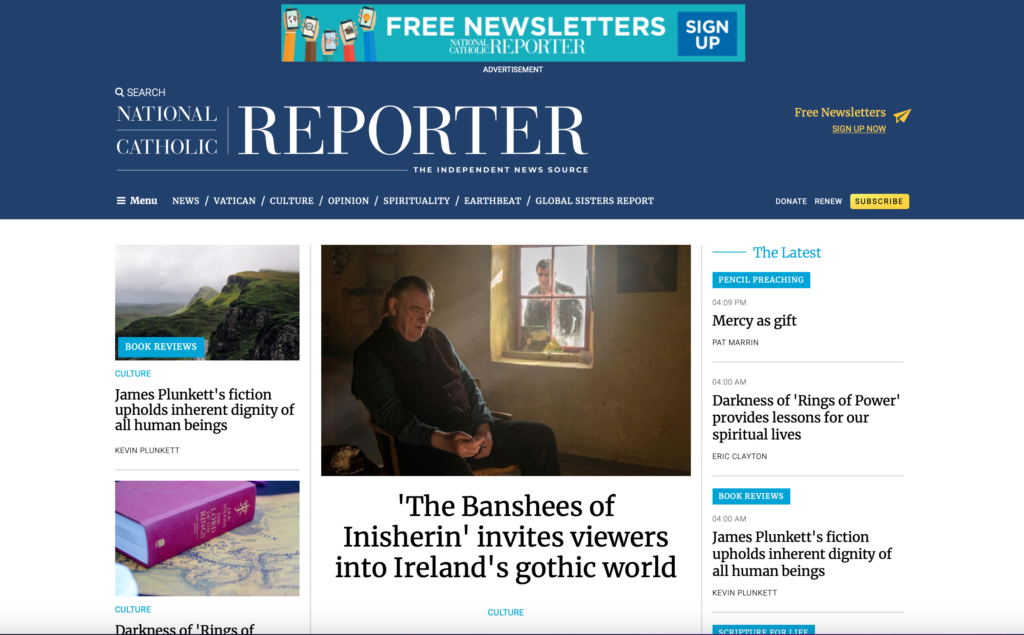
Creating an environment with plenty of headlines to sample, but without giving the impression of a congested site. The centerpiece or lead of the day appears in the middle, with navigation bar simplified at the top, and two columns of headlines for the top stories at a given moment. We cleaned the logo and emphasized white space.
Section openers
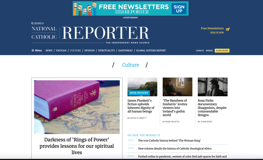
Simplicity is the key here. Identify the section, then proceed to create an environment in which the most important story jumps out to the reader, followed by three single columns of other important offerings
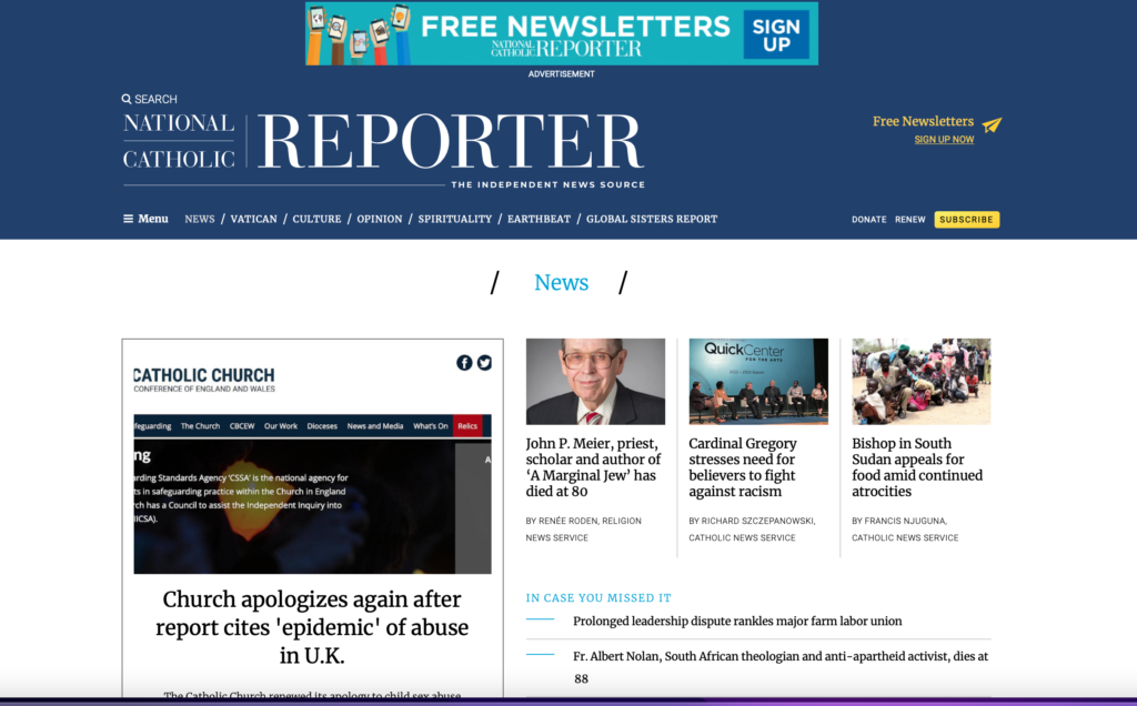
Article page
Here is an article page that also serves the purpose of navigating the readers to other interesting stories they may have missed if they did not enter via the home page.

Branding
Rodrigo Fino, of our Garcia Media team, who specializes in branding, worked on the new improvements to the NCR brand. Here is what he said:
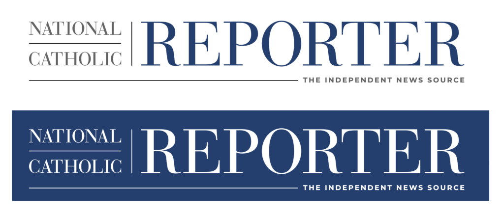
“To make the branding more effective, we analyzed the typographic structure and improved the separation between characters, as well as the overall organization of other elements such as lines, and we also simplified the lines to integrate the phrase The Independent News Source, making it more efficient and easier to read.”
Here you see a dissection of the work carried out strictly to improve the brand:
This was the original brand for the NCR

Here is the final version
Secondary brands


How readers are reacting
Here are a few reactions from readers:
Thank you for the introduction to the new digital format! While your guide describes a design that should be easy to navigate, it will be even easier because you have prepared our way.
— Larry, Lake Wales, Fl.
Congratulations for redesigning the NCR Website, which is neat and easily accessible.
More powers to you.
— Sr. Margaret from India
Thanks very much for your redesign, which makes many clear improvements.
— Douglas, Johns Island, South Carolina
I loved the old design! My position – – “If it ain’t broke, don’t fix it“.
— Bill, Poughkeepsie, N.Y
Nice, nice, work. Newsier, better organized, lots going on in ways that help me through NCR. I know that was a lot of work, but the work worked!—
–Joe, East Lansing, Mi.
Bring our mobile storytelling workshop to your newsroom
It is a mobile world, and 82% of all content is consumed on a mobile device worldwide, not just news, but all sorts of documents, especially pdfs. If your company is in the business of creating content, then you need to start thinking from small to large. Create that content for the smallest platform, where a majority of the users are consuming it.
Our Garcia Media Mobile Storytelling workshops are proven to introduce your editorial team to the way we write, edit and design for mobile platforms. It is a one-day program that involves a presentation (where I summarize my Columbia University class content), and follow it with a hands on workshop.
I urge you to consult my latest book, The Story, a trilogy full of tips and explanations about mobile storytelling, which represents the latest genre for journalists to explore. See information below:
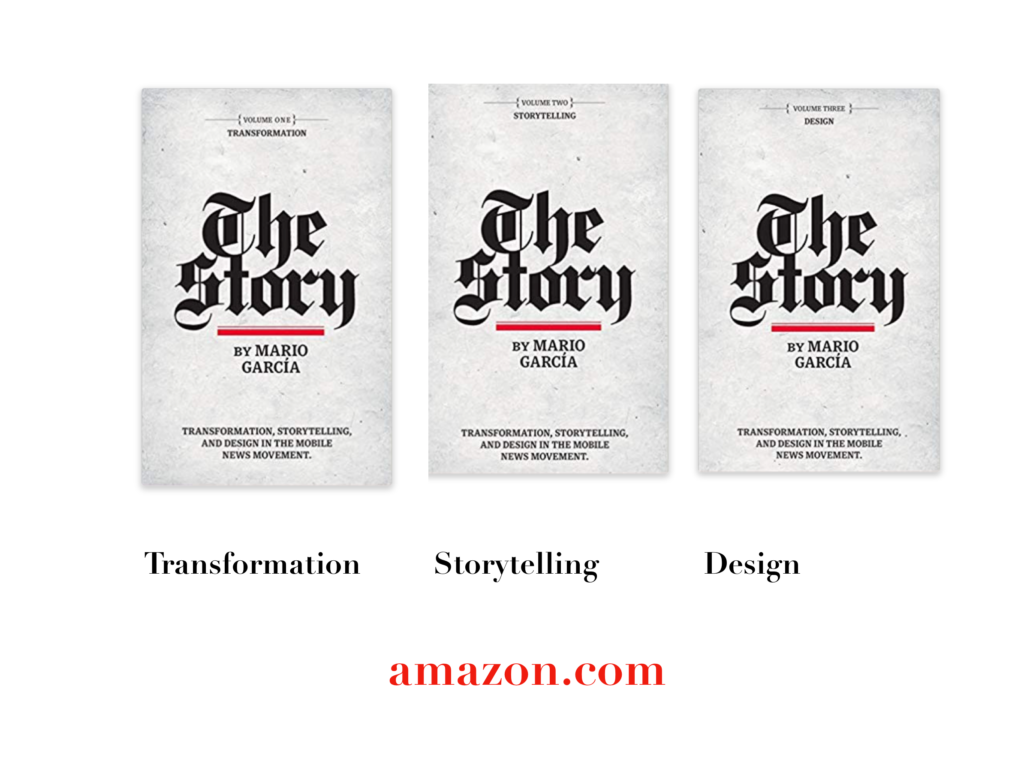
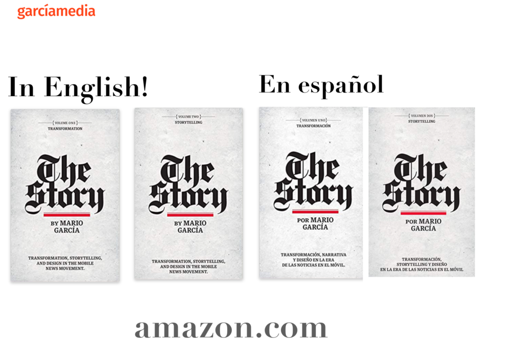
The full trilogy of The Story now available–3 books to guide you through a mobile first strategy. Whether you’re a reporter, editor, designer, publisher, corporate communicator, The Story is for you! https://amazon
TheMarioBlog post # 3357