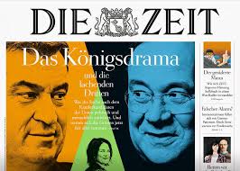
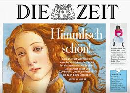
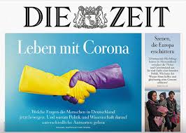
Clever art direction for this week’s cover of the German newspaper Die Zeit. Headline reads: The next vaccine? The three-stripe bandaid visual concept communicates the story directly and at a glance. Bravo for the design team of Die Zeit, inluding former Garcia Media art director Jan Kny.
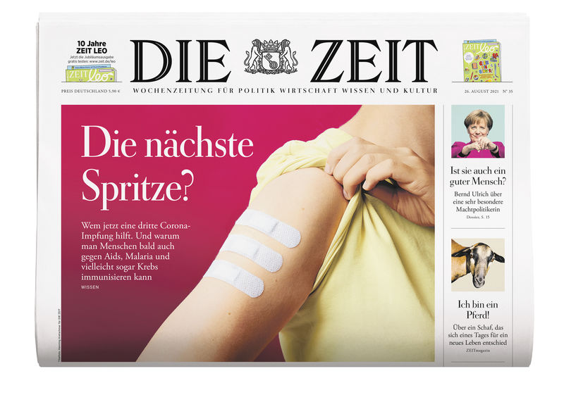
Why this works: This is a simple visual solution for a story that is current, with high reader interest, but that could lend itself to a visual cliché: Think syringe and needle going into arm! Instead the designer here combines the familiar Bandaid with the rank and hierarchy that comes with stripes on a uniform.
Readers of Die Zeit are used to clever front page presentations, as we have highlighted in this blog from time to time.
Of related interest:
Our mobile storytelling workshops now available remotely

Professors: get your review version of The Story on time for fall classes
As an academic, I know the importance of having the right tools to advance our students, especially on the important subject of mobile storytelling. Please drop me an email if you would like to sample The Story in its digital edition: mario@garciamedia.com
Start writing or type / to choose a block
The full trilogy of The Story now available–3 books to guide you through a mobile first strategy. Whether you’re a reporter, editor, designer, publisher, corporate communicator, The Story is for you! https://amazon
TheMarioBlog post # 3321
