Here is an article worth taking a look at.

Two things stood out for me as I read this piece;
- First, a comment from Erin Meanley Glenny, editor-in-chief of San Diego magazine’a statement when discussing the steps taken in the redesign of her 72-year-old magazine.
Meanley Glenny says she was intrigued by magazines that have just one big front-of-book section and a feature well—or even no distinct sections whatsoever—an idea that quickly caused panic among her staff, leading to a compromise that meant condensing four distinct front-of-book sections into three.
“My main reason for that was, if you find out you only get 60 editorial pages, for example, you don’t want to waste any on full-page openers. The fewer the sections, the fewer the wasteful openers. Don’t get me wrong, they can be very pretty, but sometimes they are a supplied image of a musical that’s touring, or opening day at the fair, which we’ve all seen before. Magazines are getting slimmer, and it’s not just about how few pages you get, but what you do with those pages, and how they’re shared between the different topics and beats.”
I agree totally with this approach, minimizing the number of sections, one that I recommend to clients almost consistently, but not always with much success. While I believe that readers who are used to reading on mobile devices are very attentive to and rely on labels to navigate a publication, I don’t think it is necessary to overload a title with many sections. In print, the issue of space devoted to “big section openers” is also a concern.
It will be interesting to get a copy of San Diego magazine and see how this approach played out. The editor began with the right directional idea, however.
- I am still studying the before and after of the logo for The New Republic.
The magazine has undergone a major redesign. The New Republic team worked closely with Eddie Opara, a partner at the design studio Pentagram, The New Republic‘s new look premieres with the March 2020 issue and marking the title’s first major redesign since 2015.
The most obvious departure from the prior design is the magazine’s cover, which features a new logo developed by Pentagram and aimed at conveying elegance and authority, but also energy.
Here is the new logo created by Pentagram:
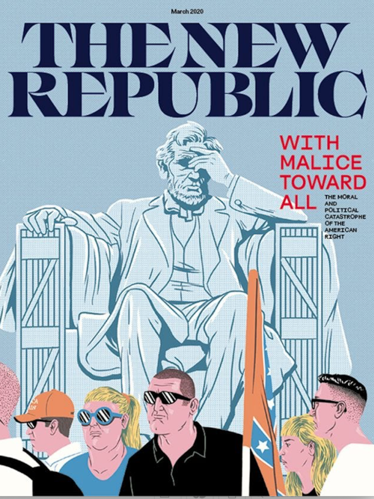
The one before the redesign (scroll up to start of this piece) was a sans serif with not much personality. The new one above definitely has more power, makes a statement of elegance and can’t be missed if you are looking at this magazine cover at a newsstand surrounded by competing titles.
It is great to see that print editions get some attention in the mobile first era.
Let The Story guide your mobile first strategy!
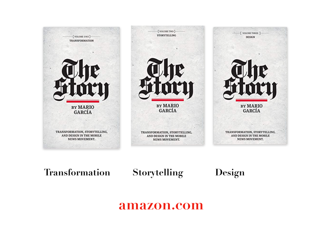
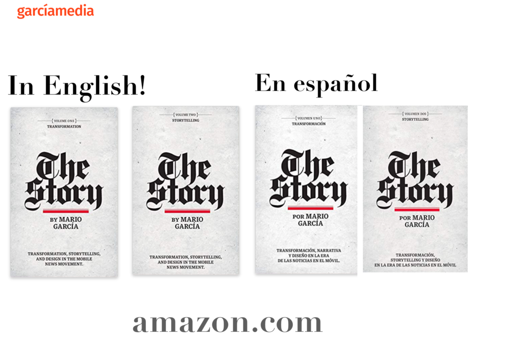
A good read to start the year 2020: The full trilogy of The Story now available–3 books to guide you through a mobile first strategy. Whether you’re a reporter, editor, designer, publisher, corporate communicator, The Story is for you! https://amazon
Mario’s speaking engagements
March 5, 2010- Hapag-Lloyd Event, Hamburg, Germany

March 13, 2020, National Media College Association, New York City, NY, USA
Keynote presentation at the National Media College Association Spring Convention.
March 27, 2020, New York Press Association (NYPA), Sarasota Springs, NY, USA

April 22, 2020, Newscamp 2020, Augsburg, Germany
https://medienkalender.bayern/event/newscamp-2020
April 26, 2020, INMA World Congress, Paris, France
TheMarioBlog post # 3218