This exercise is always part of the first three weeks of the semester for my course, Multiplatform Design & Storytelling, which are devoted to a Design Boot Camp.
Once the students have been exposed to the essentials of typography and color, the students are now prepared to study how type and color are utilized and present, which they must justify, to the rest of the class.
As my students are all millennials, I find it interesting to see what their choices are and thought you might find them interesting too. Here is a sampling:
Good use of type


Good use of color
Vox is always a crowd pleaser for students for its choice of yellow, which contrasts so nicely with the type in black.

Below iview displays a turquoise color that is quite trendy with millennials.

Here is Smart News with its tutti-frutti approach to color, but one which is distinctive and used consistently throughout the site.


Let The Story guide your mobile first strategy!
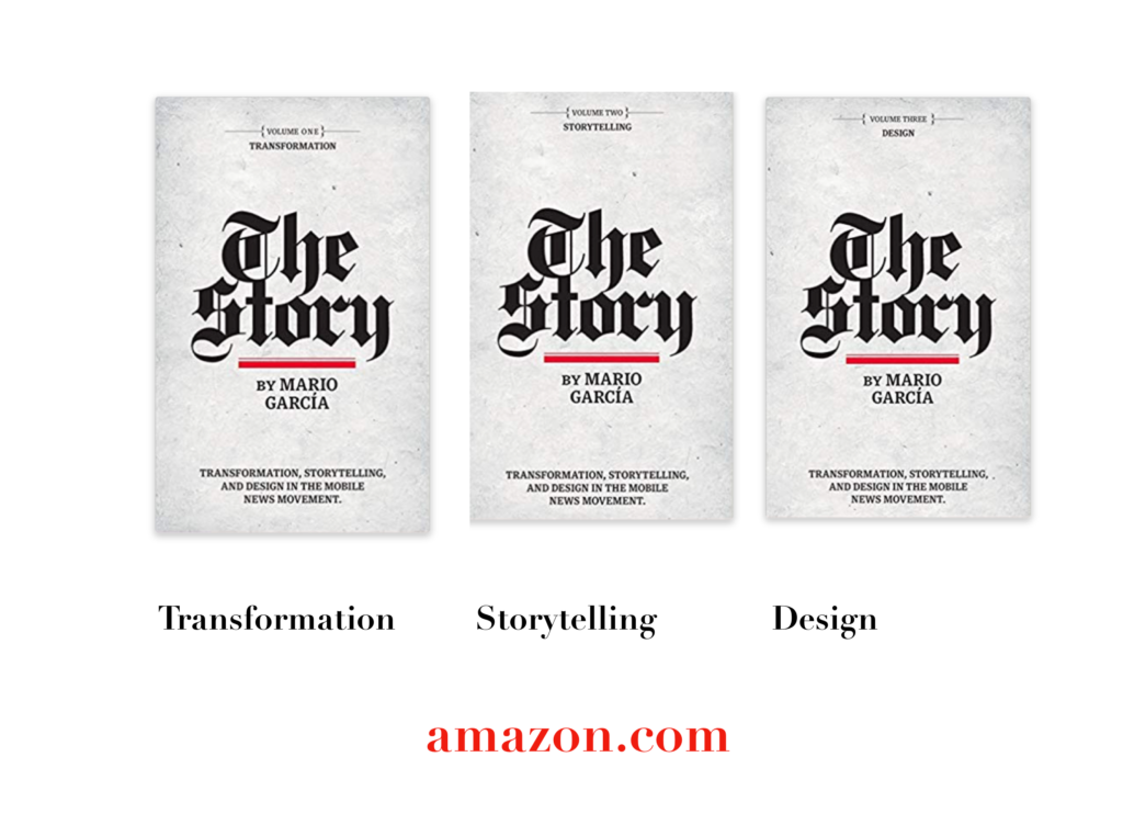
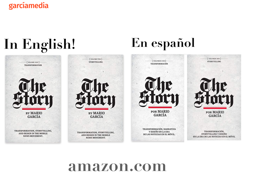
A good read to start the year 2020: The full trilogy of The Story now available–3 books to guide you through a mobile first strategy. Whether you’re a reporter, editor, designer, publisher, corporate communicator, The Story is for you! https://amazon
Mario’s speaking engagements
March 13, 2020, National Media College Association, New York City, NY, USA
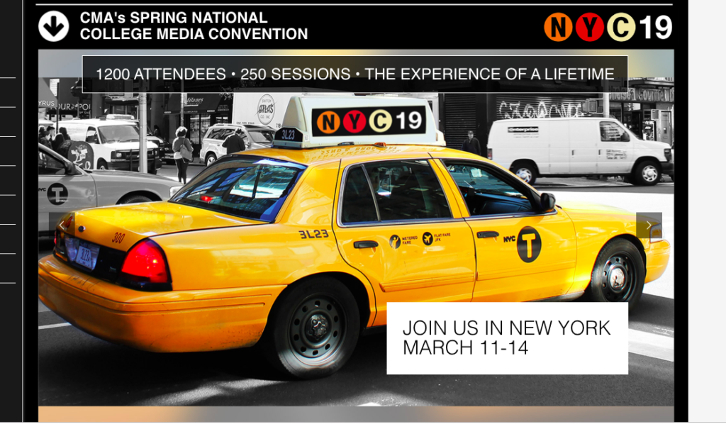
Keynote presentation at the National Media College Association Spring Convention.
March 27, 2020, New York Press Association (NYPA), Sarasota Springs, NY, USA

April 22, 2020, Newscamp 2020, Augsburg, Germany
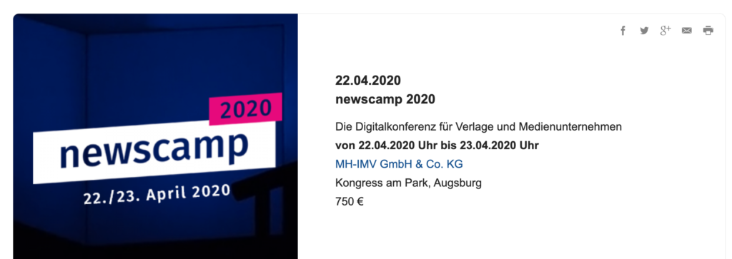
https://medienkalender.bayern/event/newscamp-2020
April 26, 2020, INMA World Congress, Paris, France
TheMarioBlog post # 3209


