The first assignment of the semester for students in my Multiplatform Design & Storytelling class at Columbia University School of Journalism was to find a newsletter of their choice and explain why they came to it daily.
Of course, there were the usual ones you would expect, The New York Times, the BBC, Associated Press, CNN, Reuters. Those are newsletters we all look forward to receiving daily, respect for their curated content and credibility.
However, some students found real gems that surprised me and that I wanted to share with you. Take a look:
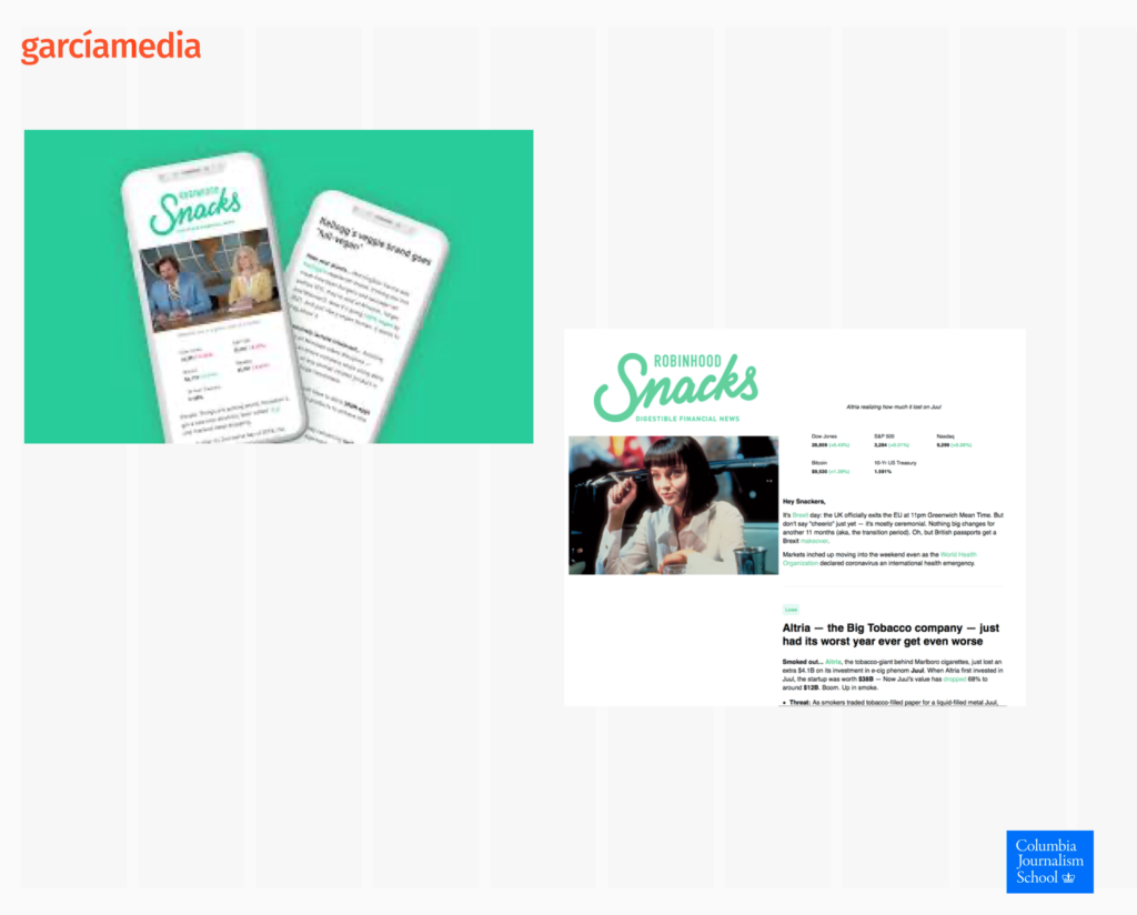
Robinhood Snacks
This newsletter is offered buy the financial services company, Robinhood, and it offers digestible financial news in an entertaining style, according to the student who picked it as his favorite.
The newsletters opens with a visual humorous take on an event of the week, followed by a breakdown of market news.
The student wrote: “…(the newsletter) is accessible to the general public without much financial background and can be quickly consumed.
Here it is:
Everlane
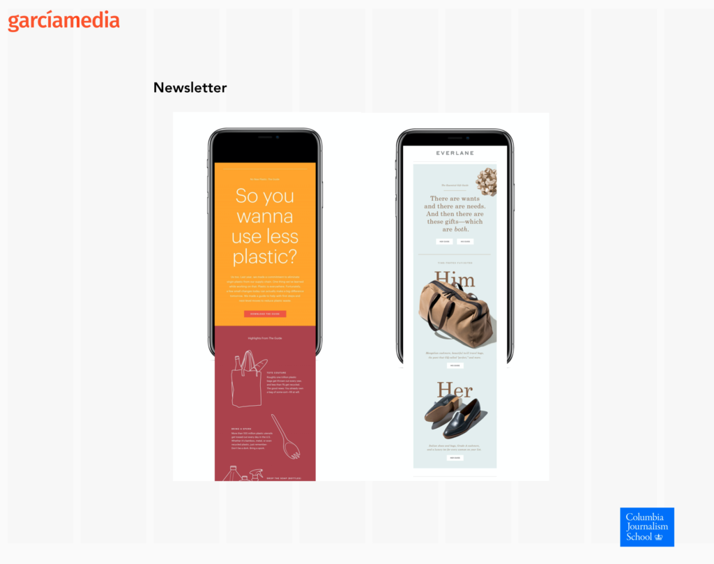
This is not a “news” newsletter. It is more about shopping, but the moment I saw it on the screen I told the class that visually speaking, this newsletter is attractive and plays with the right elements. For example, the opening screen (orange background), is a “card” with a headline. Then notice the use of typography and visuals for the rest of the newsletter. Many newsletters produced by media people could learn lessons here. Substitute the items for sale for news visuals, and this could be an attractive newsy newsletter, with visual impact.
The student who picked this newsletter wrote:
One of my favorite newsletter designs is by Everyone, which is a clothing retailer brand that focuses on sustainability. Their newsletters are clean visually pleasing through the use of color, typography and information hierarchy.
What a day….
This one is all about politics and appears nightly, published by Crooked Media.
Take a look here:
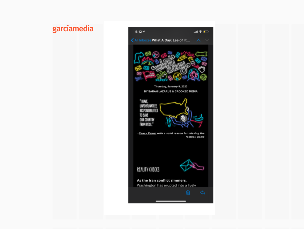
Notice the colorful and rather busy logo for this newsletter. However, the student who picked this as a favorite newsletter insists that such visual treatments are part of the appeal to people in her generation:
I particularly like this newsletter because you can say that it is designed with a young , millennial viewer in mind. Rather than following the color scheme, serious tone or mundane headlines of typical political outlets, it follows a more eccentric and humorous tone…….
The newsletter is focused on news and their commentary includes pop culture references and a sense of personality which obviously attracts the younger readers.
Let The Story guide your mobile first strategy!
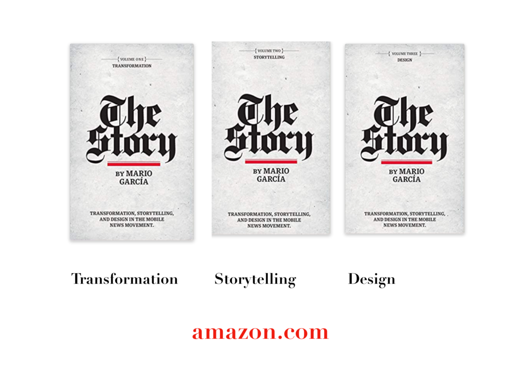
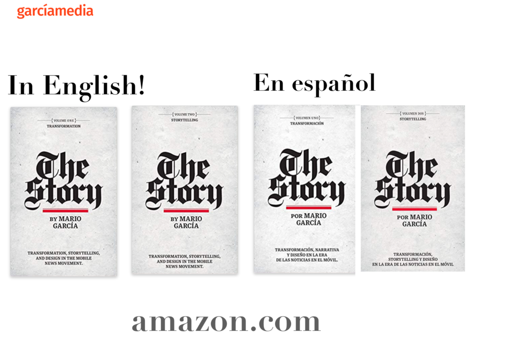
A good read to start the year 2020: The full trilogy of The Story now available–3 books to guide you through a mobile first strategy. Whether you’re a reporter, editor, designer, publisher, corporate communicator, The Story is for you! https://amazon
Mario’s speaking engagements
March 13, 2020, National Media College Association, New York City, NY, USA
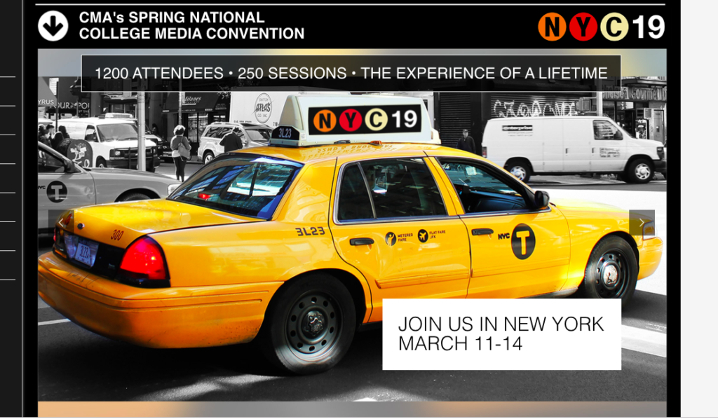
Keynote presentation at the National Media College Association Spring Convention.
March 27, 2020, New York Press Association (NYPA), Sarasota Springs, NY, USA

April 22, 2020, Newscamp 2020, Augsburg, Germany
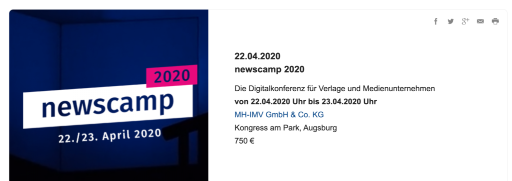
https://medienkalender.bayern/event/newscamp-2020
April 26, 2020, INMA World Congress, Paris, France
TheMarioBlog post # 3200