I enter my 7th year teaching Multiplatform Design & Storytelling at the great Columbia University’s Graduate School of Journalism. I am honored to have a place in front of the class there, and each semester the students are better prepared and they, in turn, become my teachers as well. As I have mentioned often here, the roles of mentor and mentee are often reversed, and rightly so, in our current environment of a fast changing media landscape.
I could not have written my mobile storytelling book, The Story, had it not been for the input and shared experiences of my Columbia students. They provided me with the perfect laboratory to combine the experience of an almost 50-year career with the fabulous insights of those who don’t remember life without Google.
The opening lecture
I am working and reworking that first lecture for when class starts today.
The centerpiece of this presentation—and perhaps of the class itself, something to think about the entire semester—is that never before have journalists been in such control of the visual presentation of their stories.
My message to the students: You, as journalists, can and need to have some visual control of how your story is presented. We now have the tools to make that possible and in this class, that is the way it will be. You create and write your stories, then you find the visuals and you put it all together. Never before have we seen such a blending of the words and the visuals.
Time to celebrate.
Time to learn new visual strategies.
Time to realize that words are NOT the only tools to tell the story.
The audience in a mobile first world does not want it any other way.
While visual storytelling involves linear structure for the story, one can opt to scroll to read the story, with each screen independent from the next, or, as is the case with AMP “tap” stories, the user swipes to the right to advance the story.
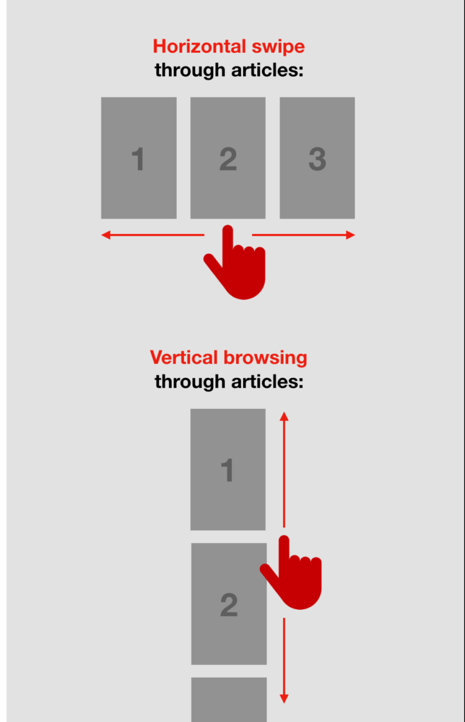
The tools
When I tell my students that they are now empowered to control the visual presentation of their stories, I am referring to such storytelling tools as AMP Newsroom Studio.
With AMP templates, it is easy and fun to build stories using a variety of visual assets, but without having to know much about coding. It is fast, efficient, and, for purposes of students, a way to practice with design and storytelling, making type and color choices, all with templates that offer almost every possibility.
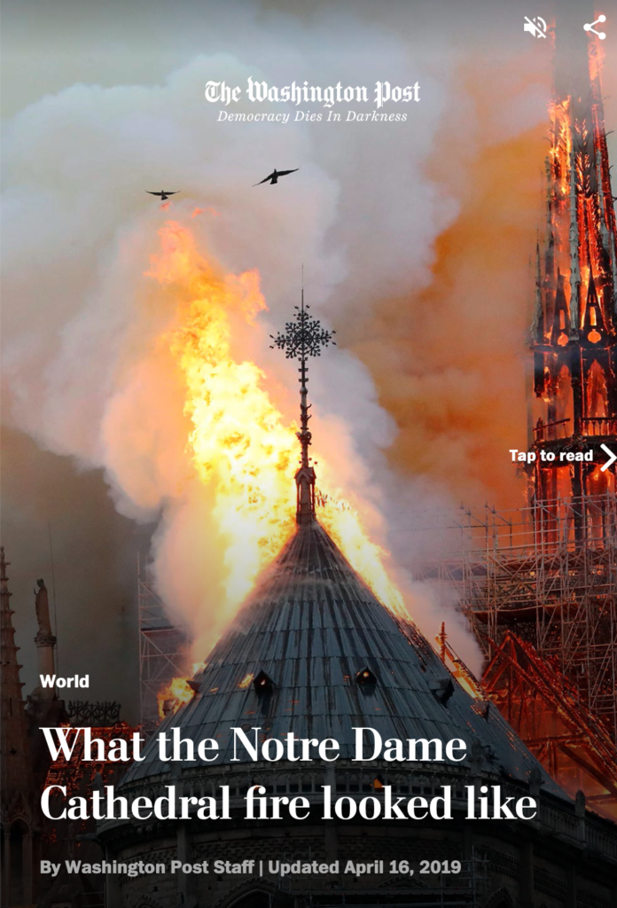
Sample these two Washington Post visual stories, specifically created for mobile using the AMP Newsroom Studio program:
Food Story
https://www.washingtonpost.com/graphics/2019/world/amp-stories/notre-dame-fire/
Notre Dame Fire
I am doing the tutorial myself and here is a simple way of presenting my class via mobile storytelling:
https://preview.nws.ai/story/1288492393/multiplatform-design-course
Start the year with The Story
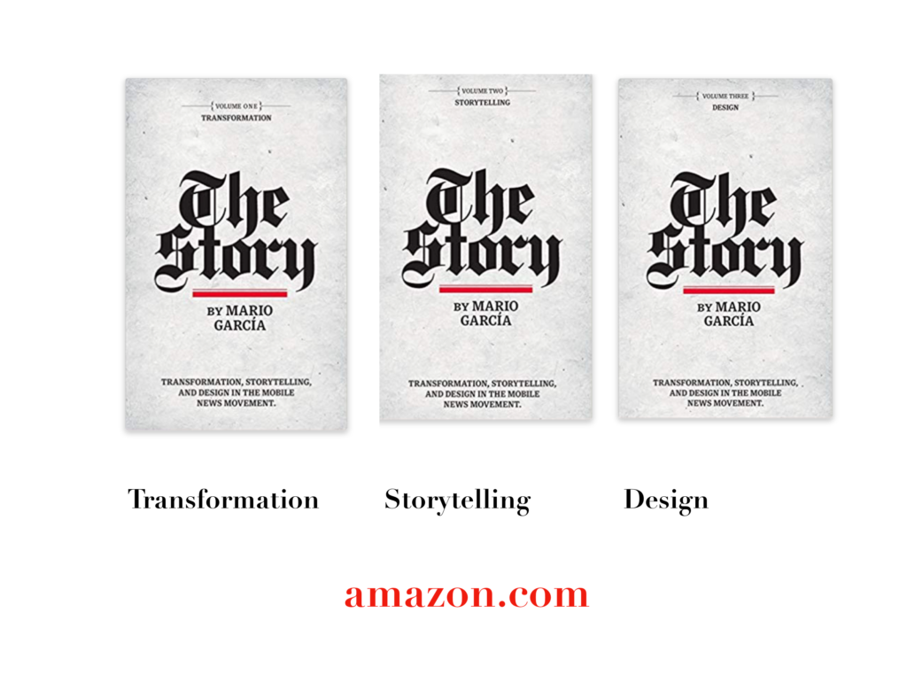
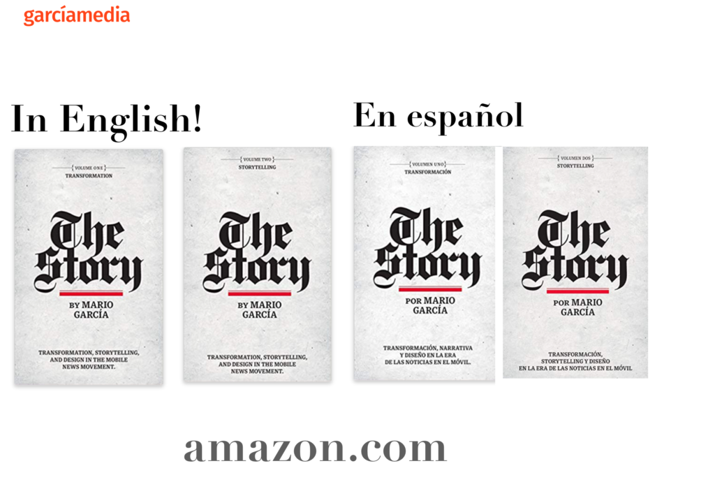
A good read to start the year 2020: The full trilogy of The Story now available–3 books to guide you through a mobile first strategy. Whether you’re a reporter, editor, designer, publisher, corporate communicator, The Story is for you! https://amazon
Mario’s speaking engagements
March 13, 2020, National Media College Association, New York City, NY, USA
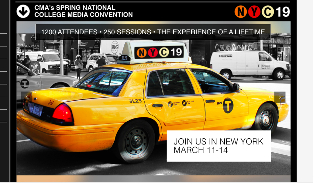
Keynote presentation at the National Media College Association Spring Convention.
March 27, 2020, New York Press Association (NYPA), Sarasota Springs, NY, USA

April 22, 2020, Newscamp 2020, Augsburg, Germany
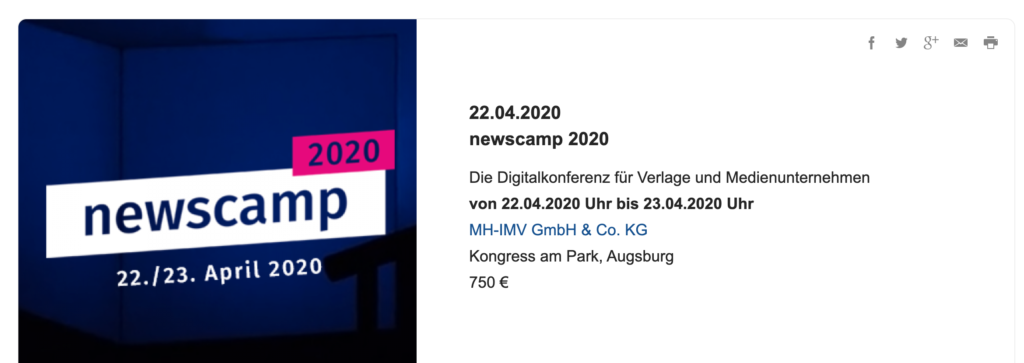
https://medienkalender.bayern/event/newscamp-2020
April 26, 2020, INMA World Congress, Paris, France
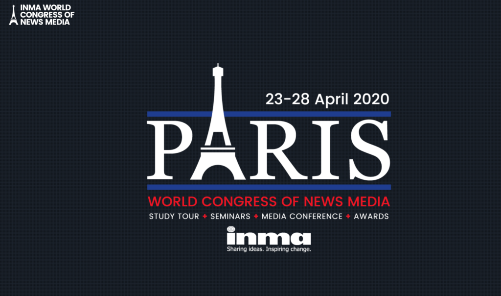
TheMarioBlog post # 3194

