TAKEAWAY: The Boston Globe struts its stuff with an offer for free access to content for a limited time PLUS: Nothing beats the A4 format for printed newspapers AND: Experimenting with advertising

Today is the opening of the two-day WAN-IFRA Latin America 2012 conference in Santiago de Chile. I am one of the speakers, but I will be reporting from the conference as well.
Follow me on Twitter @DrMarioRGarcia. The emphasis is all on Latin American publishing. Sessions are devoted to new business models, attracting young readers, successful production strategies, press freedom and successful strategies for digital publishing.
Reporting live right now from WAN IFRA Latin America: @DrMarioRGarcia
Four for the price of one
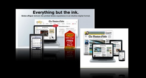
The Boston Globe: Offer expires May 6
The online ad reads:
Try BostonGlobe.com for free now through May 6th
The summary adds: Access the award-winning journalism of The Boston Globe in its entirety — from your computer, tablet, or smartphone.
While you read the message a metered clock is ticking the seconds away at the top of the screen in the www.bostonglobe.com website.
And one added attraction: Now available is Boston Globe ePaper: The complete print edition, in its exact layout. Browse the print edition page by page, including stories and ads.
This is a good way to attract new audiences, and perhaps lure back some who may have departed for all the reasons we now know people abandon their subscriptions to newspapers in whichever platform: no time to read the newspaper, getting the information free via Internet, a lifestyle that does not allow many people to set aside a specific block of time for media consumption (the way their parents and grandparents perhaps did).
Yet, we know that when asked the question in focus groups, a large number of readers tell us that they now spend MORE time across their day consuming information in a variety of platforms.
The key, I believe, is for newspapers, such as The Boston Globe, to aggressively pursue these readers and remind them that they are not a “just in the morning” publication made of ink and paper and wrapped in transparent plastic bags that is thrown in their front porch.
Not an easy task, but an aggressive campaign may do it.
The Boston Globe’s “free” offer is a good lure. We will be interested to see what results it yields.
Our previous related posts: The Boston Globe
https://www.garciamedia.com/blog/articles/the_new_boston_globe_website_innovative_functional_sets_the_pace
https://garciamedia.com/blog/articles/an_interview/
The manageable and attractive A4 format
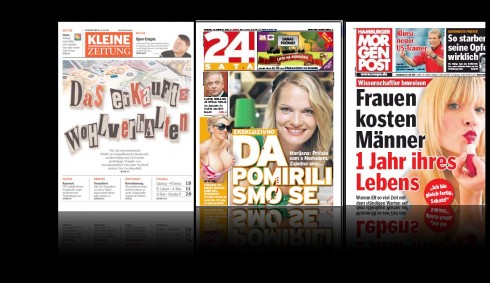
Among A4 format newspapers we have worked with: Kleine Zeitung (Austria), 24 Sata (Croatia), MorgenPost (Germany).
A reader named Robert sent me an email yesterday to inquire about my preference for newspaper formats.
‘
I am a university student working on my end of semester project, and I am interested in knowing your views about compacts versus broadsheets. Which do you prefer?.”
Dear Robert, thanks for writing. I have said it before: if I have to choose a format for a printed newspaper, I would definitely go to the A4 format, which is easy to carry, easy to read and where double page spreads truly become a designer’s perfect canvas.
Unfortunately, there are not many of those A4 formats around, and the ones that exist are mostly in the German speaking world.
WE have done several of those, and they remain among my favorite. We are presently working with a rethinking of Austria’s Kronen Zeitung, also an A4 format to be launched before summer.
If I were starting a print newspaper, it would definitely be in an A4 format—closer to the size of a tablet, in any case.
Our previous related posts: A4 format
https://www.garciamedia.com/blog/articles/why_a_smaller_format_creates_a_bigger_future_for_american_newspapers
https://www.garciamedia.com/blog/articles/one_question_for_timothy_franklin_plus_conference_musings
The Impact of the Compact
http://issuu.com/mariogarcia/docs/the_impact_of_the_compact
The March of the Tabloids
http://www.poynter.org/uncategorized/44361/the-march-of-the-tabloids/
Experimenting with ad sizing and positioning
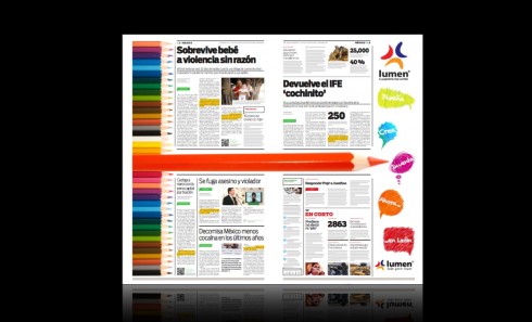
In Mexico, a.m. prototype experiments with odd shape advertisement
Recently, as we prepared the prototype for Mexico’s a.m. , published in Leon, Guanajuato, we created inside pages such as the one you see here, leading them to consider unusual, but effective, advertising positions.
In this case a double page carries an H-shape advertisement, with a belt running through the middle of the page, which then allows for a quadrant of editorial content.
In cases such as this, the advertiser will pay for the full two-page spread, but give part of it to the editorial department to include stories and images there. Win win.
Our previous related post: experimental ad positioning
https://garciamedia.com/blog/articles/advertising_display_and_experimentation
Where in the world is Mario?
It is an interesting week ahead for me, moving across two continents, but engaging in some good programs.
April 20-23, Buenos Aires—catching up with Garcia Media Latinamerica team; plus enjoying one of my top five favorite cities in the world.
http://www.garcia-media.com.ar/
April 25, Santiago de Chile—speaking to the WAN-IFRA America Latina 2012 Congress; my topic: Designing for the 21st century, across platforms.
www.wan-ifra.org
April 27, Rochester, NY—speaking at Digital Reading Symposium at RIT (Rochester Institute of Technology). I am honored to be in this gathering which explores the art and science of reading on screens .
http://www.rit.edu/cias/readingdigital/
The iPad Design Lab: Storytelling in the Age of the Tablet
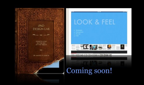
Video walkthrough of the iPad prototype of iPad Design Lab