
It is a comment I hear from time to time during my mobile storytelling workshops in newsrooms across the globe:
It is difficult to find financial stories that lend themselves to linear storytelling treatments. How can you make those stories come alive for smartphone consumption?
Well, I am happy to find this New York Times example that shows what can be done using various visual assets to tell an economy story well. In this case, it is all about how single family homes are being purchased by investors, renovated and then sold for much higher prices.
The story makes it clear that single homes are no longer purchased exclusively by those who will live in them.
But first: what is linear storytelling?
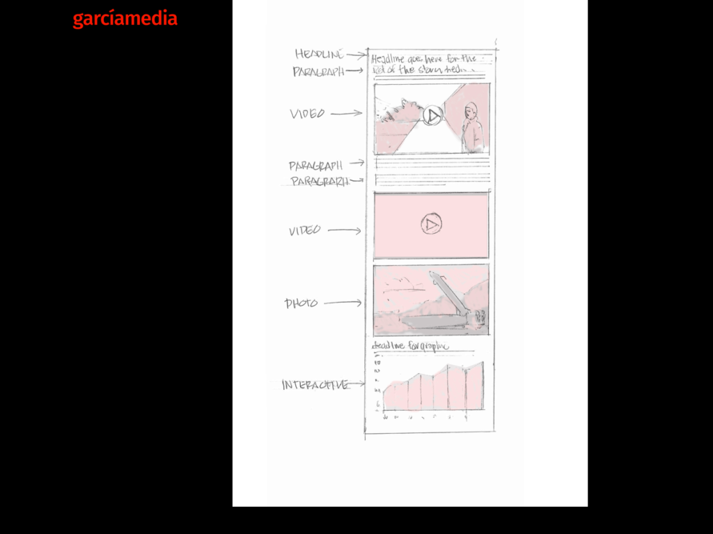
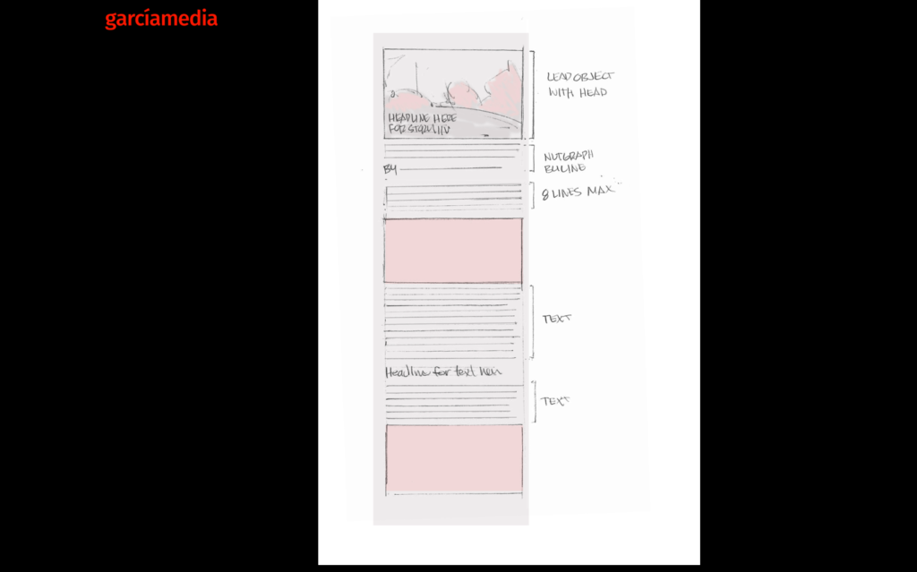
Linear storytelling is, as the name suggests, a style of writing for mobile where the movement is vertical, combining texts and visuals. Sort of the way we communicate when having a text conversation wtih someone. We write and we show. See the visuals below:
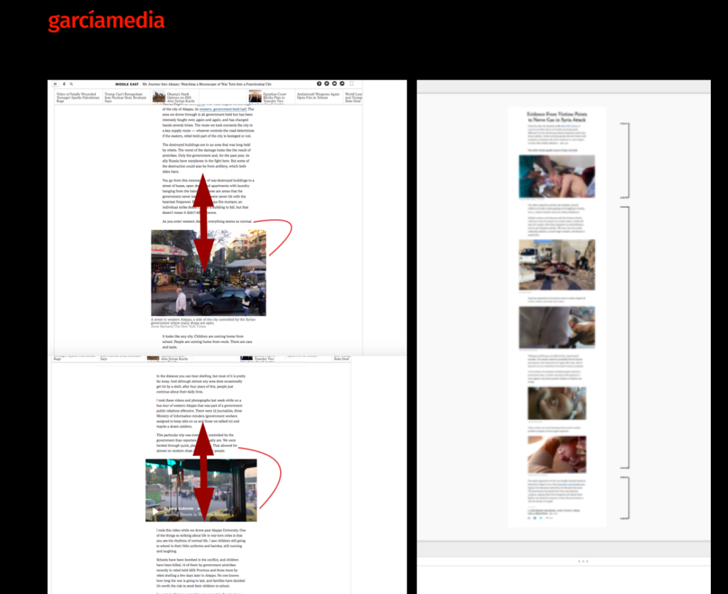
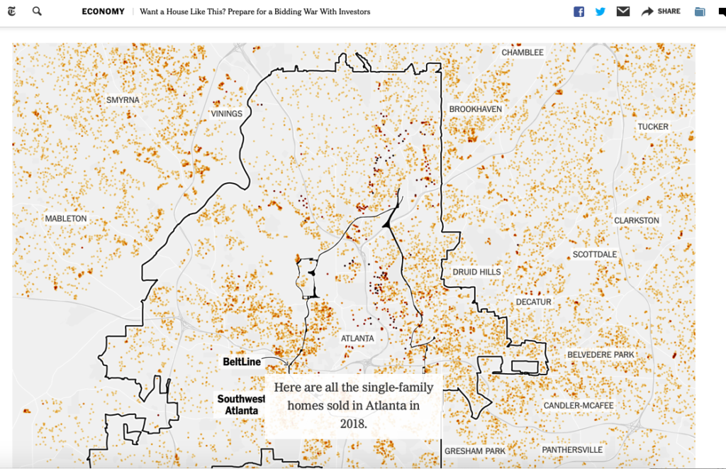
Take a look at how this story provides a lengthy narrative but supported by photos, animated graphics (see the maps showing the number of single homes purchased by investors), and videos.
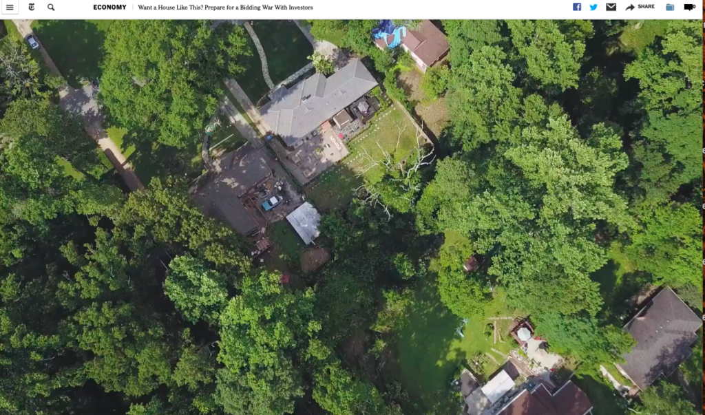
The piece begins and end with a gif that offers an aerial view of the house profiled in the lead and of the neighborhood
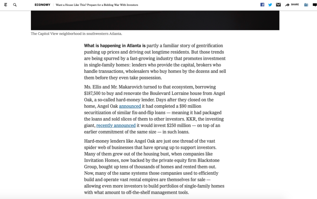
Also notice that, while there are no subheads as such, the designers have built these bold face lead ins to provide internal navigation through the entire piece:
Good use of graphics, too.

Scroll down through text and visuals
Here is how a linear story is composed: the movement is vertical as the user scrolls down one screen after the other.
Sample templates here:
So study this story and any others that follow a linear approach, observe the details of how text and visual assets are presented, then try to do your own linear story.
The obituary in linear format
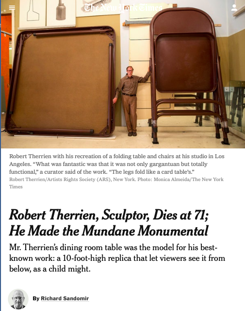
Almost any story where there are visual assets available can be told in a linear format, so friendly for mobile consumption. Let’s take a look at this obituary from The New York Times:
https://www.nytimes.com/2019/06/24/obituaries/robert-therrien-dead.html
Mario’s speaking engagements
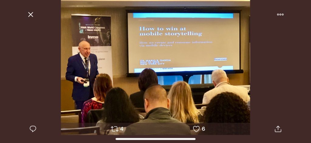
Here are places where I will be taking the message of mobile storytelling in the weeks ahead:
July 11, Florida Media Conference, St. Petersburg, FL, Keynote for editors: The mobile first newspaper strategy.
Mario’s weekend rituals…..
Monocle interviews me about what I do on a typical weekend (is there such a thing? Not for someone like me who is seldom in the same location twice. But I gave it my best shot, for what may come as a normal weekend, when I am home in New York! Enjoy.
https://monocle.com/minute/2019/04/27/
Pre-order The Story
The newspaper remains the most powerful source of storytelling on the planet. But technology threatens its very existence. To survive, the Editor must transform, adapt, and manage the newsroom in a new way. Find out how, pre-orderThe Story by Mario Garcia, chief strategist for the redesign of over 700 newspapers around the world.
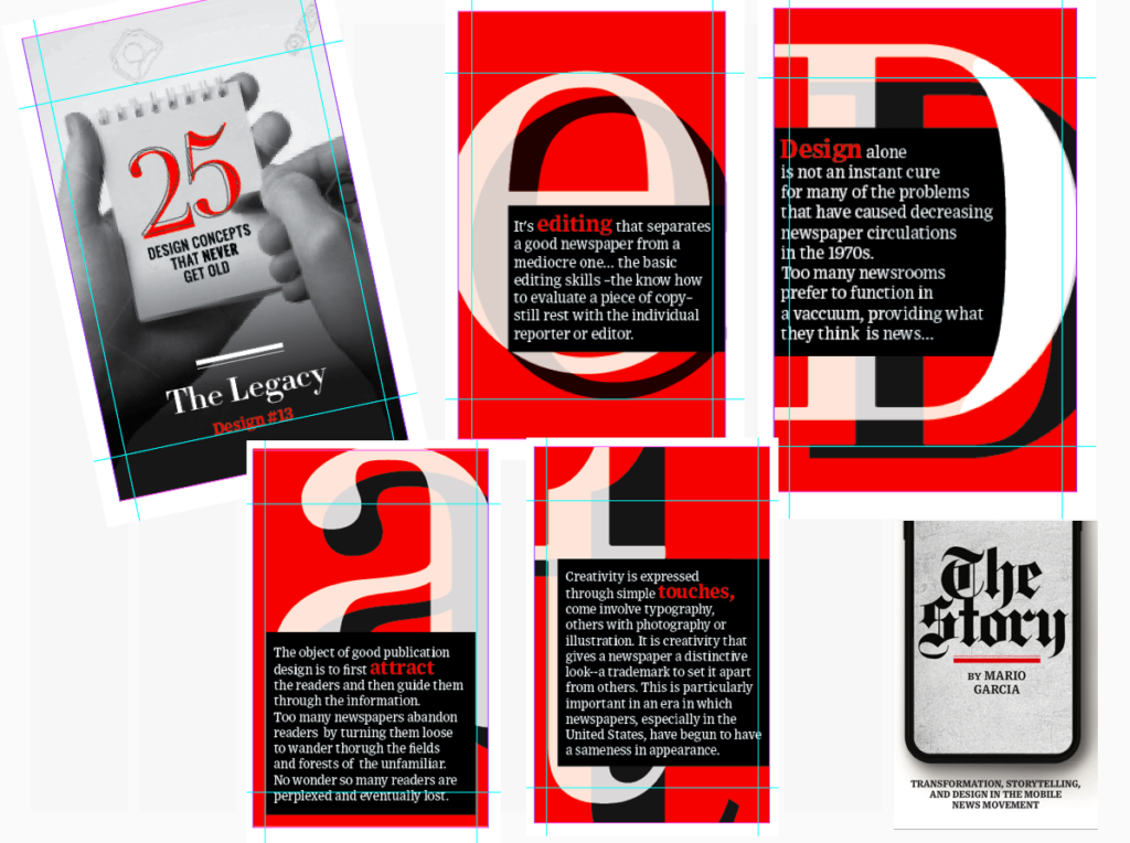
Order here:
https://thaneandprose.com/shop-the-bookstore?olsPage=products%2Fthe-story
An interview of interest
http://www.itertranslations.com/blog/2019/3/11/fd60ybflpvlqrgrpdp5ida5rq0c3sp
TheMarioBlog post #3080