Gone are the days when you had about 30 seconds on that printed page to hook the reader. In a mobile first environment, the time is less and the canvas much smaller than a tabloid, broadsheet or even magazine page.
So, the headline and the visual must do the job to convey what the story is about. The headline must have key words that tell us what’s to come, since we can’t see an overall “helicopter” look of the page, as we do in print. That is why good mobile headlines use such words as “Here is (are)….” or numbers “Five delicious Sunday brunch menus,” or a specific reference “Photos of the air disaster in Cairo,” for exaxmple.
The visuals of the poster
When it comes to the small canvas of the smartphone screen, the only thing it may have with a newspaper page is that both are square. Almost everything else is different:
- Size is drastically different; when designing for the smartphone, the designer is working with the smallest of platforms designed to read text.
- One image, well cropped and focused, works better than several images.
- One image in poster-like fashion and a short headline and summary are all that is needed.
- Motion helps: starting with a gif or a short video is more enticing to thumbing up than a static block of text.
- Visuals, overall, are the way to start. A compelling headline with a great visual , and the seduction process begins.
Mobile versus print in those first seconds of discovering a story
Let’s take a look at these two examples from The New York Times and The Washington Post, where we see one poster-like approach to the story. Both of these first screens work well as mini posters that draw us into the stories.
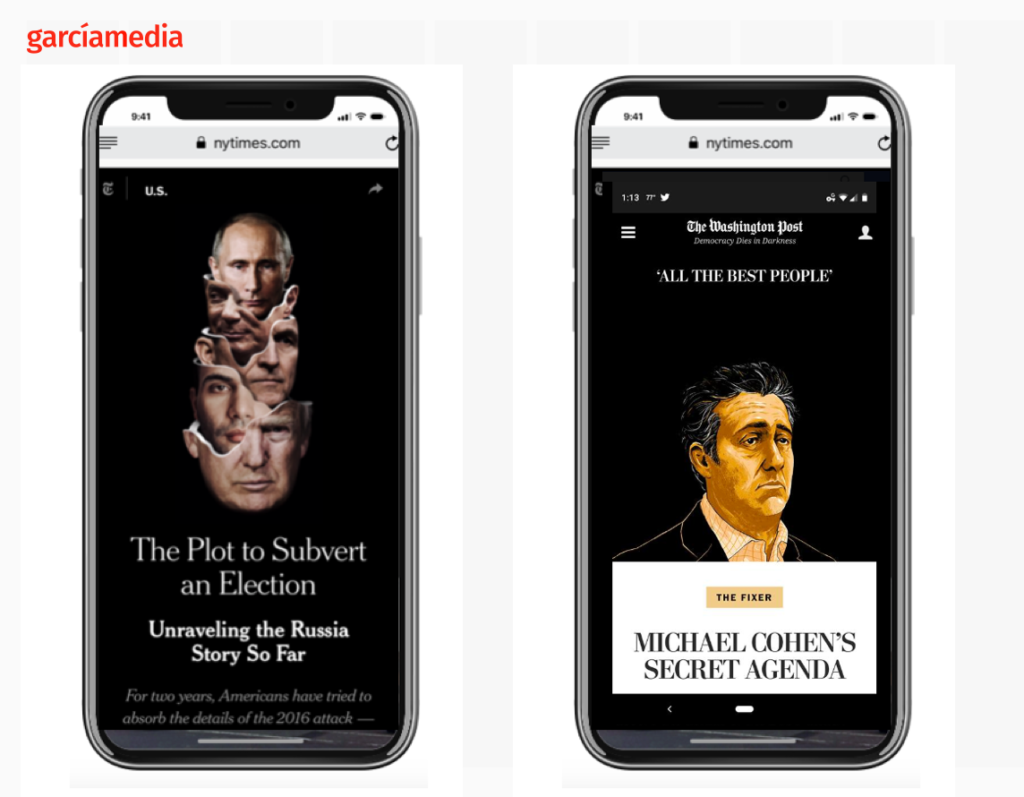
Notice the key words in the headlines above: “Unveiling” indicates that the piece will show you evidence. For the Michael Cohen story, the reference to Secret Agenda indicates that it will be revealed in the piece.
For readers of The Washington Post who saw the Michael Cohen piece in the printed edition, the signals are many and different—including awareness of the length of the story. When we look at the mobile screen, we have no idea of what’s to come. Whatever is on that screen must invite us to continue reading. No idea of how long the story is, so if the writing is enticing, we continue with our journey through the story.
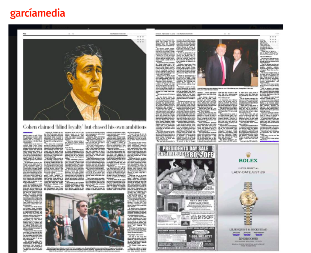
Let poster design inspire us
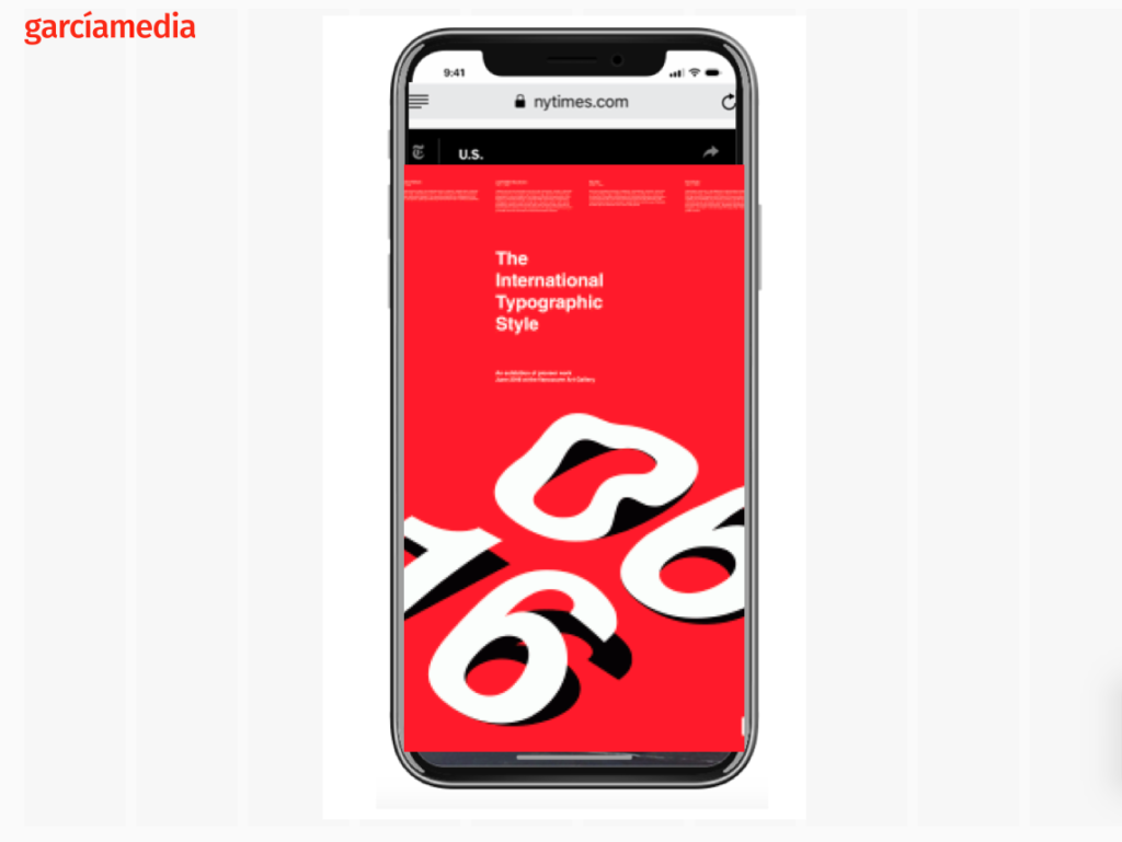
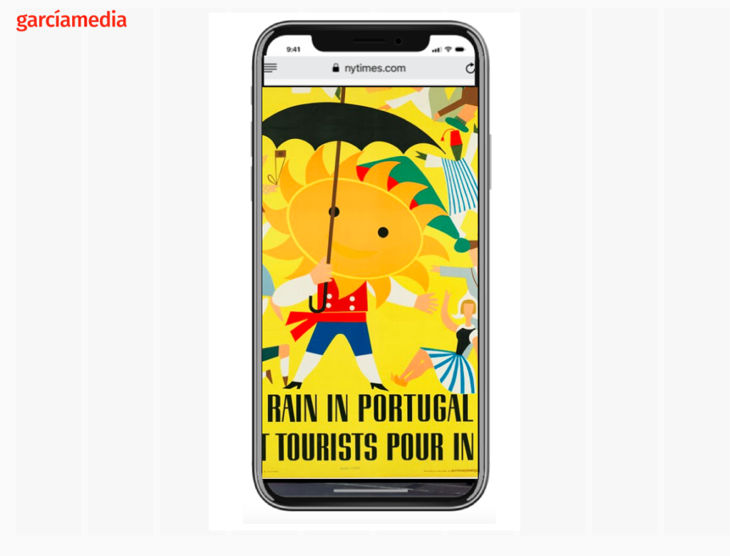
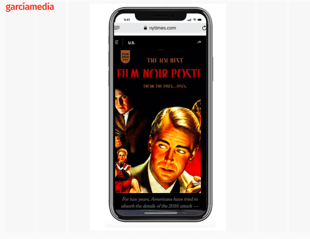
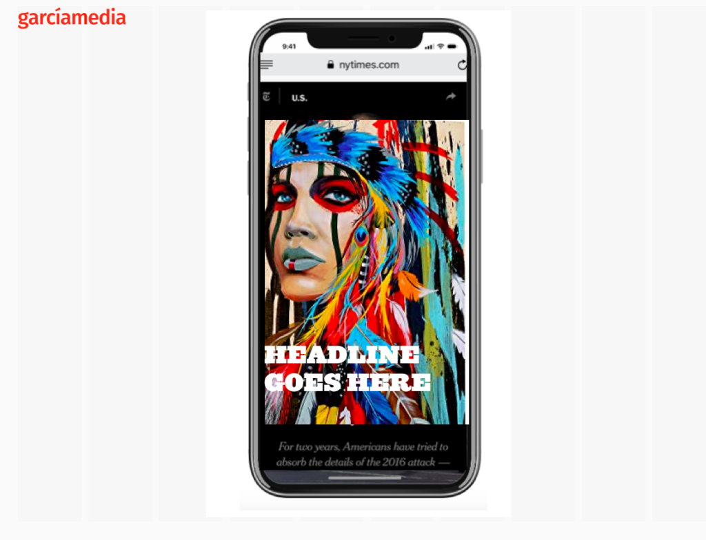
My inspiration for designing those first screens (and subsequent ones as well) of a mobile story is definitely in the work of poster designers. I go into reviews of posters from the present and the past—-especially those posters of the 1930s and 40s. Posters are designed for functionality (to showcase an event, film, concert, product) and aesthetics (attracting us visually). Those two are key elements of designing for that first screen to showcase a story.
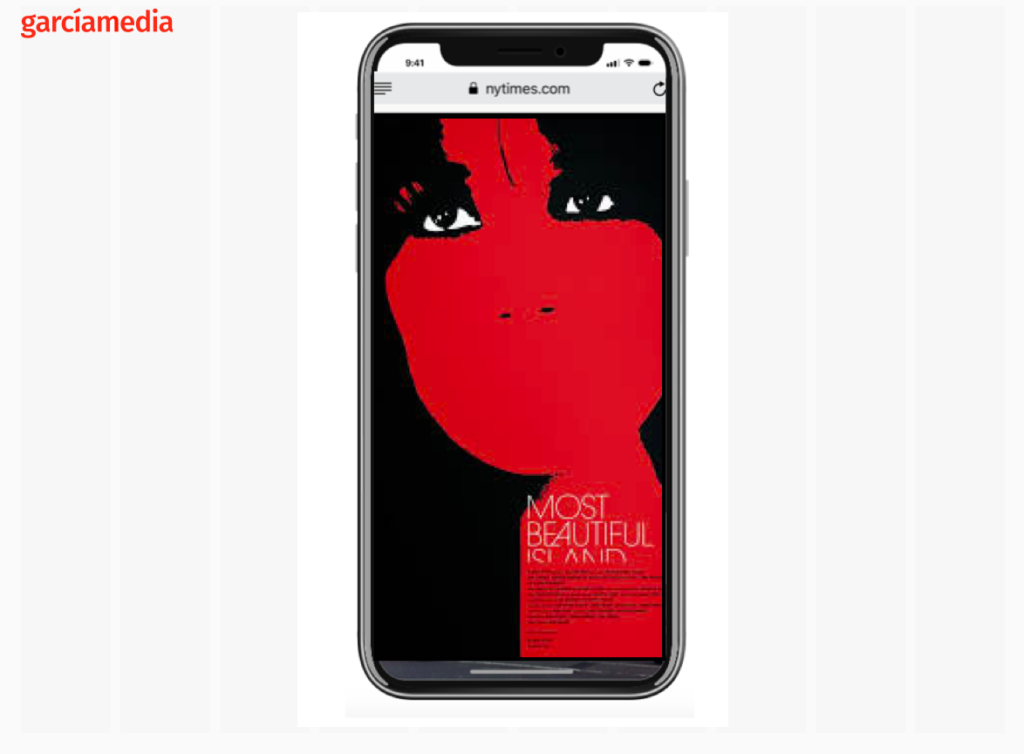
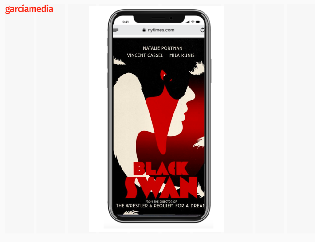
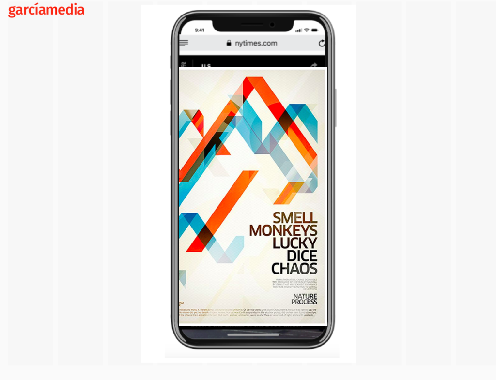
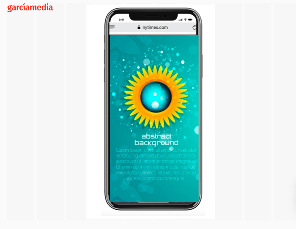
Take a look at these I have assembled, in no particular interest. I have basically adapted these magnificent posters to the screen of a smartphone to make the point.
What these have in common is a visual focus and little text. That’s all you need on that first screen.
Mario’s speaking engagements
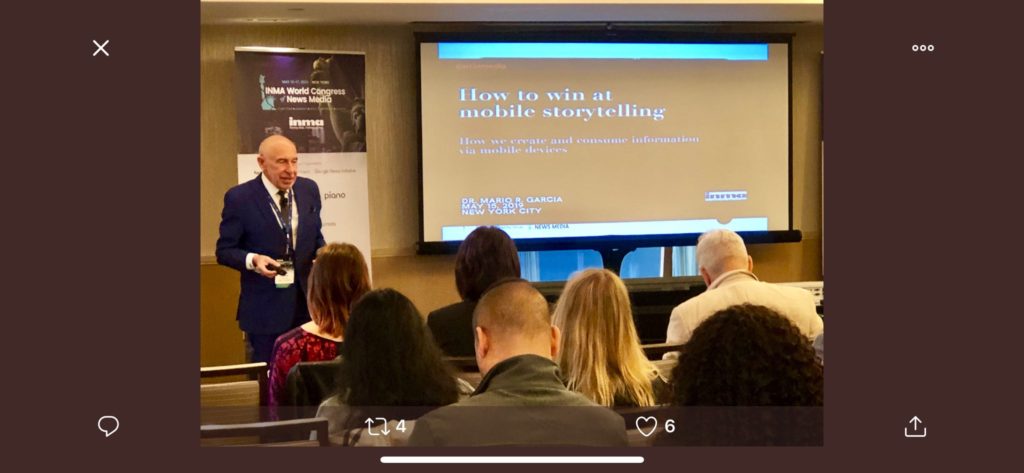
Here are places where I will be taking the message of mobile storytelling in the weeks ahead:
July 11, Florida Media Conference, St. Petersburg, FL, Keynote for editors: The mobile first newspaper strategy.
Mario’s weekend rituals…..
Monocle interviews me about what I do on a typical weekend (is there such a thing? Not for someone like me who is seldom in the same location twice. But I gave it my best shot, for what may come as a normal weekend, when I am home in New York! Enjoy.
https://monocle.com/minute/2019/04/27/
Pre-order The Story
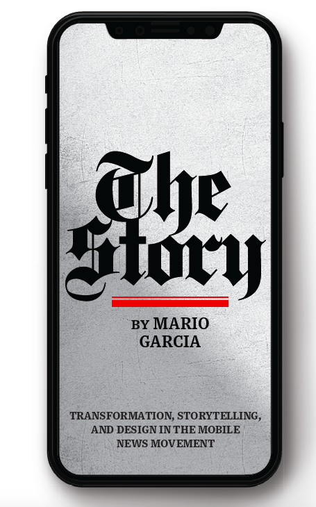
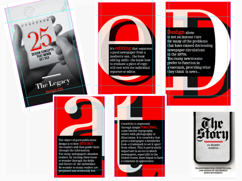
The newspaper remains the most powerful source of storytelling on the planet. But technology threatens its very existence. To survive, the Editor must transform, adapt, and manage the newsroom in a new way. Find out how, pre-orderThe Story by Mario Garcia, chief strategist for the redesign of over 700 newspapers around the world.
Order here:
https://thaneandprose.com/shop-the-bookstore?olsPage=products%2Fthe-story
An interview of interest
http://www.itertranslations.com/blog/2019/3/11/fd60ybflpvlqrgrpdp5ida5rq0c3sp
TheMarioBlog post #3072
