Tap is a feature of The New York Times that is all about tapping to swipe and see the next image in a very visual photo story.
I know that often print designers and editors consider the transfer of such great visual stories to print is quite difficult, if not impossible.
Not so, as we can see in this New York Times example.
Here is the link to the story:
https://www.nytimes.com/interactive/2018/04/30/us/detroit-come-back-budget.html
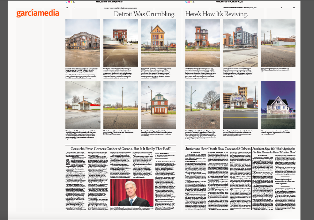
And here is how the story was adapted for print:
The takeaways
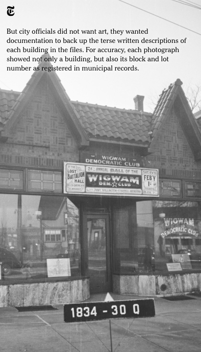
Notice that the print version continues to be a rather visual story. Other than the headline, there are none of the usual print story structure details such as summary paragraphs, heavy text. Instead, it is a very Instagram-inspired rendition of photo and text. You look at the image and you get the information. Not quite tapping but responding. I like it and recommend this treatment for many mobile stories that remain just that. Readers of print appreciate such stories on the pages of their newspaper. See below how the Tap feature looks.

Pre-order The Story
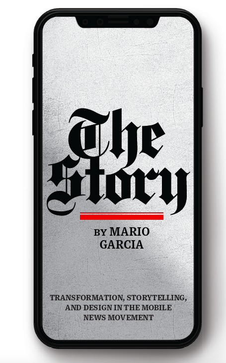
The newspaper remains the most powerful source of storytelling on the planet. But technology threatens its very existence. To survive, the Editor must transform, adapt, and manage the newsroom in a new way. Find out how, pre-orderThe Story by Mario Garcia, chief strategist for the redesign of over 700 newspapers around the world.
Order here:
https://thaneandprose.com/shop-the-bookstore?olsPage=products%2Fthe-story
An interview of interest
http://www.itertranslations.com/blog/2019/3/11/fd60ybflpvlqrgrpdp5ida5rq0c3sp
TheMarioBlog post #3013