This is the weekend edition of TheMarioBlog and will be updated as needed. The next blog post is Monday, April 12.

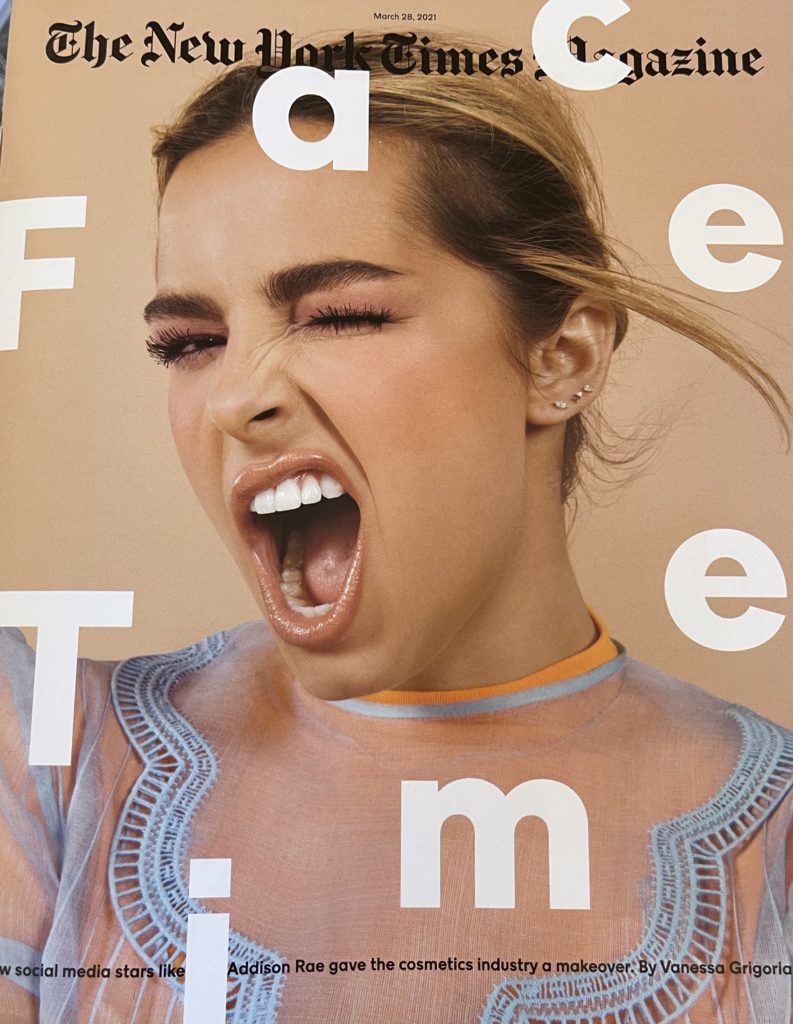
I always enjoy seeing the use of type as the main event, especially on a magazine spread, such as the one we see in the Sunday New York Times Magazine here.
The cover story is all about how the beauty industry has been transformed by social media stars.
Take a look at the cover, a playful arrangement of letters over a photo:
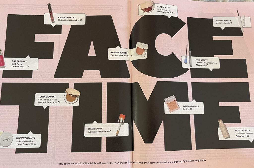
As we move inside to read the story, the opening two pages are a dynamic “type attack” with small illustrations that seem to hang from the letters.
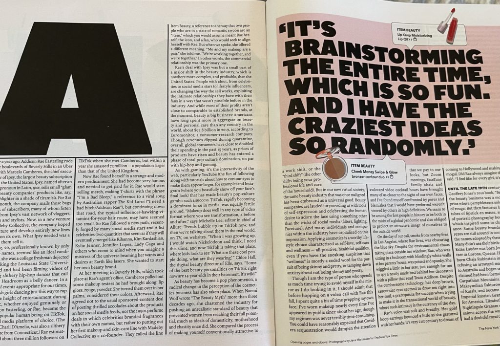
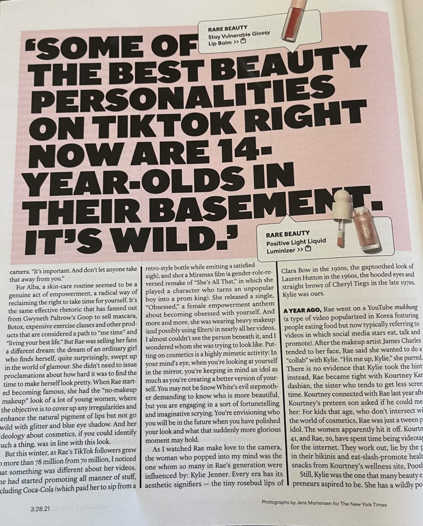
The rest of the story is told with bold initial letters like the one below, dominating the page as the only visual. The creative director here, Gail Bichler, opted for a bold sans serif font.
The cover image and the type as protagonist strategy convey a sense of irreverence that is appropriate for the content here.
These are pages that play 76 trombones, a parade of bold type coming down for the reader. It works here.
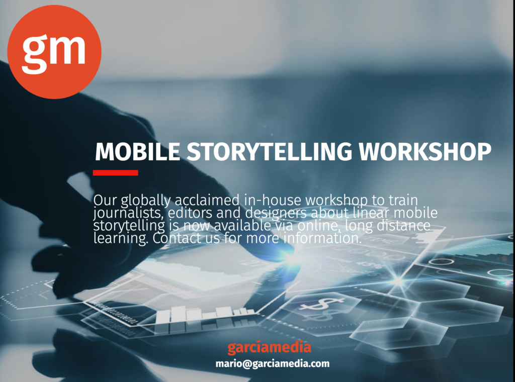
Our mobile storytelling workshops now available remotely
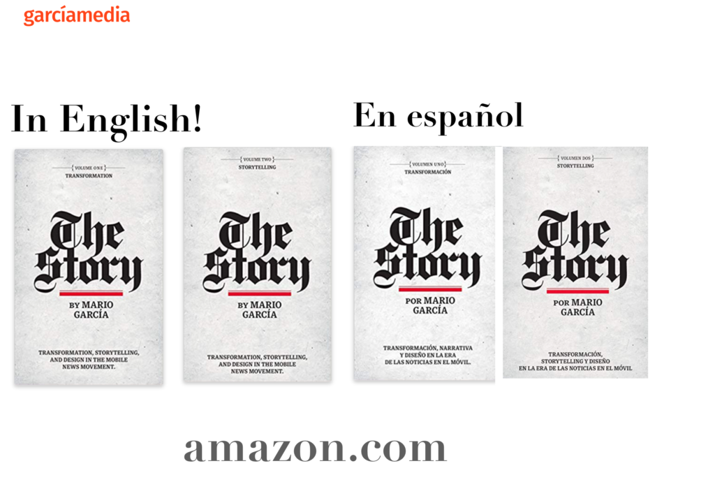
Professors: get your review version of The Story on time for fall classes
As an academic, I know the importance of having the right tools to advance our students, especially on the important subject of mobile storytelling. Please drop me an email if you would like to sample The Story in its digital edition: mario@garciamedia.com
Start writing or type / to choose a block
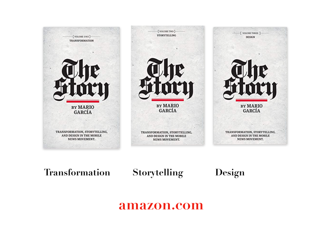
The full trilogy of The Story now available–3 books to guide you through a mobile first strategy. Whether you’re a reporter, editor, designer, publisher, corporate communicator, The Story is for you! https://amazon
TheMarioBlog post # 3304