TAKEAWAY: It is, by all standards, an iconic newspaper: USA TODAY has inspired a generation of journalists and designers globally with its color, use of graphics and short stories. Now, 30 years later, it unveils its major redesign of consequence Sept. 14. This week, TheMarioBlog will take a look back and reminisce about USA TODAY and how it has forever changed our idea of newspaper design. Part 1: We chat with J Ford Huffman, who served as one of USA TODAY’s editors from the start.
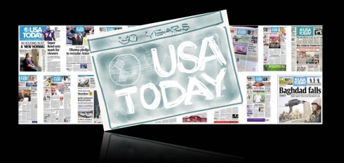
USA TODAY is planning a major relaunch of its newspaper, website and mobile platforms, complete with a new logo this Friday, September 14, the day before the newspaper turns 30.
In anticipation, I have decided to devote TheMarioBlog this week to highlight the impact that USA TODAY has had on the way we look at newspaper design and visual storytelling. To that effect, I am talking to those who were directly involved with its creation, as well as people in our industry, veterans and newcomers, for their assessment of how this iconic and game changing publication carved a line in the timeline of newspaper design history: before and after USA TODAY.
A chat with J Ford Huffman, former USA TODAY editor
A chat with J. Ford Huffman, former USA TODAY deputy managing editor. When he signed on in December 1980, Huffman became the first Gannett “loaner” assigned to help create a national newspaper. Two weeks later he arrived at Gannett News Service (GNS) on the 11th floor of 1627 K Street in Washington, and for days the only other person in the room was Ron Martin, later the paper’s first executive editor. During 29 years with Gannett Huffman was managing editor of two newspapers and GNS’ features, graphics and photography networks, and he was a deputy managing editor for design at USA TODAY. From Washington, D.C., he consults as a strategic editor, designer and manager.
Two questions for J Ford:
Mario: This is the first redesign of consequence in 30 years for USA TODAY, a newspaper to which you devoted many years of your career: What are your expectations of this new design?
“I’ve had high expectations for the paper since it was merely an idea. I was the design director (sans title) of the first two prototype editions, which were printed in the spring of 1981. At the startup in 1982 I was a content editor in Life. In 1999 I returned to the newsroom as a deputy managing editor with responsibilities including recommending the design and art direction of page one. Since December 2007, I’ve worked with staffers at Gulf News in Dubai, at Hindustan Times in India and elsewhere, and in my travels I’ve seen how USA TODAY continues to be recognized and respected. So I’m eager to see the new and different ways USA TODAY will use to attract and keep readers and advertisers.”
Mario: You are no longer involved in the day to day of USA TODAY: if you were, what would you be promoting in this new look for the newspaper?
I’d try to remember to sell the song and not the singer. Content, in words and in art, sells and tells. I would promote distinctive and exclusive information that can appeal to and retain smart readers on any platform—when effectively organized and displayed and promoted.
Looking at some of J Ford’s USA TODAY memorabilia
__thumb.jpeg)
J. Ford Huffman, speaking in April this year about today’s news media in an illustrated speech titled “A heartbreaking, heart-warming world of staggering potential” at Rochester Institute of Technology.
Once upon a time in 1981….
Early logo sketch
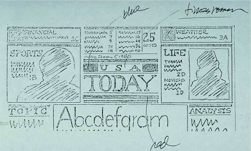
J Ford Huffman: This sketch—one of a couple hundred—was done at Gannett News Service’s old headquarters on K Street NW in downtown Washington. When I found this copy of my sketch years later I was amazed at its similarity to the structure of the top of the current page one: Centered logotype and nameplate with promotional space—later dubbed “ears”—on either side. The idea is an early one, done when ideas about the architecture of the page and the paper were still developing.
Earliest prototype of USA TODAY
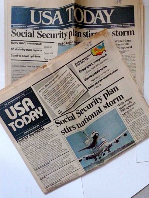
J Ford Huffman: These two prototype issues were printed in June 1981 and mailed to newsmakers (justices of the Supreme Court were on the list) and news leaders. The logotypes and nameplates were from Young & Rubicam advertising agency. The horizontal nameplate’s typeface was too decorative and the now-familiar rectangular nameplate’s typeface was too casual, too 1970s. The two did not survive.
A front page from 2006
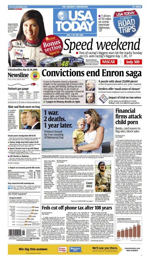
J Ford: Memorial Day weekend traditionally had strong sales, in part because of USA TODAY’s advance coverage of the two major motor-sports events. Multiple above-the-fold entry points—a must on a street-sale newspaper—include this 2006 page’s Enron story told in display type. Also of note: Two prominent images of women. USA TODAY always tried to show the diversity of its readership. On this page, Dash Parham was design editor and willing to bring synergy to any layout effort. The late Bob Fleming was content editor, and he recognized the value of telling stories in non-traditional forms.
The way we sketched…
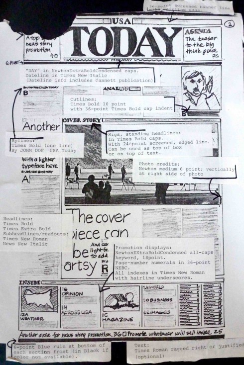
J Ford Huffman: This cut-and-pasted, felt-tip and typewritten sheet probably is the first USA TODAY style guide and was distributed March 2, 1981, to key prototype section editors Ron Martin, John Bodette of St. Cloud (Minn.) Times (NEWS), Dick Thien of The Argus-Leader in Sioux Falls (S.D.) and John Bannon of The (Wilmington, Del.) News Journal (SPORTS), Tom Curley of Gannett corporate (MONEY), and Sheryl Bills of The Cincinnati Enquirer (LIFE).
From the memo attached to the style sheet:
“For interim prototype purposes, here is a brief guide for typographical style. (Our typesetter will eventually include the Times Roman faces.)
“Layouts? Modular. Headlines? Flush left. Other than these two basic rules, be as creative as you like.
“Rules? Use 1-point rules.
“A note of caution: These guidelines are , I repeat , for interim, prototype-edition purposes. Much could change. But (the guidelines) should help us in doing pages to get a feel for the newspaper’s total design. Much of what we end up with: More extensive uses of rules, style of type, etc., will depend on the flexibility we discover while working on page mockups.
“P.S. With a 55-inch web, our working page width is 78.6 picas. Standard column width is 15 picas.”
Across the states
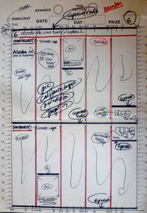
J Ford Huffman: The “Across the USA: News from every state” was an early idea that always had high readership and affectionately (or derisively, depending on the staffer’s perspective) termed “the states page.” This is a 1981 dummy sheet for the first page of an idea for a double spread that divided the USA (never “America”) into four sections including thumbnail maps.
Industry experts reflect on USA TODAY’s 30 years
Every day this week, I will be talking to respected people in our business about the effect that USA TODAY had in their work.
Joe Zeff, Joe Zeff Design
Joe: Make USA TODAY relevant today to mobile users
I remember the first USA TODAY as it if it were yesterday. It arrived in a futuristic honor box with rounded corners, so different from the squared-off boxes that anchored most street corners. This was a time when people scanned honor boxes the way they look at their mobile phones today, for a quick read of the news. Just as the box was different, so was the newspaper inside. Vivid color. Infographics. Sections.. Weather. Tightly-edited articles that did not jump. Game changers all. And the biggest game changer, the concept of a national newspaper.
Before there was an internet bursting with real-time news and Twitter feeds, there was USA TODAY. It was ESPN before there was ESPN and The Weather Channel before there was The Weather Channel. And it set a standard for young designers like myself. As a news editor at the New Castle News in Pennsylvania, I’d design each day’s front page with larger newspapers like USA TODAY and The Pittsburgh Press in mind, knowing I’d have to line up against them in the newsstand the following day. Other than USA TODAY, design inspiration came from week-old Sunday editions of the Detroit Free Press and The Washington Times that I’d buy at a bookstore and year-old contest entries in the SND annuals. But USA TODAY was in your face, and part of your day, every day. There was nothing like it.
USA TODAY was relevant then. Today it is much less so. For those staying in hotels who find a copy outside their door, it is valuable. But for those who live in a world where information flows freely and instantaneously through phones, browsers and tablets, it is no longer needed. Yet its circulation remains strong, 2.5 million plus, larger than the national newspapers that followed its lead. To redesign USA TODAY is to tinker with a formula that still works, like reformulating the recipe for Coca-Cola. Al Neuharth, Richard Curtis and George Rorick created something 30 years ago that, despite the longest of odds, remains viable and valuable today.
I would focus efforts on making USA TODAY as relevant to mobile users today as it was to newspaper readers 30 years ago. A web application has the potential to reach many more consumers than a printed newspaper in 2012, and beyond. The newspaper remains a brand ambassador for USA TODAY, and it sets forth the puzzle pieces that can be reconfigured to establish digital products that harness the power of its brand. Their future is decidedly digital, as is all of ours. But the visual identity of the print product is the glue that holds the puzzle together. A new logo and identity has the potential to detach the new product from the old. For better, or for worse.
Juan Antonio Giner, Innovation
Juan Antonio: US papers don’t invest in first class presentation anymore
USA TODAY was the last BIG IDEA in U.S, newspapers, and in reality USA TODAY was the only European newspaper in America: short pagination, full colour, national distribution and street sales. Daily front page graphics, George Rorick’s weather map,. short stories, and no jumps except for the four cover stories were very hot changes.
Spanish newspapers have started at this time its own design revolution, mainly El Pais with Reinhard Gade and Julio Alonso, El Mundo with Carmelo Caderot and Mario Tascón, and La Vanguardia with Walter Bernard, Milton Glaser and Carlos Pérez de Rozas.
Our first design and infographic workshops with the SND Spanish Chapter with Mario Garcia, Peter Sullivan, Ricardo Bermejo, Luis Infante, Nigel Holmes, John Grinwade, John Monahan, Jeff Goertzen, Walter Bernard, Roger Black… and the foundation of the Malofiej Awards did the rest.
American newspapers were at this time the role models for good design and graphics, and USA TODAY was very much admired, but not anymore. Today the best newspaper design is done outside USA, mainly because American newspapers are dying and don’t invest anymore in first class presentation.
Dr. Pegie Stark Adam, Stark Adam Design
Pegie: I could not believe how many USA TODAY copycats appeared everywhere
I was in graduate school when it launched and after seeing the color, the sharply written stories, and the dynamic design, I thought that there was hope for newspapers! I was teaching news design during that time and the examples of great newspaper design were few and far between. It was around the beginning of the Society of News(paper) Design and we were all eager to get newspapers moving in the right direction. USA TODAY showed us that YES, newspapers can have pizzazz—in content AND design!
USA TODAY also gave birth to fabulous informational graphics under the direction of George Rorick and Richard Curtis. That innovative weather map, those ‘how it happened’ graphics—they started a major trend that helped the reader understand complicated information.
I loved the color in USA Today and especially liked the way things were color coded. I believe color is information and can enhance, engage and guide the eyes of the reader. So the introduction of so much color in USA TODAY was a glorious and welcome addition to the newspaper design arena. At times I thought there was too much color when it was used as decoration and not information. But I thought, hey, why not! This is a revolution.
It changed the way I taught: I showed students that it CAN BE DONE. I think that was a powerful message that USA TODAY gave us. The naysayers in the newspaper business who said color was not serious, that color could not be printed on every page, that you could never get good color on newsprint, that you could never get color to print in register were all shown a new way of thinking, a new way or creating, a new way of designing and a new way of producing. This opened the door to new and better ways to design.
Isn’t it interesting that there were so many USA TODAY copycats around the world? I remember getting consulting jobs where the client wanted the USA TODAY look. It became a trademark.
I am delighted to hear that USA TODAY is redesigning and I can’t wait to see the end result. Surely it will be another innovative step for all of us to see.
Rodrigo Fino: Garcia Media Latinoamerica
Rodrigo: Great influence for Latin American newspapers
To me, USA TODAY has clearly marked a before and after in many aspects of newspaper design. Among them: the use of color coding of sections, which USA TODAY emphasized as its own brand element, as it became an organic part of its design for an American newspaper.
Without a doubt, USA TODAY got ahead of the rest and influenced what came after its launch. However, the newspaper’s biggest contribution is in the area of content, such as the snapshot. To this day, many newspapers have not come close to doing it like USA TODAY.
In Latin America it is difficult NOT to find a newspaper that has not been greatly influenced by USA TODAY. I would even dare say that, through its use of color, photography and graphics, it is the most Latin of American newspapers.
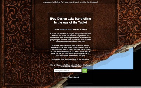
Sign up to get information on my new digital book
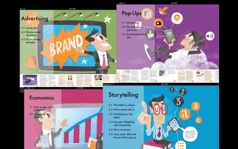
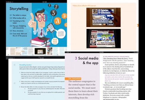
Assorted screens from the book: top, chapter openers all of which are color coded and carry illustrations by Luis Vazquez, of the Gulf News of Dubai; second image, opener of Storytelling chapter, and two inside screens.
As we get closer to publication date for The iPad Lab: Storytelling in the Age of the Tablet, we are now set up so that you can give us your email address and you will automatically be informed when the book is ready for download.
Now you can leave your email address so that you will be updated and informed the moment the book is read for download.
Simply go here:
http://ipaddesignlab.com
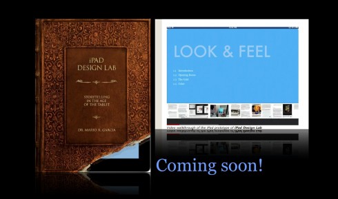
Video walkthrough of the iPad prototype of iPad Design Lab
Chatting with Tyler Brulé on Monocle Radio’s new show, The Stack
Listen to my chat with Tyler Brulé about future of print in Monocle Radio’s The Stack here:
http://www.monocle.com/24/shows/stack/
SPD: Speaker Series Begins with “News You Can Use”
(Joe Zeff Design Illustration, courtesy of SPD)
Tickets are now available for the Society of Publication Designers’ first Speaker Series event of the fall, “News You Can Use,” scheduled Sept. 10.
For more information:
http://www.spd.org/2012/08/speaker-series-begins-with-new.php
SND Scandinavia Space 2012 conference
Still time to get a spot to attend the SNDS conference in Copenhagen, Sept. 27-29;
For more information:
SNDS workshop ever. Read all about SPACE 2012 here:
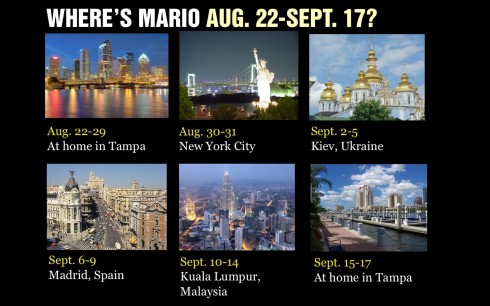
Mario Garcia’s upcoming speaking engagements:
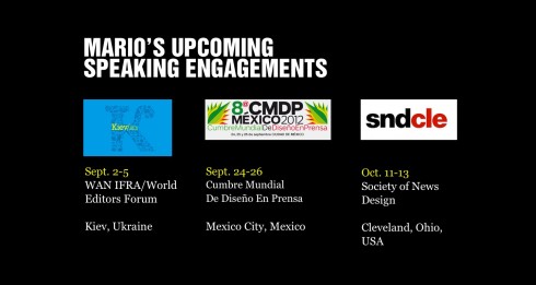
Cumbre Mundial de Diseño en Prensa 2012: Mexico City; September 24-26
http://www.cmdprensa.com/mx2012/
SND (Society of News Design) Cleveland; Oct. 11-13
http://cle.snd.org/
1st Middle East News Design Conference
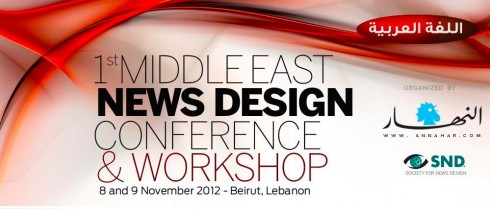
It promises to be a great program, and a historic one, too: the first SND Middle East gathering. Put it on your calendars: November 8 & 9, in Beirut, Lebanon. Sponsored by An-Nahar and SND.
For more information:
http://www.snd20events.com/conference/