Updated Tuesday, Nov. 17, 2009, at 05:23 EST
TAKEAWAY: Report from Dubai and follow ups on lower case versus capital letters for branding and online refers. also Philly, what next?
Report from Dubai
Just in case anyone wonders: this is the best time of the year to pay a visit to the United Arab Emirates. November brings cool breezes in the afternoon and evening, and comfortable beach weather during the day. Even the water feels cool and refreshing, as opposed to July, when the humidity is oppressing, the temperatures high and a dip in the sea is more like jumping into a bowl of hot bouillon.
But, of course, I am not here to play tourist. Instead, I pay one of my regular visits to the Gulf News team. This time, we concentrate on daily observations of how “convergence” or the “hub concept” continues to work.
It is not easy for any media organization to move from the traditional concept of “print as king” to the more realistic one of “every-platform-telling the story as it can best”. At the Gulf News this is work in progress.
My job this week: to sit through the various planning gatherings throughout the day, and to observe the discussion among editors, to see how much multi media plays a role in the daily dialog about stories, and provide my observations.
Yesterday’s take: the 1 pm meeting was still too print oriented. We must look for the right language to use, and to not make ONE MEDIUM dominate any of the planning meetings. Section editors are still pitching “the story”, not so much its multimedia potential.
Newspapers in Dubai: the update
This is catch up time as I had not been in Dubai since July.
The National: The beautifully designed The National continues to be a showcase of wonderful looking pages. It helps that there are hardly any ads in this newspaper, providing the editors and designers with very wide open canvasses on which to design the attractive packages that appear on almost every page.
The National is now almost two years old, and its weekend edition just turned one, prompting the editors to celebrate the landmark birthday with changes such as more variety on Page 1 (which, by the way, has become newsier and less featury), a revamped travel section, and, overall, in my view, more text and perhaps less of the white space that so clearly distinguished it when it first appeared.
The National reports that it has “doubled its reach over the last year”, prompting it to develop a campaign around the catchy phrase “twice as much to think about”.
To view The National: www.thenational.ae
Emirates Business: Here is the biggest surprise for me as I look at the newspaper landscape of the UAE. For one thing, this newspaper used to display 24/7 prominently as part of its brand; however, there is no longer a weekend edition, so the 24/7 is now only a small element of the logo.
I am told that the weekend edition is not permanently gone, only in temporary retirement, as it is being retooled. So, the newspaper may reclaim its 24/7 part of the title again.
I notice that the front page of Emirates Business now is very text oriented; gone are the mega graphics and the more magazinish look. Inside, however, the newspaper retains its well organized pages, with good graphics and a sense of hierarchy.
Remember the H in Handelsblatt?

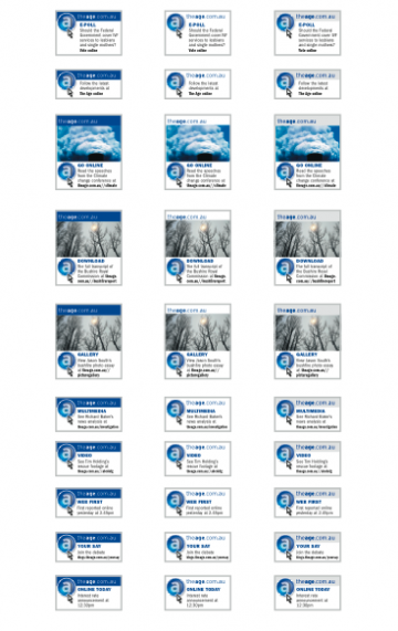
Experiments carried out at The Age, of Melbourne, Australia, with the letter “a” for online refers.

The Age uses all capitals for its print logo, but goes downstyle all the way for its online branding
Last week, just about the time Handelsblatt was ready to launch in Germany with a new compact format, we faced a last minute controversy
: could the Internet refer lines use a capital H, as it is on the logo of the newspaper, or do we relate Internet to lowercase, in which case a lowercase h would be more approrpiate. As you recall, the capital H had the majority of the votes from many of you who reacted.
Today, Steve Foley, deputy editor (New Media and Production), The Age, of Melbourne, Australia, chimes in with his own experiences on the subject:
Steve writes me that the subject of caps versus lower case for online refers became a topic of much discussion at The Age as they tried to come up with a solution.
Upper case or lower case?
Should the letter be linked to the paper’s masthead or should it tie in the website’s masthead? In our case they are different.
Online use a completely different branding – all lower case. I’m happy to share two versions we developed: The capital ‘A’ button from the print masthead and the lower case ‘a’ representing digital were both designed by our head graphic artist Jamie Brown.
In the end, writes Steve, ” we went with the small ‘a’’ and they are used extensively throughout the paper – in news, world, opinion, business and sport.”
One major difference here: The Age continues to use all caps for its traditional print nameplate, while going all sans serif lowercase for the online branding.
Thanks for sharing, Steve. Looks nice and crisp.
As for Handelsblatt: the issue has not come up with readers at all in the two weeks since the launch. Not that I am surprised.
Meanwhile, in Philly….
So many of you write to ask me what the next installment will be in The Philadelphia Story. Well, don’t hold your breath out there. There will be an installment when the next chapter worth reporting about takes place.
For now, Reed Reibstein and I work on corrections, alterations and incorporating of suggestions made during our presentation last week. At the Inquirer, Ryan Davis and the project team works on their “homework”.
Brian Tierney continues to work with his investors, bankers and lawyers.
Work in progress.
Stay tuned.
TheMarioBlog post #422