The launch of a new project is always a reason to celebrate. Each project launch includes its own characteristics that make it special and/or memorable. However, in the case of the Hindustan Times, my project #729, the “memorable” part is very likely to remain so for a long time: the second project that I have launched in the midst of a pandemic that has paralyzed the world–the first one for me was Germany’s Handelsblatt, July 6.
However, this health crisis has made us all resilient and I am so proud of the entire HT team, and especially its creative director, Anup Gupta, and his entire team of very talented young visual journalists, for keeping focused as we completed the last leg of the journey of this transformation long distance, across the oceans, via ZOOM, without skipping a bit.
The result? A newly designed and rethought Hindustan Times that adapts to the way our audience consumes news today.
I was in Delhi for my last in-person visit with the HT team in January, working on the new concept, offering instructional workshops both about storytelling and design and planning for the new HT that readers got to see today, August 31, 2020.
This is not my first involvement with the HT, as I have worked on previous redesigns in 2009, as well as the creation of its sister newspaper, the financial daily, MINT in 2007.
The HT transformation
More than a visual redesign, our work with the team of the HT was one of total transformation from the way stories are told across platforms, greater unification of the digital and print components, a review of how stories travel in a 24/7 news environment and, yes, a rebranding, which, in my view, is one of the highlights of this important project.
Working closely with editor-in-chief Sukumar Ranganathan, we conducted workshops to train journalists/designers about new ways of telling stories, differentiating between print and mobile stories, accepting that one size does not fit all. We were aware, at every step, that this was a gigantic transformation for a newspaper with a rich history that began 96 years ago, when Mohandas Gandhi stood in front of a three-story building in a grain market on what was then called Burn Bastion road, not far from the Old Delhi Railway Station. Inside it, a Dawson Payne Hand Fed Stop Cylinder Press and a Miele Press — the only makes available in Delhi at the time — were crammed into two rooms on the ground floor. The Mahatma then proceeded to inaugurate the Hindustan Times press.
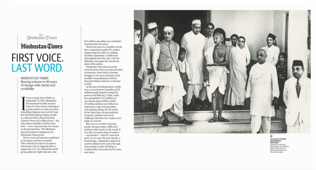
“Every word and sentence published in the paper should be weighed.
There should not only be no untrue statements, but no suggestio falsi or suppressio veri,” he advised the small group gathered. Eight days later, the first edition of the HT appeared.
What a fabulously rich history upon which to build the Hindustan Times for the 21st Century. Also, what a challenge and responsibility for those steering the wheel of the HT today. We never lost sight of history as we planned for today and tomorrow.
So, what is new and noteworthy about this transformation?
In the words of editor Sukumar Ranganathan:
“This is not your traditional relaunch that only addresses the visuals. We have reviewed how we tell stories across platforms, training all our journalists that in a multi-platform environment, readers access information at different times throughout the day, and our journalism and story presentation must adapt to the realities of today. We are proud of the work our team has done and look forward to how this transformation will allow us to serve our readers better each day.”
Rebranding
Here is an example of shaking hands with the rich past of the Hindustan Times, while creating the type of journalism that belongs in the present. The team of the HT came to the conclusion that it would be best to return to a more classic rebranding as the newspaper approaches its centennial in 2024.
Here you see the new branding, which includes a beautifully redrawn Black Letter, which we commissioned Tobias Frere Jones to carry out.
There is also a crest to extend the branding, emphasizing the HT drawn from the main nameplate above, and which will facilitate extension of the brand via mobile devices.

Here you can see how that crest inspires branding throughout the many sections of the newspaper:

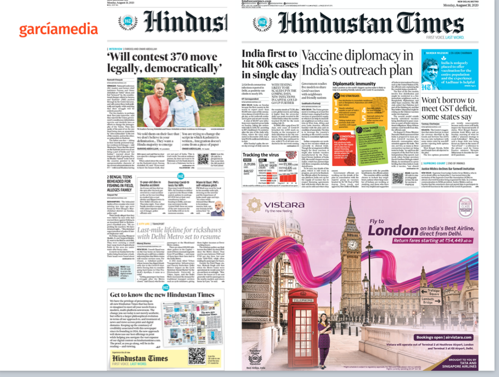
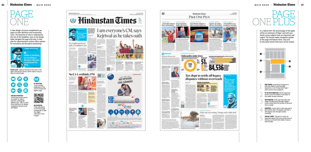
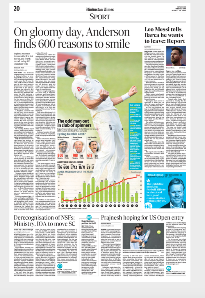
The front pages
The front page of a printed newspaper edition today should be newsy, informative and attractive. Our emphasis as we rethought the print product was simple:
–Few readers come to the print edition of a newspaper for breaking news.
-Let print do what it can do best: display large photos and graphics.
-Avoid brief items and emphasize longer pieces: Let readers who come to print sink their teeth into meaty stories. We know that readers reading a printed newspaper are more disconnected than those who read on mobile devices. Take advantage of that and offer in-depth stories.
-Make navigation easy: Readers who move from one platform to another bring with them the ease of navigation that they are accustomed to in digital offerings. Don’t make the reader suffer to find content, and provide a good summary page (see our Page 2 treatment).
In the case of the HT, we had to beware of one good challenge: advertising space on Page On can change from day to day and even on the first day, a half page ad dominates as you see here. Notice also that the HT makes good utilization of “flaps” to carry full page advertising on the last page of the section.
Here are various front page models, including the weekend Page One.
And how the concept carries to special editions as one prepared exclusively for schools:
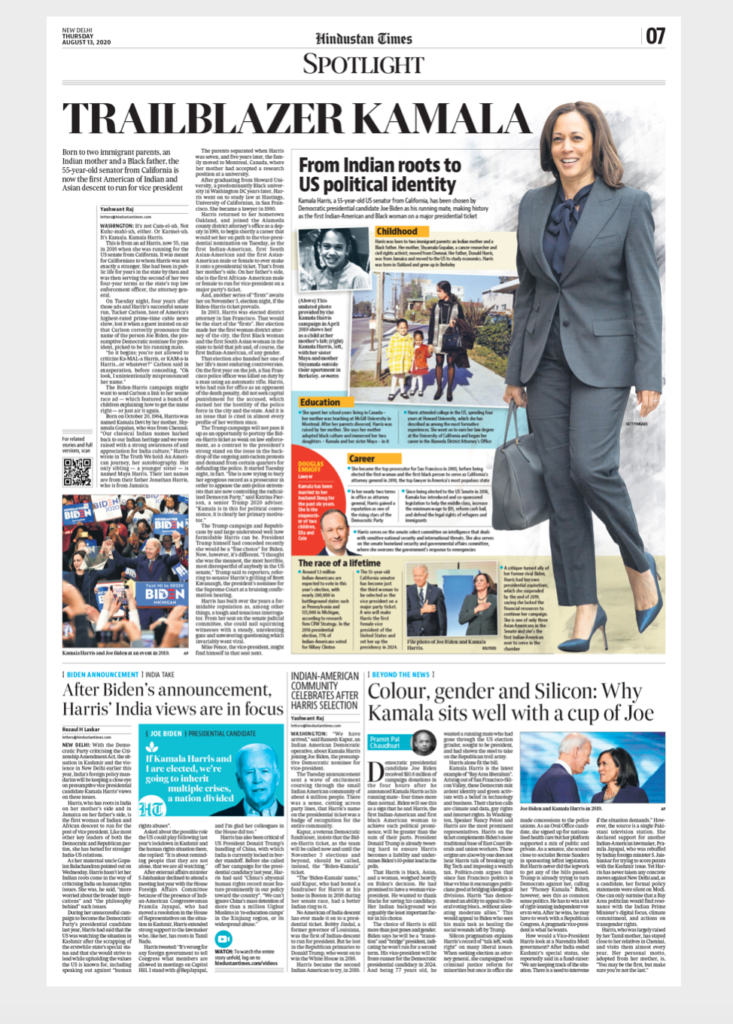
Inside Pages
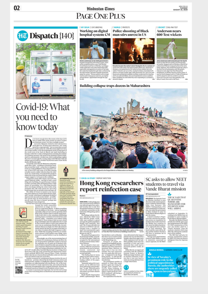
The same philosophy applies to key inside pages starting with Page 2, which is a “newspaper inside a newspaper” type of concept, titled Page One Plus, offering overviews for the reader in a hurry.
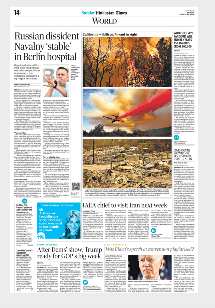
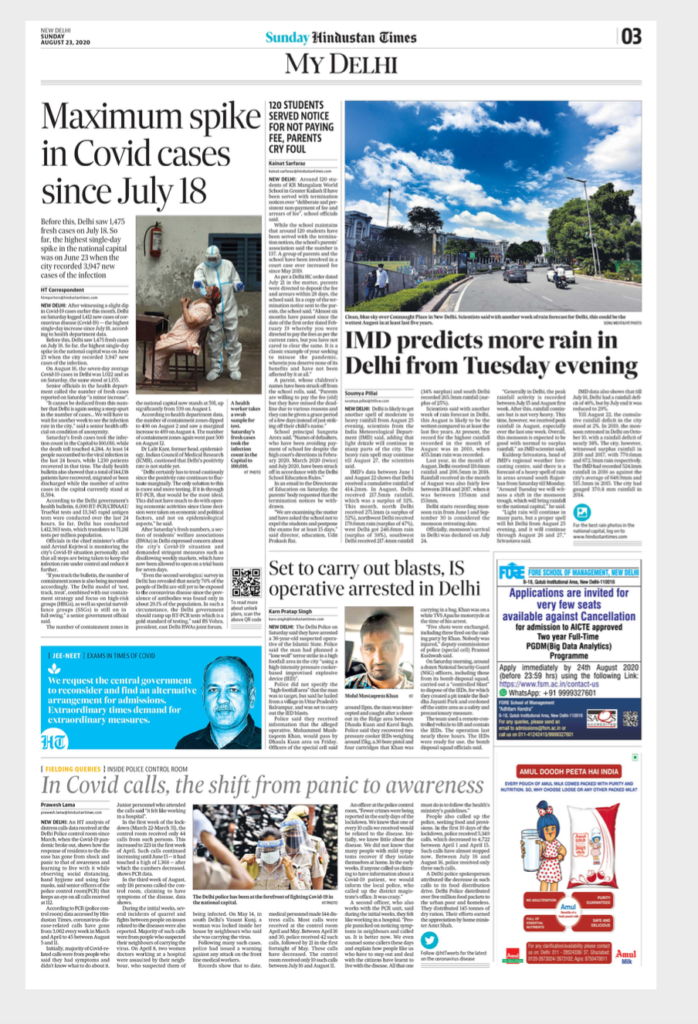
Other inside pages, emphasizing easy identification of content, longer pieces, larger images.

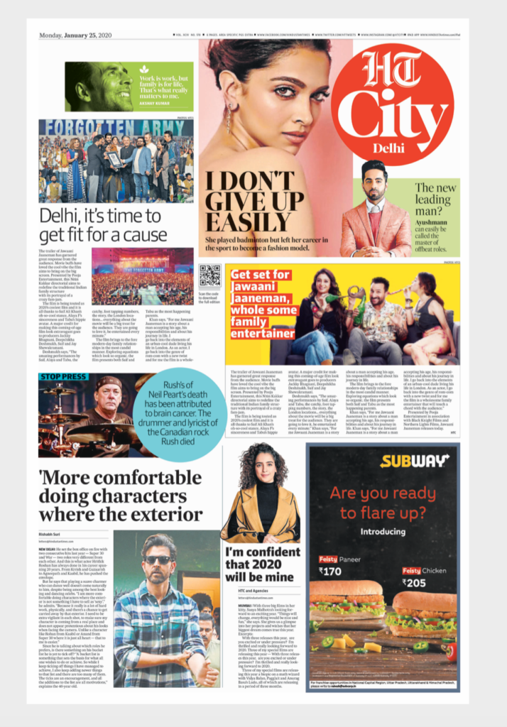
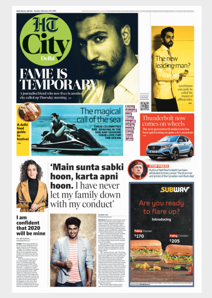
HT City
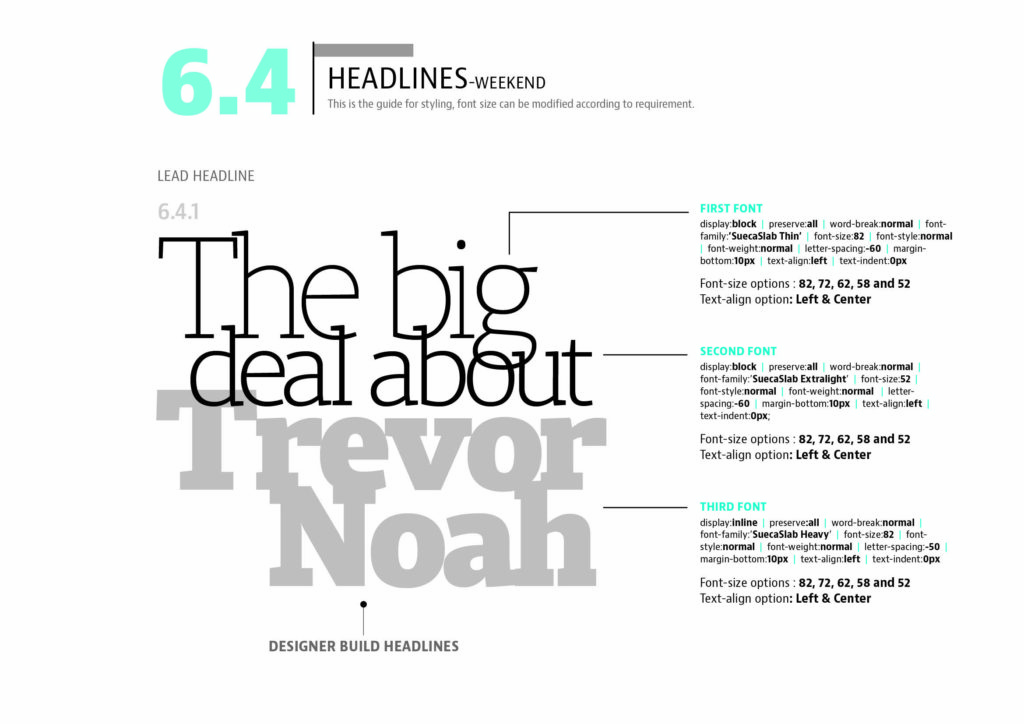
The weekend
It’s a more relaxed, magazine-like look for the weekend edition pages. It was wonderful to work with the young and talented designers who are part of Anup Gupta’s team in the creation of this concept.
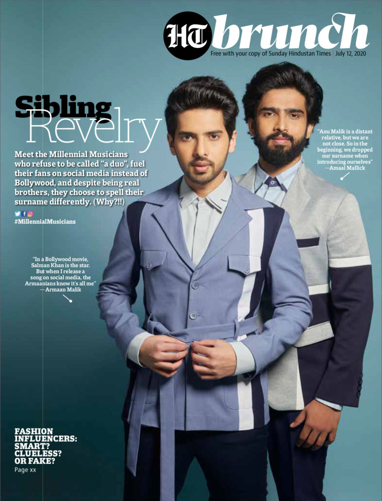
Brunch
The digital
Take a look at www.hindustantimes.com
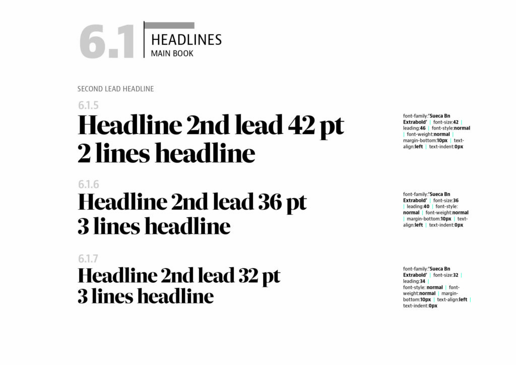
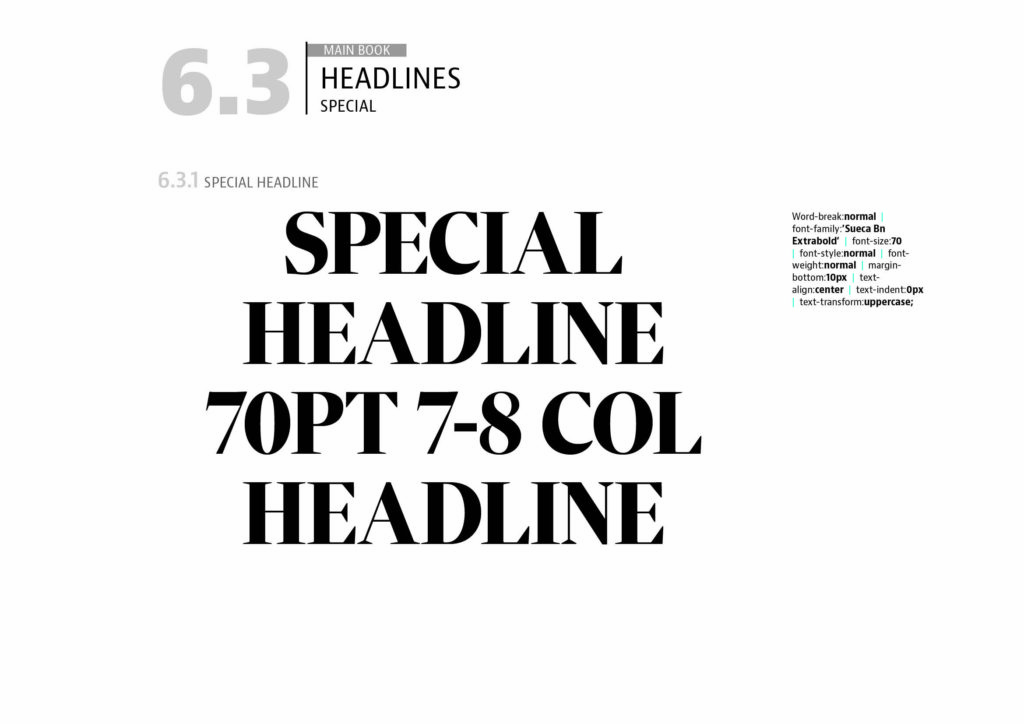
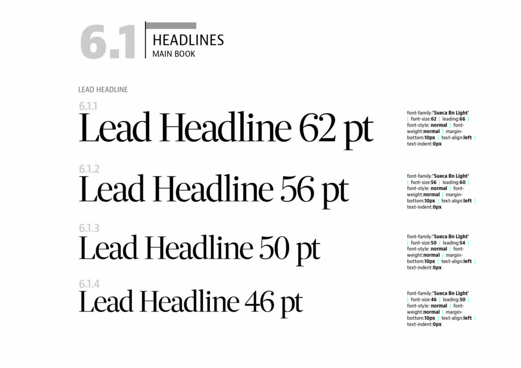
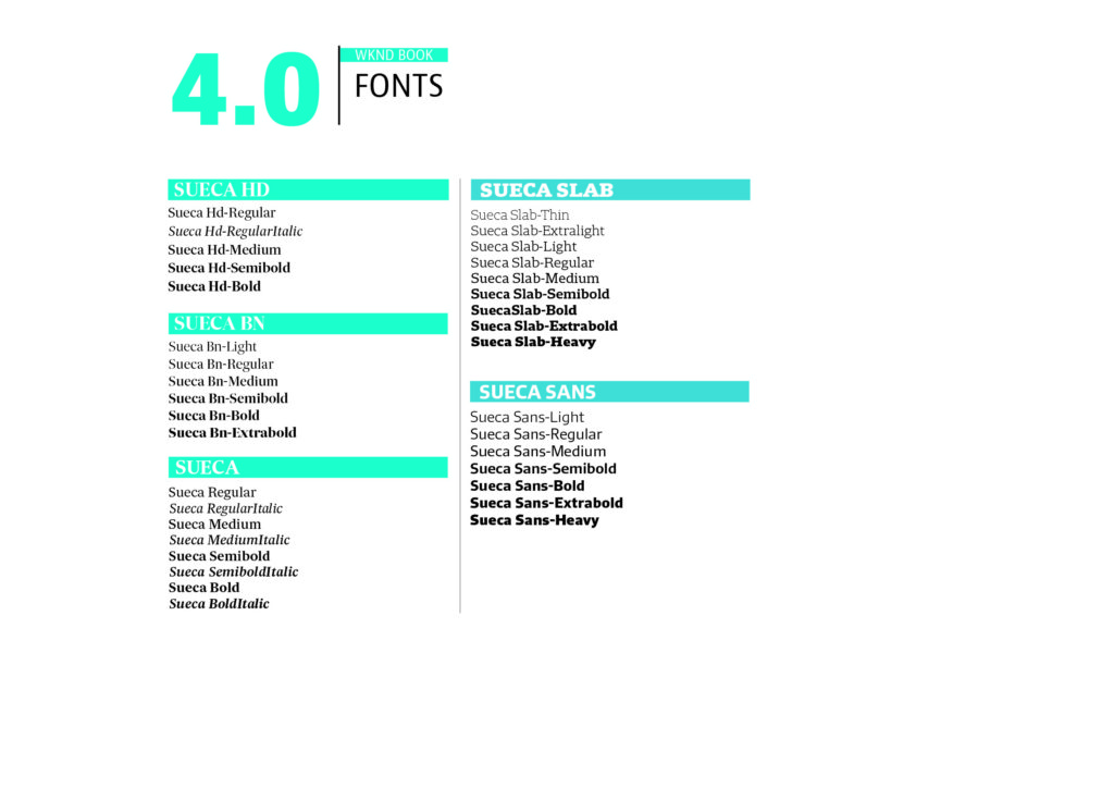
The type palette
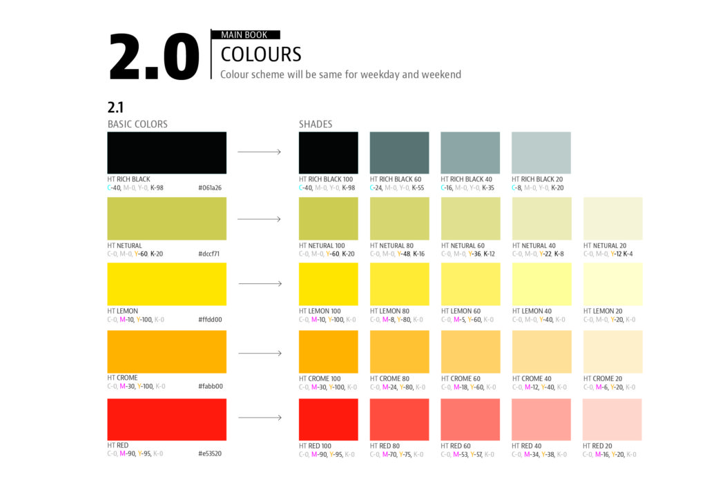
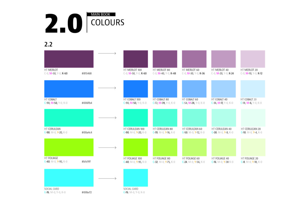
Color palette
Watch the first day intro video
Read about Handelsblatt redesign:
Professors: get your review version of The Story on time for fall classes
As an academic, I know the importance of having the right tools to advance our students, especially on the important subject of mobile storytelling. Please drop me an email if you would like to sample The Story in its digital edition: mario@garciamedia.com
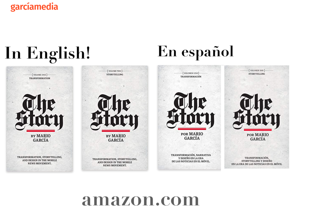
The full trilogy of The Story now available–3 books to guide you through a mobile first strategy. Whether you’re a reporter, editor, designer, publisher, corporate communicator, The Story is for you! https://amazon
Mario to keynote SND 2020
Honored to keynote this SND virtual conference, Oct. 1
TheMarioBlog post # 3253