This is the weekend edition of TheMarioBlog and will be updated as needed. The next blog post is Monday, August 10.
My intent was more historical than analytical when writing this week's blog post addressing some five design changes that are the most noticeable for The Wall Street Journal since Ruper Murdoch bought it from the Bancroft family seven years ago.
Yet, it apparently hit a nerve with some of our readers, and, the good thing: it makes us ponder out loud as to what happens to a redesign project once it is launched. What are elements of sustainability for a redesign? How does one guard against fools with enthusiasm who will see to it that changes are made, whether necessary or not?
Interesting and controversial subject, for real.
The Roger Black take
My dear friend Roger Black, one of the most prolific editorial designers in the business today, wrote:
These are the heartbreaks of being in the redesign business. I could not believe it when the WSJ summarily tossed out the historic design that you and Joe Dizney had created just a short time before. Only The Font Bureau, Inc. fonts and the apps remain to remind readers of that great effort.
For me, it was the Baltimore Sun, and the Houston Chronicle. Neither were perfect designs (clients being what they are), but each evoked the paper’s powerful history, and created an experience that was compelling and fun for readers.
The owners typically do not understand that design is an integral part of the brand, and that it is stupid to change a lasting brand suddenly. They think of a redesign as so much window dressing, a makeover, a facelift. No wonder they are struggling to survive today. Dow Jones, Tribune, Hearst do not fundamentally understand that design is the connection between their content and their readers.
Meanwhile, David Pybas, who worked at The Wall Street Journal as a designer, had this to reply to Roger's take:
Rupert has very little to do with what’s going on at the paper. Outside of the Editor in Chief, from there down is all old WSJ people.
How about the advertising?
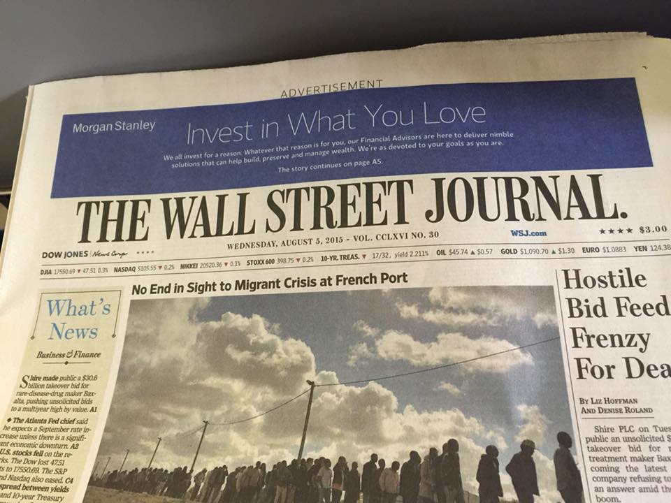
Joe Zeff , Vice President/Executive Creative Director, ScrollMotion , mentioned that advertising on the front page of The Wall Street Journal is also not very attractive:
Yuck. Advertising comes across as editorial, and entire front page under “Advertisement” rubric is confusing.
From Designer James Reyman
Designer James Reyman worked closely with us on the new design concept for The Wall Street Journal. In fact, we used his studio in Manhattan for a lot of the prototype work developed to present to editors.
Your point, Mario, about some of the interior pages looking accidental instead of planned is right on. The only thing I can think is that the pages are meant to be “friendlier” now. Bigger photos, louder headlines; more downscale, as you mentioned. We had really maintained the classic dignity of a business newspaper… while making it more accessible and easier to read.
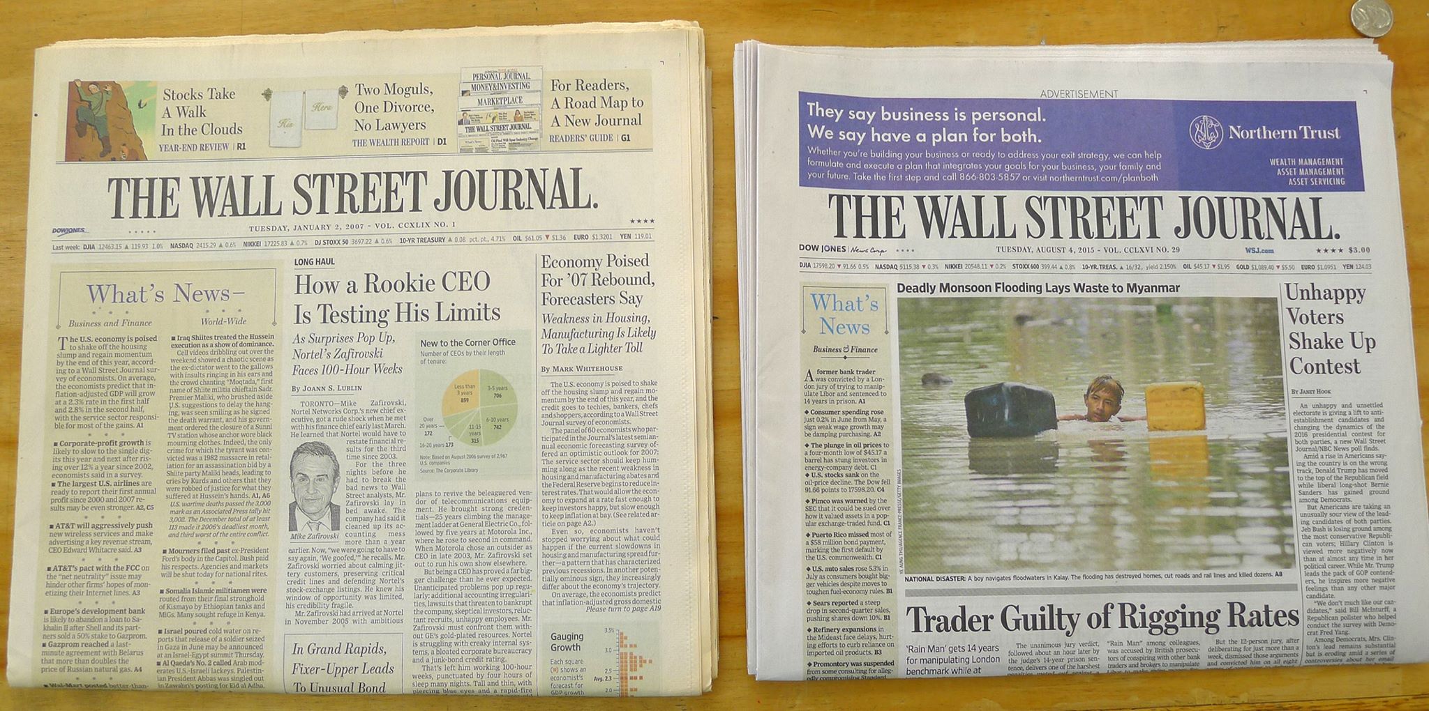
Our redesign of the domestic edition (1st issue of the redesign appears below on the left, 2007) had much less shouting on the cover than today’s (issue on right). The typographic hierarchy was less severe than it is now. There was an ad in the lower right corner of the paper but the skybox was there for navigation aids to help you find articles inside. Indeed, 5 columns on the left and 6 columns on the right. The paper from 2007 is faded a bit, unfortunately.
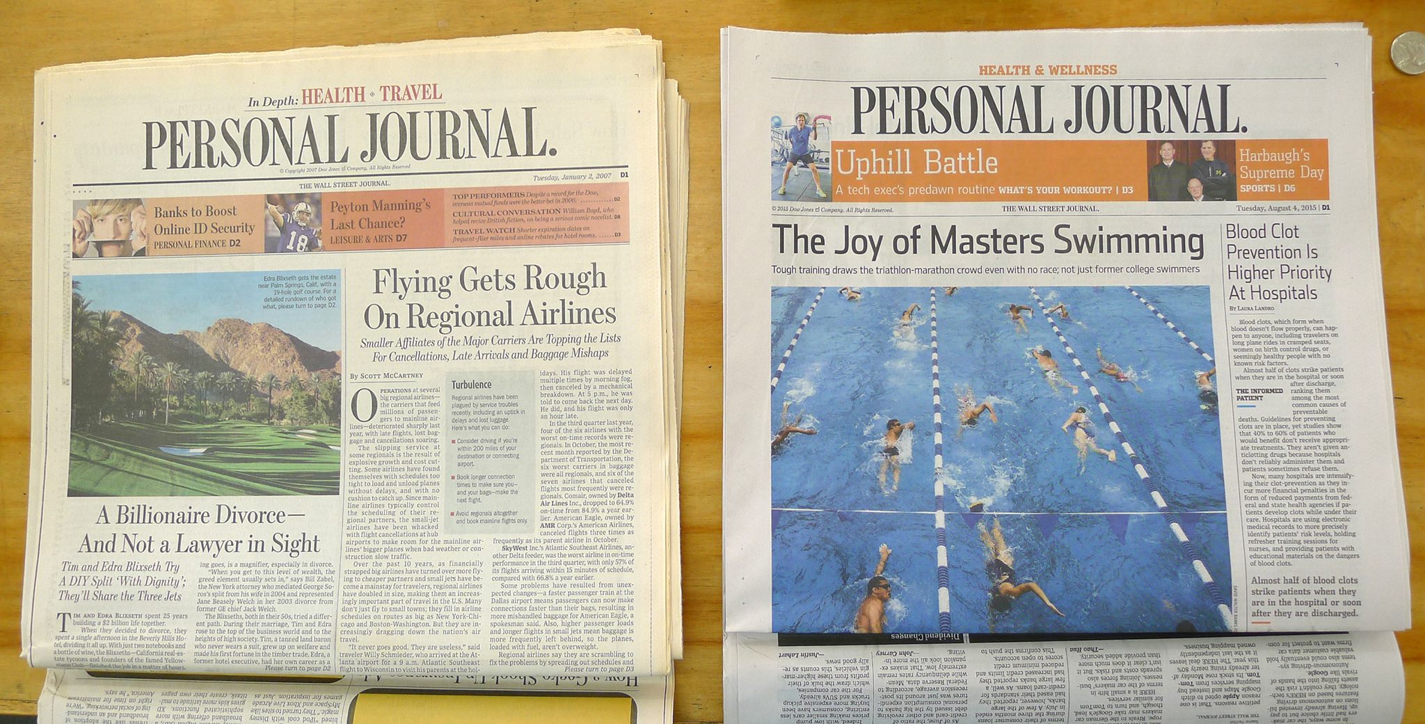
Our section covers maintained the typographic hierarchy we had used on page one (our redesign on left, 2007). The new issue (on right) has much larger photos and uses different typographic styles inside. Note the sans serif headlines.
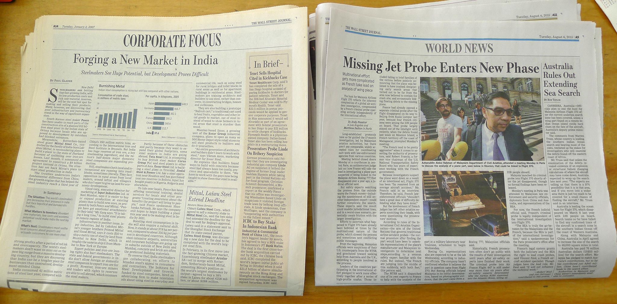
On the destination pages, we used the 5 column grid which was good. Once again, the typographic hierarchy was very clean and consistent. To me, it had a certain dignity that was consistent on every page. I love those destination titles. A good way to present business news. we designed an “In Brief” column for every destination page. We also used many navigation devices throughout the paper. See the little, “In Summary” box we created. That was a terrific idea. I don’t think they use it at all now. Also we had created the WSJ.com boxes that direct the reader to the website. I can’t find any in today’s paper. Mario, Look at that 5 line drop cap and small cap lead-in we used back then (on the left)!
How long do redesigns last?
It's difficult to put a number to the answer here. Some redesigns barely make it to the second year without many changes already in place; others, however, may last for decades. My experience involves both. As I have written often, not all projects demand the same schedule or logistics, nor do they start and finish the same way.
Redesigns —-nowadays I prefer to call the process a “rethink”, since the word redesign evokes images of things purely cosmetic, and that is definitely not what we hope to accomplish when we are invited to collaborate with a media firm that wishes to rethink itself totally to fit in the fast-paced environment of a media quintet digital world—go through a process that is full of logistical steps, including plenty of briefings to discuss goals, then testing to gauge reader reaction to new concepts, which lead to a final prototype that is implemented.
But changes always occur right after the product hits the streets —and digital products are no exception. We learn that things that tested well during the conceptualizing process simply do not work in the day to day operations. It takes a good six weeks for things to come to a point where the product resembles what it will be like for the long haul.
How long is a long haul for a redesign?
It depends on several variables:
1, How good is the styleguide that editors and designers are consulting to implement the process from day to day? A good styleguide is no guarantee of sustainability, but it is the best a team can have going forward, especially to hold staffers accountable.
2. How much ownership do editors and designers have of the project? Especially when a consultant is involved, if the local team does not feel that they own the project, that their ideas have been taken into consideration, then nobody will go the extra mile to protect its integrity.
3. What is the degree of daily corrections, postmortems conducted in the early stages of the implementation process? This is how one corrects and moves forward with good quality presentations. Learning from one's errors is a key to sustainability. Unfortunately, the consultant cannot be on the premises to perform evaluations, so each organization needs to motivate itself to schedule regular internal postmortems.
4. Finally, the most durable redesigns have good foundations typographically, architecturally and in terms of storytelling. There is nothing trendy about them, guaranteeing that they will last because they are based on functionality.
The parting shot on WSJ from Roger Black
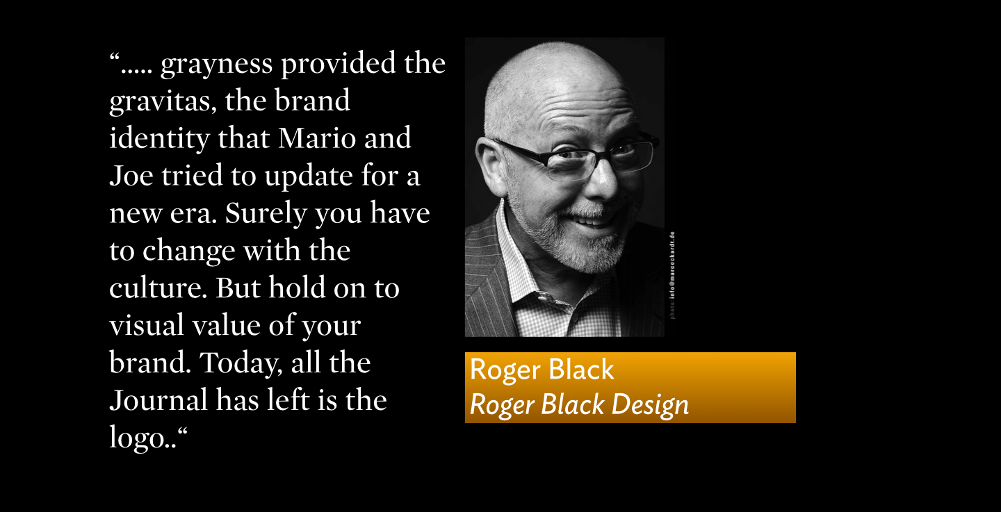
Ultimately what I miss in the WSJ was the texture of the old, 19th-century gray page. In the 50s, as much as a Brooks Brothers suit, carrying a folded one-section Wall Street Journal under your arm, identified you as a real businessman, a pillar of the community. And the community could be Ft. Wayne or Council Bluffs, but it meant you knew Wall Street. The selection of stories, anchored by the What’s News column with its careful hierarchy, provided the right content mix—every day.
Vertical was one key. Seeing inside yesterday a bad mix of overlapping horizontal stories (one with a wrong-font sans headline) and big, meaningless slugs for jumps, makes me feel I could be anywhere. But nowhere great. Verticality was the key to the legacy layout. But grayness provided the gravitas, the brand identity that Mario and Joe tried to update for a new era. Surely you have to change with the culture. But hold on to visual value of your brand. Today, all the Journal has left is the logo.
WSJ: The new What’s News App
The Wall Street Journal is targeting its loyal subscribers with its new news digest mobile app
The What’s News app, named after the front-page column of news briefs well known to regular Journal readers, will launch later this summer to subscribers and will feature a curated digest of 10 stories, refreshed regularly throughout the workday by a small team of editors dedicated to writing and updating briefs. The concept for the new app emerged out of a concerted effort by the news desk to “think digital” and, more specifically, to “think mobile.”
Numbers looking up in Australia for Sydney Morning Herald, The Age
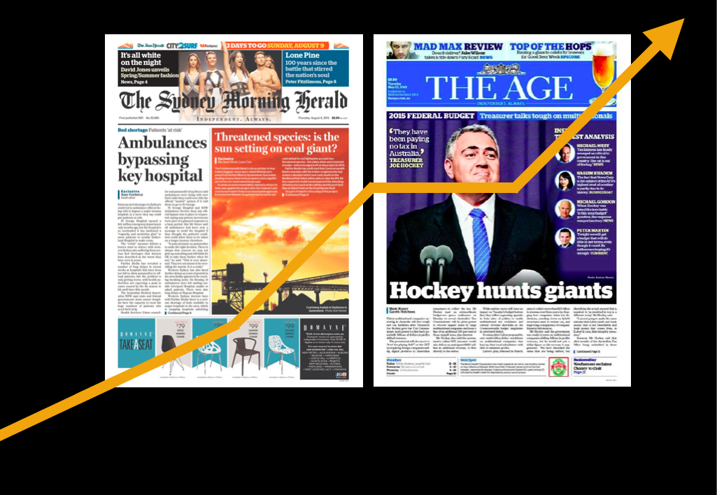
We worked closely with Matt Martel and his team when the Sydney Morning Herald and The Age (Melbourne) made the switch from broadsheet to tabloid in 2013.
Fairfax Media stated Thursday that The Sydney Morning Herald had retained its position as No.1 in total news masthead readership with a cross-platform audience of 5.1 million.
Net weekly readership of print editions of The Sydney Morning Herald was 1.5 million, said the Fairfax Media statement.
It reached more than 1.2 million people in June via mobile or tablet, up 4 per cent year-on-year. A total 3.4 million people accessed smh.com.au on desktop.
The figures come from the latest emma (Enhanced Media Metrics Australia) data for the 12 months to June 2015, which were released today.
The Herald’s sister paper in Melbourne, The Age, achieved a total masthead readership of 3.1 million in June. Net weekly readership was 1.1 million across the week.