Purchase the book on the iBookstore
“iPad Design Lab” trailer on Vimeo.
The EPUB version of book is HERE:
Now available: The EPUB version of iPad Design Lab: Storytelling in the Age of the Tablet, ready for download via Amazon.com for Kindle:
http://tinyurl.com/8u99txw.
Read the Society of Publication Designers’ review of The iPad Design Lab here:
http://www.spd.org/2012/10/must-read-ipad-design-lab.php
Read the review from Dr. Pegie Stark Adam in her blog
http://pegiestarkadam.com/
TAKEAWAY: It is more than just serif versus sans serif here. It is Obama versus Romney. It is Democrats versus Republicans. And we should know today what the choice of the people is.The blog today takes a look at the typographic choices that the campaign of these two presidential candidates made, as in Gotham and Mercury. PLUS: William Powers’ The Crowdwire
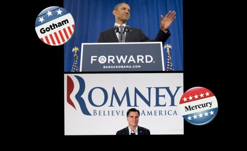
If you are like me, you are very happy that the Presidential Election is almost over. No matter whether you favor President Obama or Gov. Mitt Romney, the important thing is that you will not have to hear one more political pundit anticipating results or analyzing how swing states will vote. Not to mention no more of those offensive ads from both sides of the aisle. Amen.
But, to complete the Presidential Election cycle, I ask you to turn to my colleague Hoefler & Frere Jones to cast a vote, it appears. Fonts created by their foundry have been chosen by both Romney and Obama teams for their visual statements.
Continuing the signature voice of its 2008 campaign, Obama for America kept Gotham as its typographic keystone, this year adding our Sentinel typeface as a companion slab serif.
The GOP chose fonts from H&FJ as well, the Romney campaign settling on Mercury for its serif and Whitney for its sans.
Makes one wonder why both campaigns went straight to the same type foundry—-although we can understand why (one of the best type selection portfolios anywhere in the world, and one we visit often ourselves).
How lucky can a type design studio get? Well, perhaps not 100% lucky, as Jonathan Hoefler writes me in an email:
While Romney’s using Whitney and Mercury for his campaign’s typography, that Romney logo is in Trajan
For Jonathan Hoefler’s blog post on the subject:
https://mail.google.com/mail/u/0/?shva=1#inbox/13ad5eaed391c4ce
Of related interest:
Gotham vs. Mercury: the Presidential campaign
http://www.salon.com/2012/07/23/gotham_vs_mercury_the_presidential_campaign%E2%80%99s_real_issues_salpart/
Obama’s new fonts
http://observatory.designobserver.com/entry.html?entry=35148
The 2012 presidential campaign in 24 magazine covers (but missing http://i.huffpost.com/gen/645987/thumbs/o-BUSINESSWEEK-900.jpg?5)
http://www.buzzfeed.com/hunterschwarz/the-2012-presidential-campaign-in-24-magazine-cove-6zgv
SND: Election 2012: Inside The Washington Post’s digital efforts
http://www.snd.org/2012/11/election-2012-inside-the-washington-posts-digital-efforts/
America: Elect! The action-packed journey to U.S. election day in graphic novel form
http://www.guardian.co.uk/world/interactive/2012/nov/06/america-elect-graphic-novel
Presidential Campaign Posters: Two Hundred Years of Election Art
http://amzn.to/RDH07f
The design of the last campaign: Designing Obama
http://www.designing-obama.com/
The election in numbers: counting with M&Ms
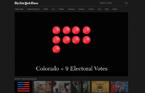
State of The Art:
http://www.nytimes.com/video/2012/11/06/magazine/100000001888546/state-of-the-art.html
Also from The New York Times: a great interactive graphic that allows you to chart the course of the election results:
http://nytgraphics.tumblr.com/
And this if you want to have some Election Day fun
From The Guardian:
America: Elect! The action-packed journey to US election day in graphic novel form
http://www.guardian.co.uk/world/interactive/2012/nov/06/america-elect-graphic-novel
Keep an eye on election via The Crowdwire
It’s the premiere of The Crowdwire, a project directed by William Powers, author of the bestseller Hamlet’s BlackBerry, in cooperation with Bluefin Lab.
Today’s the big day and we’re doing something kind of cool: a live, interactive “exit poll,” showing how many people are reporting in social media that they voted, and when they reveal it, how they voted.
It started running at midnight and will continue updating at the top of their page through the day: http://thecrowdwire.org/post/35128521367/our-live-social-media-exit-poll
Why The Crowdfire?
Says William Powers:
The social media population doesn’t mirror the public at large, so this is not an indicator of how the election will turn out. But given the explosive growth of this medium, and the vibrant conversation that’s ensued there in the last few months—much of it quite substantial and policy-oriented – I think this is an interesting glimpse of democracy’s future.
For more information about The Crowdwire: http://thecrowdwire.org/post/35128521367/our-live-social-media-exit-poll
Twitter: @TheCrowdwire
Facebook: https://www.facebook.com/thecrowdwire
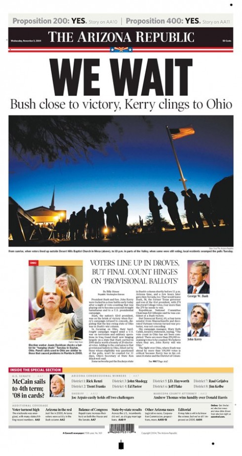
Here is a front page of The Arizona Republic from 8 years ago that sums up how we Americans, and the world, feels as we wait for the election results today—courtesy of Tracy Collins,
director at Phoenix Design Studio for Gannett
Of interest
Teenage CEO of Summly wants to ‘Cliff Note’ the news
http://news.cnet.com/8301-1023_3-57543369-93/teenage-ceo-of-summly-wants-to-cliff-note-the-news/