
In yesterday’s blog posting, I introduced the front page of the new Sunday Times, and started with some basics of the typographic components.
Today, after a long conversation with Al Trivino, designer for the new look, who was very kind and cooperative to interrupt a busy week of follow up work to chat with me, I introduce his comments behind the scenes in terms of type choices.
Here is Al’s description of how he made type choices:
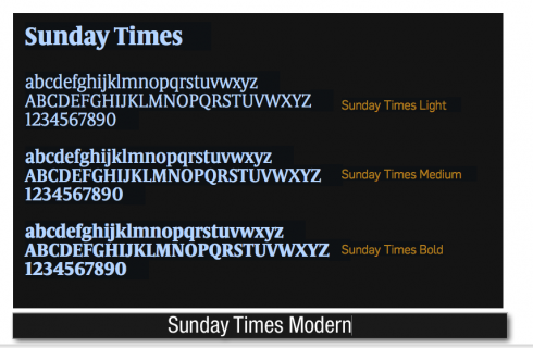
I opted for Sunday Times Modern as a display font, only for headlines.This font is created by Eduardo Manso, a Barcelona-based typographer from Argentina, featured often in the
Type Directors Club. We started by dropshaped serifs, but we quickly changed to curved and polygonal serifs to create a stronger, beefier font, more in accordance with the type of newspaper the editors want to produce each Sunday. Also to innovate and to break the mold. When one compares it to the most often used fonts in the UK, Sunday Times looks robust and unique. We achieved that.
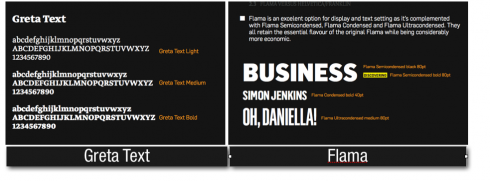
And, by the way, Al reminds me of a correction in yesterday’s blog. The typography sans for the newspaper is Flama, in its entire family: or cierto, un gran detalle! La tipogradía sans del diario es Flama in all its weights and styles, from condensed to semicondensed and ultracondensed. Created by the Portuguese typographer Mario Feliciano in 2007, it is a striking sans, with lots of vitality.
It is NOT Relato Sans, as mentioned in the blog yesterday. Relato Sans is the font considered for the magazines and supplements of the Sunday Times, but not for the newspaper itself.
Says Al: To me, Flama is the natural evolution of Helvetica, Franklin Gothic and Din. The old Sunday Times used 80% Helvetica, Franklin and Din.
I had to find a look that did not deviate too radically from that, but when I flound Flama I knew I had it. The robustness, the masculinity that the editors were asking for, but a new font.
The text font, continues Al, is Greta Text, by the great Peter Bilak. “In my view, this is the most complete body text font available anywhere.”
“So Sunday Times is the main font for NEWS in all sections of the newspaper. In my initial project, Sunday Times was the main typography for the entire newspaper, except sports, and two of the three tabs for travel, in gear, Unfortunately, the editor preferred to substitute Sunday Times for Flama in other sections. He wanted the older concept of all the sections have to adhere to one font.”
Here is a detailed spec of how the typography and sections go:.
News: Sunday Times Modern (secondary Flama) / broadsheet
Business: Flama / broadsheet
Money: Flama / broadsheet
News Review: Flama / broadsheet
Appointments: Flama / broadsheet
Sport: Flama + Flama Ultracondensed / broadsheet
Travel: Flama Condensed + Flama Ultracondensed / tabloid
Ingear: Flama / tabloid
Home: Flama / tabloid
TOMORROW: We continue with other details of the Sunday Times redesign