What the readers have said
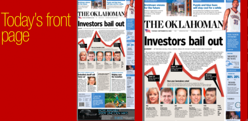
With more than 350 calls received, about one third of those calling the staff of The Oklahoman to express an opinion about the new format and design unveiled Monday, Sept. 29, said that they liked or even loved the transformation of their newspaper. But even the ones who “loved it” had some suggestions for changes.
And, as always in most redesigns, the size of text was the issue of the day, even though, in this case, text size had not been altered.
Here is what some of the ones who liked it had to say:
“The fonts, the colors, and the layout compositions are all improved and allow easier readability and, more importantly, easier comprehension,” said a professor of design at Oklahoma State University.
Another reader wrote: “I congratulate the Oklahoman for the redesign of our daily newspaper! It has so many positive changes – it’s so exciting! It’s so much easier to read – I love the new type clarity and the legibility – the print is darker and the size of print makes for easy reading! The colors, the page size, print, color coded sections, etc., all make for an OUTSTANDING NEWSPAPER! Cheers to you!”
Those readers who did not like the changes complained mainly about the size of type, especially in sports (an area we are revising and tweaking as of this writing). Others complained that they could not find a favorite feature or columnist. Interesting point: even though the newspaper made some “unpopular” changes in May of this year (including television grids, etc.), readers used today to express their dislike about those issues.
One curious fact: The Oklahoman’s new format—-44” web, narrow width, and long—-did not appear to be an issue with any of the readers who called or emailed. This, I believe, should reassure other editors and publishers contemplating a change to the narrow format.
Ouch, he REALLY didn’t like the new Oklahoman
There is always that reader who misses his “old” newspaper. These are usually very passionate readers, who let you know how unhappy they are with the new look. I get those mails, and here is one:
Dear Mr. Garcia, I hereby sentence you to reading your “creation” 100 times
after school everyday. Our paper was one of the worse in the country before
you got a hold of it, but you have found a way to make it worse. Could you
tell me the names of the other U.S. cities with a “kiddie size” paper? I
know you are in business to sell ideas, but this can’t be your proudest
moment. I know Oklahomans seem unsophisticated but we know a pig when we see
one lipstick or not. Thanks for nothing. New Dallas Morning News subscriber
The belt ad appears at La Vanguardia
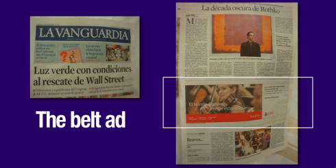
Those belt ads that cut across the page, but not at the bottom, are making quite a splash in European and Asian dailies. Today we show you an example of the Friday, Sept. 26 edition of La Vanguardia, of Barcelona, Spain, where a bank ad appears in the form of the belt.

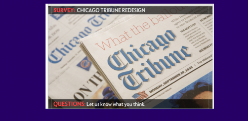
The Chicago Tribune redesign: A survey
And for those who have seen and have something to say about that other Monday redesign, The Chicago Tribune, there is a survey available where you can send your input:
http://www.surveymonkey.com/s.aspx?sm=ZVAQJwl8xBESmwoA7DH3_2fg_3d_3d
Also of interest, a review of The Tribune’s redesign in Editor & Publisher:
http://www.editorandpublisher.com/eandp/news/article_display.jsp?vnu_content_id=1003856151


![]()
Still in Oklahoma City for part of the day, then flying home to Tampa, Florida in the late afternoon.
TheMarioBlog posting #106