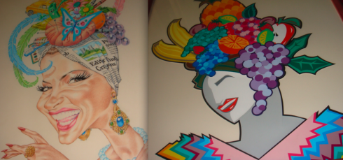
THE CARMEN POSTERS: The Carmens above were illustrated by Phil Flanders and Ana Larrauri.
TAKEAWAY: With today’s excellent color printing capabilities, those “Carmen Miranda hat pages” are much easier to pull off than in 1979. Time to bring more color to newspaper pages.
The New York Times of June 17 includes a review of the new DVD collection of five of Carmen Miranda’s films ((20th Century Fox Home Video, boxed set $49.98, individual titles $14.98).
The persona of the legendary Brazilian bombshell—who at barely five feet tall, boosted herself up with high platform shoes and even higher multicolored, multi fruit headgear—became a part of my presentations and remains so to this day by just pure coincidence, as I was simply trying to draw a momentary analogy to make a point. That moment has outgrown Carmen’s hats.
It was 1979 and Donna Summer had just released her landmark Bad Girls——which is probably why I thought of invoking that other “bad girl” Carmen. I was a professor at Syracuse University’s S.I. Newhouse School of Public Communications, and was invited to do a presentation for a regional newspaper group in upstate New York. Part of the presentation included a critique of the participants’ newspapers.
There I was on stage, an audience of about 75 editors and layout types (they did not call them designers in newspapers then), and I had before me a pile of tearsheets to critique . I remember it well: one awful over –the- top color page after another. I was trying to be kind, while conveying the message that one has to be careful when mixing so many colors on a single page.
Suddenly, I said: “This page here reminds me of a Carmen Miranda hat. All pineapples and bananas, with papayas and mangoes added for effect.”
Loud laughter from the audience followed. From my days as a child actor in my native Cuba, I knew that I had to wait till the laughter subsided to continue, which I did. By the way, I still get that same loud laughter when I occasionally single out a page and describe it as a real Carmen Miranda page. Yes, a new generation, younger, for whom Carmen is a remote caricature, but still funny.
That reference to the colorful performer was all that many remembered from my two-hour presentation and critique. The quote traveled across the pages of articles in media journals (thank God there were no blogs then), and, ironically, what was meant as a quick reference point, became a great teaching tool.
Editors from Arizona to South Africa, and, of course, Brazil, would send me a page from their newspaper with a comment attached: is this too much Carmen?
And, when Roy Peter Clark and I keynoted a Poynter seminar about WED (Writing/Editing/Design), I represented the design side with Carmen Miranda references, while Roy assumed the “word people” position, invoking the image of Raymund Burr as legendary detective Perry Mason—-all gray and dull. We were lampooning our disciplines with the extreme cases. Again, the point was made, with some theatrics added, and, at the end we showed that , indeed, Carmen and Raymond could co-exist happily in the newsroom.
We also know that today’s printing presses—more sophisticated and color friendly than those of the 1970s—allow designers to mix colors with better results. In fairness, now we are better trained to use color than did those layouters of the late 1970s, who often went too far in their enthusiasm to discover color, with poor results.
Of course, going too far is what advanced Carmen’s career as she created her own outfits to include everything from wax fruit, to live singing birds, beads, feathers and her trademark bananas.
Today, color is key to attracting and retaining readers, both on the page and on the screen. While we don’t advocate putting on a tutti frutti hat a la Carmen, we know that we can colorize more, mix the palettes, and have fun, reassured that the result will be a more coherent and consistent quality of color.
The newspapers of today must be colorful. I believe that US papers, particularly, do not explore color the way some foreign newspapers do. USA Today was the last of the great color experiments in this country. Take a look at DeMorgen, in Brussels (www.demorgen.be) where we used a wallpapering effect with color starting on page one; or try the Daily Xpress of Bangkok (www.dailyxpress.net) , a bright color palette. And be on the lookout for the new English language newspaper of Nigeria, capturing the colors of its environment.
Perhaps the new Carmen Miranda DVD collection will inspire young designers to explore more color by revisiting Carmen’s costumes and hats..
More than 25 years have passed since that one seminar presentation in upstate New York. I am ready to see more colorful pages. So are readers everywhere.
TIP: Watch Down Argentine Way (1940 and get some color ideas from the one hat she wears in the final production number.
THE SIDEBAR: As my Carmen Miranda analogy became known, people started sending me “everything Carmen”. Yes, I have the Carmen Miranda agenda book, assorted Carmen memorabilia, and two very special Carmen illustrations, complete with newspaper motifs, done for me by dear friends and super talented artists Nuri Ducassi (Fort Lauderdale Sun Sentinel) and Ana Larrauri (The Miami Herald). In 2005, I visited a special Carmen Miranda Museum presentation in Sao Paulo and had my picture taken next to a life size cutout image of la diva, with her headgear towering over me.
FOR DIEHARD CARMEN MIRANDA FANS:
Visit her Rio de Janeiro museum
http://www.frommers.com/destinations/riodejaneiro/A31000.html
See the film documentary Bananas is My Business
http://www.imdb.com/title/tt0109381/
If you read Portuguese, this biography is a must:
Carmen – A Vida de Carmen Miranda a Luso-Brasileira mais Famosa do Século XX (Paperback)
by Ruy Castro (Author), Palavra editora (Editor)
Two highlights from this detailed biography by the journalist Ruy Castro:
-Carmen’s romance with fellow actor Jose Ferrer, among others.
-Her deep Catholic faith, and her love for her mother, whom she moved to Hollywood to live with her.
THE NEW YORK TIMES CRITIQUE OF THE DVD COLLECTION:
http://www.nytimes.com/2008/06/17/movies/homevideo/17dvds.html?ei=5070&en=66735b0aed633121&ex=1214366400&adxnnl=1&emc=eta1&adxnnlx=1213711426-ZF/MU91GhYknhOuTrFxEng
WHERE IS MARIO: Working in Tampa all week.
COMING TOMORROW IN THE MARIO BLOG: A three-minute interview with Richard Curtis of USA Today.
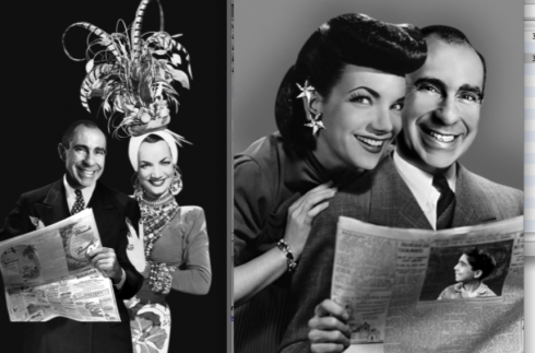
WHEN MARIO MET CARMEN? Artist Ana Larrauri, of The Miami Herald, writes that ” ….Loved your blog Mario…we all know you’ve been channeling Carmen for decades..way before color!!!!!! Archive fotos from previous redesigns prove it!!!! She includes her archival “finds”.