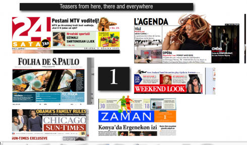
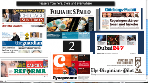
One never knows what the day will bring. For me today it has been a main focus on teasers and/or promo boxes. Regardless of what you call them, these are important elements of a good navigational system for page one.
Three important ingredients of effective promos are: variety, brevity and content.
The verdict is out on the true impact of promos in generating street sales. However, one thing is for sure: promos with well written, enticing headlines that pull the reader in, DO contribute to readers stopping the extra ten seconds to look at page one. I always mention that seduction of readers is NOT limited to inviting street sales (although nobody is opposed to selling more newspapers). A newspaper must pass the coffee table and the kitchen counter test. When that teaser stops me on my way to a second cup of coffee, it has done its job.
What works the magic?
A good headline (good story inside), and a graphic element with impact.
THREE QUICK TIPS:
Variety—-within a given space and architecture, develop various versions for promos; sometimes three items, other times one, or two. If the same number of items appears daily, readers become numb to these promos. Surprise me!
Wording: Write headlines that make the promo irresistible. Saying Movie Reviews on Page 7 is not as seductive as “The Dark Knight: Ledger Steals the Show”
Brevity: Readers will spend a second or two processing information in promos (as confirmed by Poynter’s EyeTrack research at least twice). Visuals should be tightly cropped, incorporating easily recognized faces and items. Photos that need to be studied for meaning do not belong in a promo box.
STYLES OF PROMOS:
Promos may run horizontally or vertically.
Promos may appear above the flag of the newspaper or below (your preference). There is no research to indicate the benefit of one placement over the other. However, the key is to have graphic elements.
Promos with only words do not fare as well as those that include headlines and images.
Promos that use color attract more attention.
Promos need a sense of hierarchy: if three items appear in the promo, give one larger size, more color.
WHERE IS MARIO? In Miami, enjoying my mother’s Cuban cuisine, including her unique flan with shredded coconut on top, then running through the peaceful environs of Coral Gables’ Country Club Prado to burn the calories.