Updated, Wednesday, Feb. 11, 6:32 am EST

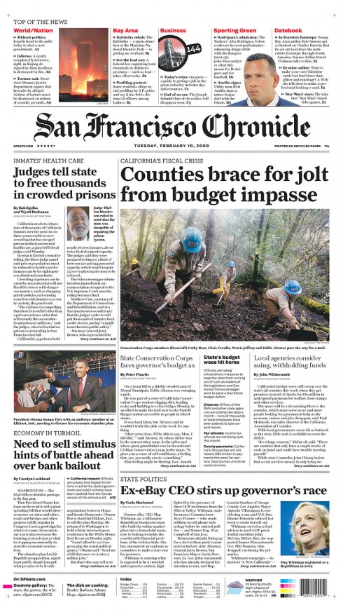
Today’s San Francisco Chronicle Page One


Mario’s note: Hoping to include a One Minute Interview with Nanette Bisher, Design Director of the San Francisco Chronicle, sometime during the day today. I am asking her about the challenges of redesigning the Chronicle. Stand by and perhaps this interview will come during the day today.
==============
Perhaps one of the most salient features of the new front page of the San Francisco Chronicle is its Top of the News navigator, which sits at the very top of the page, over the logo. Aside from that, the front page continues to be quite traditional. Much to my disappointment, almost every story here jumps to the inside. Here we have a newspaper in a major metropolitan area, where I am sure readers are more open to experimentation. Why not try a Page One that includes only summaries, with NO JUMPS. I am sure, as is always the case, that the editors and designers here may have proposed such a treatment, but reality told them otherwise. One never knows the behind the scenes of a redesign, for sure. Since the top of the page is such a great navigator, why not treat the rest of the front page as a map to the destination????
I asked my good friend and colleague, John Miller, who was design consultant to the project to give us his thoughts about this redesign. Art director for the Chronicle, and, according to Miller, responsible for the final version is another dear friend, Nanette Bisher:
Our thoughts from the beginning were to take the best of the Chronicle brand and apply it to a fresh new look. That meant choosing typography that hearkened back to the “classic” Chron; and more importantly, it meant better presenting the tradition of a strong local voice. This is most obvious is the re-introduction of “Top of the News”, a crisp A1 news summary the Chron did before anybody really did A1 news summaries. (I remember it vividly from the 70s.) Our process was very involved. First I set up blue sky meetings: small groups comprised of a mix of all departments, who were tasked to take a section of the paper and research in ALL media how that type of content was best being presented. Each group delivered a report, which was used in creating initial sketches.
We did multiple approaches of everything, including magazines, tabs, logos, new sections, and almost 100 versions of A1.
The changes are more substantial than just cosmetic, as explained by a note posted on the newspaper’s website. In addition to a new look, this is also what the SF Chronicle will present its readers:
As we entered our 145th year, one thing was clear: It was time for a fresh coat of paint. This week, we introduce a redesign that updates The Chronicle’s look with the goal of making the paper easier to read and navigate while retaining its distinctive, classic character.The redesign not only makes the Chronicle brighter and more modern, it also prepares us for the rollout in June of state-of-the-art presses that will dramatically improve the paper’s reproduction and color capability.
Major changes accompanying the redesign:
1. Four sections: During the week, a key change readers will notice is that The Chronicle will be printed in four sections – a cost-saving move that will enable management to produce the paper at a single printing facility.
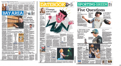
2. Datebook section will expand to include more coverage of lifestyle topics isuch as health, home, dining and outdoors. The section will continue to feature coverage of the arts and culture, columns by Leah Garchik and Jon Carroll, and the regular lineup of comics, crosswords and listings.
3. The Bay Area section will be combined with the Business section, which will start on the back cover every weekday. (Business has been on the back of the Sports section in Monday and Tuesday editions.)
4. The Editorial and Opinion pages will move to the back of the main news section, where they appear in many large daily newspapers.
5. A new Movies section will premiere on Friday – in addition to the daily Datebook section and the 96 Hours entertainment section published every Thursday.
Initial thoughts:: One cannot truly judge the effect of a redesign by viewing ONE edition. My initial impressions are:
—Is this a rather tightly packed and congested look? Is text dominating in most of the pages shown here?
—Perhaps this is a retro look, with narrow columns and a feeling that if you don’t read it here, you will not find it elsewhere.
—There is a sense of hierarchy, and photos are used well on page openers.
For full information about the changes in the SF Chronicle:
http://www.sfgate.com/cgi-bin/article.cgi?f=/c/a/2009/02/02/MNCD15KIK3.DTL&hw=redesign&sn=003&sc=955
Goodbye to Blossom Dearie

I already know that one of my life’s regrets will be never having seen Blossom Dearie perform live. Not that I did not try—-like several times during trips to New York City. However, by the time I discovered Blossom Dearie that Christmas of 2000 when my friend Ron Reason surprised me with one of Blossom’s CD’s, she was already not performing nightly. You simply had to “catch” la Blossom performing at the now defunct Danny’s Skylight Room, in Midtown Manhattan. I was close once, during the redesign of The Wall Street Journal, but the place was fully booked. I would have settled for a spot behind the door, just to listen to Blossom do her rendition of “Peel Me a Grape” or at her best doing Antonio Carlos Jobim’s songs, especially “Wave”, which became one of her most requested songs.
Of course, Blossom was not for everyone, with her little girl’s voice and pixie pageboy haircut. And not everyone’s music was for Blossom, either (she hated anything from Andrew Lloyd Webber, for example). However, for me Blossom Dearie was a one-piece orchestra perhaps playing inside a music box you put on your coffee table.
I remember running the New York City Marathon while listening to a variety of Blossom Dearie songs, including the old standard “Manhattan” (quite appropriate as we crossed the five bridges and five boroughs of New York City). Someone asked me: how can you run a marathon listening to that kind of music? I did, still do, with Blossom serenading me as I hit the asphalt, or the snow, or the grass around the globe.
You see, Blossom did not try to reach for notes in the sky, and nobody expected her to, but she did reach for the soul, and she managed to grab mine several times, with or without my running shoes on.
And, just in case you wonder: that was her real name, as in Marguerite Blossom Dearie. She died Saturday in New York City at age 84.
Go here to see Blossom Dearie performing in 1985:
http://www.youtube.com/watch?v=-WQBxL53HE0
The New York Times obituary: Blossom Dearie, Cult Chanteuse, Dies at 84
http://www.nytimes.com/2009/02/09/arts/music/09dear.html?_r=1&scp=1&sq=Blossom%20Dearie&st=cse
IFRA seminar about mobile phone publishing

We have mentioned it repeatedly in this blog: mobile phones are the tool of the future, especially for publishing. Now IFRA offers a seminar devoted entirely to the subject. I urge everyone to take notice and to participate if possible. Timely subject. Good program. Read the information below:
7th Mobile Media Day
Inspiration from those on the front lines
21 April 2009, Amsterdam, The Netherlands
The program includes:Innovations, hottest trends, new technologies, interesting case
studies will be presented and discussed during this well high-profile,
one-day conference.
Highlights of the program:
– Thomas Husson, Senior Analyst, European Mobile, Forrester Research,
France: Trends and best practices of the mobile publishing business
– Matthew C. Jones, Director, Mobile Strategy and Operations,
Gannett Digital, USA: USA Today – Implementing iPhone applications
– Todd Tran, Managing Director, Joule (former Mobile Kinetic), UK
Marketing Opportunities for Publishers
– Christen Krogh, Chief Development Officer, Opera Software,
Norway: Prerequisites for successfull mobile publishing – a forward
looking perspective
Please find further details and regular programme updates on
www.ifra.com/mobilemediaday
TheMarioBlog posting #190