This is the weekend edition of TheMarioBlog and will be updated as needed. The next blog post is Monday, April 29.
Last week we wrote in TheMarioBlog about a new makeover for the iconic font, Helvetica.
We talked about Helvetica Now, which restores some of the original features of the font that have been lost along the way—such as an alternate single-story lowercase “a,” and a capital “R” with straight legs.
TheMarioBlog post #3039
So I turned to my friend and colleague Roger Black—type connoisseur par excellence—for his reactions about Helvetica Now.
It is funny that in one of his emails to me, Roger titled it “Hellvetica”—pun intended, I guess.
Roger agrees that there was a need to revive optical sizes for Helvetica for a long time now, explaining that in the conversion to prototype and then on to digital, when the basic font was used at big sizes it looked a bit monotone—and the very small sizes unreadable.
“There were useful headline styles offered in the cold type era by Letraset and VGC (the Phototypositor). And the famous New York typesetting shop, Photolettering, had a full set of weights and widths, with the smooth increments called “waterfalls,” at $10 a word. But the different sizes of the metal fonts cast in the late 1950s had a range of different designs—what we’d call micro, text, deck, and display. These important distinctions were discarded in the conversion to text typesetting machines, mostly to save money. “One size fits all.” That is: Small.”
Roger writes that the updated Neue Helvetica in 1982 offered an even range of weights and widths, but no optical sizes. So, for decades we’ve seen Helvetica blown up from 8- or 10-point masters. “No wonder we got tired of it,” he said. Here is what Roger has to say about the new Helvetica Now version:
“The talented Charles Dix and a large team of designers have reworked it into a big family, with precise waterfalls of weights and widths. If one of the big tech companies had put it out as their new UI font, we’d all have been impressed, even if some commented that it looked a lot like Helvetica.”
Still, Roger says he has two questions:
1. Why didn’t they compress this giant family into a few variable fonts?
https://www.typenetwork.com/brochure/opentype-font-variations/
2. Is it Helvetica?
“I’m happy to see the effort to design sizes, although the large sizes seem less elegant than the Stempel’s original version, and not as strong. I miss the metal—with its hard shapes, sharp edges, and Swiss stiffness. So for now I will stick to Neue Haas Grotesk (Christian Schwartz’s revival of Helvetica’s precursor), and badger my friends at Font Bureau to make an optical size for small text.
Here is an example from Neue Haas Grotesk to which Roger Black makes a reference above. I, too, agree that the Grotesk has a strong, elegant way of presenting the best of Helvetica but with what I think is a fresher voice.
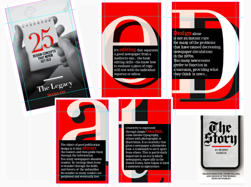
Pre-order The Story
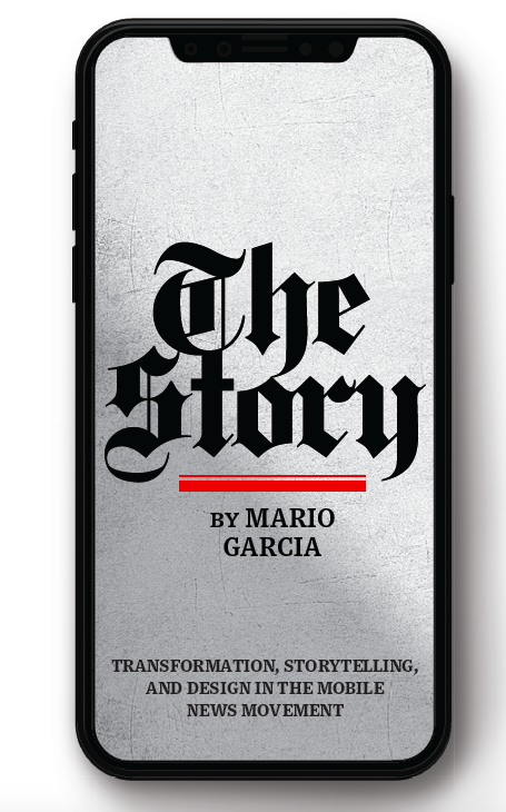
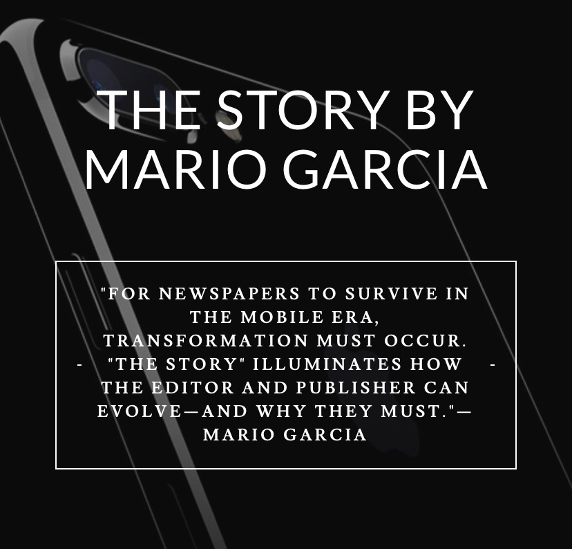
The newspaper remains the most powerful source of storytelling on the planet. But technology threatens its very existence. To survive, the Editor must transform, adapt, and manage the newsroom in a new way. Find out how, pre-orderThe Story by Mario Garcia, chief strategist for the redesign of over 700 newspapers around the world.
Order here:
https://thaneandprose.com/shop-the-bookstore?olsPage=products%2Fthe-story
An interview of interest
http://www.itertranslations.com/blog/2019/3/11/fd60ybflpvlqrgrpdp5ida5rq0c3sp
TheMarioBlog post #3039