


Images of Retina, family-wide and close up, show “in-use” examples (size is 640px width).


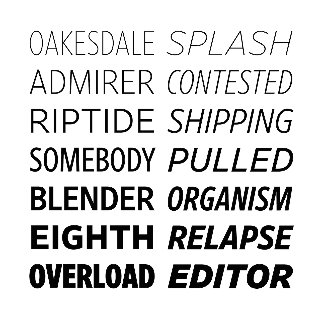


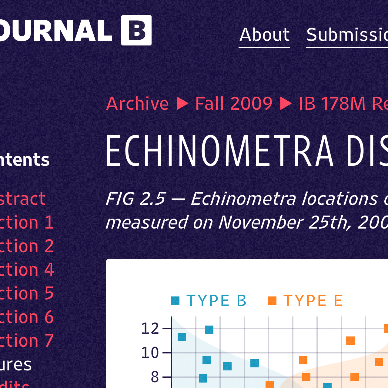
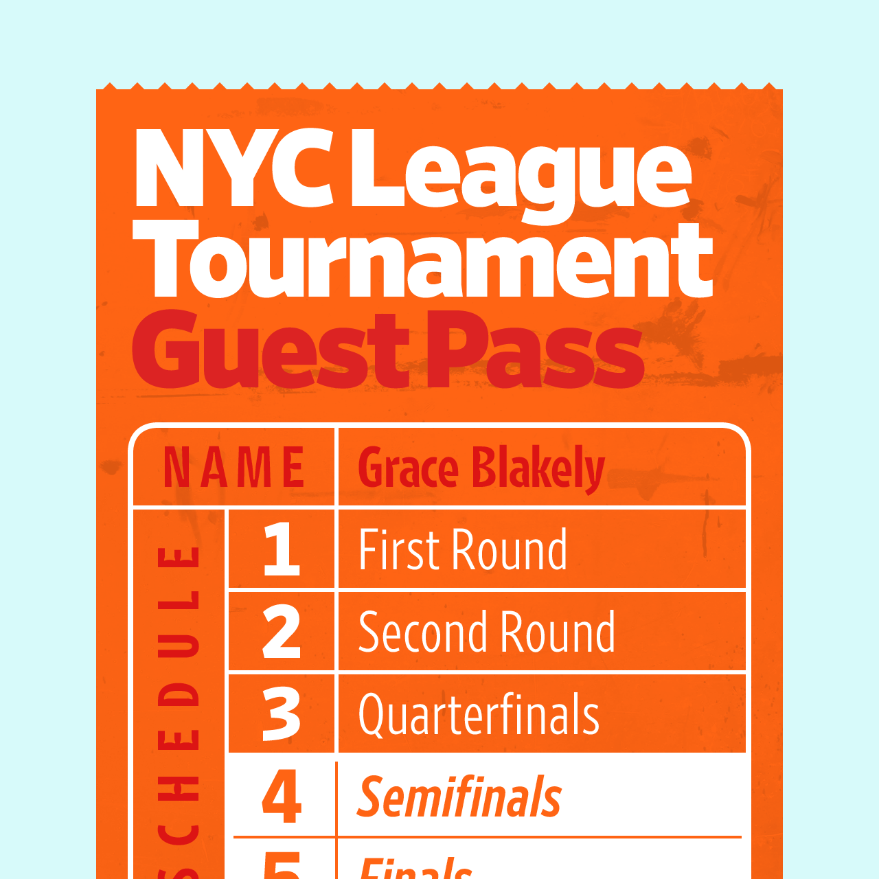


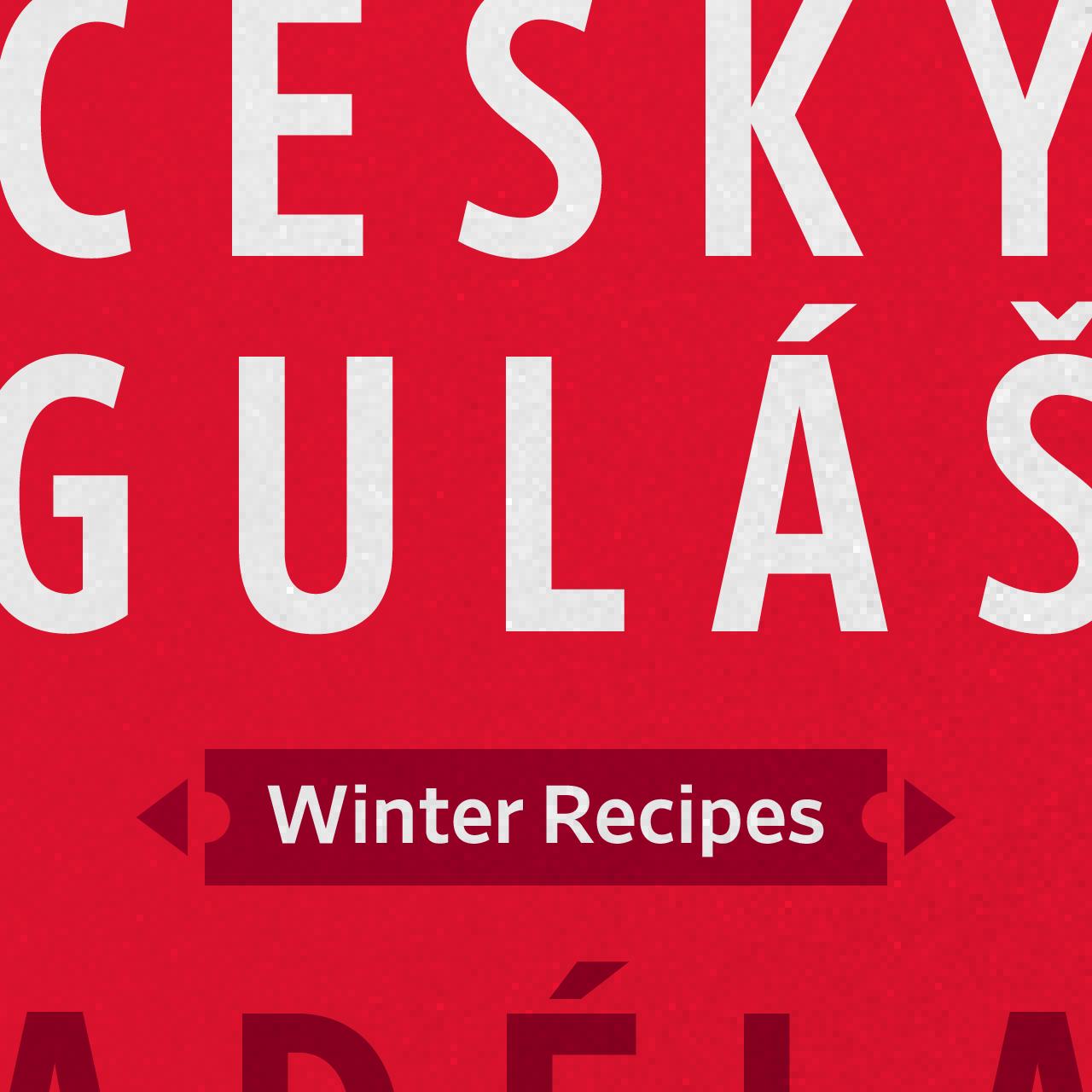
Images of Retina, family-wide and close up, show “in-use” examples (size is 1280px width).
Retina has a distinguished history. In fact, I was happy to be there at its creation, when a group of us were working on a redesign of The Wall Street Journal. Art director Joe Dizney and I thought that there was a need for an elegant and legible font for all those pages of stock listings, which in those days were more than in today’s WSJ.
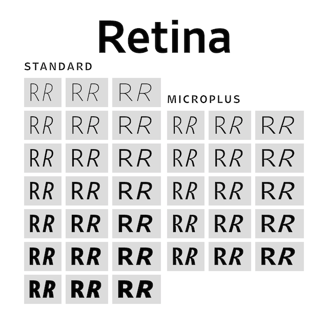
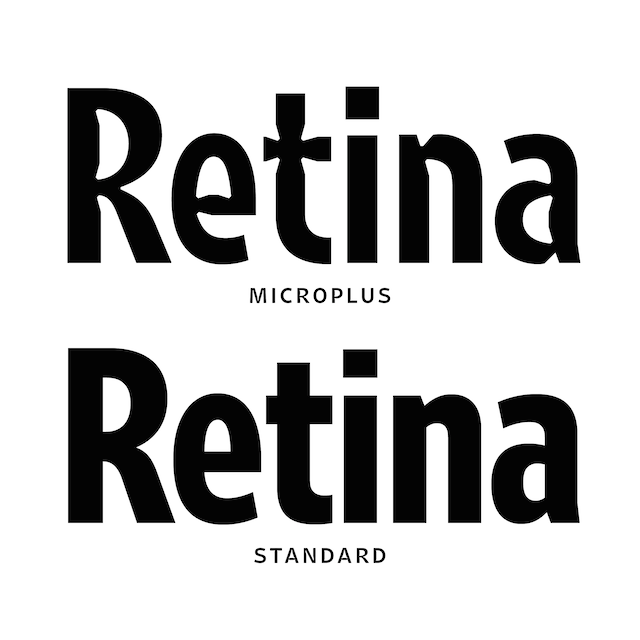
We wanted a font that would allow for what I call “finger reading”, with the eye maneuvering long lists of numbers usually set in “agate” (6 points of smaller, now referred to as MicroPlus). The rest, as they say, has been history, with Retina developed to go beyond agate type to headlines in various weights.
The Museum of Modern Art has recognized Retina as a milestone in type design, and acquired it for its Architecture and Design Collection.
A chat with designer Tobias Frere-Jones
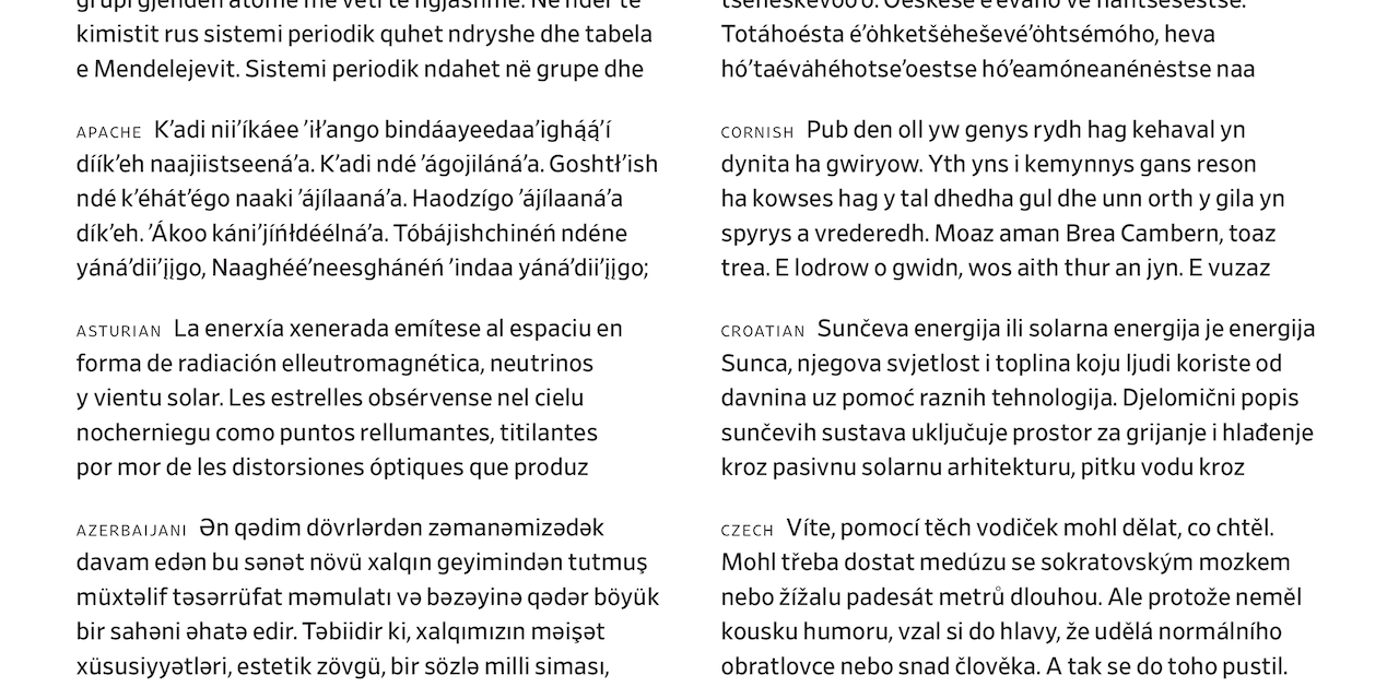
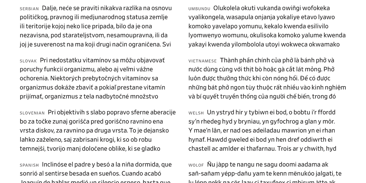
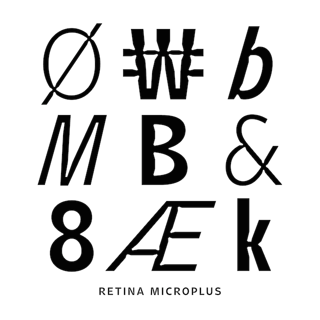
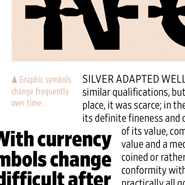
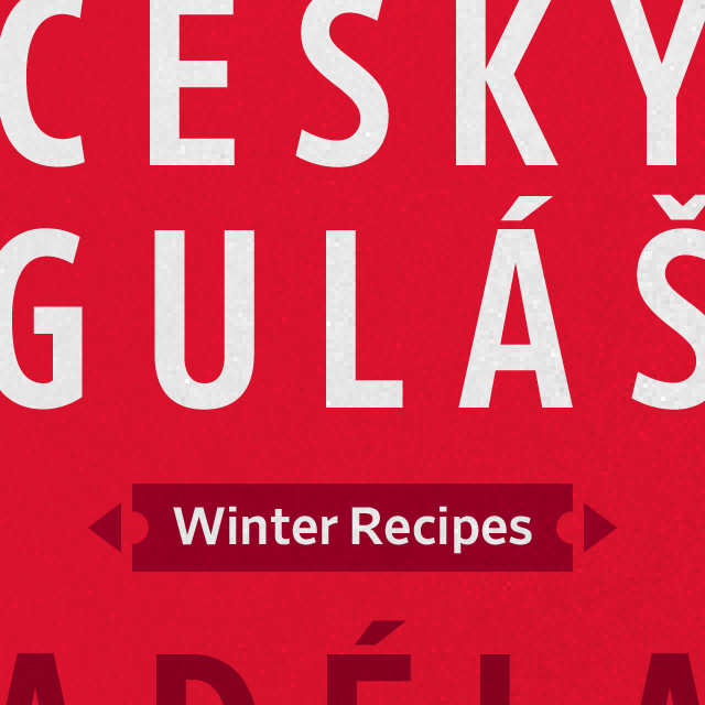
Retiina supports more than 200 languages
Mario: Tobias, what is new with Retina?
Tobias:
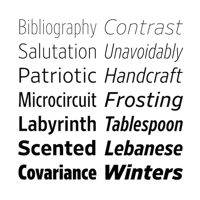
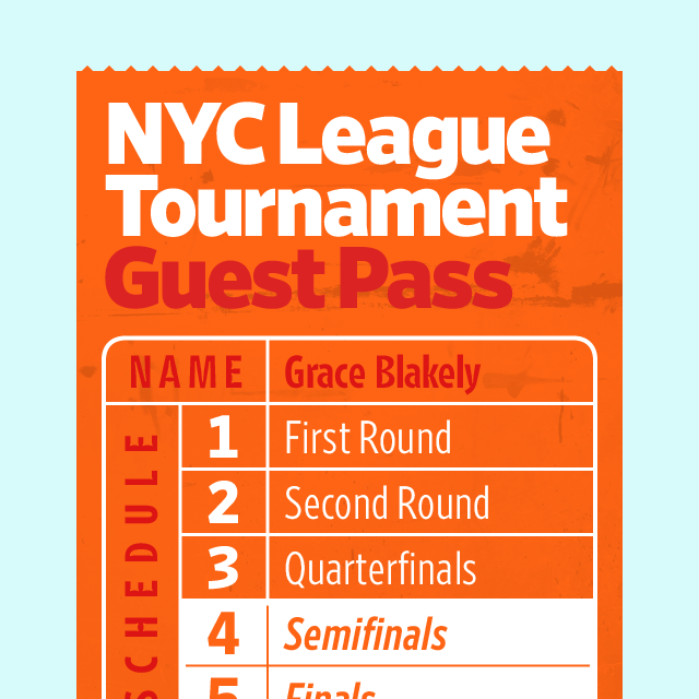
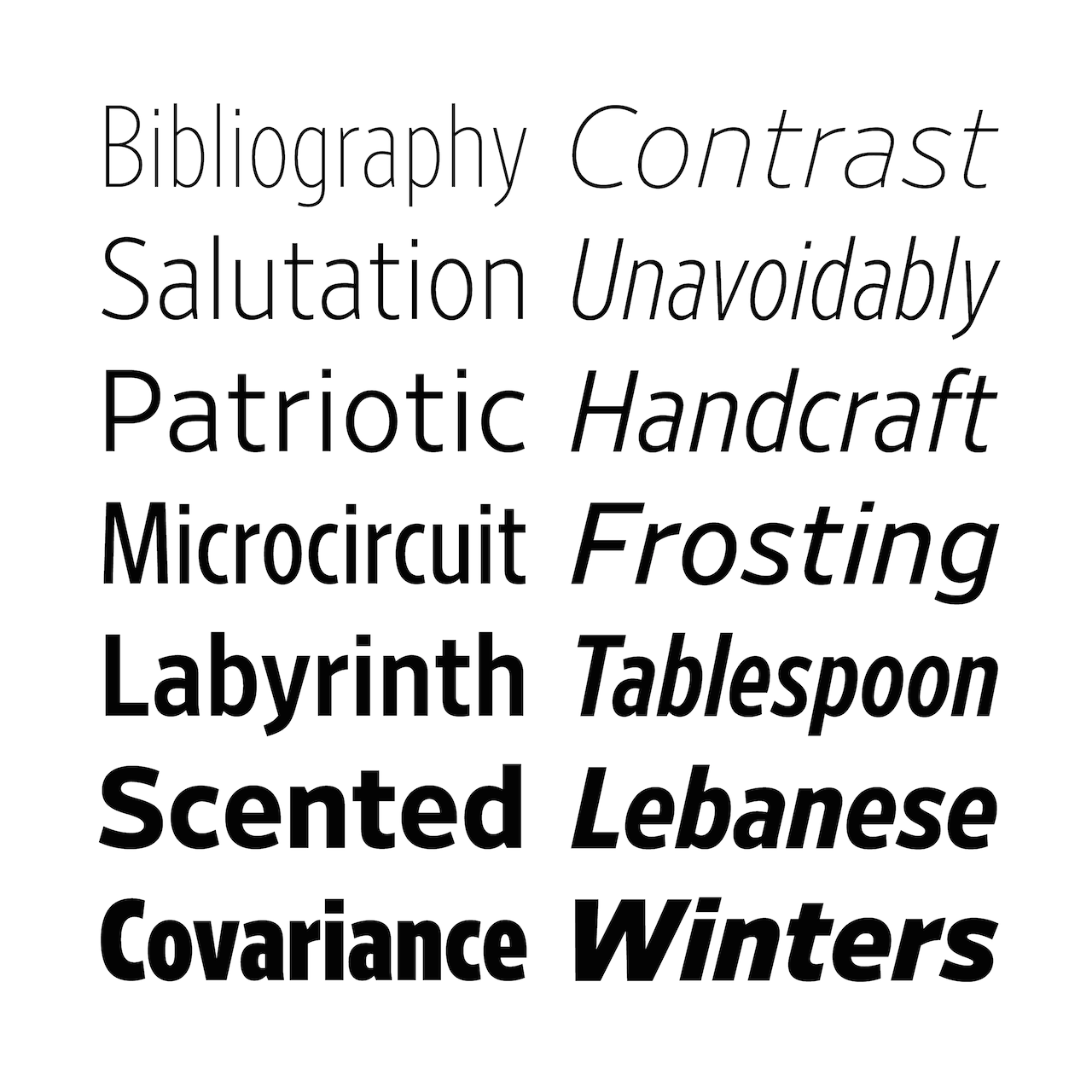
“There are a few changes with the retail release: The Retina family has been reorganized to have three widths for now (Condensed, Narrow, Normal). All of these styles in the MicroPlus and Standard now have accompanying italics, as well as web font versions. The language support has been greatly expanded, and now covers all of Central and Eastern Europe and Vietnam. We also added several currency symbols, including the newly adopted symbols from India, Russia, and Turkey.
“The older Retina family (with the style names like A04, B10, D08 etc) will also still be available for licensing directly from Frere-Jones Type, separate to this retail release.”
Mario, can you tell me how Retina came to be?
Tobias:
“The ideas of Retina go back to 1991 when I was a RISD student, taking my first steps in type design and trying to understand more about how shapes are interpreted as letters. I made several experimental typefaces to investigate this question, including some that deliberately blurred character identities. In my later work at Font Bureau I designed type for newspapers and low-resolution device displays, and watched Apple’s system fonts being hinted. Throughout, I was learning more about what helps or hinders our eyes in reading.
“In 1999, I started sketching out a strategy of exaggerated details, building on the previous years of experiment and observation. I didn't have a specific application in mind, apart from facing a hostile environment. (Though I had long wanted to do an agate face, knowing that it was one of the hardest challenges)”
Mario: Is that when those of us involved with the redesign of The Wall Street Journal came into play?
Tobias:
“The commissions from the art21 television series and the WSJ came in quick succession, and seemed like a perfect fit for Retina’s experimental strategy. In both cases, notches were added to the design, to anticipate ink spread or light bloom. That early foray into TV came back more recently as Retina was optimized for screen rendering, and those same notches help emphasize the critical structures.”
Mario: I take it that newspaper readers have a special affection for Retina. Right?
Tobias:
“The original Retina family found a wide use among newspapers around the world. But I have long felt that Retina could —should— do more, so I reorganized the family to be more intuitive, and expanded it with italics and broader language support, and added screen optimization. I hope that designers in other sectors, like websites or advertising or packaging or broadcast find the same value in Retina.”