TAKEAWAY: We take a look at a selection of pages published in the South China Morning Post since their May 16, 2011 rethinking ALSO: What happens when advertisements that pay well become too invasive? AND: Do you know some news apps that deserve to be shown in my book, Storytelling in the Times of the iPad?
When all the pieces of the design come together
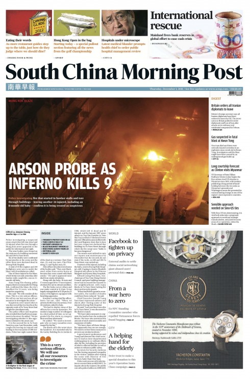
The SCMP front page design is flexible: it can react to a major story, as we see here……
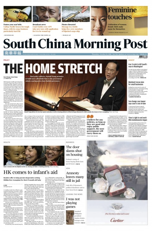
…or it can accommodate a variety of stories, as is usually the case: five to six elements
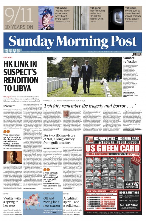
The Sunday front page showcases content in a promo strip that is different from that used daily. In this case: promoting special 9/11 anniversary package
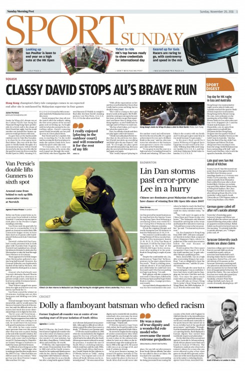
Opening of sports section for a Sunday edition
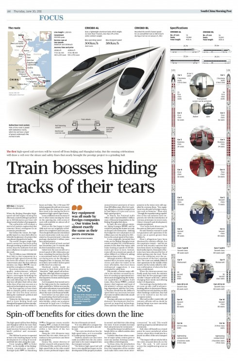
Page Four is always Focus: an in-depth story on a topic of the day
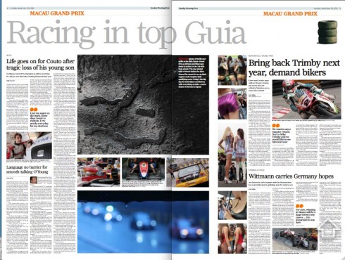
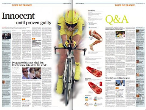
Sports section makes use of double page treatments often
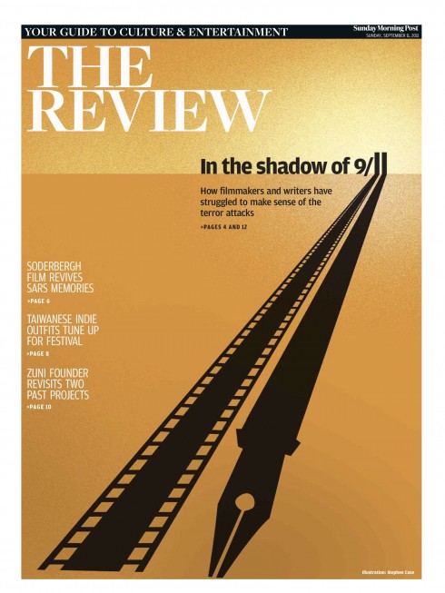
Tabloid cover for Review, part of the 9/11 anniversary package
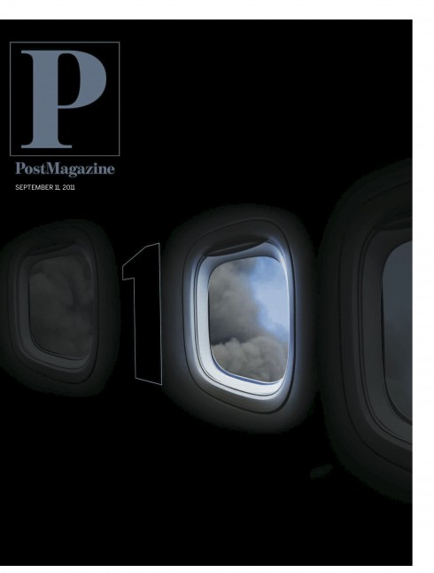
Cover of the glossy Post Magazine, also on the subject of 9/11 retrospective
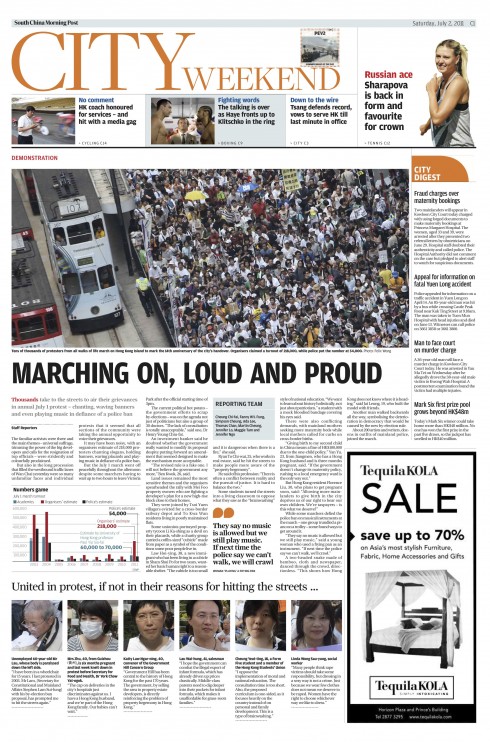
Opening of City, the local section
As we review pages of the past three months, it is gratifying to see that the South China Morning Post has not only kept the basic foundation of the design we introduced May 16, 2011 intact, but there is an evolution as well.
Yesterday we showed various pages showcasing the infographics that are now part of the storytelling process here at the SCMP.
Today I turn my attention to pages that design director Carl Jones and I have spent time reviewing. These represent the best efforts of the team. It is noticeable that content has been beefed up too, with great emphasis on local Hong Kong, and regional China news in the first four pages.
The “newspaper within a newspaper” concept continues to work well. The first four pages of the newspaper offer readers a chance to get a good mix of stories that are “must know” before they head out to work. Page 4 of the News section, titled Focus, emphasizes an in depth topic of the day.
Those advertising strips on the front…..
This one works well. Indeed, the ad does have the look of the navigational bar above it
Here there is higher contrast between the ad and the promo bar, but it is still not offensive
Here the ad is too ugly for its own benefit, and, unfortunately, it brings down the entire page with it
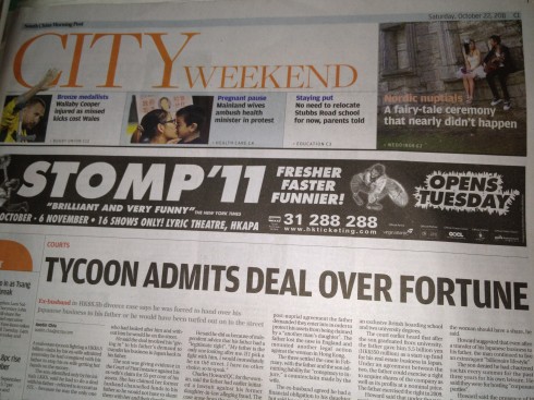
One of the big changes that took place May 16, 2011 when the South China Morning Post introduced its new look was the allocation of advertising space in areas where it had not appeared before.
With that has come an increase in advertising revenue, and, of course, the positioning of ads in areas that the editors and designers would prefer not to see an ad.
Having said that, we now evaluated one particular position which the designers describe as “tricky,” (I am using the better word here, as this is a family blog). That position is the prime spot that advertisers pay a good premium for to be directly under the navigator or promo box for the section opener. “In some cases, the advertisers are wising up to us and they make the ad look pretty much like the promos,” says Carl Jones, design director.
Indeed, that is the case, and, in my view, this is preferred to instances like we see below with the Stomp ad, which is so ugly it constitutes an eyesore.
These are tough times for newspapers, and an advertiser who wants a specific spot, and pays a premium for it, will not and should not be denied it. However, it helps when the ad, which is already in a prime spot, does not become an eyesore that destroys the rest of the page.
While I know that this type of discussion is usually quite lively in the newsroom—-especially among designers—-I usually remind them that if we are going to be honest about the readers and how they react, the answer is: readers have no opinion on the matter. In fact, if you press me for a more specific answer concerning the readers’ feelings about invasive ads like these, the answer is, “some do like them, welcome them, and would not have it any other way.”
This, of course, is music to the ears of the advertising director.
Your views?
Previous blog posts about South China Morning Post
Report from Hong Kong 2012: #1 Infographics at the South China Morning Post
https://www.garciamedia.com/blog/articles/report
South China Morning Post: new beginnings in a new Hong Kong, new China
https://garciamedia.com/blog/articles/south_china_morning_post_new_beginnings_in_a_new_hong_kong_new_china
On the fourth day: South China Morning Post design evolves
https://garciamedia.com/blog/articles/on_the_fourth_day_south_china_morning_post_design_evolves
The marketing of the South China Morning Post relaunch
https://garciamedia.com/blog/articles/the_marketing_of_the_south_china_morning_post_relaunch
South China Morning Post: Three months after its rethinking
https://garciamedia.com/blog/articles/south_china_morning_post_three_months_after_its_rethinking
The iPad Lab case study: The South China Morning Post introduces app version 2.0
https://garciamedia.com/blog/articles/the_ipad_lab_case_study_the_south_china_morning_post_introduces_app_version/
Help me find the best news apps for my book
I spend a great deal of my time now writing what will be my first digital book, Storytelling in the Times of the iPad.. It is exciting to be contemplating all the possibilities that a book especially created for the tablet presents. While I am writing each chapter on all that is possible, I am well aware that the book itself must be an example of all that can be done in this new platform.
Right now I am writing a key chapter in the book, Look & Feel, involving those components that provide us with a design: typography, grids, color, creativity.
I am recruiting you to help me find the best examples. Have you seen news apps with grids that are functional and contribute to well organized design for the content? Or news apps with typography that is easy to read but also beautiful to look at? And how about color use and color palettes? If so, drop me a line and tell me about your favorite news app. I will take a look for possible consideration.
There is still time for you to get involved. How about documentary apps, where a good single story narrative is presented with appeal to all the senses?
I thank you in advance for your contributions.