TAKEAWAY: A surprise change in Monday’s front page of The Wall Street Journal. The What’s News navigator goes one column.
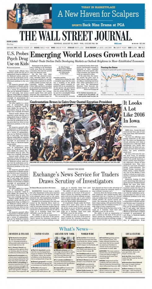
One of The Wall Street Journal’s most prominent and visual icons, the What’s News column became skinnier yesterday, going from two columns to one. This had been first tried in the tabloid editions of the European and Asian WSJ, but it does not work as well on the larger canvas of a broadsheet.
However, my objection is NOT about the look. (Though this is one time when skinny does not look better.) It is all about the principle behind What’s News—the ultimate Page One map to each day’s journey inside this great financial paper.
I remember when I was involved as a consultant with the WSJ, we used to discuss the fact that What’s News was visionary. To think that an editor more than eight decades ago decided that business readers were busy people and that it would be ideal to give them a summary of the top news right on Page One!
Today, What’s News is imitated everywhere, and every focus group and research project I have been involved with recently yields the same result: Readers/users want to see what’s inside the newspaper before they dive in.
That is why I am a bit confused by the WSJ’s switch to minimize What’s News, at a time when they should have amplified the concept, illustrate it and give it more space on Page One.
Of course, I am not involved here and have no idea what the readers of today’s WSJ want. I am sure that this is an intelligent decision, not made overnight, something the memo from editor Gerard Baker confirms. Nevertheless, I am still surprised.
I have always imagined a larger more visual What’s News. Reed Reibstein, our art director/project manager, and I have put together a sketch of how it could be below.
Our concept
Here is how our suggested expanded What’s News would appear, preferably at the bottom of the front page
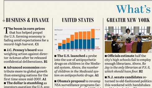
Close-ups show details: We did our version to include 25 items in the What’s News navigator, all with real texts from the Monday edition and other WSJ stories.
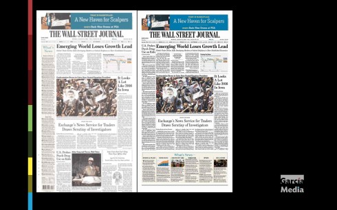
An enhanced version of What’s News offers a large opening for news at the top of the front page
In our suggested concept, we salute the past with What’s News, complete with all those familiar visual icons: the hood over it, the diamonds (we must tell Marilyn that diamonds are not just a girl’s best friend, but at the WSJ, a treasure of visual history), and, of course, the champagne hue background we introduced in 2001.
But, at the same time, in our sketch, we open up the top of the page for all those stories that the Editor wants to feature there. And we add images to make What’s News seduce the reader.
A win-win situation, without diminishing the role of What’s News.
In our view, What’s News is the one navigational model that has inspired news websites globally for its efficiency and functionality, so why reduce it to an anorexic presence on the front page?
It’s safe to say that readers of the WSJ (in all age groups) were probably not asked their preference. If they were, I doubt that they opted for a diminished version of What’s News.
Perhaps these readers will speak up. The good thing about today’s media environment is that one can make corrections on the go.
In my view, this move to a one column What’s News begs for correction. Pronto.
We would love to hear your take on this change and our sketches. And, of course, we’d particularly be interested to hear from the folks at the WSJ. This is a timely topic to discuss, given the critical importance of navigation in everything we do today, print and digital alike.
The editor’s comments
In a note to his staff WSJ editor Gerard Baker writes:
Even as we become daily a more digital newspaper, increasing the reach and impact of our reporting, analysis and comment online and on our various electronic platforms, we never neglect our print edition
And he cites that creating a newsier front page is what has prompted him and his team to reduce the What’s News to one column:
The What’s News Column has long been a valued tool for our readers, a comprehensive, elegant and concise digest of the most important stories in the day’s news…….From today we will be running it again daily as a single column. There are a number of reasons. For some time now, since the paper went to a smaller page width six years ago, the remaining four columns of front page news have constrained the rest of the articles into a punishingly thin four columns. What’s more, since the changes we’ve made in the last few years to A1 have made the front page newsier, the case for two full columns of news digest items has diminished, and some of the items in the What’s News columns have become repetitive, even otiose.
What’s News is universal
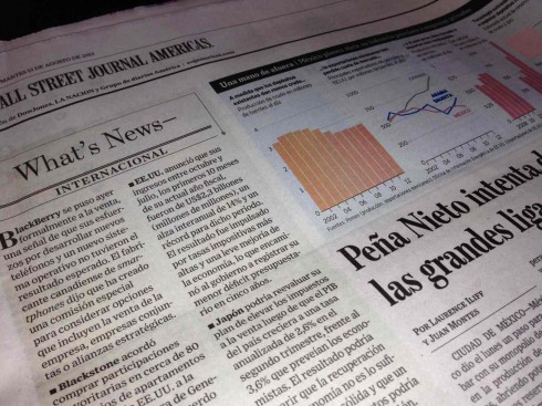
This is how What’s News appears in The Wall Street Journal Americas section of Argentina’s La Nacion
The What’s News element of The Wall Street Journal is such a part of the brand that even in its foreign language editions there is no translation of What’s News.
Here is how the WSJ appears inside the financial section of Argentina’s La Nacion. Even though all texts are in Spanish, What’s News stands as its own heading. Here it is still a two-column unit.
Of interest
Magazine design history buffs will enjoy this: The covers for first issue of 19 famous magazines are here.
Some of those first issues have aged well. Very appropriate to our commentary above concerning The Wall Street Journal and What’s News navigator: take a look at the first issue of People Magazine. That navigator would work perfectly well today, too.
http://mentalfloss.com/article/50299/very-first-issues-19-famous-magazines