This is the weekend edition of TheMarioBlog and will be updated as needed. The next blog post is November 11
TAKEAWAY: One of India’s most respected English-language dailies, The Hindu, has returned to its classic design, one that Garcia Media created in 2005. This is, of course, an unorthodox move. We find out why.
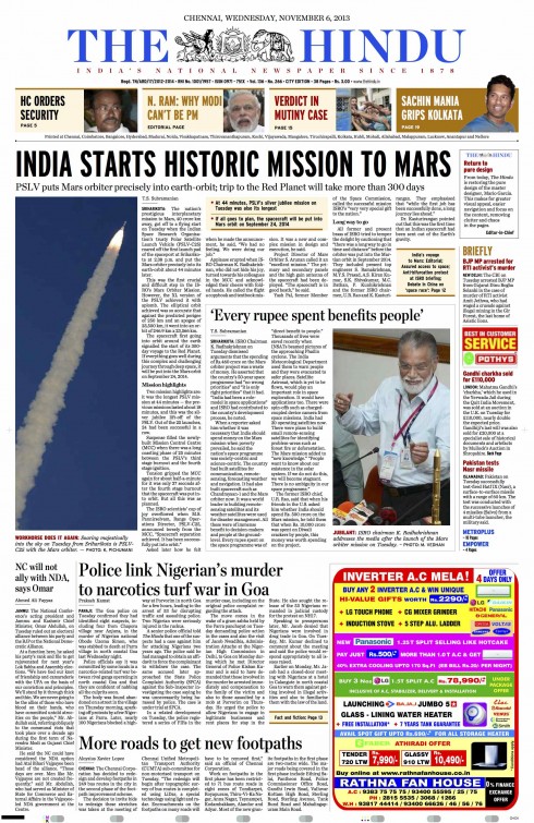
The Hindu: the classic design we created in 2005 is back
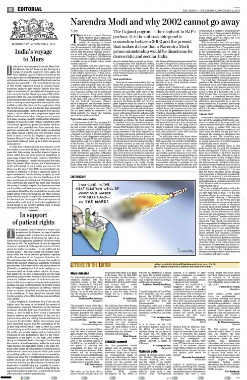
The Hindu: look of the editorial page after it was restored to original, more classic look
It was in July of this year that I read that The Hindu had abandoned the classic design we at Garcia Media had created in 2005 for that English-language daily, and adopted one suggested by a new editor, who had hired his own design director.
Truly, this was not a surprise. Eight years have passed since we created that look for The Hindu, and, in today’s media environment, that is a long time (many newspapers change their look & feel every three years or so—-it was more like 20 years not too long ago!).
As I turned to The Hindu that appeared Nov.6, it was refreshing to see that it was identical to what our Garcia Media designer Jan Kny and I had created. The style guide and templates had been dusted off from a three-month stay in the attic and fully applied again.
Emails and messages started pouring in from India from people interested in newspaper design, friends and acquaintances. The questions were pretty much the same:
What do you think of your design returning to The Hindu?
Why did they revert to the classic look only three months after the redesign?
I decided not to answer these queries individually. Instead, I have established a dialog with N. Ram, the former Editor-in-Chief of the newspaper, and N.Murali**, the former Managing Director of the family-owned company that publishes The Hindu, as well as N. Ravi, the present Editor-in-Chief, to get the complete the story.. The first two were the project leaders when we created the original design of The Hindu.
For the first time: non family members as editors
After a period of unrest and upheaval as a result of difference of opinions among the family members with ownership of The Hindu, it was decided to “professionalize” the operation—hiring non family members as editors. Following a brief period under this set up, the family members took control of the newspaper again, reinstating the so-called “classic” look.
So, on October 21, N. Ram, chairman of Kasturi & Sons Limited, the company that publishes The Hindu, issued the following statement via Twitter:
Note that The Hindu (printed newspaper) is returning to Mario Garcia’s pure design “contemporary classical”. Pastiche & mishmash are out.
A classic design returns
“It’s great to be able to reconnect on design—the great ‘contemporary classical design’ you did for The Hindu (alongside the other pure designs you did for our other publications) some years ago,” N. Ram, said. “It’s great to have you back at The Hindu through the return of your pure design after an embarrassing period of eclectic, free-for-all experimentation, which brought ‘clutter and chaos’ (and mishmash) to the pages and was, net, an eye-sore (fortunately, it lasted only a couple of years).
“The changeover to your original design is also a metaphor for the journalistic values for which The Hindu was renowned, returning to the iconic newspaper,” says N. Murali, co-chairman of the company that publishes The Hindu.
Why return to the previous “classic” design?
The Hindu of November 6, 2013 had a page 1 announcement titled “Return to pure design” from Editor-in-Chief N. Ravi.
In the spirit of getting the complete story in a fair way, I asked N. Ravi, editor in chief of The Hindu, about the decision to return to the classic design concept of 2005.
“The decision to return to the pure, classic look that you had brought to The Hindu was easy and obvious and has given us all immense satisfaction. Your pure design had served us admirably since it was adopted in 2005 and had won wide appreciation from readers. In the last two years, there had been a gradual but noticeable departure from the design and four months ago, new elements and colours that were totally out of line with the concepts and look that you had introduced were introduced. In the result, the pages looked mangled and chaotic and the newspaper had lost its distinctive character. The mix of colours introduced was far removed from your palette and made the pages garish. Designers and page layout editors did not have definite design templates to work on and it became a free for all. Navigating the content became very difficult, and instead of maintaining the content-related hierarchy on the pages, stories that offered more play for design elements dominated. It was after a hard look at this distortion of the design that we decided to restore your pure design.
What was the readers’ reaction?
“As for the reactions of readers, many had complained before the restoration of your design that The Hindu had lost its distinctive character and was beginning to look like the other newspapers around. After the change, there has been a general and widespread appreciation, with one long time reader saying that it was once again The Hindu that he had admired and enjoyed. The neat, classic look with a well-defined hierarchy and easy navigation as well as the use of your distinctive, classic colour palette are the specific features that have won appreciation.”
I don’t recall any previous instances where a design was resurrected. As I look at the classic look for The Hindu, I think it still applies, a testament to a design strategy that did not emphasize trendy elements.
I have always maintained that the true test of editorial design is its sustainability and longevity.
In fashion, Balenciaga and Coco Chanel dresses are as elegant today as they were when created.
The same applies to newspapers, as this episode from The Hindu reminds us.
Of related interest:
Introducing our new look newspaper
http://www.hindu.com/2005/04/14/stories/2005041406580100.htm
First paragraph:
Classic, yet contemporary; contemporary, yet classic — that is what The Hindu has continually sought to be in the world of Indian and international newspapers.
The Hindu: website redesign
http://www.garciainteractive.com/your-portfolio/the-hindu
Reader reaction to the 2005 redesign of The Hindu
http://www.angelfire.com/nd/nirmaldasan/editorials/may2005.html
‘Hindu family’ chucks out ‘professional’ redesign
http://wearethebest.wordpress.com/tag/mario-garcia/
Highlight:
Four days after The Hindu board summarily decided to pause its ongoing “professionalisation” process, the Mount Road Mahavishnu has reverted to its previous design, as promised by chairman N. Ram in a tweet
Of redesigning newspaper and redefining common sense
http://www.thehindu.com/opinion/Readers-Editor/of-redesigning-newspaper-and-redefining-common-sense/article4892170.ece
(Here is what the editor who changed the classic design of The Hindu had to say about his project)
Highlight:
Last week, this newspaper started sporting a new look. According to the Editor, the new soft redesign was aimed at a brighter, cleaner yet sober and modern look to enhance the reading experience. In this process, some sections were relocated and some renamed, and a few new features introduced. It may take a week or two for everyone to become familiar with the new design.
Of special interest today:
Mobile is changing how audiences consume journalism
http://live.wsj.com/video/has-mobile-consumption-changed-the-news-industry/47550116-E262-417A-BE74-C93FAB98861B.html?utm_source=API%27s+Need+to+Know+newsletter&utm_campaign=e34dee1caa-Need_to_Know_November_6_201311_6_2013&utm_medium=email&utm_term=0_e3bf78af04-e34dee1caa-31701869#!47550116-E262-417A-BE74-C93FAB98861B
Highlight:
In this video Mashable’s Jim Roberts, BuzzFeed’s Lisa Tozzi, Circa’s Anthony De Rosa, and News Corp’s Raju Narisetti talk about how news organizations can respond to the audience’s change in consumption habits. They also talk about how news organizations should rethink their content to cater to each platform.
Axel Springer makes considerable progress in the digital transformation of the company
http://www.axelspringer.de/en/presse/Axel-Springer-makes-considerable-progress-in-the-digital-transformation-of-the-company_19503336.html
Highlight:
Increased number of paid-content offerings on the Internet / Digital portfolio supplemented through several acquisitions / Groupwide EBITDA margin is 17.5 percent / Management Board confirms expectations for the full year