TAKEAWAY: It is a conversation that should never be missing from media conferences, seminars, and college communication classes: how does reading on screens differ from reading on paper? A Scientific American article summarizes the issue and supports it with splendid research on this new topic. Read about it here as I touch upon the main themes of the piece. Part Two: Which platform, paper or screen, causes greater fatigue to the user?
Top photo, www.mhpbooks.com; bottom, spacing.ca
We continue today our conversation, started in this blog yesterday, and inspired by a Scientific American article about the differences we experience reading on paper as opposed to on a screen surface.
Today I concentrate on one of the theme centerpieces that I have derived from the SA piece:
Are we less reflective when reading on screen than on paper?
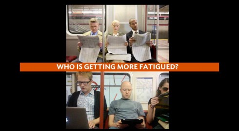
The element of fatigue
Is it possible that we get fatigued more quickly when reading texts on a screen, which leads to a less reflective mode?
Or is it, I believe, a function of the design process itself that affects our levels of fatigue and comprehension, regardless of platform.
Here is a highlight of the SA article:
Compared with paper, screens may also drain more of our mental resources while we are reading and make it a little harder to remember what we read when we are done. A parallel line of research focuses on people’s attitudes toward different kinds of media. Whether they realize it or not, many people approach computers and tablets with a state of mind less conducive to learning than the one they bring to paper.
The statements above trouble me a bit, although I am reassured by the use of the verb “may”, which leave it open to speculation whether screens do fatigue us quicker than the printed page. I imagine we will see more research on this very important point. Personally, and as a member of the generation of what I refer to as Printnets, who feel at home both reading on paper as well as screens, I have not recorded any sense of fatigue while reading several newspapers each day on my tablet as opposed to when I read those papers in their printed edition.
I, too, go from one platform to the other, sometimes without realizing that I am doing so.
Just this morning here in Prague, I went to the breakfast room of the hotel and picked up an International Herald Tribune and finished reading a piece I had started the night before, just when I was about to go to sleep and reading on my iPad. Of course, I could say that fatigue made me fall asleep while reading at 10 pm, already in bed, and in a total lean back sleepy mode, and that is the reason I did not finish the piece. At breakfast, I had all my morning energy, so there was no fatigue completing the piece on page 9 of the IHT.
One of the studies mentioned in the SA piece, originating in Norway, asked 72 10th-grade students of similar reading ability to study one narrative and one expository text, each about 1,500 words in length. Half the students read the texts on paper and half read them in pdf files on computers. Afterward, students completed reading-comprehension tests consisting of multiple-choice and short-answer questions, during which they had access to the texts.
Students who read the texts on computers performed a little worse than students who read on paper. The study concluded that students reading pdf files had a more difficult time finding particular information when referencing the texts.
My question: isn’t this an issue of navigation, not necessarily one of the platform in which students were reading. A printed newspaper, or a book without an appropriate index can be as tiring to navigate as the same situation on a tablet or smartphone screen.
This to me reinforces the importance of clear, intuitive navigation when designing for screen platforms.
I would also add that fatigue of the type described here is something we have been aware of when designing for print. A page with “graphic noise” (a difficult to follow info graphic, for example), or text that is too small and difficult to read,or a photograph that is not clear, all of these are elements which contribute to retarding the process of reading, cause fatigue and derail the comprehension process. There may be an element of “screen noise” that we need to become more aware of as well.
Fatigue, in my view, occurs when the receiver of the information is overwhelmed, feels disoriented, or encounters visual obstacles along the way, such as the ones described above. The platform itself may be quite secondary, the design process, very primary.
In that sense, this study pushes us to think about what we do carefully, with functionality and clarity as the keys of the process.
Those were the keys of the process when I first laid out a newspaper page for my college newspaper. They will also be the keys for future generations of designers, in platforms we cannot even imagine today.
Tuesday’s blog post on the subject:
A conversation about differences of reading on screen versus paper
https://www.garciamedia.com/blog/articles/pa_conversation_about_differences_of_reading_on_screen_versus_paper_p
Related to the subject:
http://mit.ittelkom.ac.id/courses/media-arts-and-sciences/mas-630-affective-computing-spring-2008/readings/aesthetic_readin.pdf
Abstract:
In this paper we demonstrate a new methodology that can be used to measure aesthetic differences by examining the cognitive effects produced by elevated mood. Specifically in this paper we examine the benefits of good typography and find that good typography induces a good mood. When participants were asked to read text with either good or poor typography in two studies, the participants who received the good typography performed better on relative subjective duration and on certain cognitive tasks.