–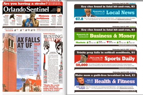
BLACK IS BACK?: The Sentinel sports a black reversed nameplate, and accentuates section page headers at the very top with a strip of black. Not bad.
TAKEAWAY: : : Behold the color black, and pay tribute to those reverses that were the “only color” layouters had for decades, before other colors became available to them
Florida’s Orlando Sentinel unveiled its much discussed new look Sunday, and I have received almost a dozen emails from here and there, with one main question or concern:
What do you think of this black reverse nameplate?
Oh, the mails echo a variety of feelings:
“This is not like Central Florida at all,” commented one correspondant.
“Don’t tell me that we are going back to black as a trend for newspaper flags!,” wrote a Swedish designer.
“Is this part of the new ugly?,” an Ivy League university student asked.
“I tend to like it, but isn’t too tabloidy and sensationalistic?” wrote a design director from a broadsheet daily in India.
I think it works for this newspaper, even though we associate the Central Florida area with Disney World’s midnight parade, oranges and colorful space shuttle launches. Why do I think it works? If used properly, and in small canvases (the nameplate is not necessarily small, but the designers of the Sentinel have done the right thing by surrounding it with tons of bright colors), black can be a good accent to bring contrast to a page.
The fact that there are hardly ANY black reversed nameplates anywhere will give those Orlando readers a bit of a shock or surprise, and it will make their newspaper stand out in the stands, or the coffee table for that matter.
Long before we had color as we know it today, there was black as THE COLOR. The Brits used and overused what they called “wobs” (white on black). To this day they continue to do so. Has anyone read The Sun, or The Daily Mail lately? And Bild Zeitung in Germany has black and white as top colors in their palette.
I think the Sentinel has a distinct page one look, and one I hope they can keep producing day to day with content that does it justice. This is not a traditional US newspaper page. I wish I had participated in the meetings when prototypes were presented to the editors.
It is a bit tabloidy, indeed, but that is good in my way of thinking. Wake them up, and squeeze that orange juice in their face; pull them by their Mickey Mouse ears, and show them that an American newspaper does not necessarily have to be dull, or aimed to please the Mamie Eisenhowers of the world.
As in any other redesign, some will love it, others will hate it, but I give the Sentinel staff and its designers a B+ for effort, and for their adventurous spirit.
WE SEND YOU: For more on the Sentinel redesign, go
http://www.visualeditors.com/apple/2008/06/an-in-depth-look-at-the-new-and-improved-orlando-sentinel/
http:www.newsdesigner.com
http://www.orlandosentinel.com/
WHERE IS MARIO? Flying between Frankfurt and Lagos, Nigeria