This is the weekend edition of TheMarioBlog; we will update this post during the weekend; next new posting, Monday, Nov. 14
Update #5: Kuala Lumpur,Saturday, Nov. 12, 10:54
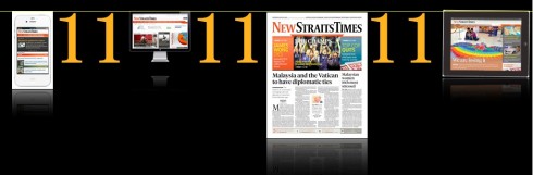
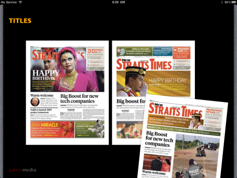
TAKEAWAY: Finally the day it is here, all those number one’s, 11-11-11, which have resonated in the newsroom of the New Straits Times for about six months, at first a distant date with perfect symmetry of numbers, then the realization that with the creation of the last prototype, we were weeks away from D-day. This is our final in a series of blog posts leading to today’s launch: see the pages, read about the stylistic details, share the fun of the day.
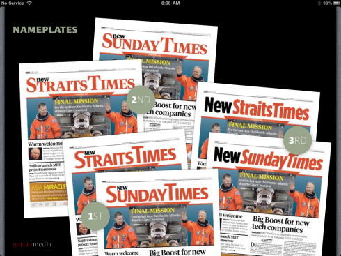
Pages from the New SundayTimes
These are pages from today’s first Sunday edition of the Straits Times since its relaunch.
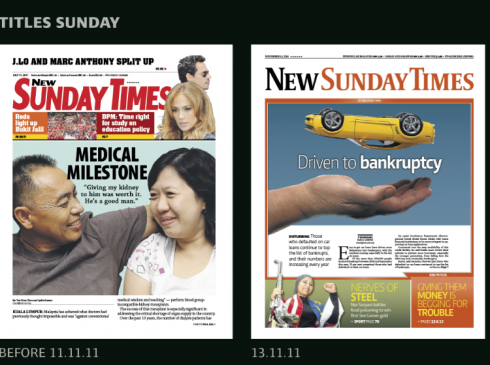
The Sunday front BEFORE and after the redesign of the Straits Times
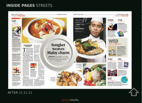
A centerspread feature page from the Streets section of the New Sunday Times
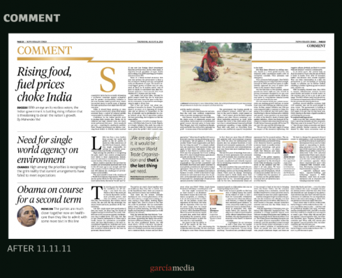
New style for Comments page
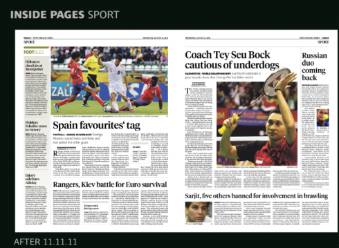
Sports pages from Sunday edition
A discussion about the New Straits Times with Tyler Brulé in Monocle Radio
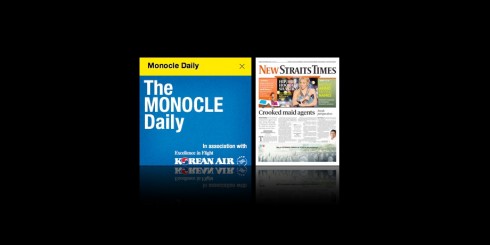
It is Saturday for me, but Friday night in London and I just appeared in Monocle Radio’s The Monocle Daily show. It was a fun chat with Tyler Brulé and Hugo Macdonald, who were quite interested in our work here for the New Straits Times, and especially the 3D feature for the first day of the launch.
To hear the full interview, go here:
http://www.monocle.com/monocle24/?openshow=112
Breakfast show discussion of the New Straits Times
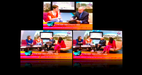
Making an appearance in Malaysia’s Breakfast Show to discuss the new look of the New Straits Times
The marketing of the new New Straits Times
Here is the 60-second TV spot that started playing 11-11-11, the first day of the new New Straits Times. The marketing campaign was created by marketing director, Zuraida Mohammad and her team. It includes, in addition to TV spots, radio, billboards and print ads throughout the Malay media.
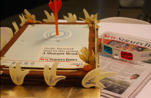
Every advertising agency received a cake courtesy of the New Straits Times, marketing department
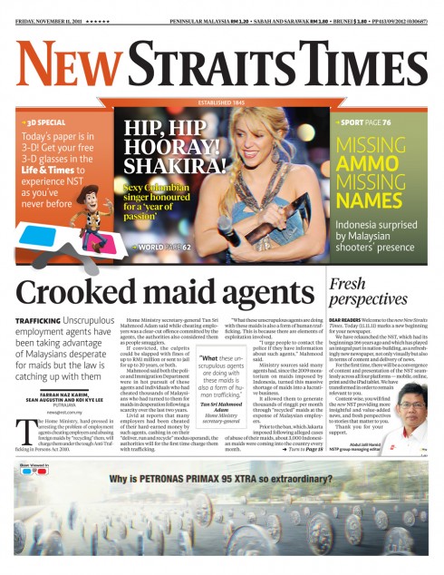
First front page of the new New Straits Times
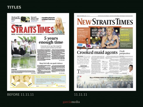
Before and after front pages
Well, today is D-day.
We have watched in amazement how much progress has been made in so many different areas:
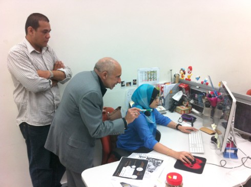
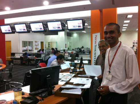
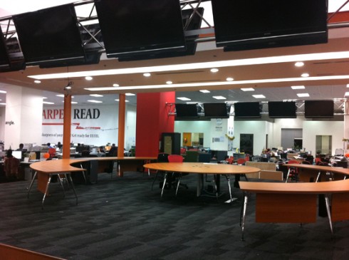
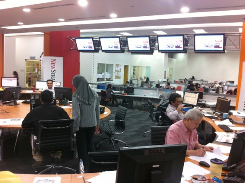
The newsroom was reconfigured to allow for a more integrated unit of journalists from across the platforms. What used to be an enclosed, old fashioned fish-tank of a room in the middle of the newsroom became a stylish news center of operations, with custom made wooden round tables, huge TV monitors hanging from the ceiling and a bringing together of editors with the story as their main common task, not the platforms. “I waited about 15 years for this moment,” a seasoned editor told me, sitting for the first time at the center table, and, “ready to show that we are here as journalists intereste in creating better stories.”
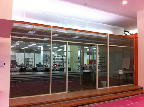
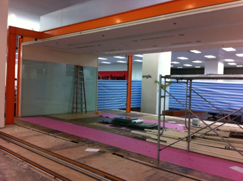
See the evolution of a newsroom redesign: the old “fish tank conference room” gives way to a modern, state of the art open room
The printed newspaper has undergone a total rethinking from the way stories are told, how pages are laid out, the new navigation system, new typography, simple grids and a brand new palette (our blog of the past four days have dealt in detail with all these topics, see links below).
The digital side of the operation has undergone tremendous change as well: a new look for the mobile and online editions, but, more importantly , a new version of the tablet app. Users will find a more vibrant, graphic and pop up friendly app starting today. Take a look!
Below: section fronts for the new NST
_thumb.jpg)
_thumb.jpg)
_thumb.jpg)
_thumb.jpg)
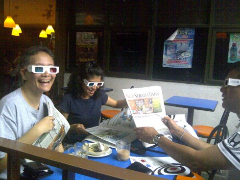
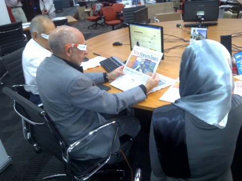
It is all in 3D today!
To make it all more exciting this first day, the entire newspaper can be viewed with special 3D glasses, a treat for readers and advertisers. It is my first experience with a 3D edition of a newspaper and I admit that it was fun, although perhaps not practical for everyday. The selection of photos was more mandated by the 3D requirements than other values, but it is only one day.
Will there be 3D printed newspapers in the future? Indeed, I am sure. Advertisers love it and today’s edition of the New Straits Times is packed with ads, as all advertisers wanted to show their products in 3D. Why not?
We created a 3D prototype and the entire newsroom can be seen from time to time wearing the funny glasses and perusing the pages of their newspaper, a smile on their face. I guess the child in each one of us loves to see that sports photo of the World Cup qualifier with the extra dimension, not to mention those automobile ads where the cars seem to be in motion, not to mention Shakira, well, showing you that hips don’t lie.
The tablet edition is also on 3D an I must admit it is an interesting experience to see what we already consider to be a rather amazing platform go further with the 3D glasses.
It is now wait and see to find out how much the readers of the New Straits Times liked this feature of their newspaper today, the first day of the new look.
A typical breakfast scene in Kuala Lumpur Friday morning
We test the 3D effect on the prototype
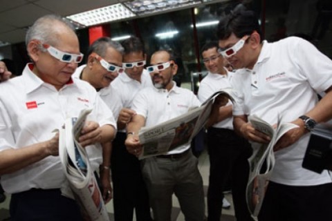
The NSTP management team getting their first show of the newspaper’s 3D edition
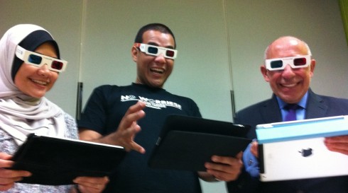
Posing with the tablet production team
Other important changes:
The logo: this is a touchy subject, usually, and, although many newspapers toy with the idea of changing a logo, in the end, it usually does not happen. But here it has.
The new logo of the New Straits Times is based on Gerard Unger’s Coranto 2. The logo was created by the Garcia Media team. Constantin Eberle, of Garcia Media Europe, created the concept, and our art director/project manager Reed Reibstein, based in New York City, produced the final design. Their collaboration created a logo that is more modern and emphasizes the word New, which the old logo diminished.
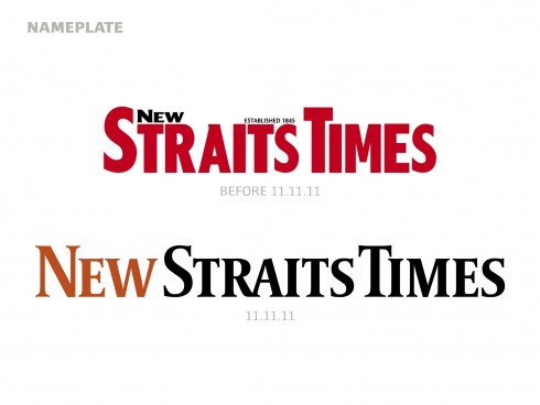
The old and the new logos for the New Straits Times: the new one is set in a lightly customized Coranto 2
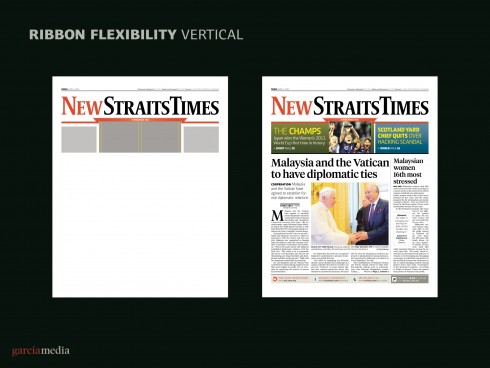
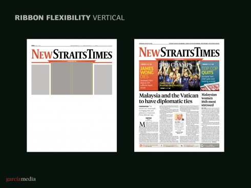
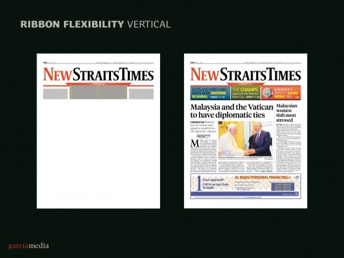
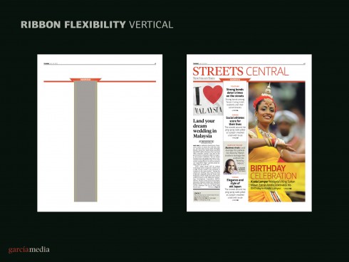
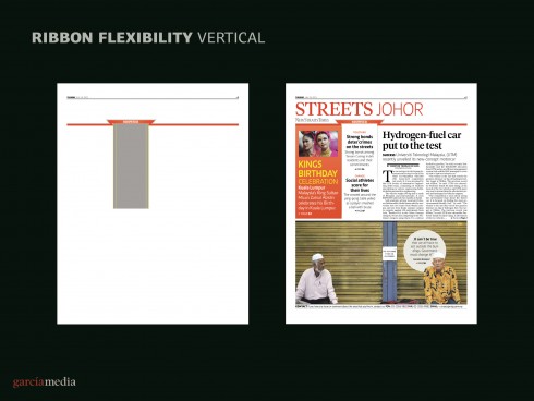
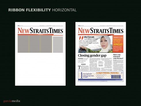
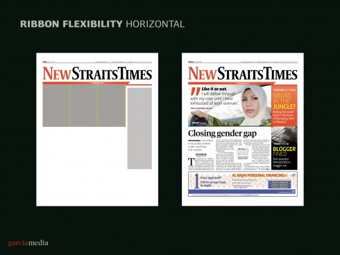
The ribbon: A visual continuity theme thru the entire presentation is the ribbon, which may appear in various forms depending on the images of the day and how navigation is presented. Notice the different ribbon uses in the templates below.
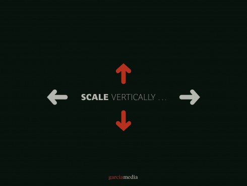
The concept of the ribbon to provide visual continuity
Below: Working at the NST
Below: building the new NST newsroom
Early prototypes
Here are images of where the process began. These are the first set of prototypes that we created. From the start, as you can see, we wanted the look to be colorful, bold, young and seduce readers visually in a few seconds.
These are prototypes that our art director for Garcia Media, Constantin Eberle, and I, experimented with in early stages of the process
My note to the readers
(available also at http://www.nst.com.my/opinion/columnist/reader-benefits-creating-the-modern-newspaper-1.4275)
Creating the modern newspaper of the 21st Century
It is a new and freshly rethought New Straits Times on your coffee table this morning.
After almost six months of briefings, discussions, sketches, prototypes and training, this newspaper opens a new chapter in its 166-year history.
Why change the newspaper?
Many of you who are habitual readers will probably ponder the question, others will enjoy it, have a second cup of coffee and go about your business as usual.
Newspapers undergo evolutions from time to time, and I have been helping them do so for about four decades now. Monocle Magazine editor Tyler Brulé describes me as a Newspaper Doctor when I write short commentaries for his publication. I sort of like that, although there is a great difference between what doctors do—-tending to patients who are usually ill when they visit the doctor—-and what I do.
Many of the newspapers who come to me for help are not rushed to me by ambulance. Not at all. Instead, they are seeking preventive medicine.
Perhaps this is the exercise we conducted here at the New Straits Times.
For you, the reader, this visit to the “newspaper doctor” is full of benefits, small and large, and I wish to point out some of them for you here.
First, what constitutes a well designed newspaper?
A well designed newspaper makes information easy to find, easy to read, and easy on the eyes.
I believe we have accomplished that in a big way at the New Straits Times.
Make it easy to find
The newspaper has a system of navigation—-conceived with the digital reader in mind—-which will allow readers to get oriented right on Page One: what are the best stories I should not miss today?
But navigation does not stop there. Each section, such as Streets, Business, Sports, will have its own navigator, facilitating the search for news for readers who tend to be in a hurry these days, and who, in many instances, bring to print their digital reading habits.
The way we have created hierarchy on the pages also aids navigation. Each page has a definitive lead story, the one important piece that the editor of the section feels should be read first, followed by secondary stories, compact stories, briefs, photo stories. Each has its own style typographically.
Each section front has its individual navigation, allowing for quick indexing, and also permitting readers to budget the time as they read a newspaper.
It is important to note that current research reveals that many readers—-it could be you—- do not have the time to read their entire newspaper in one sitting. Instead, they read a little in the morning, and then decide to continue during the first coffee break or during lunch time. In some cases, research we have been involved with shows that an average reader may read his/her newspaper in as many as three different sittings.
Why not? So we have created the right navigation and hierarchy to facilitate such reading habits.
But, of course, if you still sit down to read your newspaper cover to cover, the new New Straits Times should provide you with pleasureable, orderly and entertainment reading—-and more attractive pages to look at.
Make it easy to read
This is, after all, the reason all readers come to a newspaper: to read, to be informed, to catch up with news, to expand or to reaffirm that which they may have already heard, and to be surprised by a series of stories which are new, entertaining and that they wish to share with family and friends.
Typography plays a key role in making the information easy to read, and we have selected two typographic fonts, Tiempos and Caput, which are new, legible and should facilitate reading, especially of small text, and very particularly for readers of a certain age!
Making a newspaper easy to read is a combination of legibility and readability.
Legibility refers to the visual aspects of type: the size and shape of the letters, for example, which our fonts provide quite abundantly. Readability, however, refers to the content of headlines and texts, how stories are written.
Our system of hierarchy allows for stories to have more than one point of entry. So, in addition to a headline, there may also be a summary which enhances the content of the headline.
If, as we know, a newspaper audience is constituted by both devoted readers and scanners, then it is the obligation of the editor and the designers to design a newspaper that follows these two tracks: if you are a scanner who only reads headlines and summaries, and who looks at photos and read captions, then the new New Straits Times offers you plenty of opportunities to scan. If you are a devoted reader who reads intensely and deeply, we have the good for you too.
A win win situation, your newly rethought New Straits Times.
Make it attractive (easy on the eyes)
We live in a visual world. There is color everywhere, and outstanding graphics, animations and visual treats in advertising, highway billboards, online, tablets and even T-shirts.
A modern newspaper has to look good. It has to seduce in those first ten seconds when you look at the front page. Of course, the real seduction is with the type of stories that appear, and how they are written, but before we get to the stories we are attracted by the packaging.
We have revised the entire packaging of the New Straits Times.
You will see different typographic fonts, a new colour palette that emphasizes the warm and bright colors of Malaysia. You will see better photos, displayed bigger, as well as infoboxes to expand on stories, to offer details, and, through it all, as a theme a ribbon that offers continuity from section to section.
When you see that ribbon, you know it is the New Straits Times.
Like ribbons on a gift box, anticipating the surprise, the New Straits Times becomes a sort of daily present for its readers, starting today.
It is our hope that you enjoy it!
Note from the NST
http://www.nst.com.my/local/general/1.4010
First paragraph: Today’s date, 11.11.11, marks a new era for the New Straits Times, the country’s oldest newspaper. Changes in the newspaper not only involve its masthead, but also its contents and points of dissemination.
Our previous New Straits Times posts
New Straits Times relaunch: The Digital Platforms
https://www.garciamedia.com/blog/articles/new_straits_times_relaunch_the_digital_platforms
New Straits Times relaunch: Creating the Color Palette
https://www.garciamedia.com/blog/articles/new_straits_times_relaunch_creating_the_color_palette
New Straits Times relaunch: The Typography
https://www.garciamedia.com/blog/articles/new_straits_times_relaunch_the_typography
Creating some basic pop up moments in your tablet
https://garciamedia.com/blog/articles/creating_some_basic_pop_up_moments_in_your_tablet/
Emphasizing the New in the New Straits Times: Part 3
https://garciamedia.com/blog/articles/emphasizing_new_in_the_new_straits_times_part_3_—a_new_tablet_edition/
Emphasizing the New in the New Straits Times: Part 2
?https://www.garciamedia.com/blog/articles/em
Emphasizing the New in the New Straits Times: Part 1
?https://www.garciamedia.com/blog/articles/monocle