Update #1, Monday, April 5, 07:37
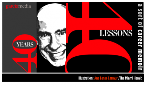
TAKEAWAY The Easter bunny brought me my iPad, and I needed no chocolates as I spent a big chunk of the weekend discovering this marvelous new medium; Arabi font developer and expert Nadine Chahine talks to us about what is new in the world of Arabic typography. PLUS: New pages from Times of Oman and Al Shabiba AND: 40 Years/40 Lesons: 6. Eagle
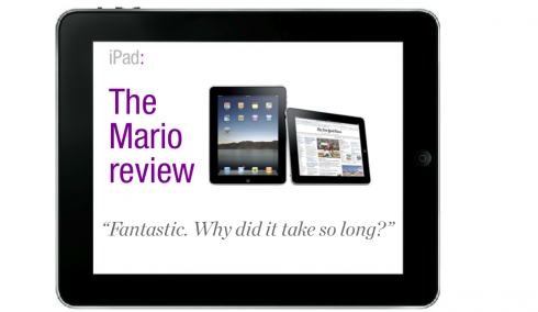
Mario’s impressions of the iPad
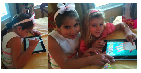
The iPad girls: My granddaughters Sophia Lazaro and Angelina Barravecchio feel right at home 5 minutes after putting their fingers on the iPad screen.
I have now had the iPad for almost 48 hours. I have to admit that I have loved it, and that is not an exaggeration. In fact, I have only used my MacBook for not more than 20 minutes, as I have found the iPad just perfect for browsing the Internet, writing and receiving emails, listening to music, watching videos, going into Facebook or Twitter.
Because so much has been written about the iPad, including many wonderful reviews to which we have linked in this blog, I have decided to do a short and to the point sequence of impressions, more so than a full review.
My favorite iPad feature: Its portability. I found myself using the iPad while lying in bed, which I would rearely do with my MacBook. If Steve Jobs intends for his new product to be one we associate with “leisure”, as opposed to work, then he has achieved it here. The screen is about 9.7-inches, as in a giant iPhone, but what a difference size makes here. At 1.5 pounds, the iPad is not difficult to carry (although it is heavier than the 10-ounce Kindle).. Yes, I am happy to have waited and not to have succumbed to the temptation to get a Kindle.
Troubleshooting: A word of caution to those first getting their iPad: Make sure you have the latest version of iTunes. I did not, so when I first plugged my iPad into my MacBook, nothing happened. I waited and waited, but nothing going. Once the new version was downloaded and installed, then iPad and MacBook decided to talk to each other. Great moment.Second bit of anxiety: at one point I could not connect to the Internet, as “no server was recognized”. After 30 minutes of frustration, I decided to go for Support. All I had to do turn off and turn on the iPad. It worked. In a few seconds, I was downloading apps.
About the apps:: There are so many apps in so many topics, that I decided I must have two or three days off just to do apps. The alarm clock is a favorite one for me, and one I will be able to use (just remember, if you use it, leave the app open to make sure it will wake you up! As for the sound for getting up: tons of choices, including music from your own iPod. Jazz in the morning? That would be new, but with the iPad, try for discovery.
Media and demos: I am very surprised to see so many worldwide publications that include demos of what they plan to do with iPad editions, including Spain’s ABC daily, and Italy’s Il Messagero, France’s Le Monde , as well as apps I would like to explore further, such as one called Newswiper, which costs 99 cents to download. I have to admit that these early demos did not impress me much, but I can understand that these newspapers were mostly trying to get their foot in the door, and the result is almost a 100% transfer of pages to an iPad application.
I believe that publications preparing these demos must, while not pulling out all the stops, bells and whistles, take time to develop some iPad specific content presented in a way which enhances what the printed edition does. This will come with time, and I bet many of the demos we will see now that the iPad is OUT, will be more representative of how this new medium can be used effectively.
I enjoyed TIME Magazine ($4.99 to download), with Steve Jobs on its cover, and a happy mix between the printed version and the new iPad edition. The table of contents is a highlight.
Speed: My machine is fast, surprisingly so. Connecting to the Internet is so much faster than on my iPhone. And, for me, jumping to take care of my social networking thru Facebook and Twitter was as fast as can be. I am also surprised as how long the battery lasted ( it is supposed to last 10 hours, but I kept my iPad going for extended periods of time with no problems). Speed is paramount here: Things open fast, scroll fast, load fast.
The big screen: Everything looks luscious here, from the pages of the Winnie the Pooh book which I read to my grandkids, to an episode of Ugly Betty, to photos and even emails.
The sound: I have to admit that listening to Japanese jazz favorite, Charito, doing her rendition of They Say That Falling in Love is Wonderful was as good as it gets here.
Horizontal versus vertical screen: I prefer horizontal, and found myself holding the iPad for landscape viewing 90% of the time.
The keyboard: I am sorry I got me an extra keyboard, assuming that the iPad’s built in keyboard might be difficult to handle. Not at all. I have not touched the extra keyboard. No problem using the one that comes with the iPad, and one can make it disappear in a second.
The books: I still have five big books that I want to read in the days ahead, and already purchased them in print formats, but I now wonder about taking those bulky titles in my carry on bag. I have downloaded Michael Pollan’s Food Rules, An Eater’s Manual, and already got all the way to page 21 to find out an important rule “don’t eat anything your great grandmother wouldn’t recognize as food”. And, oh, that dictionary tool always at the ready: how I wish I had had that in 1963 when I struggled with American literature with only a scant knowledge of English.
Final grade: It is an A as far as I am concerned. I am already wondering how we could have survived so long without something like this. Finally, I can read for long periods of time without my eyes getting tired (as in online or iPhone reading of text). This is where I think the iPad will be the definitive game changer.
Finally, when I put it on the table after our Easter Sunday brunch at my daughter Elena’s home today, my granddaughters Sophia (6) and Angelina (5) took to the iPad and in a matter of minutes were moving their fingers like experts over the screen, pinching photos to make them bigger and reading Winnie the Pooh, turning the pages as if this was the normal way to do such things.
Perhaps it is, and those of us “slightly older” than Sophia and Angelina, well, we have to think the same.
A Renaissance for Arabic type, says Nadine Chahine
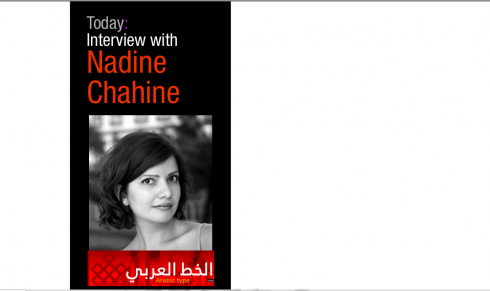
Nadine Chahine is one of the most successful contemporary Arabic typographers and font developers. She has created variuos Arabic fonts, including Frutiger Arabic, Palatino Arabic, and Neue Helvetica Arabic. Also such original fonts as: Koufiya, Badiya and Janna. Nadine is currently a Ph. D. student at Leiden University in The Netherlands, where she is completing her research project on the legibility of Arabic typography. Nadine and I engaged in an exchange of emails recently during the final discussions of the logo for Al Shabiba
Mario: Nadine, what is the status of Arabic font development in the world right now?
Nadine: We are in the early stages of a Renaissance. It is absolutely amazing how quickly the Arabic typography scene is changing! I’m not sure about the quantity but there’s been a substantive qualitative leap forward in what is available on the shelf today. These are very exciting times to live in, with lots of exciting challenges and new terrains to explore.
For many years, centuries actually, Arabic type design has been bogged either by technological constraints or by the lack of the skill set necessary to produce high quality work. This is no longer the case today and the body of work being produced today is testimony to that. We are finally free 🙂
Mario: We have experienced very long and tedious sessions discussing just a “sheen” in a logo: is that typical of working with Arab calligraphy?
Nadine:Yes and no. If you asked for a straightforward (i.e. Ottoman style) Thuluth or Diwani character, you would have been done much earlier. However, to ask for innovation and modernity in Arabic calligraphy is a much tougher challenge to take on. There are, of course, calligraphers who are able to shake things up and stride forward. Unfortunately, a significantly large number of calligraphers today are more focused on their ability to master the styles as developed during the height of the Ottoman empire. It is a golden cage, but a cage nevertheless. The same goes for the market’s expectations which is why you had such a prolonged process.
Still, it doesn’t mean that Arabic calligraphy is stuck in a time capsule. There are many examples of work that is truly inspired and unbelievably gorgeous (look for the work of Samir Sayegh to see what I mean). Just like in the case of your logo, you have to have the right people on board, and you have some convincing to do.
Mario: As a type designer with a recognized specialty in Arabic fonts, what are some tips you would give designers working with Arabic language newspapers and magazines?
There’s a few things that might be helpful:
1. It’s always good to have an experienced Arabic designer as part of the design team or as an external consultant. There are issues with how one would read that is part of the design process and having an Arabic editor is not enough.
2. Designing in Arabic is not simply a process of flipping the design of a newspaper to read from right to left. Arabic text has different dynamics on a page and this needs to be addressed.
3. Regarding the dynamics, Arabic text is generally less uniform in appearance than Latin. With the exception of Kufi based designs and the heavy-based Naskh titling faces, it is not as stable when set in headlines as it doesn’t generate the rectangular block effect that one gets with Latin. One would need to design around that. In text, it is less repetitive and has a lot more motion than in Latin. Depending on the typeface, it could even look hectic.
4. So, the white space and supporting graphics are needed to lock the elements into place. Otherwise, the text might end up feeling as if it has been thrown onto the page, rather than an integral part of its composition.
5. The palette of existing Arabic typefaces that would work for a modern looking newspaper or magazine is very limited, especially in the number of weights available. It’s good to factor in at the beginning of a project some extra time for development work in case that is needed.
Times of Oman and Al Shabiba launched new design Sunday
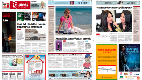
Pages from Monday’s edition of Times of Oman
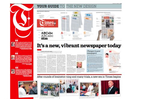
Both Times of Oman and Al Shabiba used a double page spread to introduce the new design to their readers
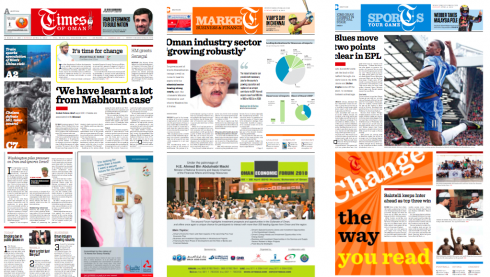
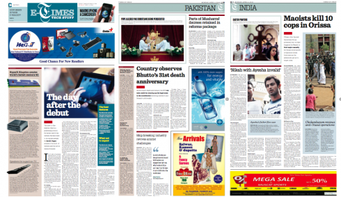
Various pages from Times of Oman: front, Market, Sports
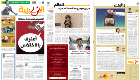
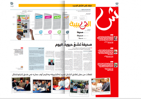
Various pages of Al Shabiba’s Sunday edition: first day with new look
We show you here a variety of pages from Times of Oman and Al Shabiba following the launch of new looks Sunday. Notice that both newspapers presented a two-page guide to the new design.
For related blog posts about the redesign process, go here:
Times of Oman goes for total rethinking and redesign:
https://www.garciamedia.com/blog/articles/times_of_oman_goes_for_total_rethinking_redesign
A logo is finally chosen for Al Shabiba
https://www.garciamedia.com/blog/articles/moschino_it_is_the_best_youngest_logo_for_al_shabiba_wins
The process of redesigning a new brand for Al Shabiba in Oman
https://www.garciamedia.com/blog/articles/tuesday_report_from_oman_opinions_vary_on_al_shabiba_logo_and_we_continue

High flying daily newspaper project # 1
This was no ordinary American eagle.
This was an American eagle wth wings expanding about 8 columns across the top of the page.
This was an eagle that, when we changed it to a more stylized eagle, grew bigger wings that took off, with me under them.
The flight of that eagle has been a journey that has not ended for me yet.
The eagle in question was the eagle on the nameplate of The St. Cloud Daily Times, of St. Cloud, Minnesota.
(The newspaper is now just St. Cloud Times, as it dropped the Daily in 1988 when it started publishing a Sunday edition as well)
I must admit that the first time I came in contact with a copy of the Daily Times, I knew that the first thing we had to do was take that eagle off the front page of the newspaper.
In the process—-and this was my first official redesign project from start to finish——I learned valuable lessons, most important of which was: yes, you can push for what you believe it, and sometimes you accomplish what everyone around you think is NOT possible.
In reviewing my notes and articles written “post redesign” of the The St. Cloud Daily Times in 1979——at the time I was a professor at Syracuse University’s S.I. Newhouse School of Public Communications——I find my own reference to the eagle on the nameplate:
“….most importantly, the front page nameplate displayed a spreading and graphically overwhelming eagle, which became the greatest source of irritation and delays as we proceeded with our redesign efforts.”
More on that famous eagle and the impact it had on my career later.
Why a redesign for St. Cloud Daily Times
Around 1978, the young staff of the Daily Times, led by news editor John Bodette (who is now executive editor), had formed a “redesign committee” which spent months meeting regularly, analyzing the newspaper and trying to come up with graphic ideas to make it look better. But Bodette and Times editor at the time , Don Casey, soon realized that their in-house efforts to redesign the paper were hampered by the lack of a sense of direction. This prompted them to seek an outside opinion. It was at this point that I became involved with the Times as a design consultant.
I asked Bodette to send me two weeks worth of newspapers for me to analyze. This allowed me to observe the newspaper’s highs and lows, as well as to grasp a basic understanding of the newspaper’s news content, photo and art choices and the role of visual journalism in how the newspaper was put together daily.
By the time I made my first visit to St. Cloud—-a snowy day (those are frequent in St. Cloud, of course), I was able to experience the gravitational center of St. Cloud, the locale where readers and advertisers of this newspaper lived. I soon realized that St. Cloud, which at the time had a population of about 44000, was close enough to Minneapolis that it was like a microcosm of the larger city. This mental image started floating in my head, leading me to think that the old, ugly eagle on the nameplate could be replaced for something more stylish.
Eagle evil thoughts
I started sketching a modern version of this eagle on napkins, business cards, and anything that I could get a pencil image on. It became a crusade for me, but I was still not telling anyone about these “evil” thoughts. How do you begin a project——your first!—-by informing the editors that you want to change the nameplate, and, furthermore, remove a patriotic symbol as strong as an American eagle, which, by the way, I found out later, was a major nameplate staple of newspapers across the country.
I also was aware that as a Cuban American, many in the newsroom might see me as someone with no real patriotic feelings or attachments to the American symbol of freedom. To make matters worse, this ugly eagle was wrapped around an American flag.
But I could not imagine the front page looking good with that nameplate on. Something had to be done.
There were no Macs to design on in those days. But we did have border tape, and glue sticks, and ideas. The rest was a matter of executing.
I found myself drawing a box, a perfect rectangle, then using thin border tape, configuring the profile of a stylized eagle. I liked it from the start, but I was not telling anyone.
I casually asked about the “history” of the existing eagle adorning the top of the front page of The St. Cloud Daily Times.
Bodette, always gracious, enthusiastic and ten steps ahead of me, had compiled the information:
The eagle at the top of the newspaper had survived two World Wars, the Korean and Vietnam Wars and it had sat proudly there on July 20, 1969, when man first set foot on the moon.
I could read between the lines as Bodette and I reviewed this over lunch one very cold day: “Mario, this eagle means history here.”
Yes, the eagle and St. Cloud readers had more than a mere casual relationship.
By the end of this lunch I had decided to tell ONLY Bodette about my plans to dethrone the eagle and replace it with my idea of a minimalist rectangle and a very thin lined shape of an eagle inside.
Always open to the next idea, Bodette did not seem to brush my idea aside instantly.
“Why don’t we tell the others, Mario?,” he asked me as he got ready to pay for our lunch and head back to the newsroom.
A case of cold feet
The old eagle and the one in the box
Bodette knew his colleagues well, I must say.
The publisher of the Times and many of his editors developed a normal case of cold feet when the discussion of the eagle took place.
“We are not getting rid of the eagle totally,” i hurried to say. “It is just that we put in a more modern one.”
Half the people in the room were at least curious, others stayed quiet and seemed confused, and not at all convinced.
I emerged from that long and mentally exhaustive meeting with at least permission to try my rectangle with the stylized eagle inside.
I returned to Syracuse and knew that I had to truly work something magnificent before I send it for review.
Every night for days, I sat at my drafting board (remember those), watching the snow fall outside in Syracuse, while my son Mario, barely 9 years old at the time, stood by my side, watching me maneuver around an X-acto knife (yes, some may not know what that is—-call it a weapon of choice for artists and designers in the newsroom, seldom used for bad intentions).
Finally, I had it, and it started to put it on a page, and place type around it, since this boxed eagle would NOT sit there alone, it had to work wtih the rest.
I liked it a lot, and so did Mario Jr,, who expressed approval from the start.
New eagle lands in St. Cloud
I arrived in St. Cloud another snowy day and showed it to Bodette first, then Don Casey. They both liked it, Bodette more so, and he was already jumping with joy at the sight of this new, young version of the old, tired and ugly eagle.
But we had to convince a whole lot of other people, and, eventually, Gannett execs (they were in Rochester, N.Y. at the time).
In my correspondence of the time, as I tried hard to lobby for my new eagle concept, I wrote the following:
”….notice that I am proposing a radical change for the nameplate. But, you will notice that your eagle has been preserved, if only in very abstract terms. Of course, I would not part with the eagle….I feel that we can reach this happy compromise—-keeping it, but minimizing its impact.”
As I read this in 2010, I realize that “compromise” had become part of my vocabulary, but little did I know at the time that it would have to be the one tool that I never leave home without for every project presentation. The consultant, editor or art director who is not ready to compromise will perish along the way or self destruct.
Second I enjoy reading the words “keeping it but minimizing its impact”-—-a phrase that I have probably attached to almost all 500 plus projects at one point or another.
In this first project, that American eagle taught me much, but its impact on my career would come later, after the paper was launched, and,yes, with the new stylized eagle.
What the readers said….
The new eagle concept went to Gannett headquarters for final approval, and I knew it would not be easy, but, hey, we had overcome all the obstacles locally in the St. Cloud newsroom, so how worse could it get.
Lesson #2: when a newspaper is part of a group, the locals produce the paper, but the execs at headquarters decide in a few minutes what works or doesn’t.
More cold feet when Rochester reported that the change was too drastic, and might shock readers. (However, Bodette reminds me in a mail this week that, at the end, headquarters guided and advised, but the decision to adopt the new eagle was done in St. Cloud.)
Those shocked readers: really?
Shocked readers?
This is an argument that I still hear weekly in some newsroom around the room. I have learned that most ideas shock editors and publishers, but few shock readers. Readers tend to be open minded and ready for change almost everywhere ! Put that on my headstone please. And while at it: editors and publishers are more likely to be fearful, skeptical and afraid of change!
Somehow, however, the locals in St. Cloud had fallen in love with the stylized eagle, and the publisher managed to get a go ahead.
So, on March 17, 1980, the new eagle flew into the front page of The St. Cloud Daily Times (in the process the old eagle took the article THE from the logo as well, good riddance). Now St. Cloud Daily Times was the name, and a boxed stylish eagle was perched on the corner of the page, and then the hush in the newsroom that first day was to wait for reader reaction.
What would the say?
How many would cancel subscriptions because the old eagle had flown away forever?
Hot lines were put into effect at the switchboard. Editors and reporters volunteered to man the phones, all ready to persuade “furious” readers who would called, indignant with the change, that their newspaper had changed logos, but not spirit, credibility or sense of community.
It was my first project, so I had no idea what to expect. I was nervous, and, for the first time, wondering if I had committed some major crime against tradition, an unpatriotic act that could cause the government to revoke my citizenship and send me back to Cuba (horror of horrors). This could be my first and last project, I told myself. But, then, I was a professor, so I could always just teach.
And, as you may have anticipated, nothing like this came to be.
A team of marketing people set up calls in the evening of the first day of the redesign, to call subscribers and find out what they thought about the new look of the paper, with hints of “what do you think of the new logo.”
Surprise. Not one negative call, and, surprise #2, some of the subscribers called asked the question: What logo are you referring to? Here was this eagle that had been seating at the top of the Page One for decades, it was no longer there, and nobody had noticed?
The research of eagles, logos and the rest
Instantly, the St. Cloud Daily Times eagle logo change was a cause celebre in the industry.
So much so, that the American Newspaper Publishers Association commissioned a study of reader reaction to the change of logo in St. Cloud.
The results, published for all to see, revealed that the change of logo had not affected perception, consumption, level of subscription, and, that, indeed, some readers were not even aware of the dramatic change.
When I said earlier that the eagle had LONG HAUL wings I mean it in terms of my own career.
I never stopped working again. Not because this design was anything that set the world on fire, but because the story of the eagle was told and retold.
I still do seminars in the US sometimes, and, inevitably, some older person in the audience will say: You are the one who changed the St. Cloud eagle, right?
Yes, I did, I usually respond proudly, and thank serendipity and luck for putting that patriotic icon in front of me.
(In another Bodette update this week, he reminds me that before we even signed a contract, he and I were sitting at lunch at the American Press Institute, and he showed me his newspaper and asked if I would be interested in working with them. He says that I responded: Yes, please, let’s do it so I can get rid of that ugly eagle on your nameplete.)
Ooops, shame on me, not very diplomatic!
St. Cloud was my first project redesigning a daily newspaper from start to finish (I had done dozens of weeklies around upstate New York, but no dailies). Every bit of that experience remains with me, and I was fascinated, as I wrote this segment, to realize how much of it I remember as if it was yesterday.
Of course, readers of this blog have followed my blogathon
about the logo of the Arab language daily, Al Shabiba, taking place this week. There was no eagle here, but there was a sheen that consumed as much time and effort. In both cases, the better version won, but it was not easy.
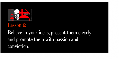
If you have followed me to this paragraph, you know that I learned many lessons in St. Cloud that shaped my style of work, my behavior with clients, and my belief in myself and the fact that as consultants we sell and promote ideas. The best consultants believe in their ideas, present them clearly and enthusiastically and promote them with passion and conviction.
In that sense, the consultant can soar higher than any eagle, including the one in St. Cloud.
The follow ups to Eagle
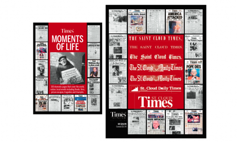
This book includes 150 pages of the St. Cloud Times, celebrating 150 years. Notice the various nameplates the newspaper has displayed through the years, including the stylized eagle.
From John Bodette this week:
The mastheads can be found on these book covers from a book of historic front pages we did in 2005. It was a great project for me and at the end of the year – after going through our history – I was named executive editor.
I look back fondly on the St. Cloud redesign for several reasons. It served the readers well (the most important reason). We all learned a ton and I think we advanced the new field of newspaper design. I had a chance to gain a mentor and friend for life – you! We also showed that small papers can do big things…..The rest is history.
Remember too that shortly after we completed our project and became instant experts, I found myself working on another project … helping create what would become USA Today
Bringing back the eagle?
Well, maybe for one day. Bodette reveals that he is toying with the idea of returning the old eagle that flew away in 1980 back for the June 13, 2010 edition, on the 150th anniversary of the newspaper.
Go for it, John. But make sure it’s only for one day.
The research of St. Cloud’s change of nameplate
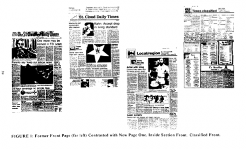
Image from News Research Journal shows before and after pages for St. Cloud Daily Times
For those who wish to read the research around the St. Cloud eagle:
Mario Garcia, J.W. Click and Guido H. Stempel III, “Reader Response to Redesign of St. Cloud Daily Times,” Newspaper Research Journal 2, no. 2 (winter 1981): 36-41.
Subscribers’ Reaction to Redesign of the St. Cloud Daily Times [and] Understanding the Research Process. ANPA News Research Report No. 32.
1.Mirrors.
https://www.garciamedia.com/blog/articles/40_years_40_lessons_1—a_look_in_the_mirror
2.Refugee.
https://www.garciamedia.com/blog/articles/40_years_40_lessons_2—refugee
3.Teacher..
https://www.garciamedia.com/blog/articles/40_years_40_lessons_3—teacher/
4.Mentors..
https://www.garciamedia.com/blog/articles/40_years_40_lessons_4—mentors/
5.Consultant.
https://garciamedia.com/blog/articles/40_years_40_lessons_5—consultant/