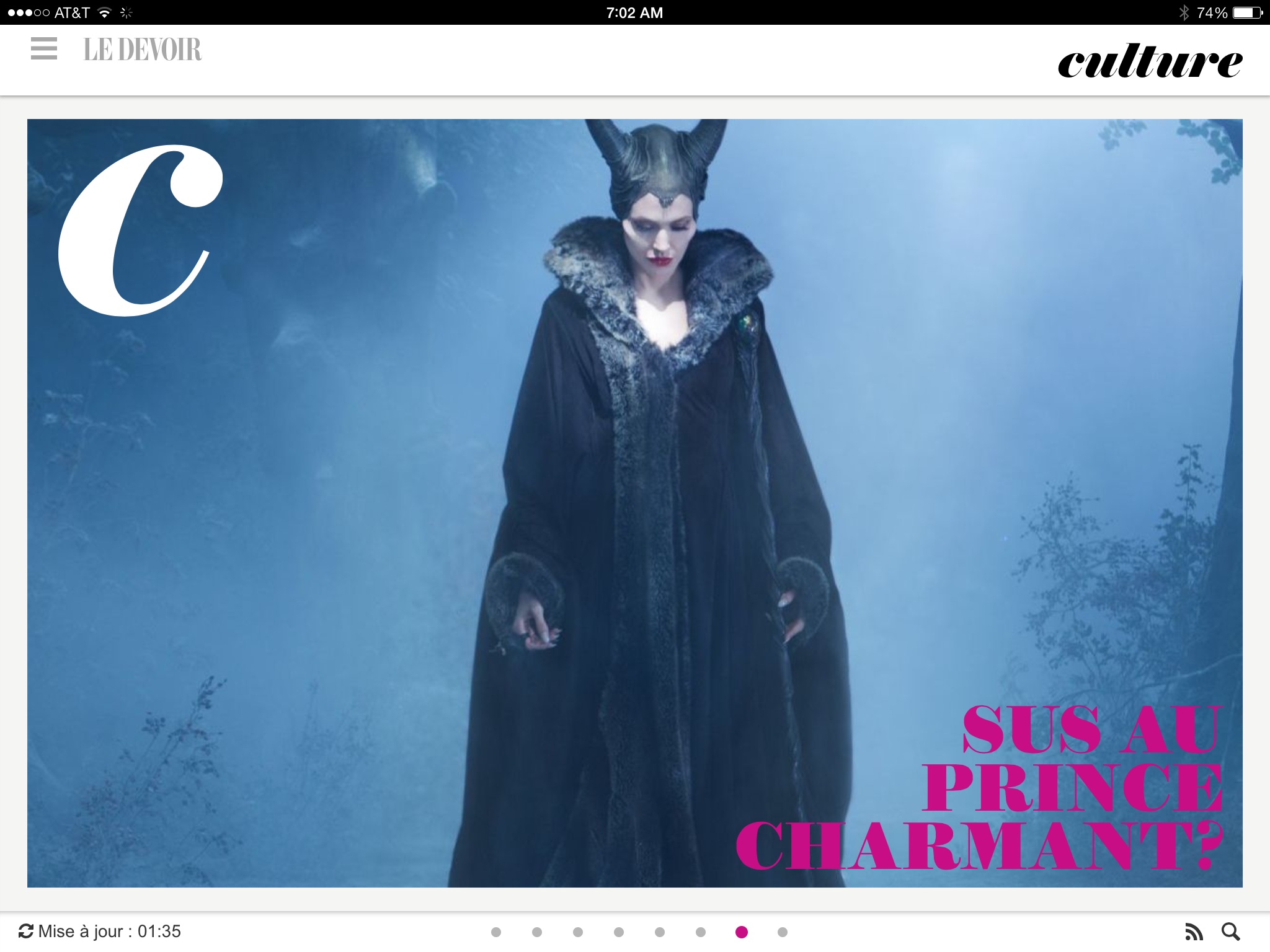


It’s a new morning tablet edition for the Canadian French-language daily Le Devoir. It is available from the iTunes Store.
It’s colorful, free, easy to follow and available via iOS and Android.
In Le Devoir’s first tablet edition of Nov. 4, publisher Bernard Descoteaux, writes:
“We are not trying to reinvent the newspaper or journalism. Le Devoir’s tablet edition will be different from the Le Devoir print edition, but it will always be a newspaper where the mission is to inform.”
The opening page of Le Devoir tablet edition gives us an overview of the main pieces the editors consider worthy of the readers’ attention.
As I look at this first day edition (and we all know that it takes weeks and months for a tablet edition to evolve successfully), I am inclined to say that the editors and designers are cautious about bells and whistles (few to be found), and have concentrated on the journalism. For example, article pages always allow for related stories to be within reach. The publisher refers to these elements as “complimentary information”. While he also refers to videos and audio, there was not much of a sampling on these on the inaugural edition.
It's too early to evaluate Le Devoir's tablet edition, and we may revisit it in about six weeks, but I would describe it as clean and organized and quite guarded in its use of more tablet friendly features such as the occasional pop up that keeps the finger entertained.
Lucie Lacava, designer for the new tablet edition, reminds me that the weekend edition will contain more interesting visual content.
A One-Minute Interview with Lucie Lacava

The much admired, award winning Canadian media designer Lucie Lacava was involved in the design of Le Devoir’s tablet edition. I caught up with Lucie via email about this project:
Mario:
What was the greatest challenge for you as you designed this tablet edition?
Lucie:
Keeping the design as simple as possible was the greatest challenge, in other words doing the most with the least. The first constraint was to keep it within budget, since the more functionality you add the more it would cost in developers time.
The second challenge was to create a design that would practically run on automatic pilot. A small talented team of editors from the news desk had to be retrained to work on the application. Without a design director on the digital side, we put the emphasis on photo selection, and photo editing for maximum impact.
Mario:
I assume that you also designed the print edition: how much of a transfer is there from print to tablet?
Lucie:
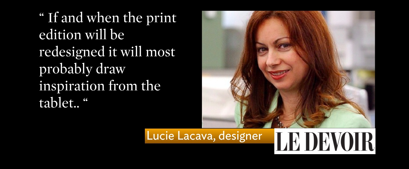
This is a Digital First project in every sense of the word. At the moment there is no print project. It is long overdue. The last major redesign was the one I did in 1993, and it has been modified several times since. If and when the print edition will be redesigned it will most probably draw inspiration from the tablet.
Mario:
For designers who admire you and your work and who may wonder about this question: what do you find to be the biggest difference between designing for print and mobile?
Lucie:
Designing for mobile is very similar to designing for print. Especially when it comes to type selection, there is no need for webfonts since the screen resolution of the tablets is high definition. The biggest difference is in the user experience or UX, this functionality relies mostly on the developers. How easy, pleasant and intuitive it will be for the user to scroll and explore what the app has to offer without getting lost in it, and finding unique and valuable content, will in the long run determine its success.