Edgy and with an attitude
As a student of newspapers for more than four decades, I am always fascinated by the fact that no matter how they are transformed, newspapers always maintain the look and feel that is characteristic of the country in which they are published.
A few examples:
In Italy: Look for the dramatically horizontal layering of stories, the bolder headlines which contrast with two or three different weights of the same font; headlines that are set in both capital letters and lower case letters. A touch of chaos—-the five-espressos look. It works there.
In Brazil: Look for front pages that have always been navigational tools, since before it was trendy or recommended to do so.
Photos are big, columns tend to be narrow, and color abounds.
In the United States: Nothing can be more homogenous than the design of American newspapers, in spite of a wave of redesigns that swept the country from coast to coast during the 1980s.
Specifically: look for broadsheets (true, this is now changing to narrower webs—-as is the case with our project The Oklahoman, which premieres tomorrow, but still broadsheets), promo boxes over the nameplate of the newspaper, lead story on the right hand side of the page.
In his blog, http://www.markporter.com/notebook/?p=147, Mark Porter describes the changes of The Independent this way:
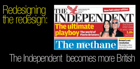
The discipline of the original design is gone and it feels more like a middle-market paper, in line with the sympathies of its editor.
The Independent of London
So it comes as no surprise that less than three years after it was streamlined, redesigned and rethought, The Independent took a few steps back to become more of a British-style newspaper with a decisive tone of brashness that could be referred to as vulgarity-light, but that is so prevalent in those aggressive British newspapers that fight in the street for readers daily.
A word of caution here: when I say “vulgarity light” I am not using the term negatively. Some newspapers design an element of systematic chaos into their pages, to make them more aggressive, to display the presence of the readers they are trying to reach. I believe that the new Independent design is an attempt to do that, to sort of roll up the sleeves and go after the mechanic with the dirty fingernails, while not losing the executive with the suit and the briefcase. A sometimes dangerous dance for newspapers, but that some handle successfully: USA Today comes to mind.
The Independent that premiered its new look Monday, Sept. 22 abandoned the systematically, classic, eye pleasing architecture of its 2005 design, without throwing it totally out the window.
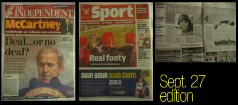
Here are some of my observations of the Saturday, Sept. 27 edition:
The front page appears edgier, more ready for a good fight in the streets
The Page 2-3 spread, where a main feature (but not the cover story) appears is pure British tabloid: screened headline, big photos
The new five-column grid makes it newsier and more energetic.
In terms of font, Whitney was replaced by Amplitude (here it is a matter of taste: Whitney, I believe, is a more elegant font).
By the way, new Independent editor is Roger Alton, with whom I worked during the redesign of The Observer of London. Roger is a hands-on editor and tends to prefer a more robust, macho type of design for his newspapers, but he listens to the art director and designers, so I am sure it is the same here.
![]()
For another review by Mark Porter, for The Guardian, go here:
http://www.guardian.co.uk/media/organgrinder/2008/sep/23/theindependent.pressandpublishing
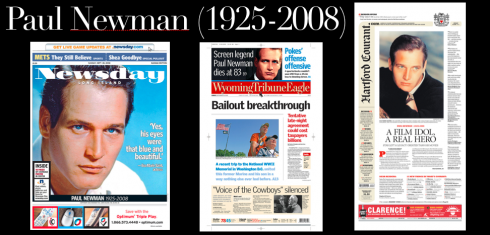
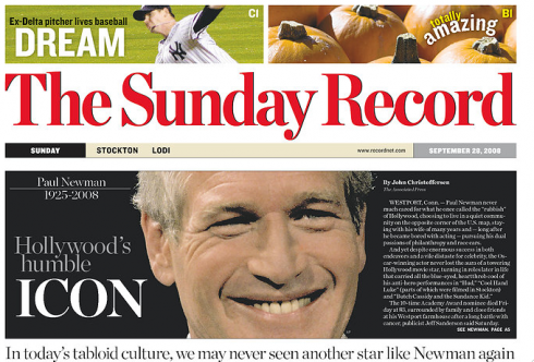
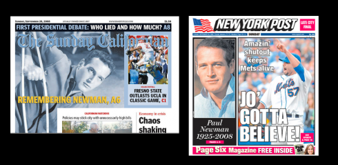
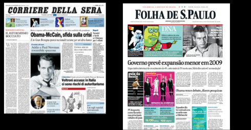
How the front pages say “adios” to Paul Newman
Some selected front pages from today’s editions, honoring Paul Newman, the legendary actor who lost his battle with cancer at 83.
![]()
In Oklahoma City, Oklahoma, for the launch of The Oklahoman, which premieres its new look, and format, tomorrow, Monday. Sept. 29.
For Editor Ed Kelley’s page one story announcing the launch of the new Oklahoman, please go here:
http://www.newsok.com/article/3303769
TheMarioBlog posting #104