I will be updating this blog post about the relaunch of Mexico’s am and Malaysia’s Berita Harian as new pages arrive. Make sure to check back!
Updated Monday, July 2, at 06:35 EST
TAKEAWAY: A bright Sunday full of hope and excitement for two of our projects which launched new looks and rethinking on this day: in Malaysia, Berita Harian, in Mexico, Leon’s am.
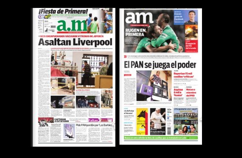
Here is the front page of am before and after the redesign/rethink
Here is a selection of pages from the July 1 edition of Mexico’s a.m. on first day with new look and rethinking:
Sunday July 1, and two of the projects that we at Garcia Media have been working on for months launched their new looks. Exciting day for all involved.
The projects are Mexico’s daily, am, published in Leon, and Malaysia’s Berita Harian, a Malay language daily. In both cases we were presented with newspapers that already have a robust following, good circulations and that changed to update their look and their style of journalistic presentation, and to adapt to a multi platform publishing world.
In today’s blog we offer a review of each, starting with Mexico’s am;
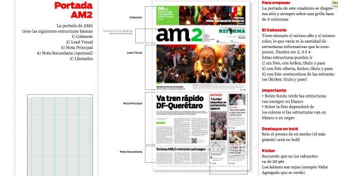
Mexico’s am
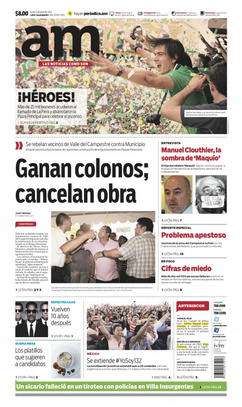
Prototype of the new front page for Mexico’s regional daily, am
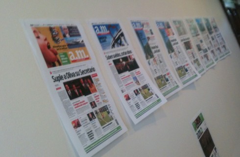
The gallery of pages on the wall of our ‘redesign suite” shows all the tryouts to display the flexibility that the new front page allows
Sections are color coded
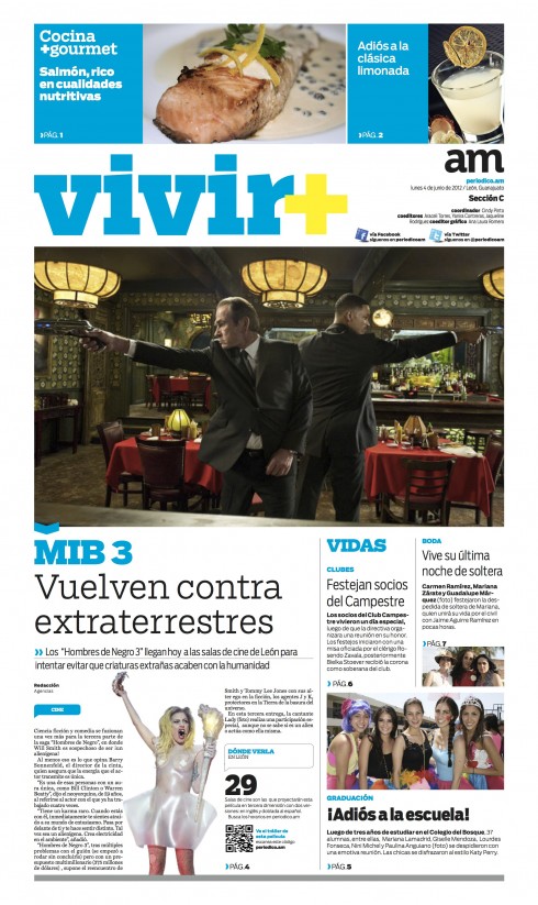
The new Vivir section
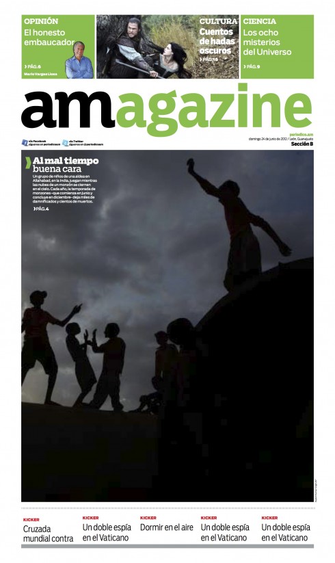
The new am Sunday section opener
Not many editors would choose to launch a new redesign and rethinking the same day as that of the country’s national presidential election. It takes courage, and when Enrique Gomez, publisher of am, told me that it was his intention to do so, I asked him if he was sure:
“Why not? We will be prepared, and we know that there will be a tremendous amount of interest in the newspaper and the news that day.”
And so, as Mexicans went to the polls July 1, the voters on Leon had something new to look at: their newspaper.
The daily am—-don’t you love that short name?—is one of Mexico’s most respected regional dailies. Respected for its journalistic quality, its investigative reports and for its community involvement, the newspaper , already a design winner from the Society of News Design, needed, in the words of Enrique Gomez Jr,, project leader, “gotten a little tired, somewhat too busy with its design, and needed a clean up.”
Garcia Media Latinoamerica
Go here to flip through the pages of am BEFORE the redesign:
This project was carried out by our Buenos Aires team—headed by senior art directors Rodrigo Fino and Paula Ripoll—-working closely with me.
Rodrigo and I paid several visits to Leon, and conducted workshops and training sessions arriving at the newspaper that you see today.
Our team worked closely with Enrique Jr., as well as with Ana Laura Romero, art director of am, and her team of designers.
Every editor in the organization sat through our training sessions.
What’s new?
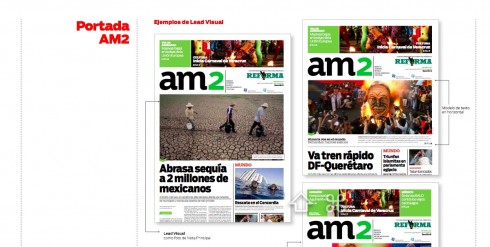
The front page—-Readers will see a more visually oriented front page than the one before the redesign. We have utilized the concept of the two-track front page here:
the visual lead and the journalistic lead. The logo of the newspaper is part of the main promo display at the top. Various templates of the front page are created, so that the editors and designers can use the top of page one to surprise the reader visually, while incorporating visual elements of interest for stories found on the inside. However, the main visual in the top box could be the lead photo on the front page as well.
There is limited use of text on the front page, allowing for the page to become more of a navigator.
The style manual for am, assorted pages
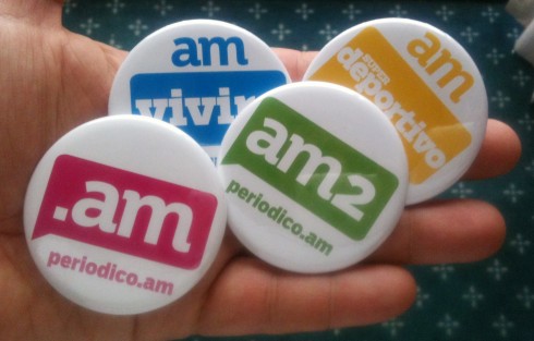
The logo—-While the name of the newspaper lends itself well to interesting treatments, as it is only two letters “am”, the original logo had dots between the a and the m. From the start, the publisher told me that he was open to a cleaning up of the logo, and so I contacted the great Jim Parkinson for the task. As always, Jim produced many versions of how he would create the new am logo and we selected the one you see here. Simple, elegant and without the dots between the letters.
The typography——The typographic components for am are: Salvo Sans and Salvo Serif
Story structures—-We created hierarchy through the use of various story structures, from lead to secondary to compacts to briefs.
Color—-Notice that we have used color within the text, as in yellow highlights of particularly interesting passages in a story.
Flip through the pages of the special supplement about redesign of “am”.
Here is the special supplement published July 1 to accompany the first edition of the newspaper in its new look.
To read about the “am” redesign in Spanish
http://www.garcia-media.com.ar/blog/post/todo-rediseno-tiene-su-encanto/194
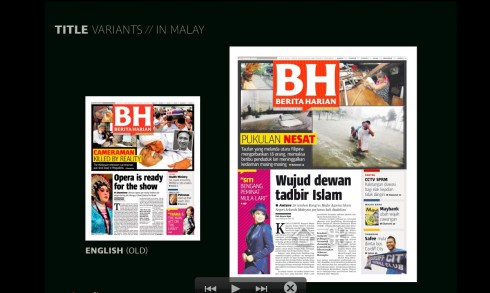
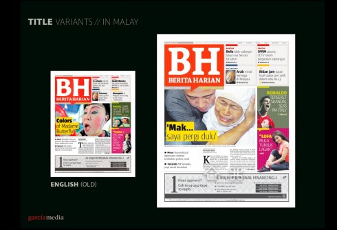
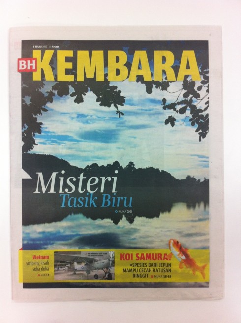
Malaysia”s Berita Harian
 ont page of Berita Harian
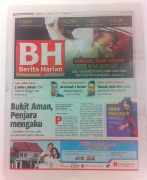
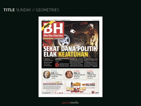
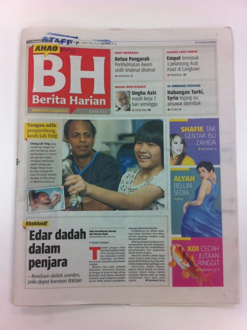
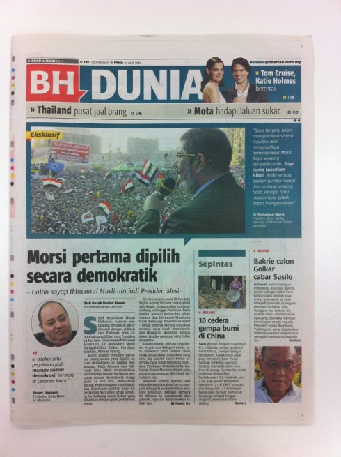
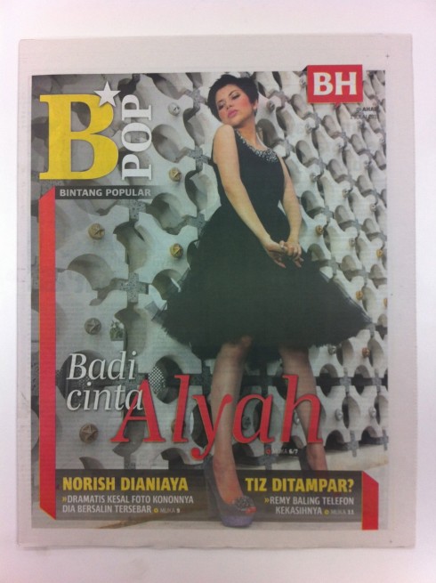
Here is the Monday, July 2, front page of Berita Harian
Malaysian readers take to their newspapers with gusto. And they like them to be compact, colorful, with big headlines and peppered with many photos and secondary details. It is a challenge for the editor to satisfy those readers, and a challenge to create pages that keep them interested.
Berita Harian is a sister newspaper of The New Straits Times, which we helped rethink a few months ago. While the NST is published in English, Berita Harian is published in Malay language. By the way, there is a third cousin publication, the daily Metro, a popular down market tabloid, which we at Garcia Media are currently rethinking with the team.
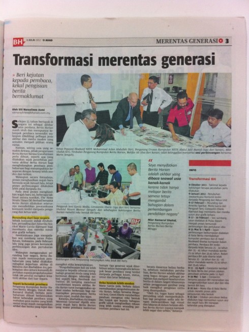
Working again with our Garcia Media Europe art director, Constantin Eberle, we proceeded to create the new look of Berita Harian using the workshop concept, which works so effectively. We gathered the key members of the editorial, advertising and digital teams and began with a thorough briefing: what should the new Berita Harian be like?
The answer to that question was: livelier, slightly more sophisticated to appeal to more elite readers who read in Malay language, but, at the same time, the editors wanted a more cohesive visual presentation, more use of photos and graphics, and better markers to link to their excellent digital platform content.
Consti and I went to work and produced a first set of sketches, with special emphasis on the logo.
Why the logo?
![]()
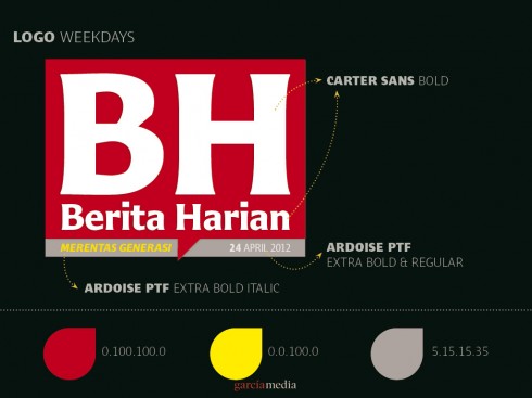
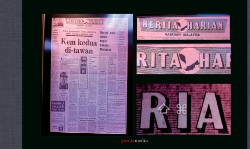
Well, in this particular redesign the logo would play a key role. For years, Berita Harian has had the name of the newspaper spelled out. I remember that we did a “gallery walk” of the newsroom, where various front pages of Berita Harian hang on the wall, and with various formats: larger broadsheet, narrower broadsheet and then compact.
The logo, too, has undergone all kinds of transformations.
However, the editors were very sure that they wanted something different, to truly signal to the readers that this was a dramatic change, more than a redesign, a relaunch of the new Berita Harian.
Consti and I suggested the “pill box” logo concept, using just the letters BH, but spelling Berita Harian in smaller type at the bottom. Then we had to present the pill box in various fonts.
From the start, the editors liked the way the pill box, square BH logo looked, and the flexibility of movement it allowed on the front page.
The front page philosophy
While creating a more sophisticated look, we never travelled too far from the roots of Berita Harian: a lively newspaper with big headlines and good display of photos.
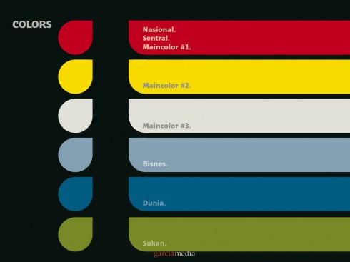
The color palette
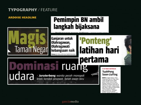
The typography
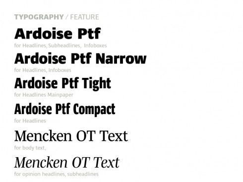
The typographic components for the new Berita Harian:
Serif Font: Mencken Text and Mencken Subheadline.
Sans Serif Font: Ardoise Full Family (Ardoise, Ardoise Narrow, Ardoise Tight, Ardoise Compact)
Website: http://typofonderie.com/
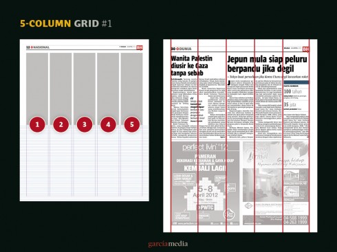
The grid
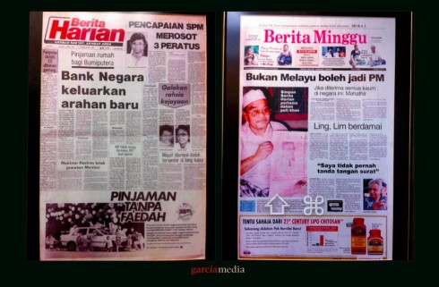
Previous looks
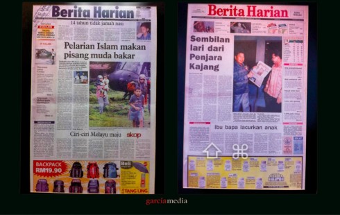
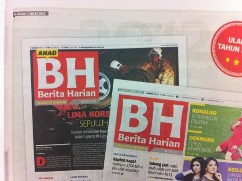
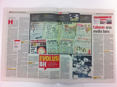
Here is how Berita Harian looked till June 30. Below you also see front pages from throughout the newspaper’s 55 year history.
This is the look of Berita Hairan until June 30th
Our many design tryouts

Logo tryouts
![]()
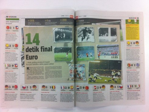
Inside pages and sections
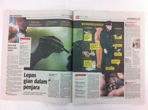
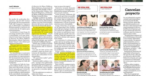
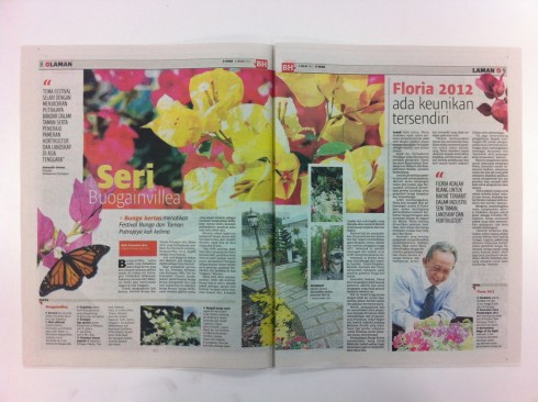
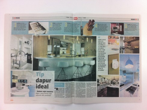
Here we show you how the story structures and grid come together for inside pages.Notice the use of logos for inside section openers and for continuation pages.
Daily entertainment supplements
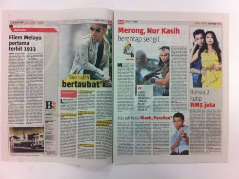
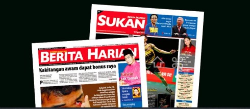
Sports.
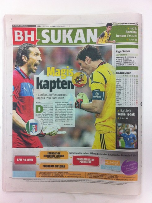
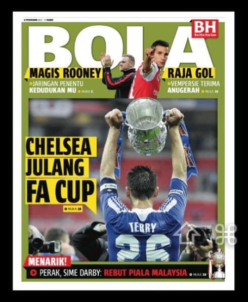
Bola, the new sports supplement design
Supplement presenting the new look
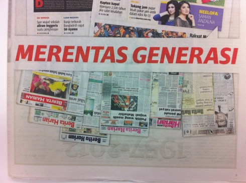
These are assorted pages showing the new look and celebrating Berita Harian’s 55 years.
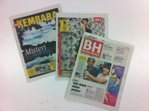
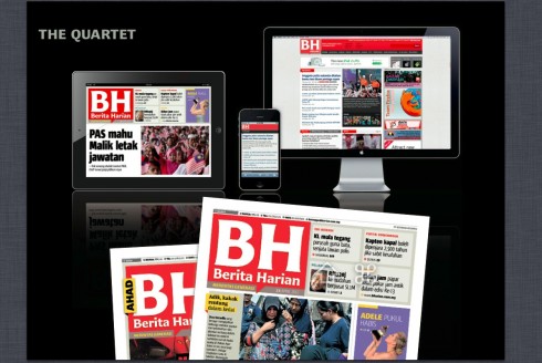
The Berita Harian quartet
Marketing campaign to unveil relaunch

The team
Abdul Jalil Hamid (Group Managing Editor)
Datuk Mior Kamarul Shahid (Group Editor of BH)
Mahfar Ali (Deputy Group Editor)
Norhayati Md Said (Executive Editor News)
Badrulhisham Othman (Executive Editor Production)
Shahrul (Yoyo) Nizam ( Art Director)
The iPad Design Lab: Storytelling in the Age of the Tablet
Video walkthrough of the iPad prototype of iPad Design Lab