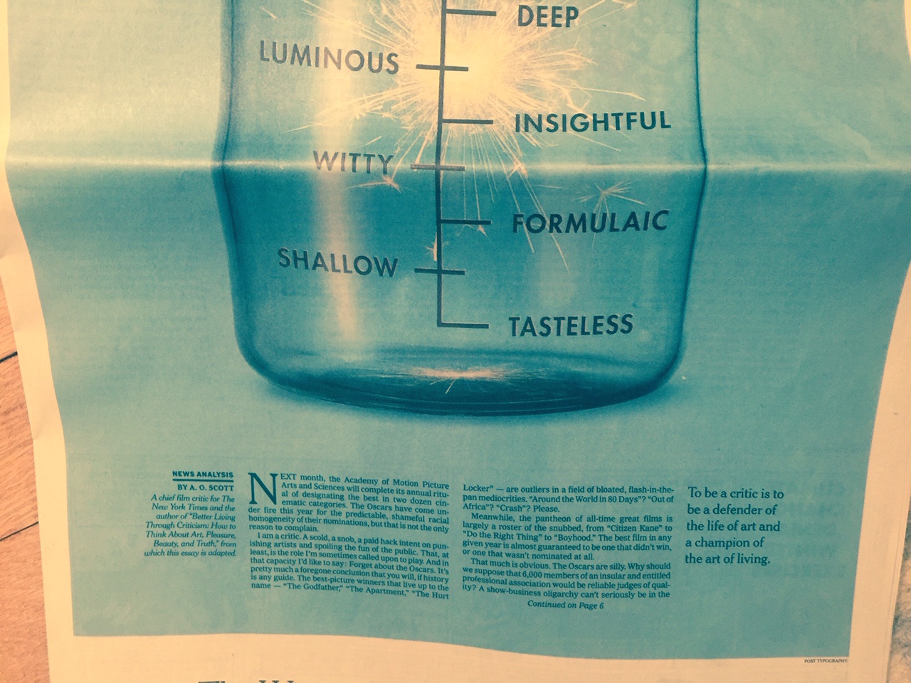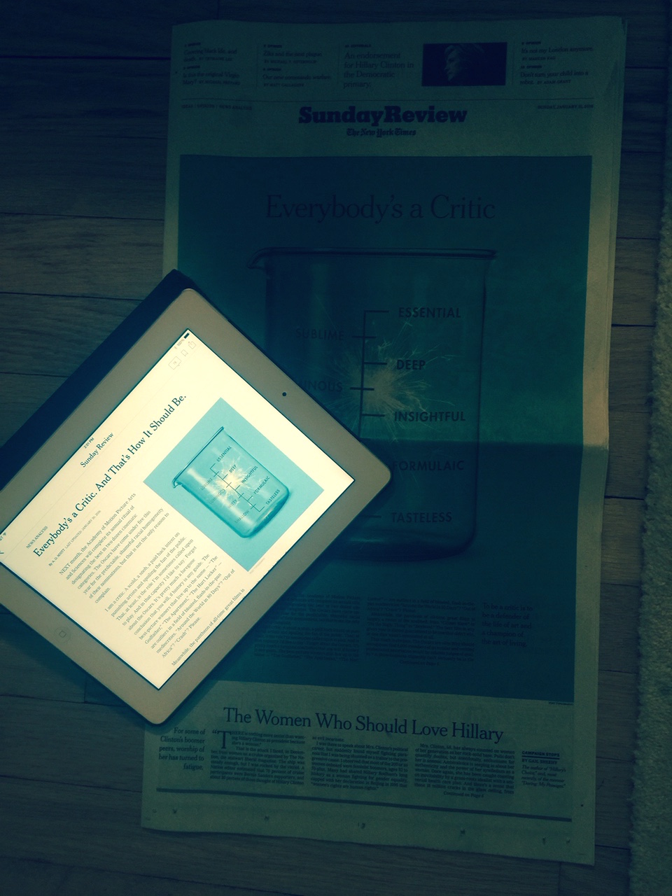
This is the print version of the story with a heavy blue background that made type difficult to read.

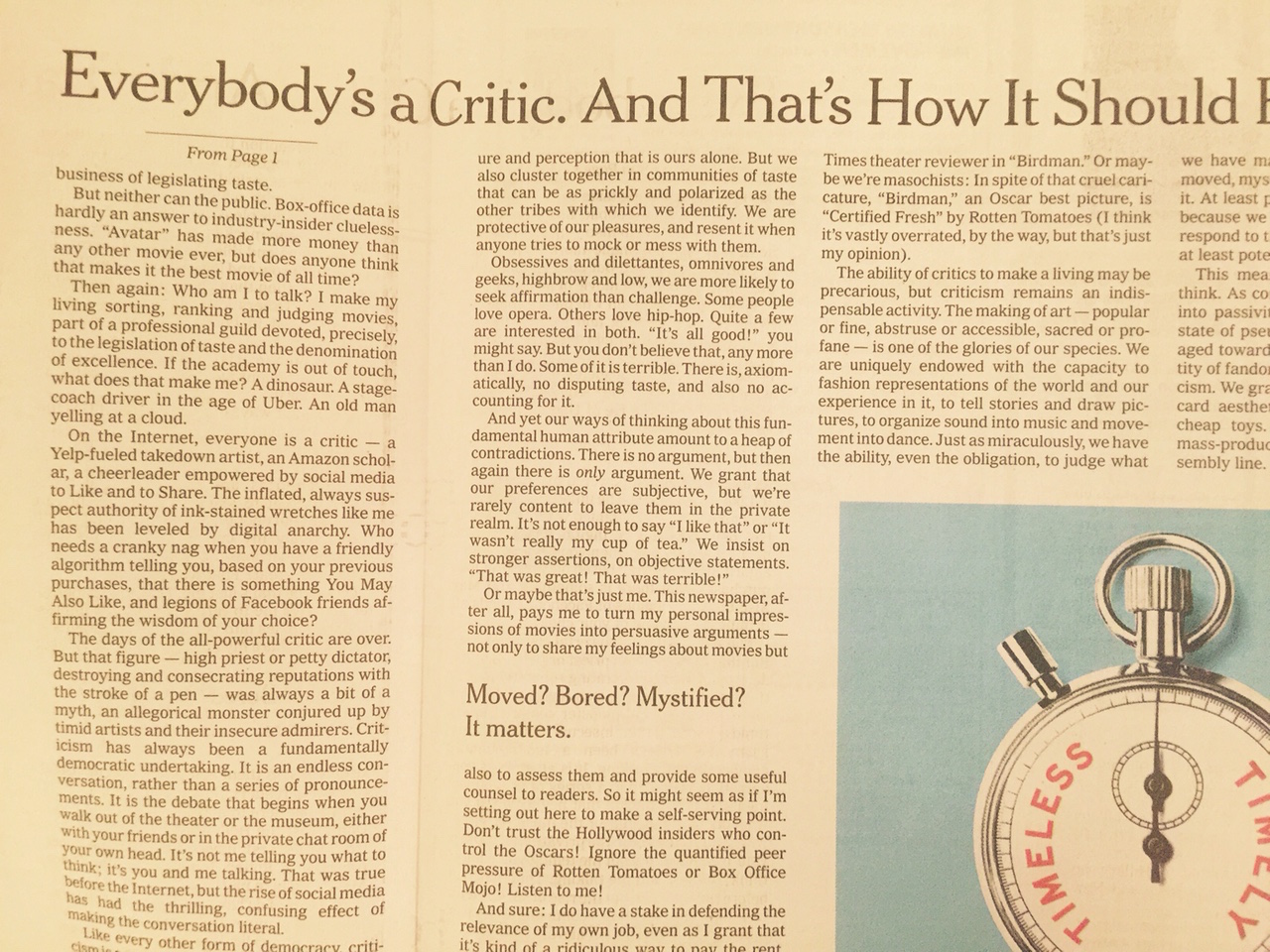
This is the jump page of the article: with white background and much easier to read.

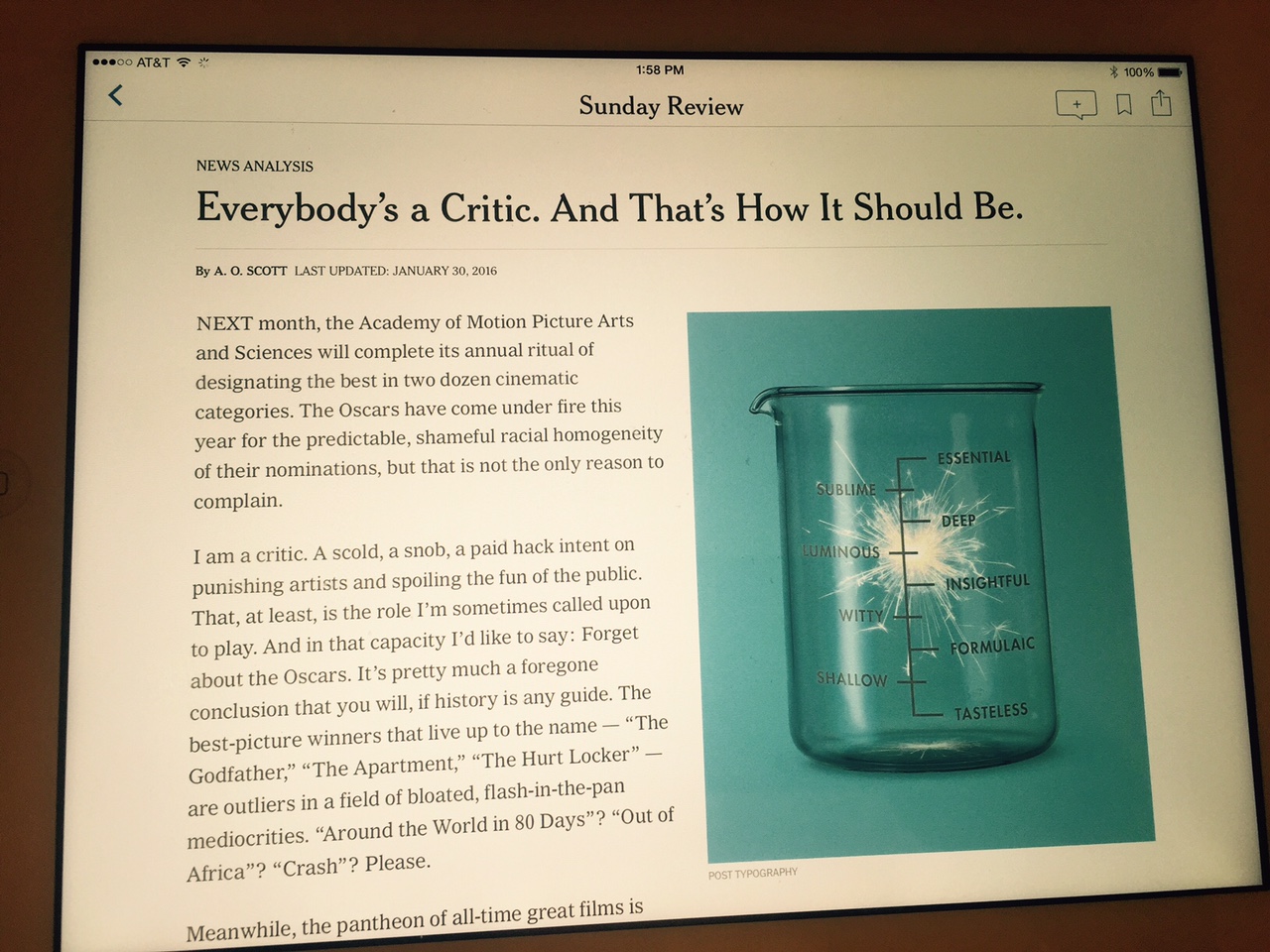
Tablet version of the story: crisp, white background and easy to read type.

It happens from time to time. The page designer selects a color background to “wallpaper” the page (or the screen), and while the color may bring visual impact to the package, legibility suffers. Such was the casse with the Sunday, January 31, Sunday Review front page of The New York Times.
See for yourself. The blue in the background of this page is so dark that I had trouble reading the text. It was one of those few occasions when one looks forward to the jump page knowing that, as in this case, it would be black type against a white background, the unbeatable combination.
In my Pure Design (2002) book, I wrote:
“There is no substitute for the legibility of black type over a white background.”
I still agree. This is not to say that one should never use a color background on a page or screen, but, by doing so, one must pay attention to how legible type will be. Tips include increasing the size of the text, allowing for more space between lines.
In the digital age, however, frustration with type that is difficult to read in print is short lived. Readers will as I did: turned to my iPad and continued reading the article there, on a crisp white background where the black type did what it is supposed to do: make reading pleasant and enjoyable.
I know I am not the only reader of the Times who found this piece (a very good one, by the way) tough to read in print. We do not need to make reading in print difficult, especially with all the many challenges that print publications already face.