Jakob Nielsen
Editorial Manager
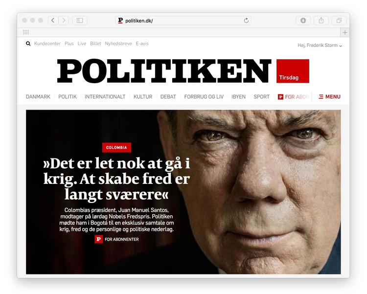
Take a look at the new Politken website and you will find that it is not just faster, but easier to navigate, with better tools for everything from the way news is curated and presented, ability to interact with the audience and even how ads are presented, both for traditional and sponsored content.
Jakob Nielsen, Editorial Manager of Politiken, introduced the new look with a piece that details the innovations. I have singled out a few here from Nielsen's report:
“We now have better tools to tell our stories and highlight the unique Politiken content, which we are proud to show off . At the new Politiken you can better feel of who we are,” Nielsen wrote.
Paying for content
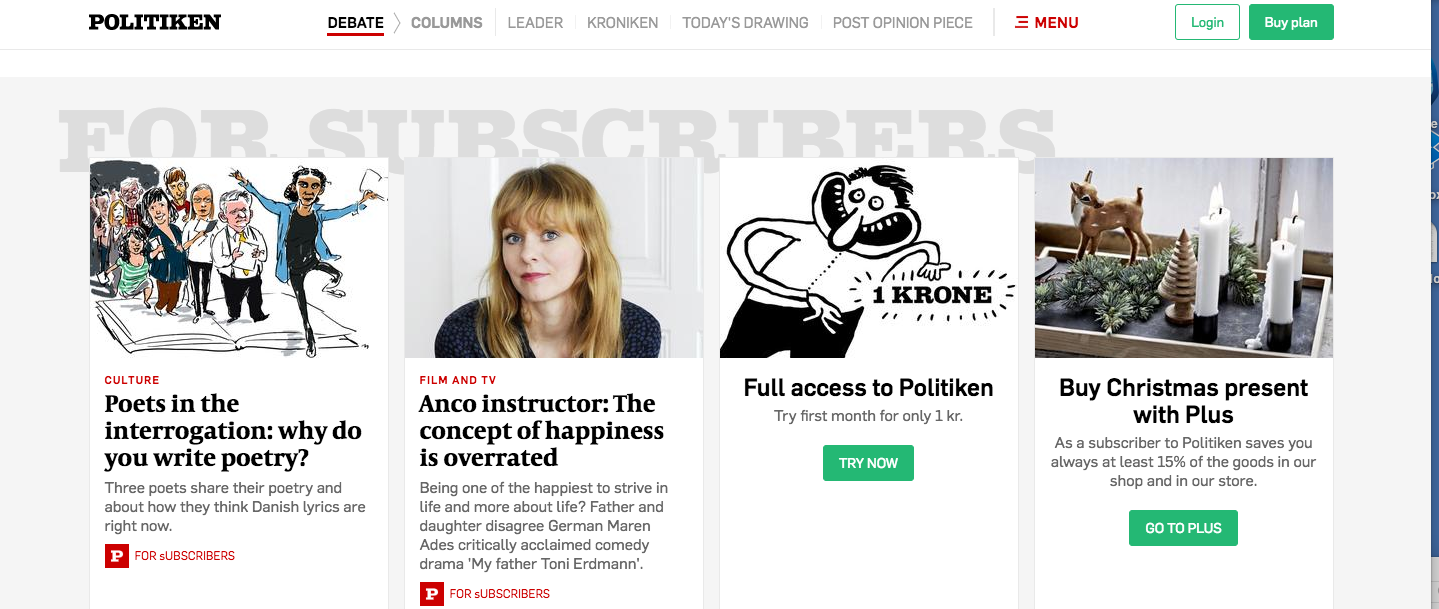
The new Politiken is free in the sense that you can read as many articles as you want to. But part of the article is for subscribers only.
An offer you can't refuse
Politiken introduces the new website with an offer: try it for a month for one penny! You can access all articles on http://www.politiken.dk– and you also get full access 7 days a week to the E-newspaper, which is the electronic version of the paper newspaper, page by page.
Five values
This was a most interesting part of the piece by Nielsen. These are values worth considering and probably served the redesign team with good reference points during the process.
Surprising – “Sometimes it takes Politiken to really surprise me '
Quality – “I appreciate quality and Politiken sets the bar high '
Love – “In Politiken, I am in the company of people who care about me, and through the shape and history will bring me something important '
Culture Creation – “Politiken makes my world bigger, dare move my limits and make me move up '
Present – “Wherever I find myself, I trust that Politiken gives me an overview and a sense of being updated”
Designing for the phone first
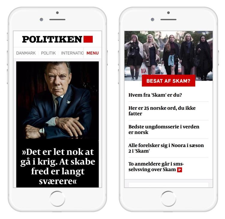
Nielsen reports that his team started the design process with the readers' phone in mind, steadily expanding to the Danish internet usage.
“This summer was actually the first time that Politiken for several weeks in a row had more readers on mobile than on laptops and PC.”
Modules
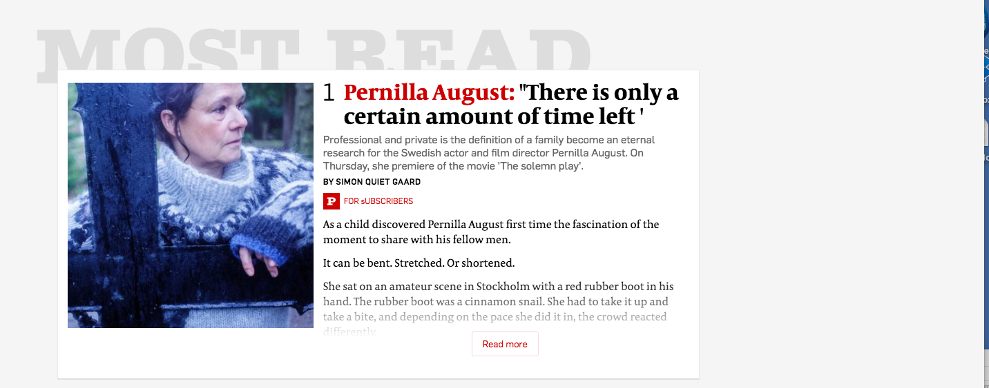
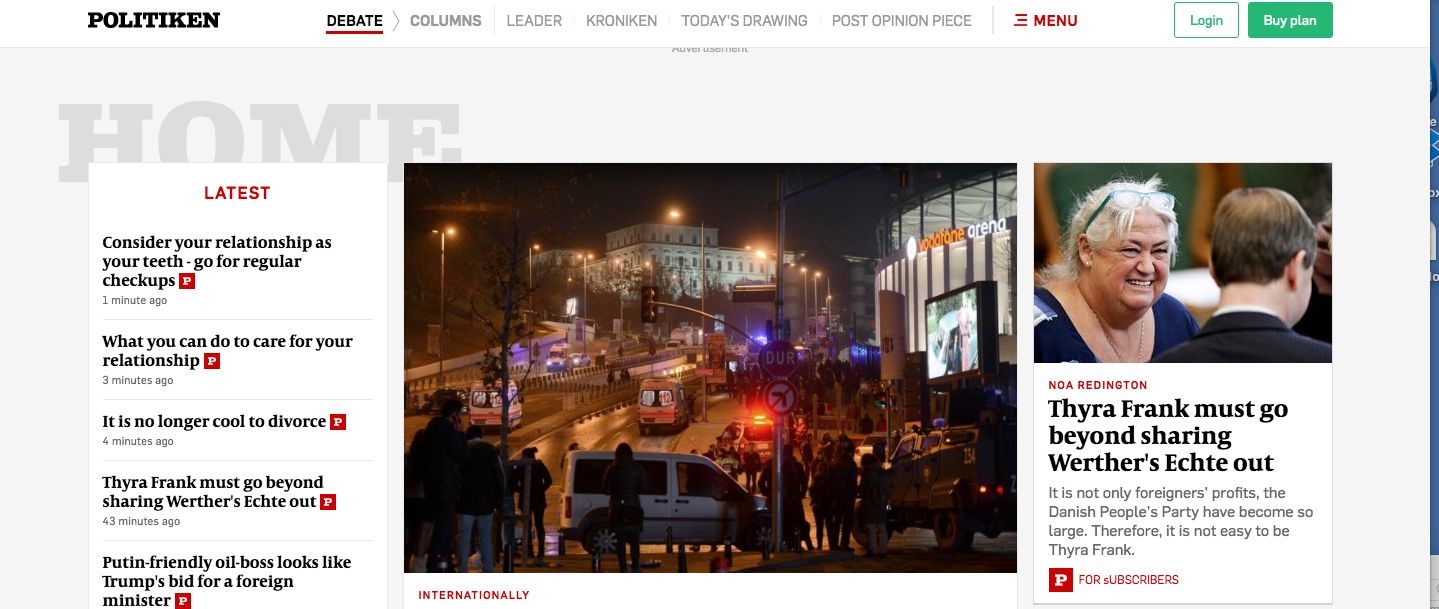
The biggest innovation in Politiken's new website is that all news now is made up of modules.
It is easiest to see on a big screen, but the principle is the same everywhere. It provides a more manageable side to look at – and seen here from the Town Hall, it means that we can very easily change the look and structure.
Sometimes you will find that the top of politics consists of one big story, other times it will have two, three or four.
Donald Trump has got his own page
Really? You will also find that the articles are equipped with red fields – so called tags. Those uses will to collect material on a topical issue – which can be both Donald Trump, the Cannes Film Festival or European handball.
Updates and connection with readers
“One of the things I'm most looking forward to in service on politics, our new ability to speak directly to readers on the front. Our designers have invented something called text fields, and here anything can happen,” wrote Nielsen.
A journalist or editor can update directly to a news development. Or show you a video from YouTube, everyone is talking about right now. Or talk about the latest crazy tweet from Anders Samuelsen or Donald Trump. All without having to click on the story to see it.
Ads, including paid content
By putting most ads in as modules on the page the Politiken team tries to ensure that ads are less intrusive and disturbing than in the previous version of the wevsite.
Conversely, hopefully you sometimes want to click on them – not least in the so-called paid advertiser content, where a journalist in Politiken's ad department has written article in agreement with – and against payment from – a client.
We have done a lot of checking the ads clearly, so you should never be in doubt about when you read something paid content, and when you read Politiken's independent journalism.