![]()
When Hillary Clinton announced that she is running for President this week, many were surprised by her choice of a logo. It is a sans serif, minimalist H with an arrow pointing forward.
This is good for a 60-something candidate that some think represents the past. So, for starters, that arrow has something going for it.
Yet, from the moment the new Hillary logo was seen, it has sparked comments both pro and con (not the candidate but the visual).
Even the great Milton Glaser, who gave us the iconic I ♥ NY logo, chimed in. Yes, he liked it, referring to it as “effectively simplified.”
“”I don’t understand the emotional violence in response to the logo,” Glaser told CNN. “It’s all a little naive, if you ask me….a little bit generic, but not too much so.”
I agree. It is simple and conveys a clear message of how Hillary wishes to position herself to appeal to the common Americans that she is counting on to get to the White House.
Meanwhile in Miami…..
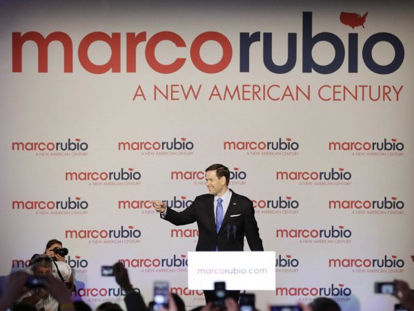
Also announcing his aspirations to become the first Hispanic US President, Senator Marco Rubio (R, FL) went on stage to declare himself the candidate of his generation, with emphasis on all things young and future.
Rubio’s logo is also minimalist, sans serif and emphasizes the colors red and blue, with a tiny map of the United States over the i in Rubio.
Simplicity is the key here, too.
But, perhaps it went too far, if you read what Karl Gude, a graphics professor at Michigan State University and a former graphics artist at Newsweek and the Associated Press, told Business Insider, for example, that the America dotting the “i” in Rubio was missing Alaska and Hawaii.
“The map feels like an afterthought,” Gude said. “He just lost the Alaska and Hawaii vote.”
And the rest
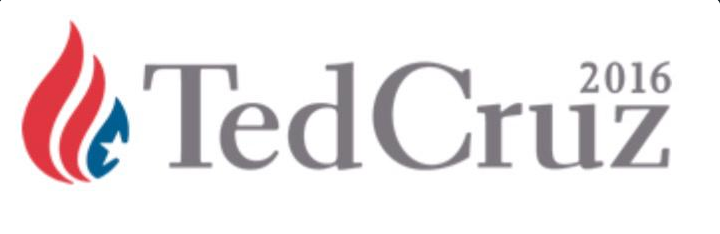
Ted Cruz’ (R-Texas) logo has already incited debate, too. People have commented that it looks like everything from a teardrop or even a flame, to the logo from Al Jazeera.
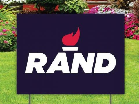
Rand Paul (R-Kentucky) has gone for a torch in his logo. The image includes a solid red flame on top of bold letters that spell out his first name.
And there will be more presidential aspirants declaring their ambitions in the weeks to come, along with more visual images to brand them.
The political season of seasons is upon us. Let’s at least have some fun looking at how candidates and their marketing teams present them via logos.
At The New York Times: a palette takes shape