![]()
An article in The New York Times, (Down With Helvetica: Design Your Own Font, June 26, 2008), referred to software which enables a wide range of users to make custom typefaces. From restaurant menus to church programs, it is possible for anyone with time and money to commission the font he feels best conveys the feeling and mood of his publication.
“Before the personal computer, most people were oblivious to fonts…..but that changed when word processing programs offered a hundred or more fonts….”
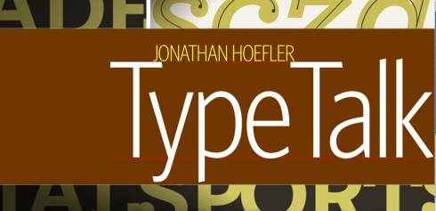
Reading this, and knowing that more often than before, editors and publishers are asking if they can get a customized font for their publication, I decided to go to one of the type experts I most respect, Jonathan Hoefler, with whom we work often, and who serves as president of Hoefler & Frere-Jones, Inc.

Mario: How do you see the state of new font creation today?
Jonathan: It’s a very exciting time. Ten years ago people were talking about a “second golden age of typography,” in which there were more talented type designers at work than at any time since the sixteenth century. Now we’re seeing this same community energized by both globalization and a technological renaissance, which are forcing type foundries to produce ever better work. The designer who chooses one of our fonts for a publication is already thinking forward to the Polish and Romanian editions, and is already working on the iPhone app that will broadcast their content in a whole new way. Type designers weren’t necessarily thinking about these things ten years ago, but they’re things we’re very much concerned with today.
Mario: What is your overall view of this “customizing” of typefaces?
Jonathan: The word “custom” comes up in connection with fonts in two ways. There are “custom fonts,” which are created from scratch, and designed to address a specific editorial problem. (For clients who have the time and the budget, as well as a compelling need that no existing typeface can fill, a custom font can often be a good investment.) But more often, when someone talks about a “customized font,” what they mean is an existing typeface that’s been altered in some way, in an attempt to make it do something it wasn’t designed to do. “Customizations” like these are a thorny business, and designers who pursue them as a solution should tread carefully.
Font software is owned by the company that produces it, and when you “buy a font,” you’re buying a license to use that font in a specific way. These ways are listed in the End-User License Agreement (EULA) that ships with a font, and every reputable type foundry’s EULA specifically forbids the modification of its fonts. This means that any modifications to a font must be done by (or approved by) the foundry that owns the design—but the good news here is that a conversation with a font’s designer often yields other solutions to the problem at hand. Most of the requests we get are ones we’ve heard before, which means we often have a solution on hand.
But the real problem with “customizations” is that they create administrative, technical, and even legal hassles that become our clients’ to deal with. A font that’s been altered is fixed in time: it doesn’t automatically receive the kinds of periodic upgrades from which all other fonts benefit, so whoever commissioned the font remains forever responsible for the cost of maintaining it. A “customized font” produced ten years ago won’t have a Euro symbol, it won’t contain accented characters for Central Europe, and it won’t exist in the OpenType format. These enhancements are significant undertakings, and while they’re built into the cost of the fonts we publish, they can become a surprise expense down the road for anyone relying on a customized font.
At H&FJ, we always enjoy working with our clients to create new typefaces. Having a genuine design challenge to push against always produces interesting work, and it’s very rewarding when we can use typography to actually solve problems, whether they have to do with format or readership. But not everyone has the time to commission a new design (a custom font isn’t like a “custom cake,” it’s more like a “custom kitchen”) which is why we’ve invested so much energy in building a library of fonts that our clients can license and download online. Some of the best design being done today uses our retail fonts; ready-to-wear fashion leaves plenty of room to establish a strong personal style.
Mario: What new font(s) are you and your team creating at the moment?
Jonathan: We’ve always got new things on the horizon, and are looking forward to a couple of exciting launches this season. Most of this year has been devoted to two of our hardest-working typefaces, to which we’re adding the “most requested” features that our clients have asked for—many of these having come to us as requests for customizations. We’ve got one project that’s specifically intended for editorial settings, where columns are narrow and leading is tight; another one of our fonts has gone back to school and learned 200 new languages! We’ll have more to say about these in the coming months—keep an eye on the H&FJ blog, at http://www.typography.com/blog.
![]()
Jonathan Hoefler specializes in the design of original typefaces. Named one of the forty most influential designers in America by I.D. Magazine, Hoefler’s publishing work includes award-winning original typeface designs for Rolling Stone, Harper’s Bazaar, The New York Times Magazine, Sports Illustrated, and Esquire; his institutional clients range from the Solomon R. Guggenheim Museum to the rock band They Might Be Giants. Perhaps his best known work is the Hoefler Text family of typefaces, designed for Apple Computer and now appearing everywhere as part of the Macintosh operating system.
![]()
The New York Times article:
http://www.nytimes.com/2008/06/26/technology/personaltech/26basics.html?_r=1&scp=2&sq=Fonts:%20creating%20the%20type%20you%20want&st=cse&oref=slogin
Jonathan Hoefler
Hoefler & Frere-Jones, Inc.
http://www.typography.com
611 Broadway, Room 725
New York, NY 10012-2608
Tel. 212 777 6640
News: http://www.typography.com/blog
FROM THE IFRA EXECUTIVE NEWS SERVICE, AUGUST 14, 2008:
English:
– UK: BBC internet plans ‘will kill off local papers’
http://www.telegraph.co.uk/news/2552609/BBC-internet-plans-will-kill-off-local-papers.html
– UK: Midlands dailies to offer breaking news on the move
http://www.holdthefrontpage.co.uk/news/080814mnamobile.shtml
– UK: How the regional papers use video: The Express & Star
http://www.andydickinson.net/2008/08/13/how-the-regional-papers-use-video-the-express-star/
– UK: Is the Kindle ebook reader becoming Amazon’s iPod?
http://www.guardian.co.uk/technology/2008/aug/14/amazon.kindle
– USA: New Report: Small Is Still Beautiful in the Newspaper Biz
http://www.editorandpublisher.com/eandp/news/article_display.jsp?vnu_content_id=1003838357
![]()
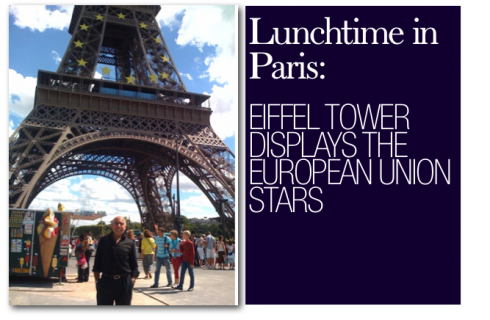
In Paris, France till the end of the week. Running from the Opera area to Rue de Rivoli and down by the Place de Concorde to the Eiffel Tower and back to Opera. In August, the city sleeps like a cat on a comfy couch. With most of the local residents on holiday in the south of France, or in the countryside, the city takes a break. The occasional Japanese tourist snaps another shot of the Eiffel Tower, and Champs D’Elysees is light with traffic. The weather? Changing every 20 minutes or so. Yesterday it was a little rain, potent sunshine, clouds and the feel of a dark October day, then sunshine again. Bienvenue to summer in Paris.

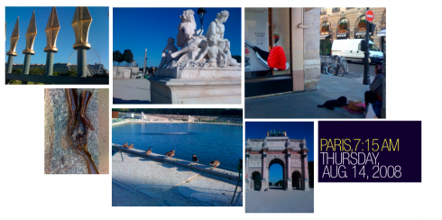
It is 7:15 am today, Thursday, August 14. There are few running routes as spectacular as the center of Paris (New York’s Central Park and Stockholm’s Kungsträdgården are possible competitors in my “rave runs” book). This morning the sun shines, and I decide to cut across Rue de Rivoli and into the park that leads from the Louvre Museum to the Eiffel Tower. A group of young Paris firemen run ahead of me, but there is hardly anyone else around this early August morning. There is the always-present drunk—-the man for whom morning and night intertwined as he stumbles towards one of the giant statues. I carry my iPhone for music, but I am happy that there is a camera there, so I can stop for two seconds and capture the images of the morning as I pass, including the homeless woman sitting outside the exclusive Godiva chocolate shop, with her two puppies. By the time my 7-kilometer, 41-minute run is completed, the city begins to wake up—-the cat on the sofa stirs. Another day begins.